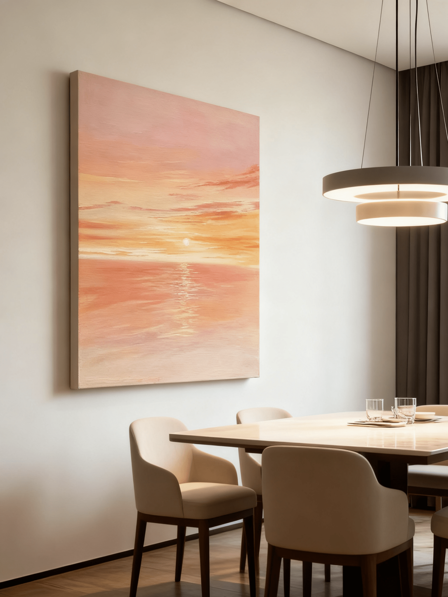
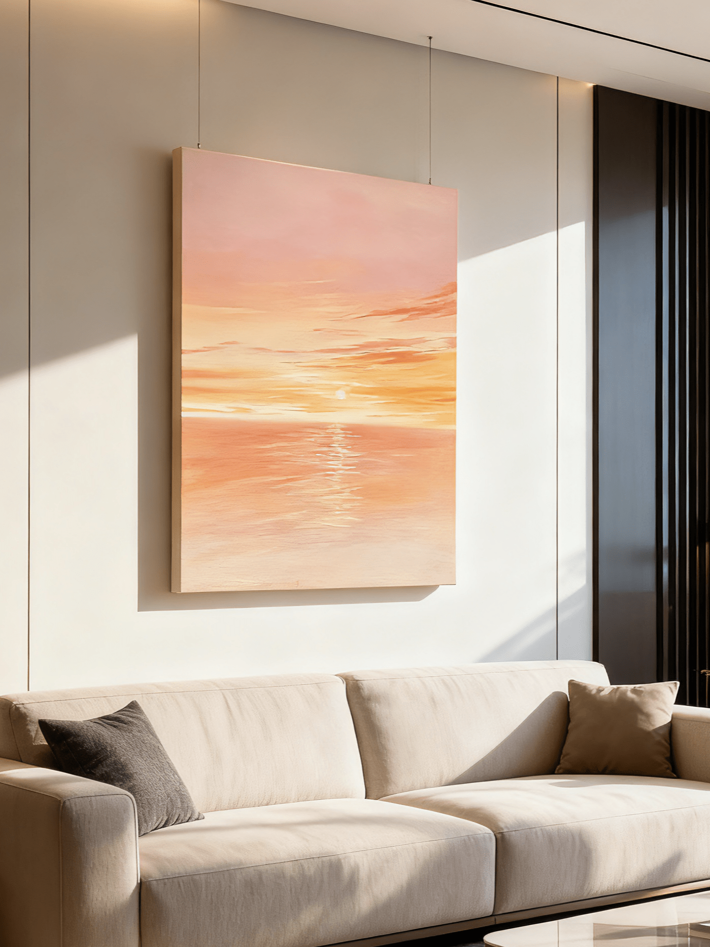
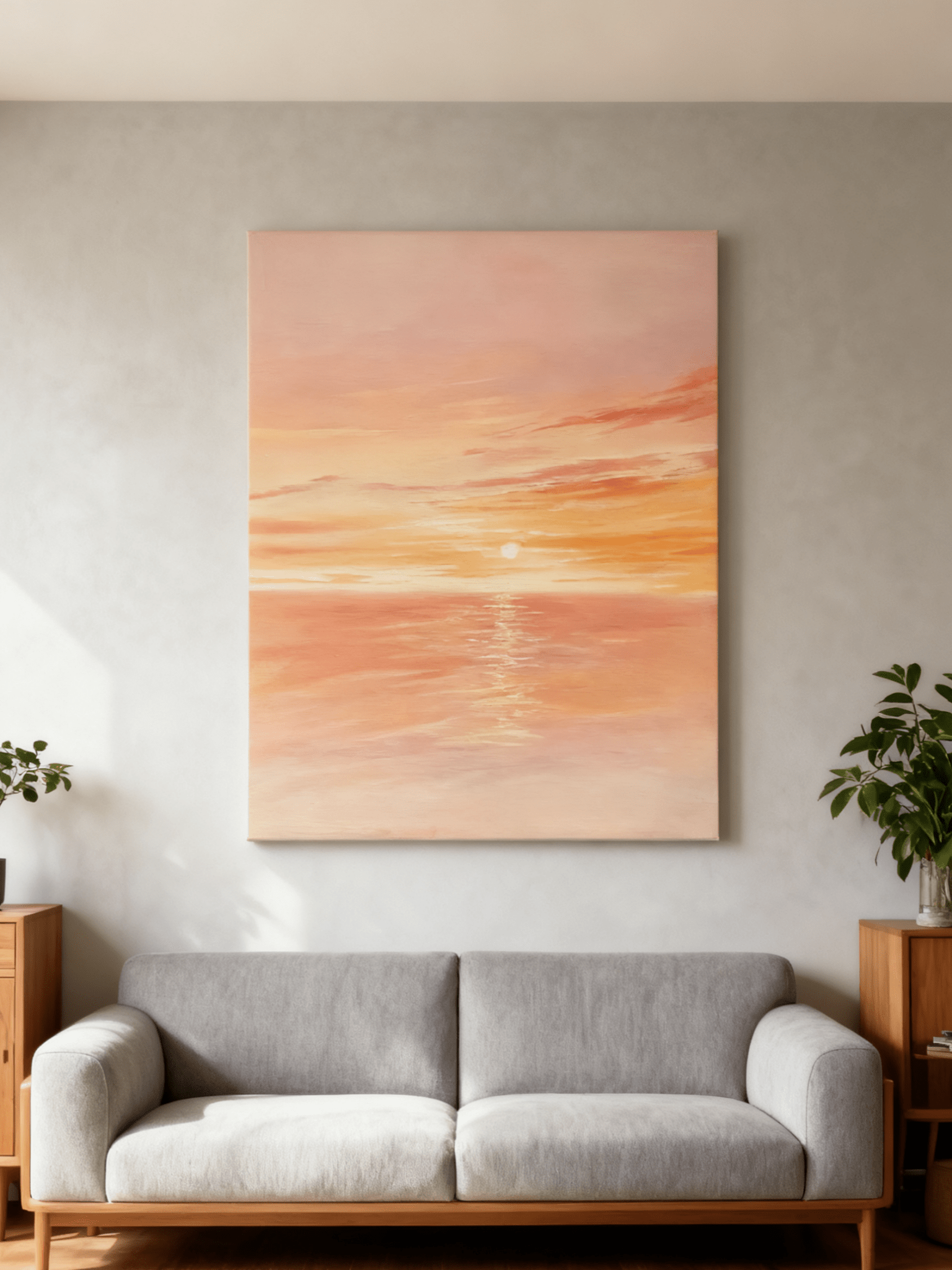
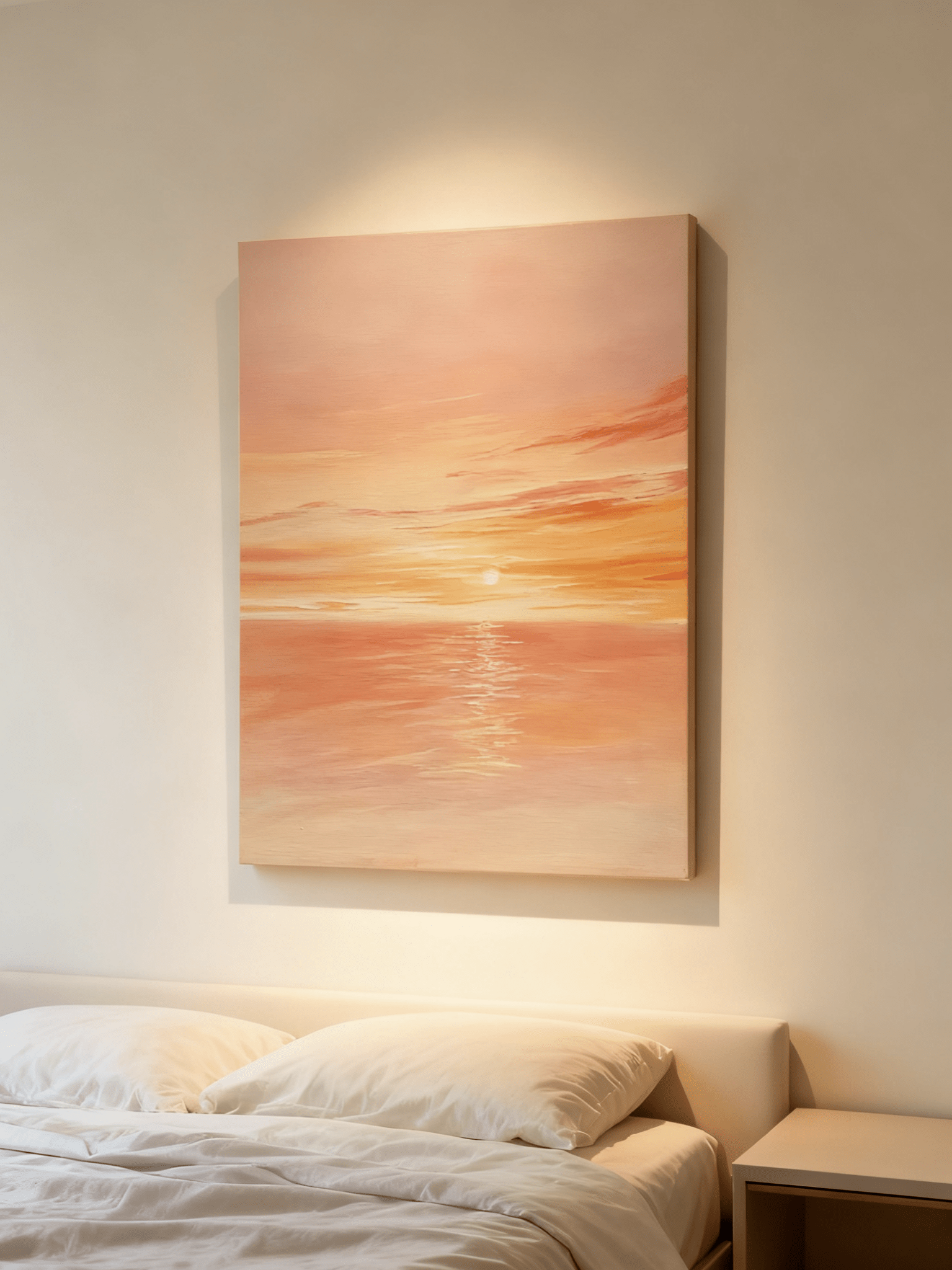
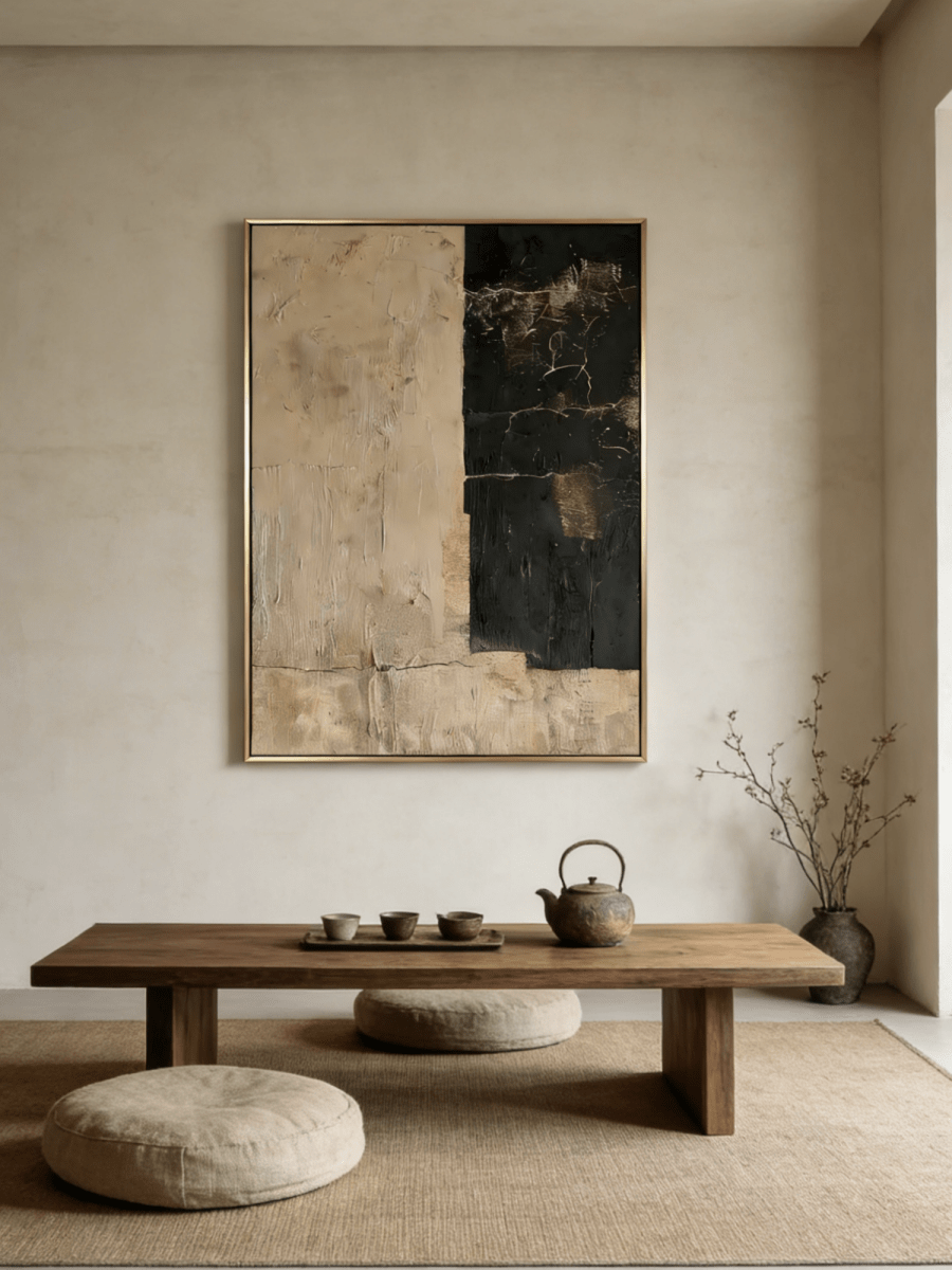
A mineral-finish wall already has movement, so the best art for limewash walls should be visible without cancelling that movement. Start by separating the painting from the wall in at least one way: value, color temperature, edge definition or surface character. On a pale warm-white limewash, that may mean an umber outline or a cooler gray passage. On taupe or clay limewash, an ivory field can supply the contrast. Keep the frame and surrounding objects quiet enough that the wall remains part of the composition.
The practical goal is not to match every mottled tone. It is to decide which surface should lead from the normal viewing distance. The wall can read as a soft atmosphere while the artwork carries the clearer shapes, or the painting can remain restrained while a thin frame provides the boundary. Measure in the room, review the work in daylight and lamplight, and judge the complete wall rather than a close-up sample.
Read the wall before choosing the painting
Limewash, Roman clay and decorative plaster are not identical finishes, but they share one useful design characteristic: their color is not visually flat. Trowel marks, cloudy transitions and changes in reflectance can make a single paint color appear lighter, darker, warmer or cooler across the wall. That variation is precisely why a painting that looks distinct on a white product page may feel quieter once it is installed.
Stand six to ten feet from the intended position and note three things. First, identify the lightest and darkest values on the wall. Second, decide whether the overall cast is yellow-beige, pink-clay, gray-taupe or cool mineral white. Third, watch what happens after sunset. Raking daylight may make the wall active in the afternoon, while diffuse evening light can reduce it to a nearly solid field.
A small phone photograph converted to grayscale is a useful check. If the wall and the painting sample collapse into the same gray value, color alone may not give you enough separation. A defined frame, a darker passage within the work, or a little more blank wall around the canvas can restore the hierarchy.
Use one clear source of contrast
Four types of contrast matter beside a mottled wall. You do not need all four. In fact, one strong distinction and one quieter supporting distinction usually feel more composed than maximum contrast everywhere.
- Value contrast: a pale work against medium taupe, or a brown and ivory work against warm white.
- Temperature contrast: blue-gray or charcoal against a golden limewash; ochre and sand against a cool gray finish.
- Edge contrast: a slim dark, wood or metallic frame that separates similar neutral tones.
- Surface contrast: clear relief, directional marks or structured geometry against the wall's broad, cloudy movement.
Surface contrast deserves care. Heavy texture can work on a textured wall when the scales are different: broad, low-contrast movement behind; smaller, more intentional relief in front. If both surfaces have equally busy marks and equal tonal range, they may compete. The existing guide to heavy versus subtle textured wall art is useful when the painting's relief, rather than the wall finish, is your main uncertainty.

Match the painting to the limewash color
Warm white and cream limewash
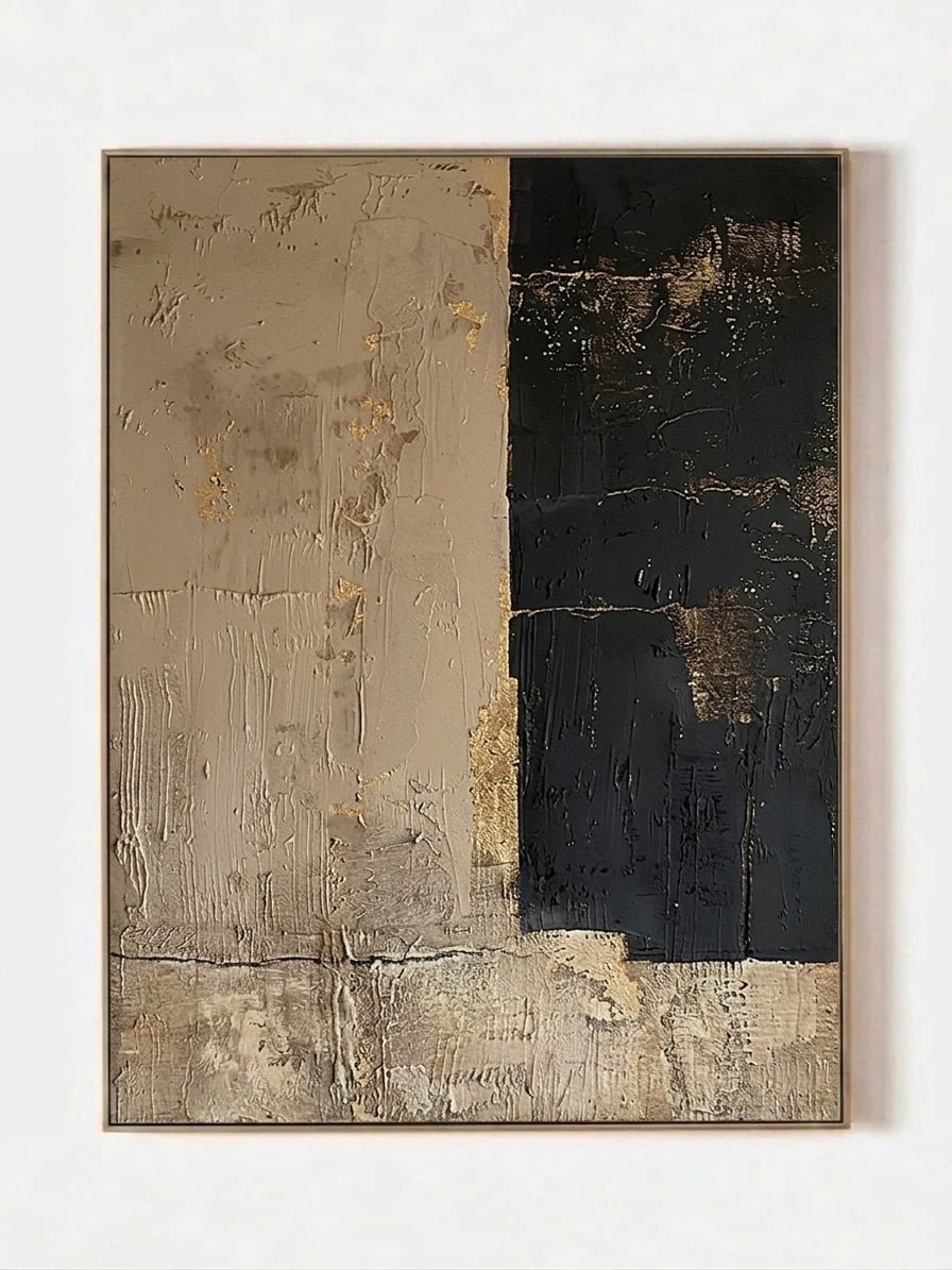
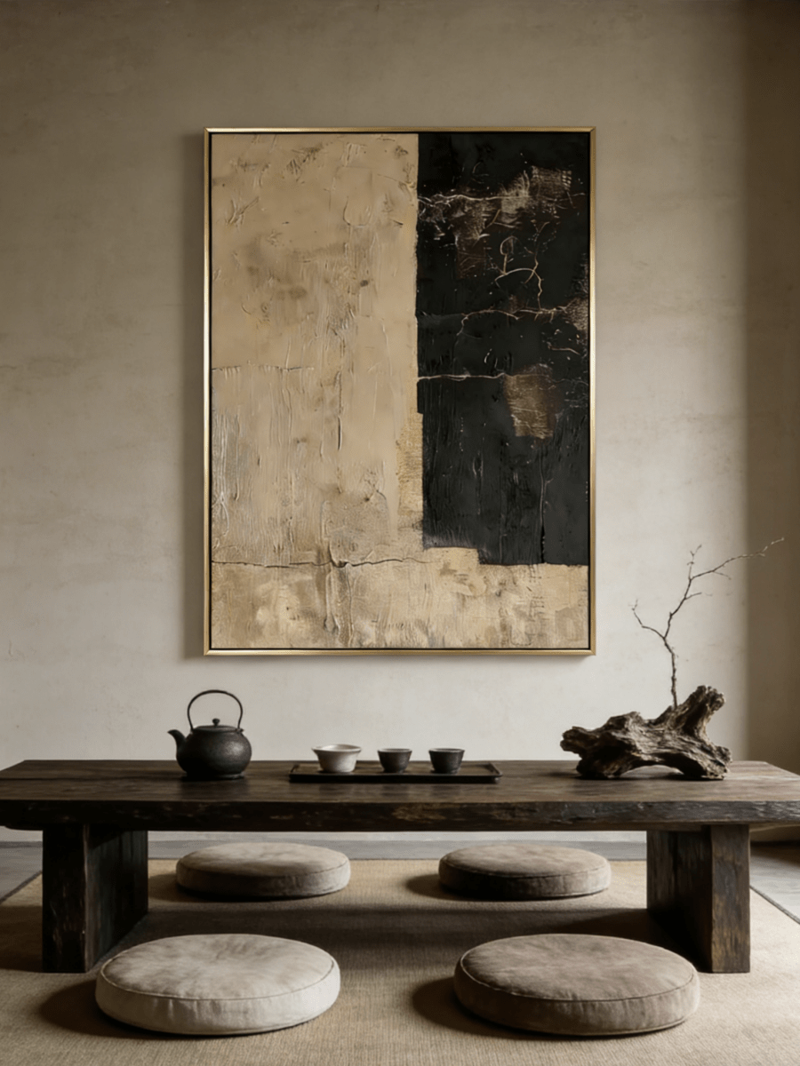
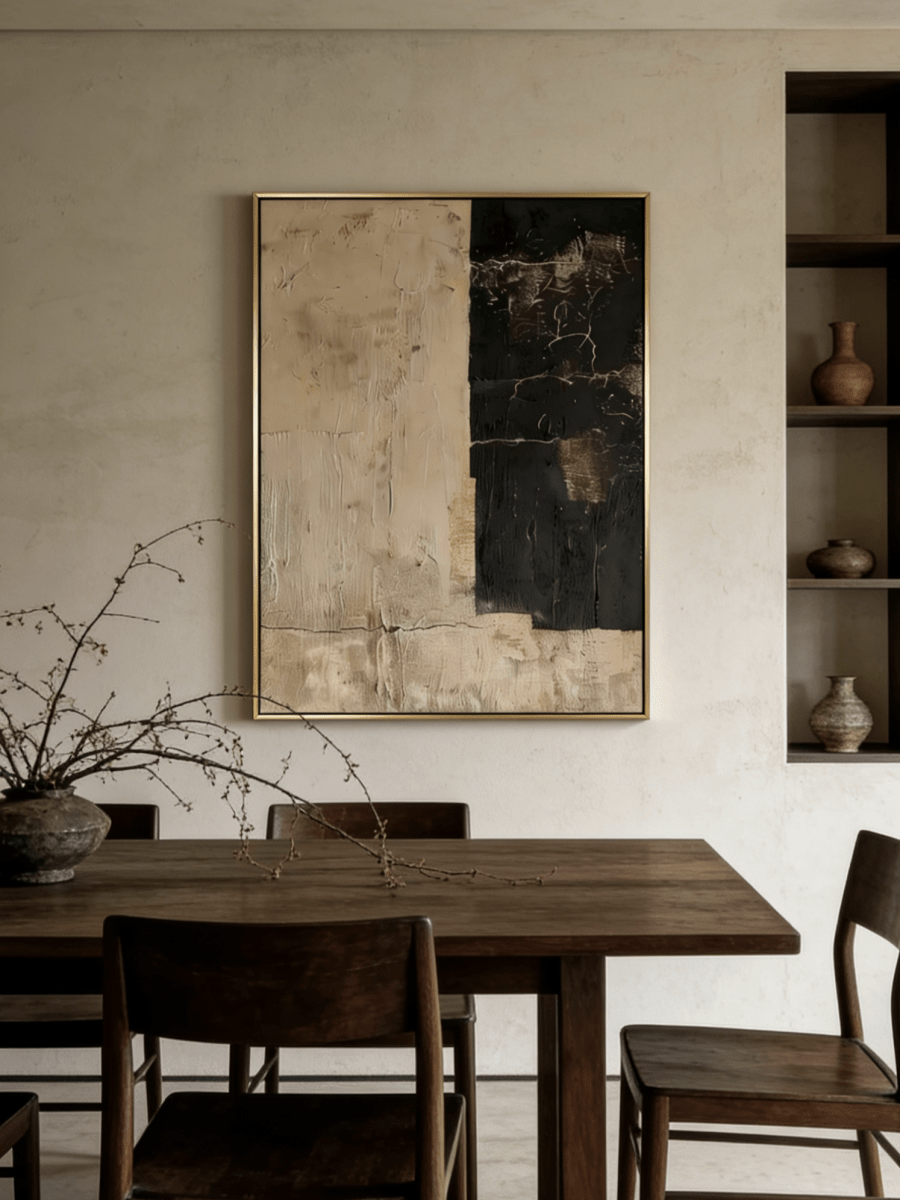
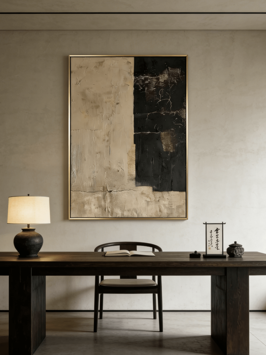
A cream wall can swallow a cream painting if both share the same value. Keep the neutral harmony, but introduce definition through brown, charcoal, ochre or a visibly structured edge. Gilded Sand Blocks – EV#0419 remains within an ivory-and-sand family while its geometric divisions and warm gold-toned passages create readable structure. Repeat only one of those warm notes in the room, perhaps in oak, aged brass or a camel textile.
Greige and taupe limewash
Greige makes warm ivory look clearer and can support both brown and cool gray. The safest pairing usually has a light area that is lighter than the wall and a midtone that relates to it. Weathered Ivory Blocks fits that approach. If the room contains walnut or dark bronze, a slim dark frame can make the transition feel intentional rather than abrupt.
Clay, terracotta and ochre limewash
On a richer earth-colored wall, give the eye a place to rest. Ivory, sand and soft gray are easier than a second large field of saturated rust. A work with narrow ochre notes can connect to the wall without disappearing into it. Avoid choosing from a cropped product image alone; the percentage of pale space matters as much as the presence of a matching accent.
Cool gray or chalky white limewash
Cool walls often benefit from one warm bridge, especially when the floor is oak or the upholstery is cream. Quiet Ivory City – EV#0418 combines ivory, soft gray and an ochre note in a vertical format. Its architecture-like lines provide a different rhythm from a cloudy wall, while the warm accent keeps the pairing from feeling clinical.

Choose scale by visual weight, not wall area alone
A textured wall makes the entire surface feel designed, so an undersized painting can look like an afterthought. Begin with the furniture below the work. Above a console, bench or low cabinet, a painting that occupies roughly two-thirds of the furniture width is a sensible starting point, then adjust for objects on the surface. In an empty stair landing or narrow recess, use the available wall width and leave a deliberate border on all sides.
Visual weight can alter the calculation. A pale tonal piece reads lighter than a dark graphic piece of the same dimensions. If the art is close in color to the limewash, go slightly larger or give it more breathing room. If it contains a strong umber field, a smaller canvas may still hold the wall. Test the outer dimensions with low-tack painter's tape and view the outline from the doorway, the principal seat and the adjacent room.
Do not measure from a decorative edge that will be hidden behind curtains or a tall plant. Also account for wall switches, sconces and door swings. The best position is often a few inches away from mathematical center because it belongs to a furniture grouping rather than to the architecture of the entire wall.
Let lighting reveal two surfaces separately
Light striking from the side exaggerates relief. If strong daylight already grazes the limewash, a second hard spotlight on a highly textured painting can create too many shadows. Use a softer, wider beam or place the fixture so the artwork receives gentle frontal light. In a dim hall, a directional source can help the painting read, but check for glare on any protective coating or frame glazing.
Review the wall at the time you use the room most. A dining room chosen only in noon light may become murky during dinner. A bedroom selected under warm lamps may look unexpectedly yellow in morning sun. Photograph the painted wall in both conditions and compare it with the product imagery. Screen color is not an exact material sample, so treat this as a relationship check rather than a color guarantee.
Frames, spacing and nearby materials
A frame is not always required, but it can solve a low-contrast pairing. Pale natural wood feels continuous with cream or clay finishes; black creates a crisp boundary; warm metal connects with ochre or bronze details. The frame should relate to a material already present, not introduce a completely new finish for its own sake.
Keep at least one quiet zone around the artwork. On a visually active wall, several small objects, a mirror and a painting can fragment the surface. One canvas with restrained accessories often lets both textures breathe. If you are building a pair, keep the gap consistent and judge the total outline as a single installation.

A five-step pre-purchase check
- Record the wall's lightest and darkest tones in daylight and after dark.
- Choose one main contrast: value, temperature, edge or surface.
- Tape the full outer dimensions, including the frame, onto the wall.
- Check the outline from normal entrances and seats, not only from directly in front.
- Open each product page to confirm available dimensions, orientation and framing options before ordering.
The Textured Wall Art collection is the broad commercial destination for comparing surface treatments, while the Wabi-Sabi Wall Art collection narrows the view toward irregular line, restrained color and organic composition. Use the individual product page as the source of truth for the chosen artwork.
Frequently asked questions
Can you hang textured art on a textured wall?
Yes. Separate the two surfaces by scale or value. Broad, subtle wall movement can sit behind more defined relief, while a highly active wall usually benefits from a quieter painting and a clear edge.
Should art match the exact limewash color?
No. Exact matching can make the painting disappear. Repeat one wall tone, then add a lighter value, a darker line, a temperature shift or a frame that defines the boundary.
What frame color works on a limewash wall?
Choose a finish already present in the room. Pale wood is soft, black is graphic, and warm metal works with ochre or bronze details. The frame's job is to clarify the art, not overpower the wall.
Does limewash make a room too busy for abstract art?
Not when the visual rhythms differ. Pair cloudy wall variation with larger, clearer shapes or controlled lines, and limit competing accessories around the painting.
How should I test artwork before ordering?
Mark the exact dimensions with painter's tape, review from several viewpoints and compare the color relationship in daytime and evening light. Then confirm sizes and framing on the product page.
Find the right degree of contrast
Limewash should not force you into either blank white art or a high-contrast statement. The more useful question is which layer should lead: wall, artwork or frame. Once that hierarchy is clear, neutral color becomes much easier to control. Browse the latest New Wall Art, then compare the pale, earth-toned and structured options against photographs and measurements from your own room.