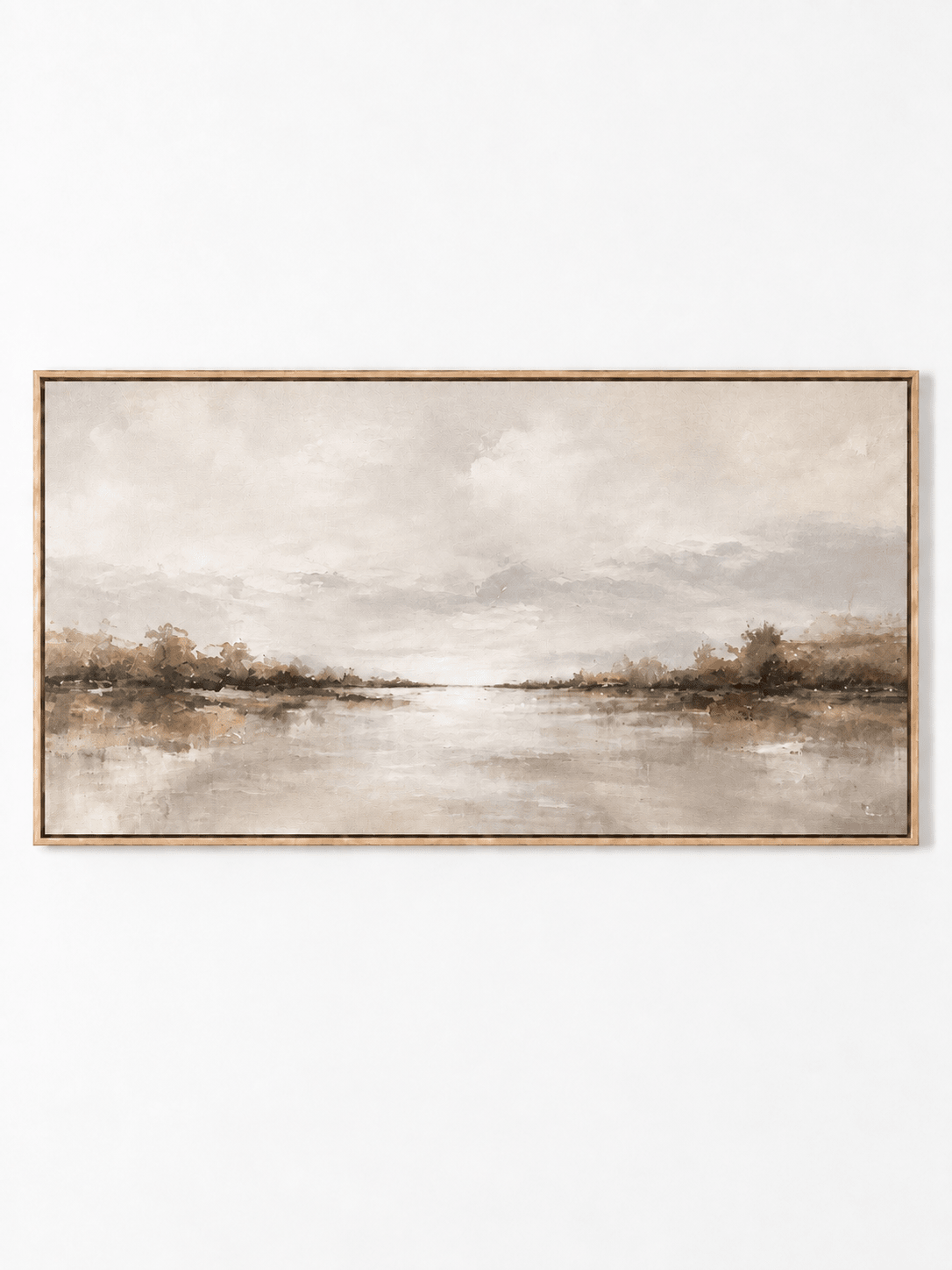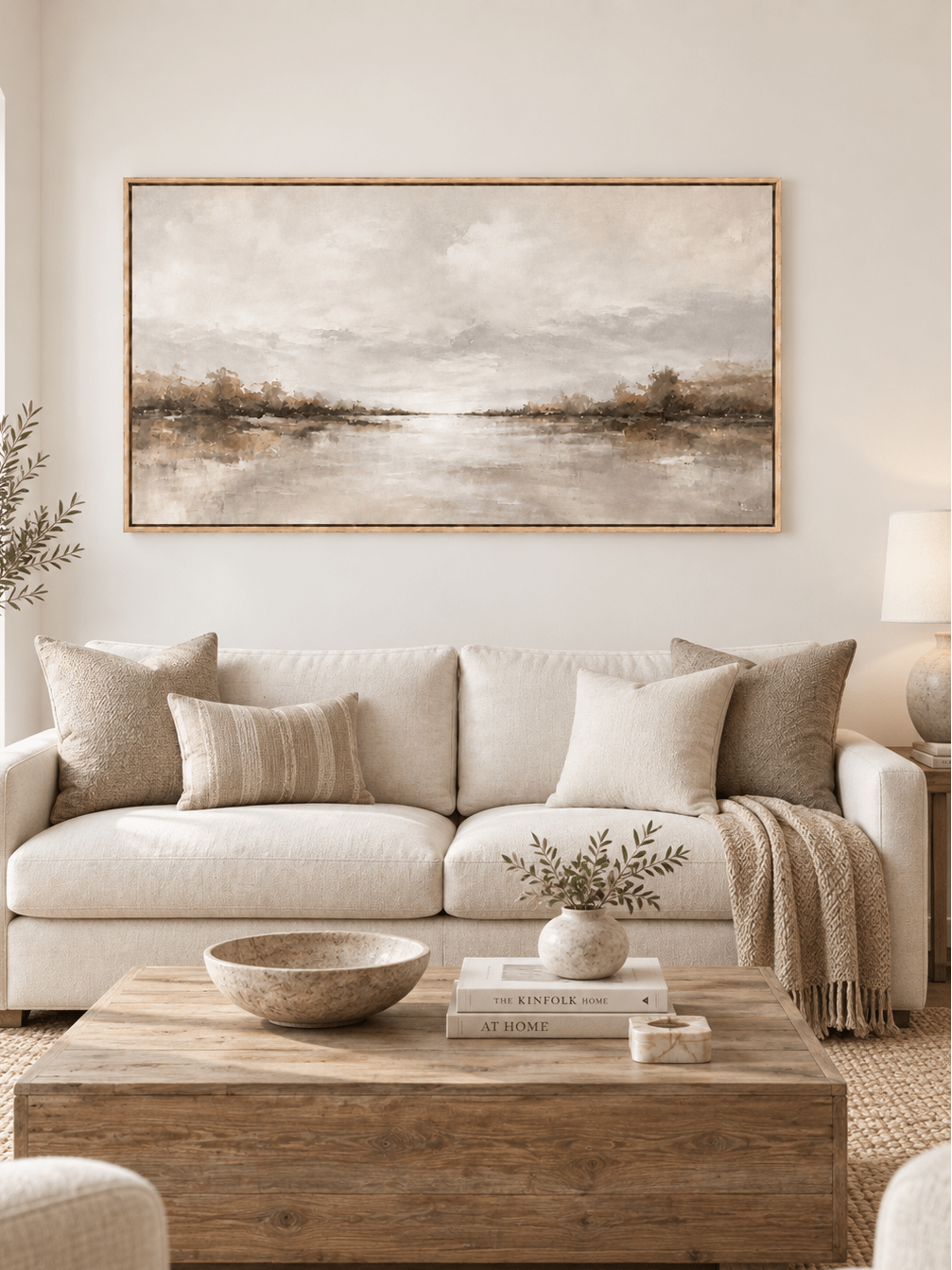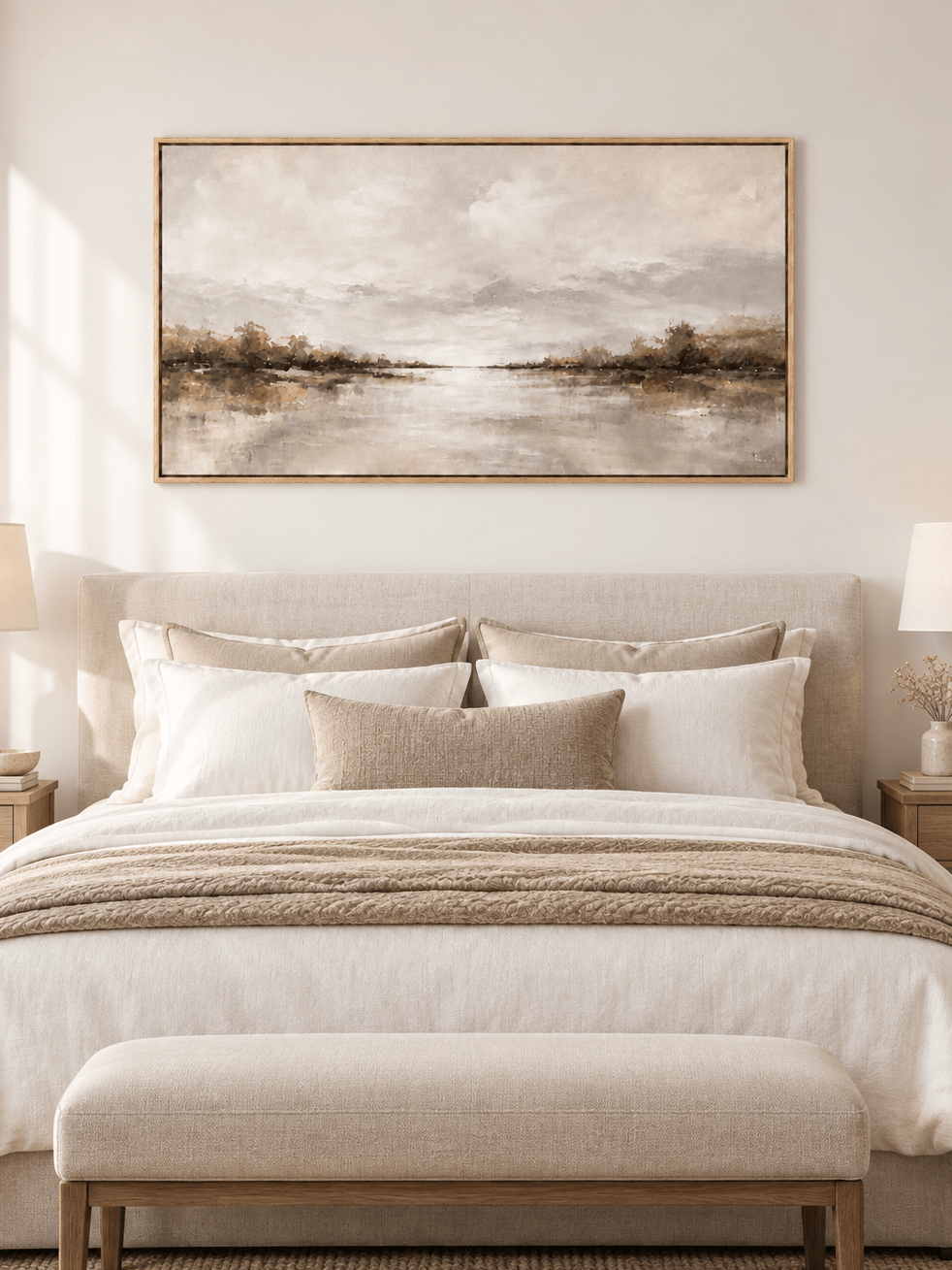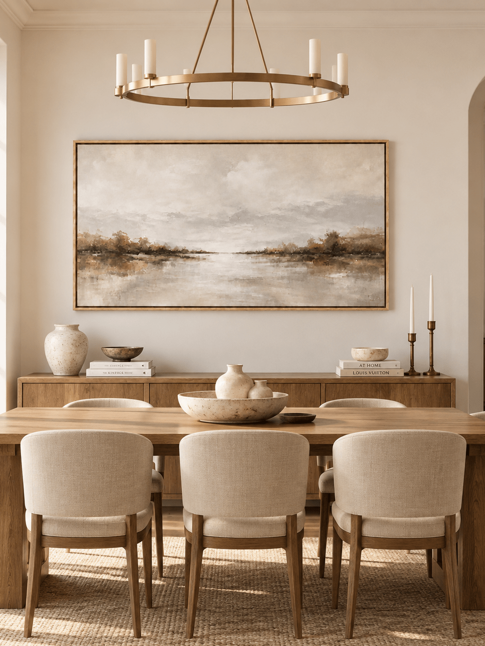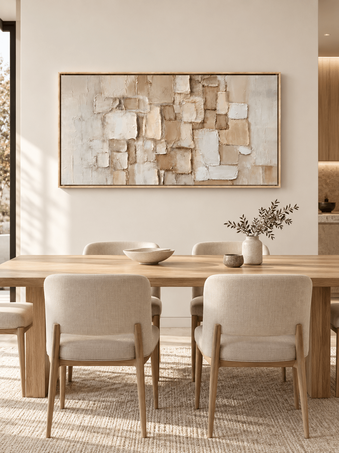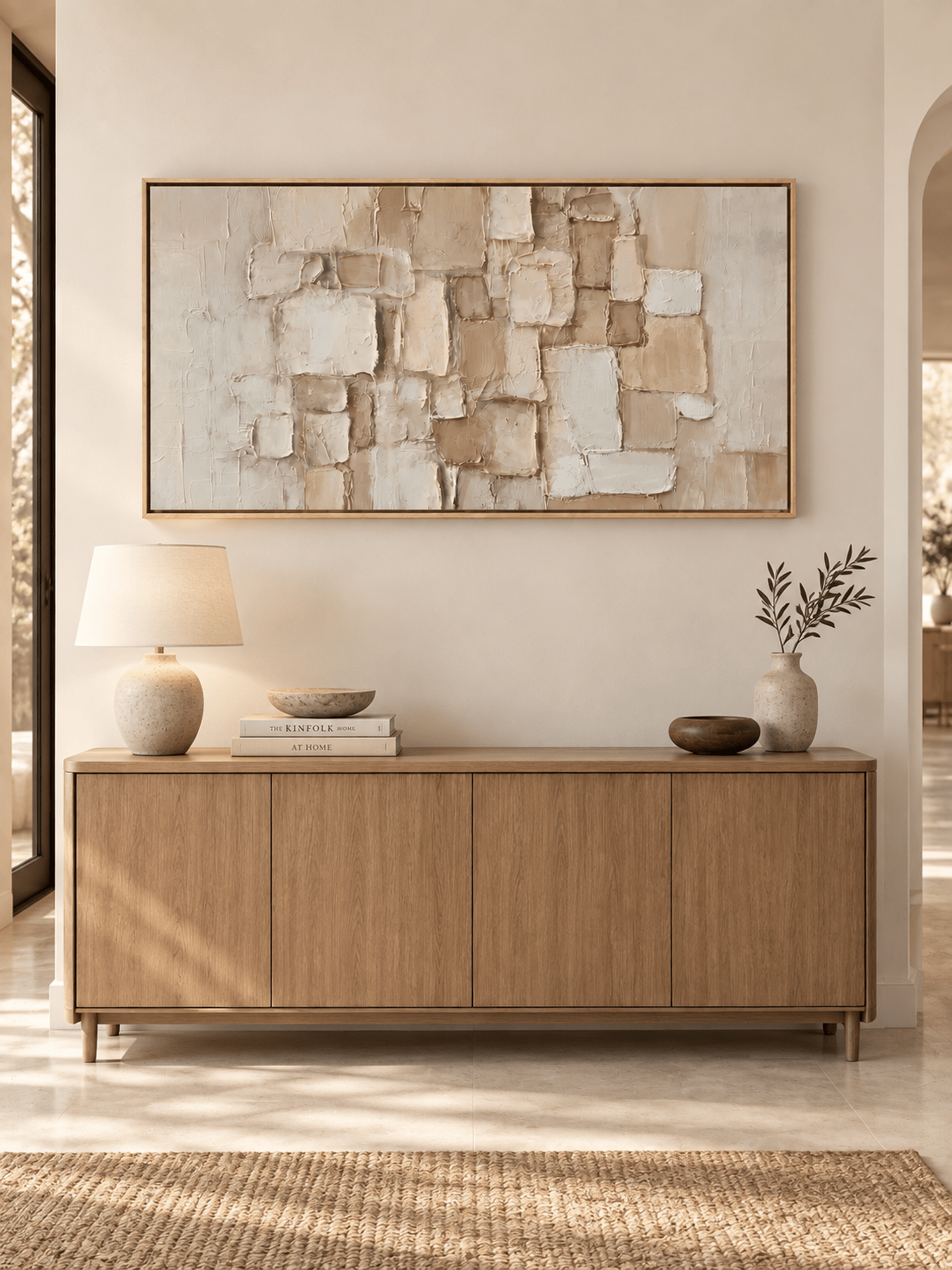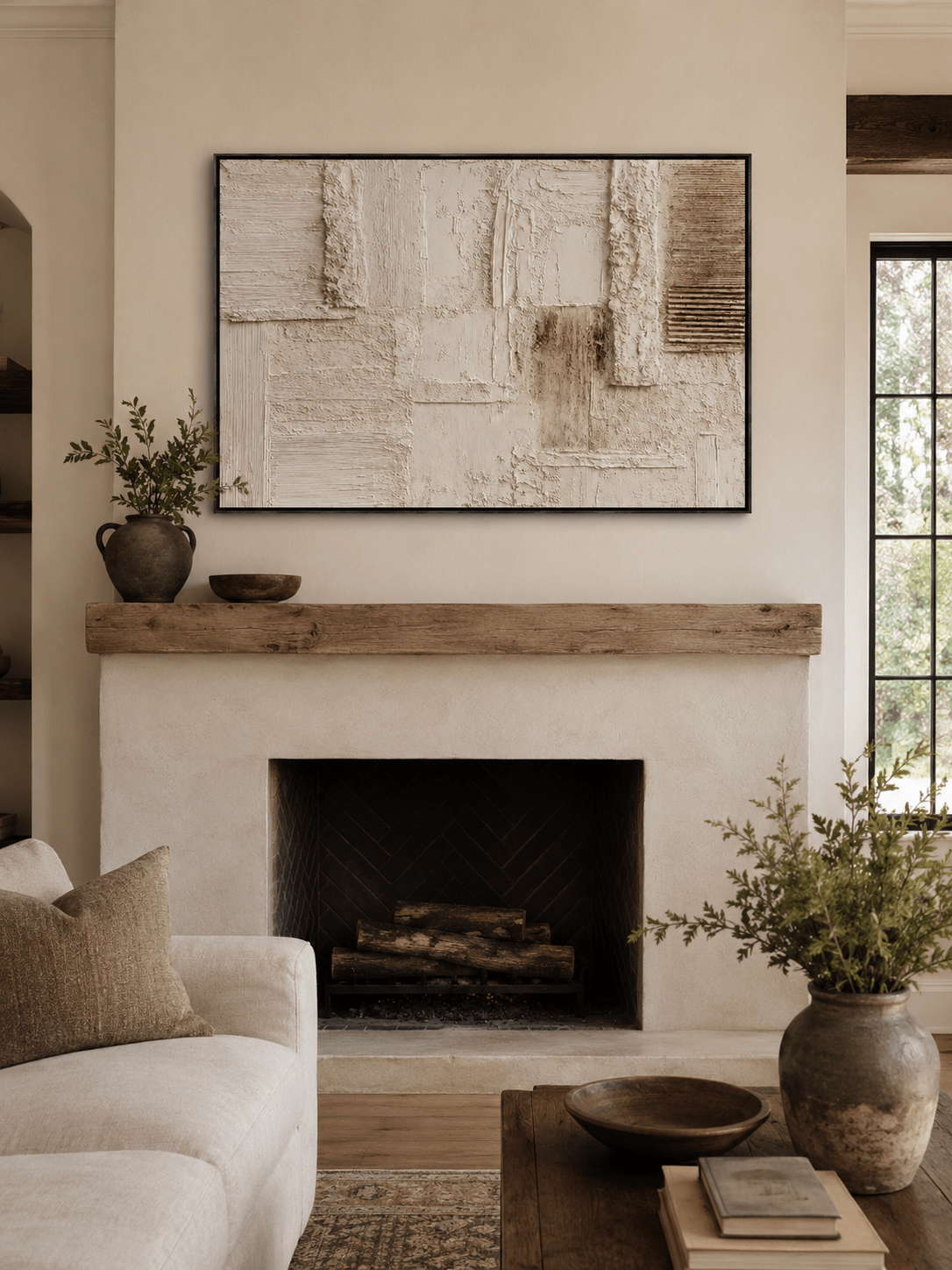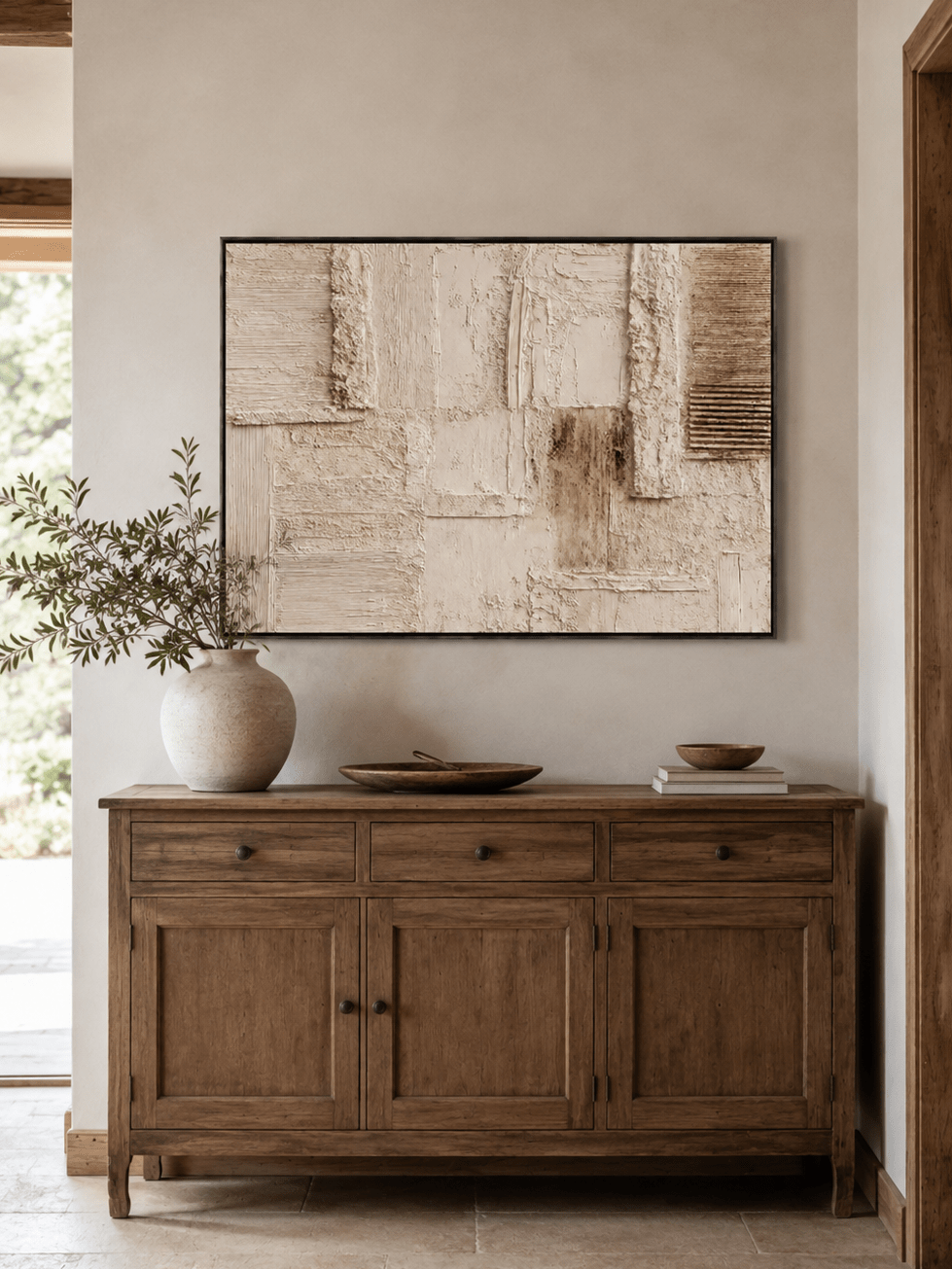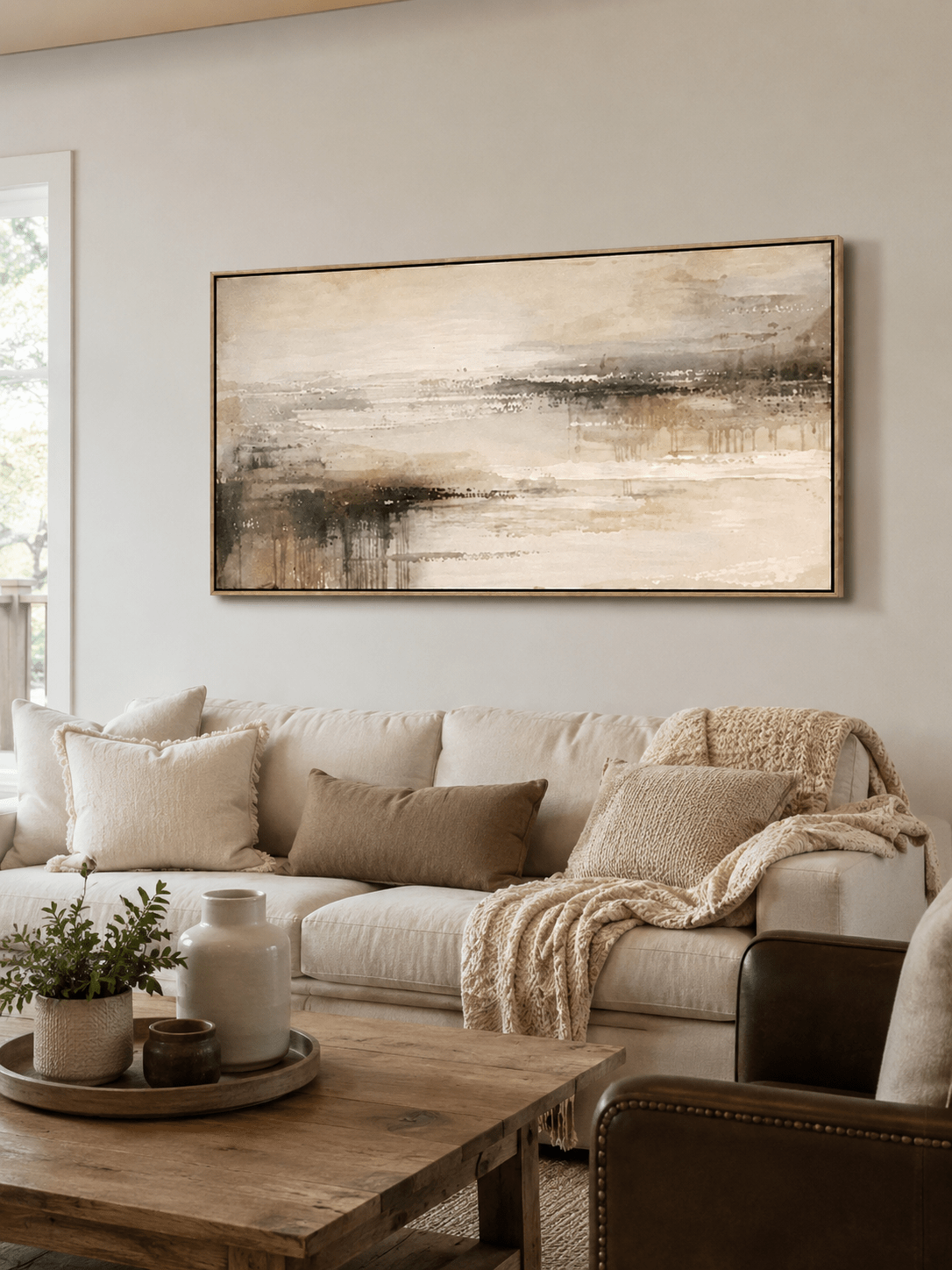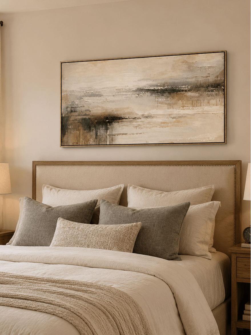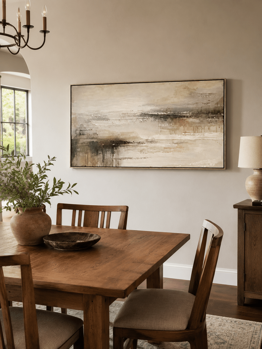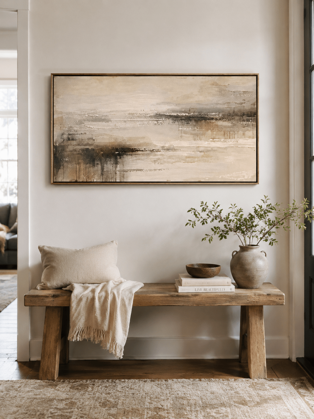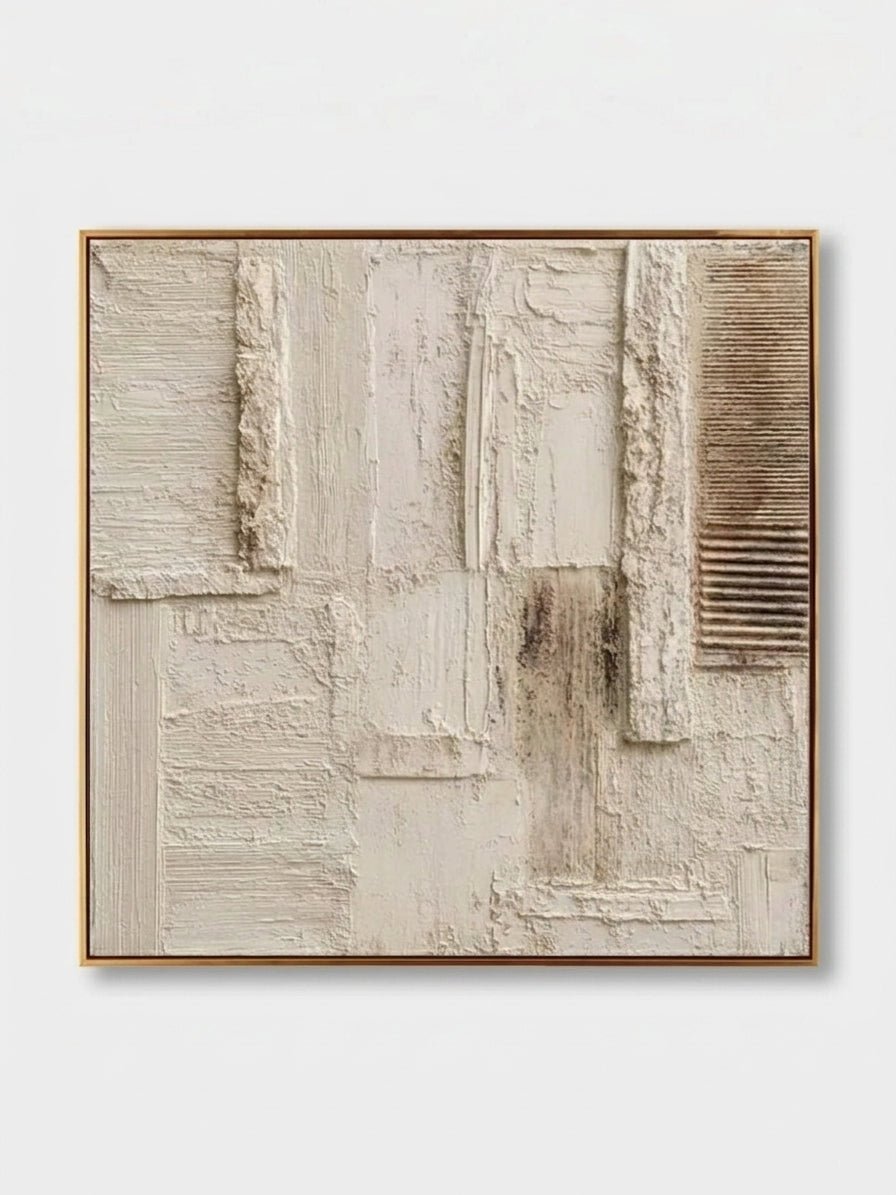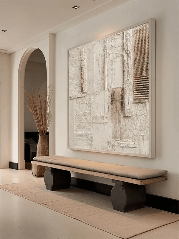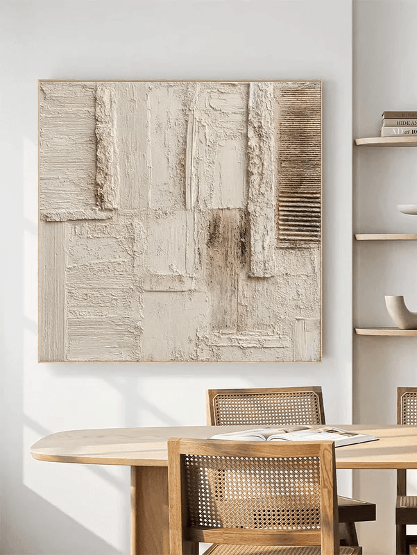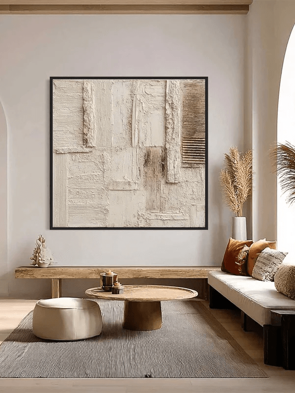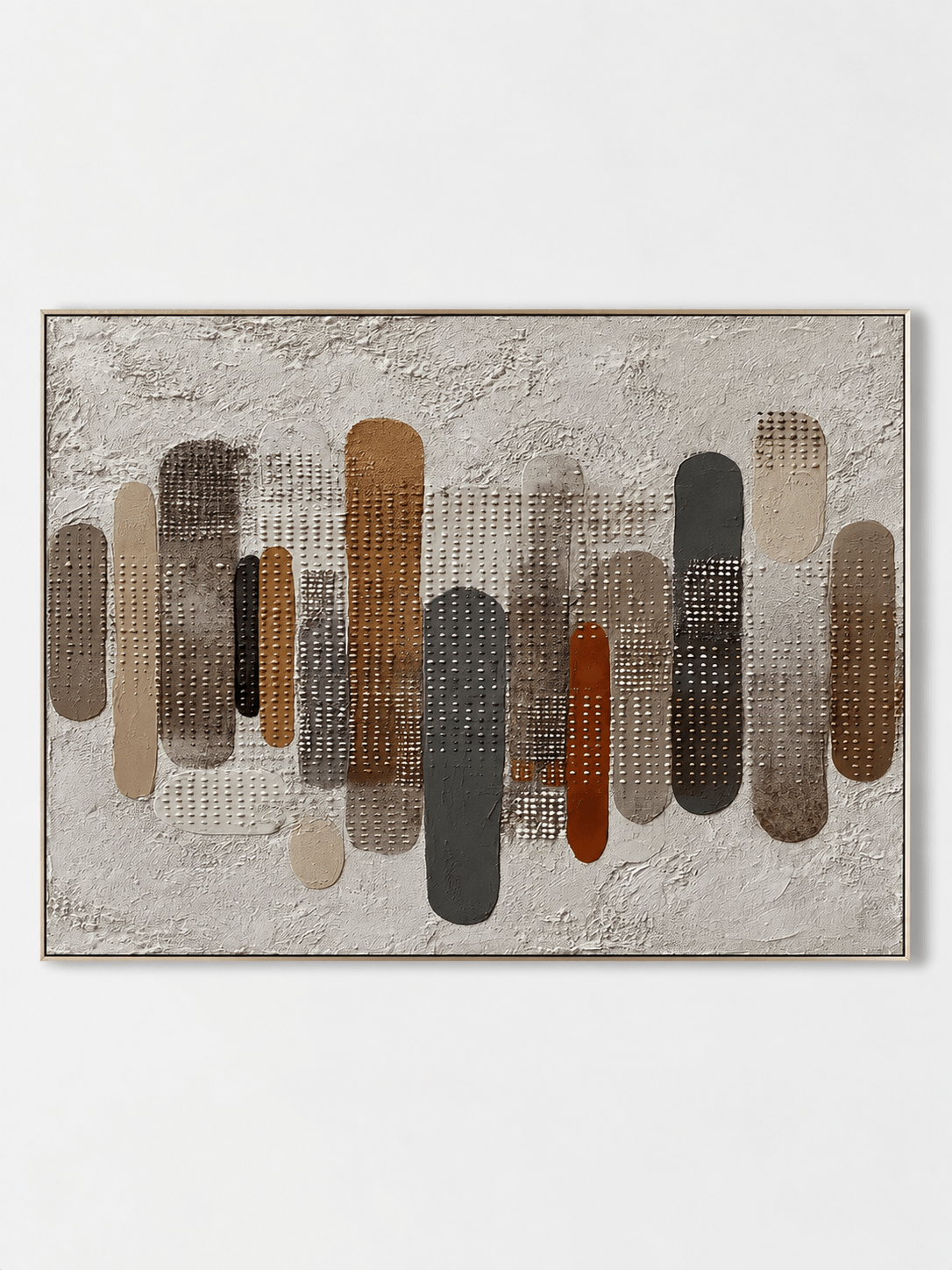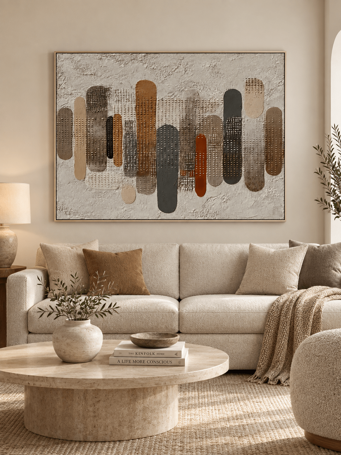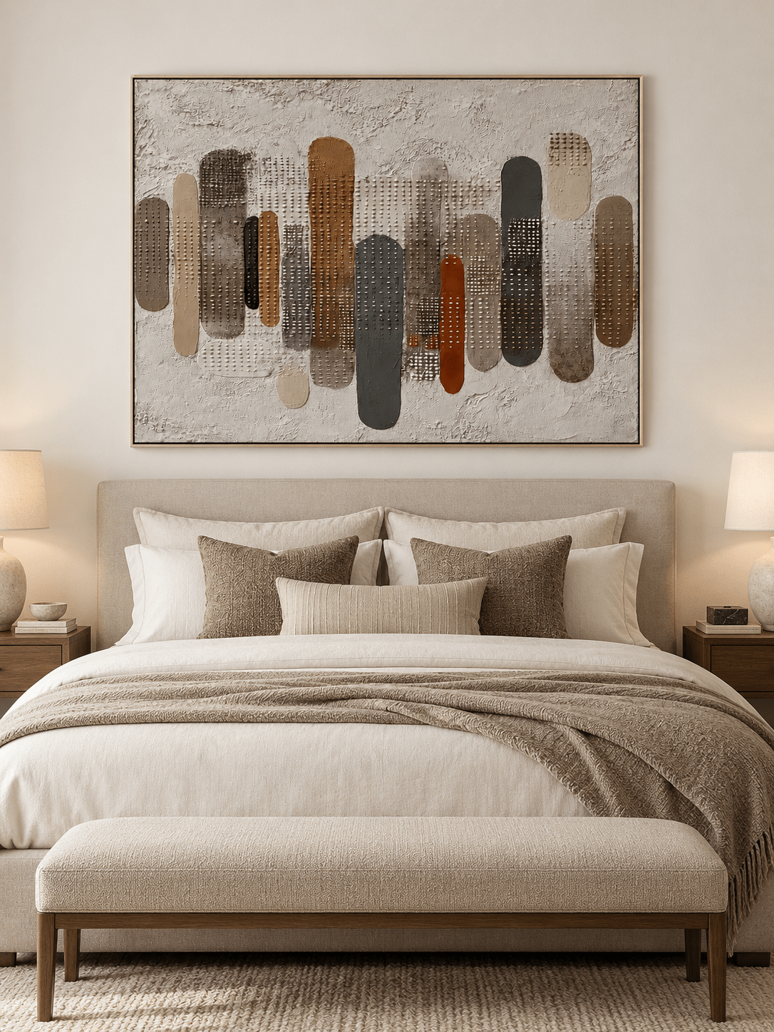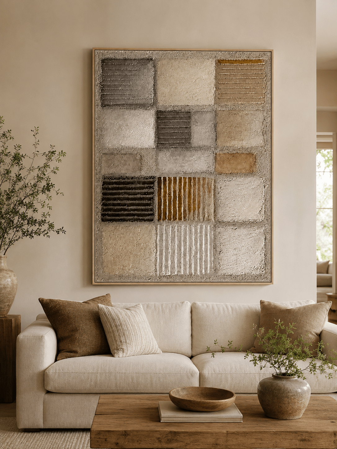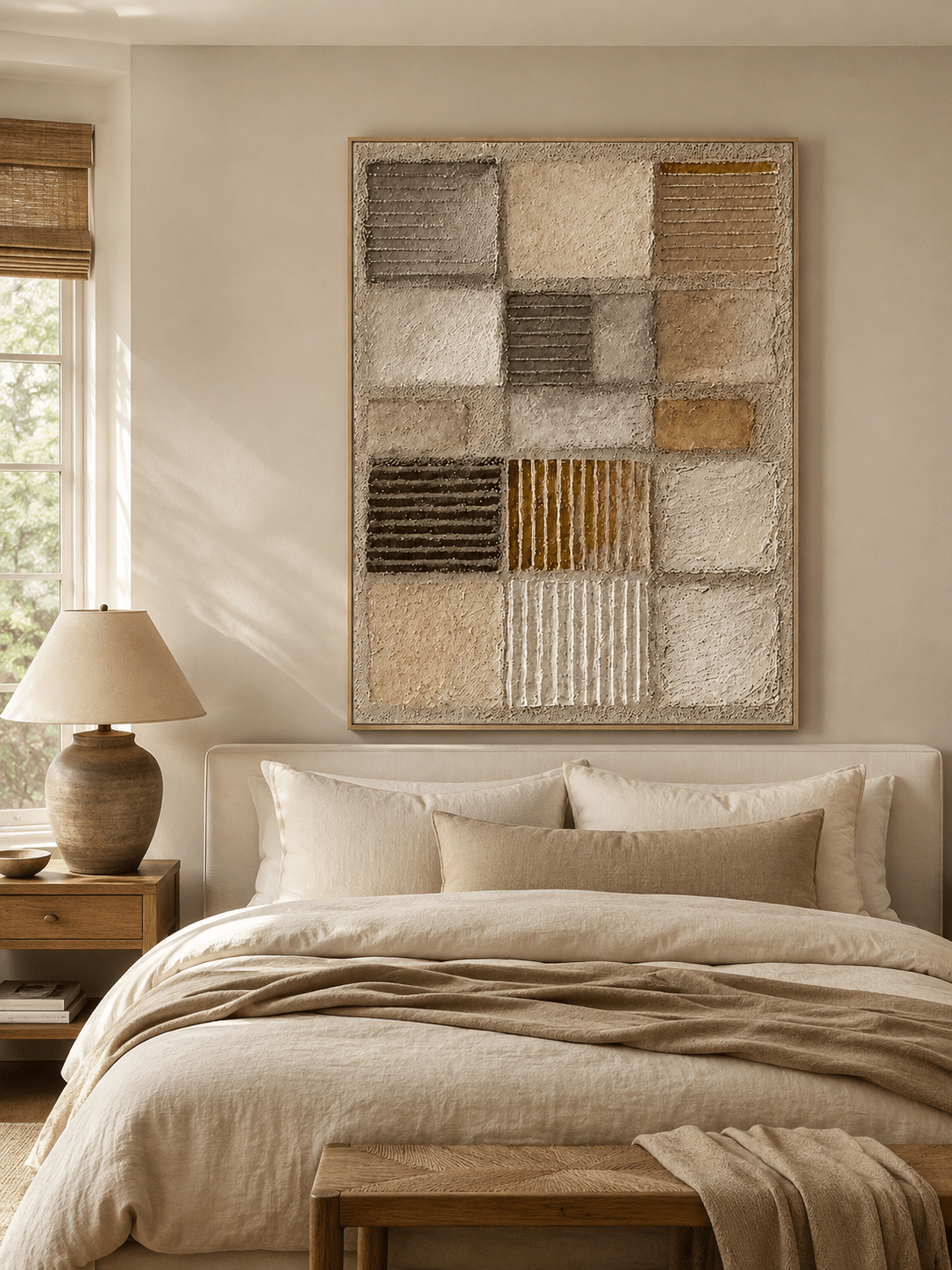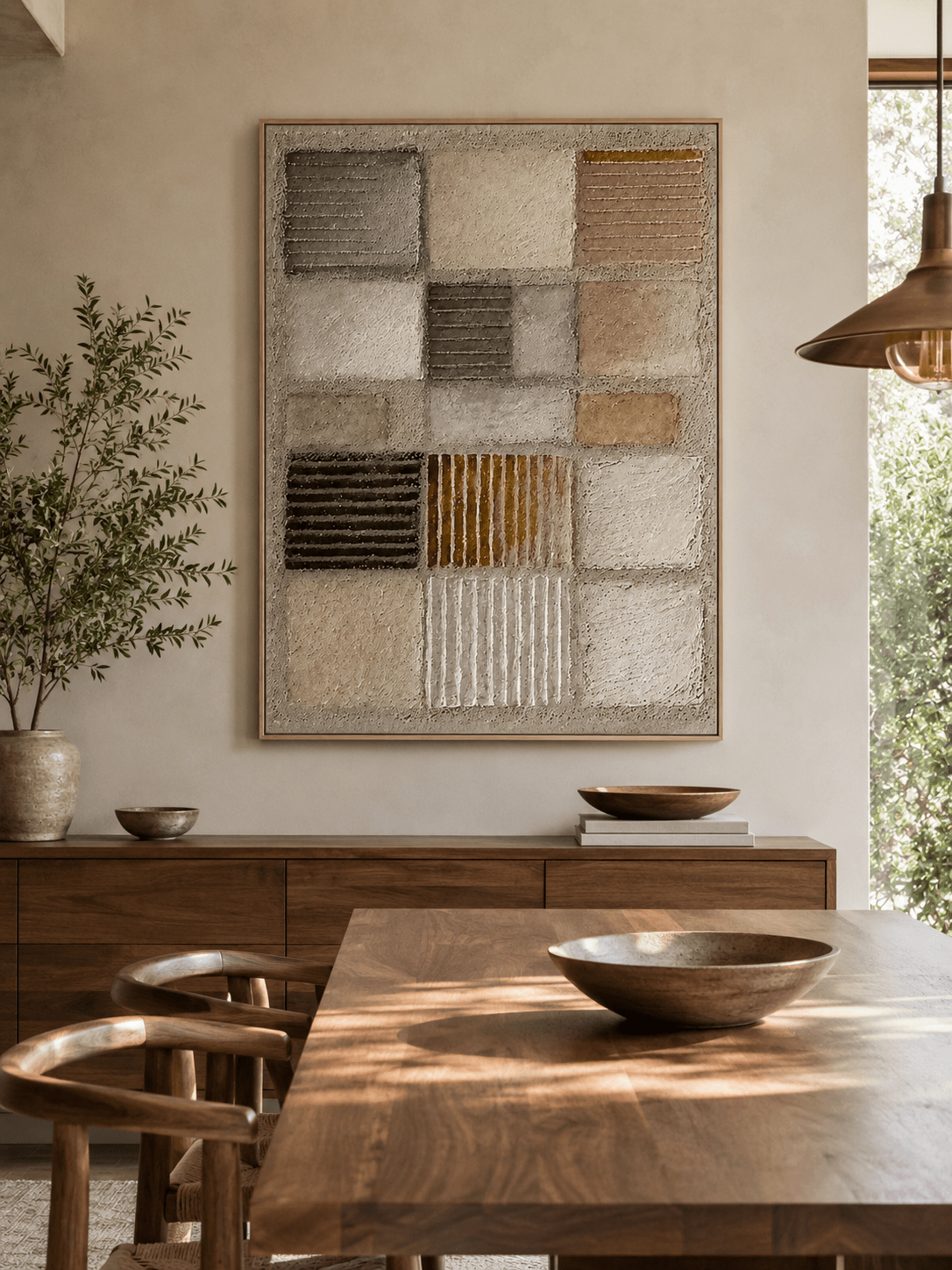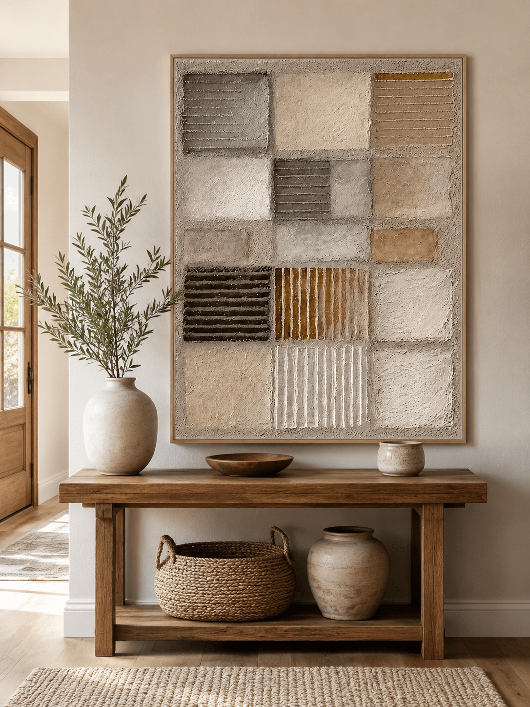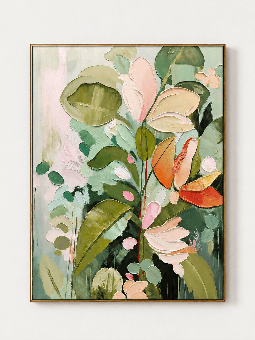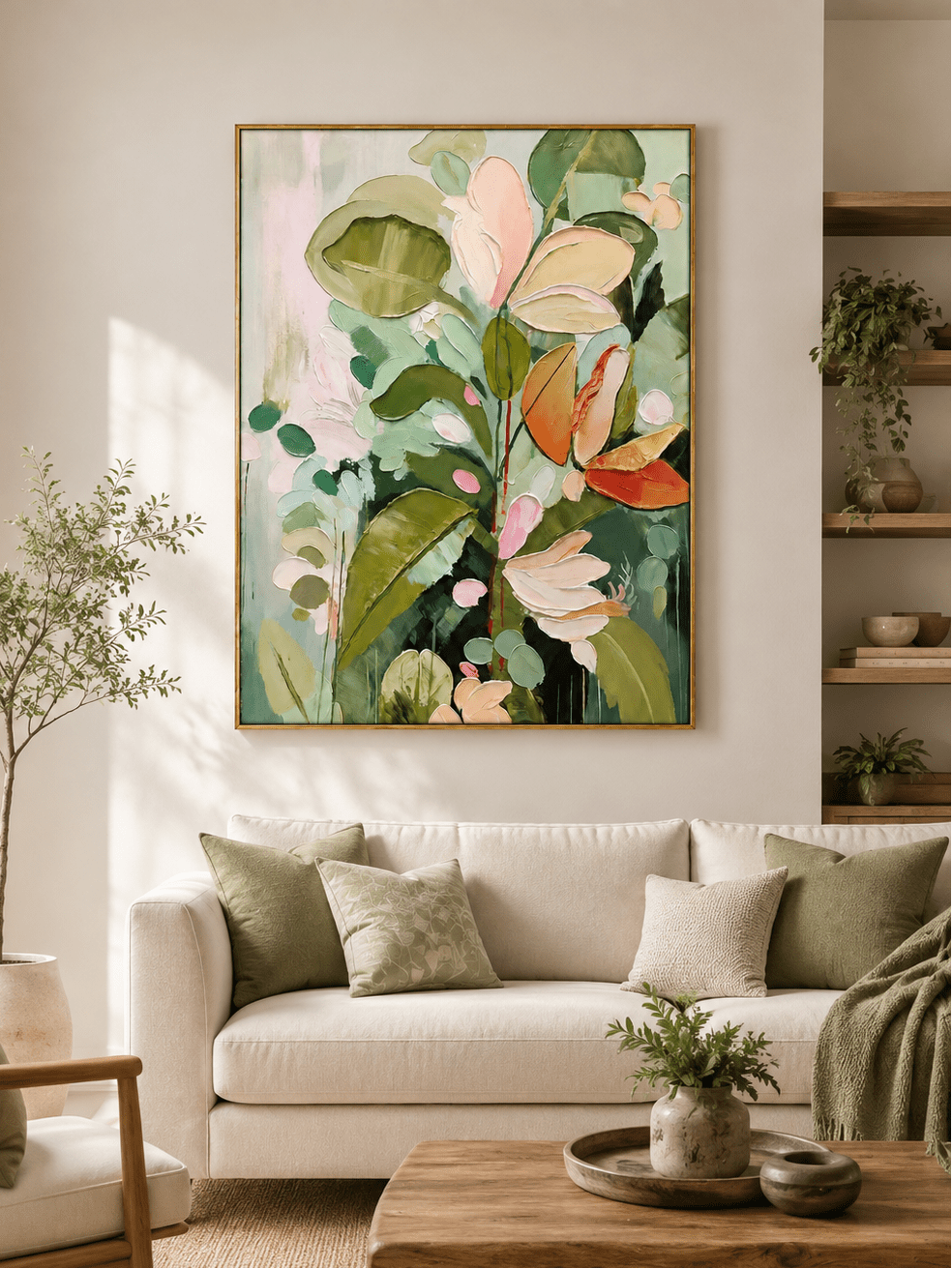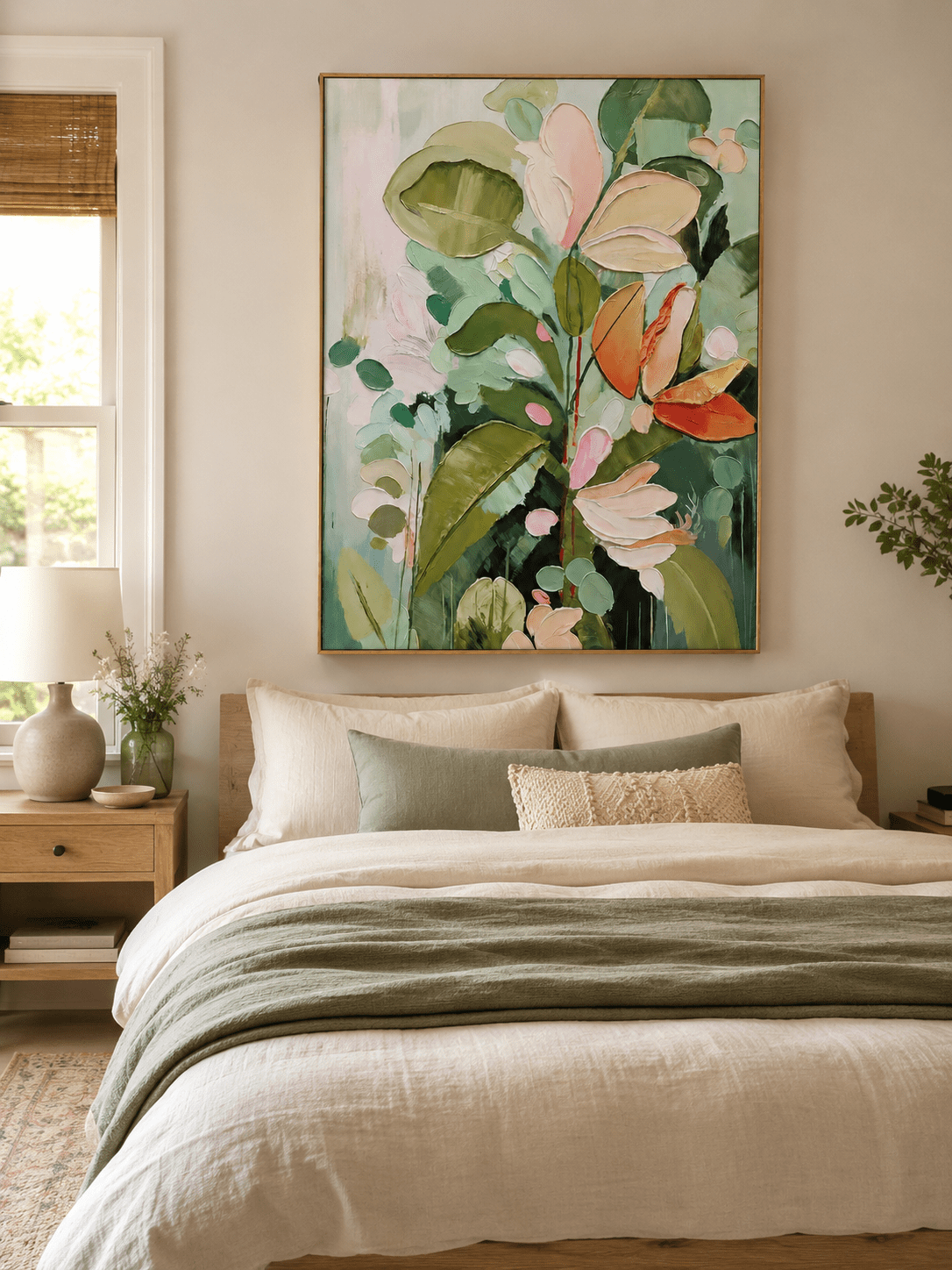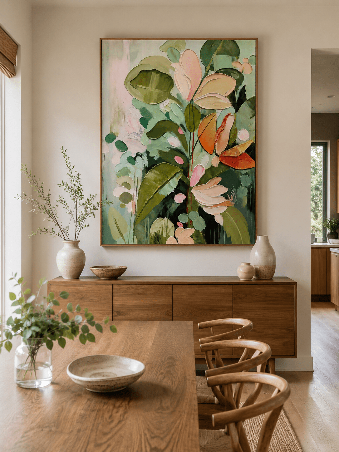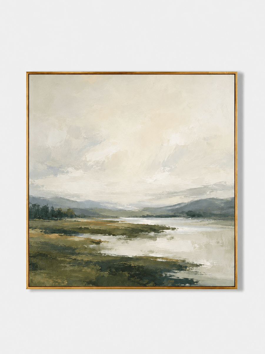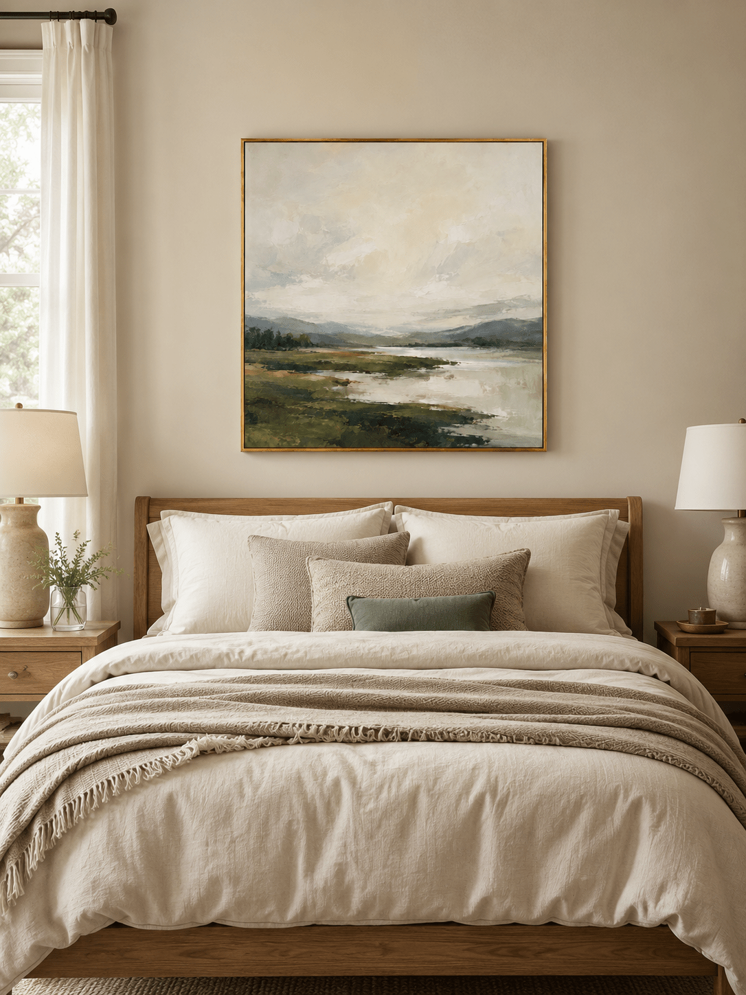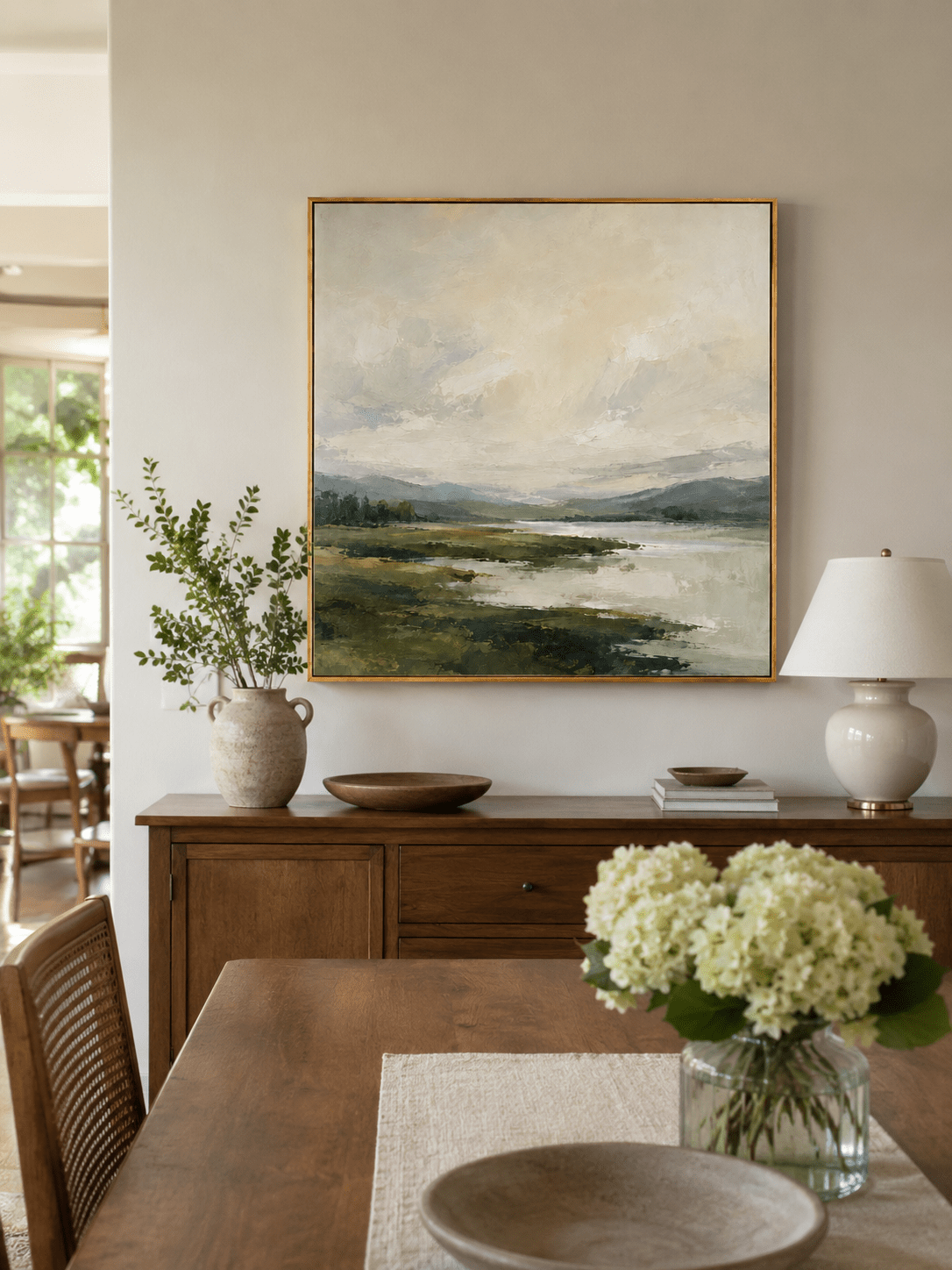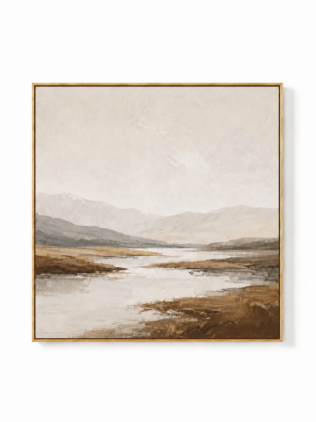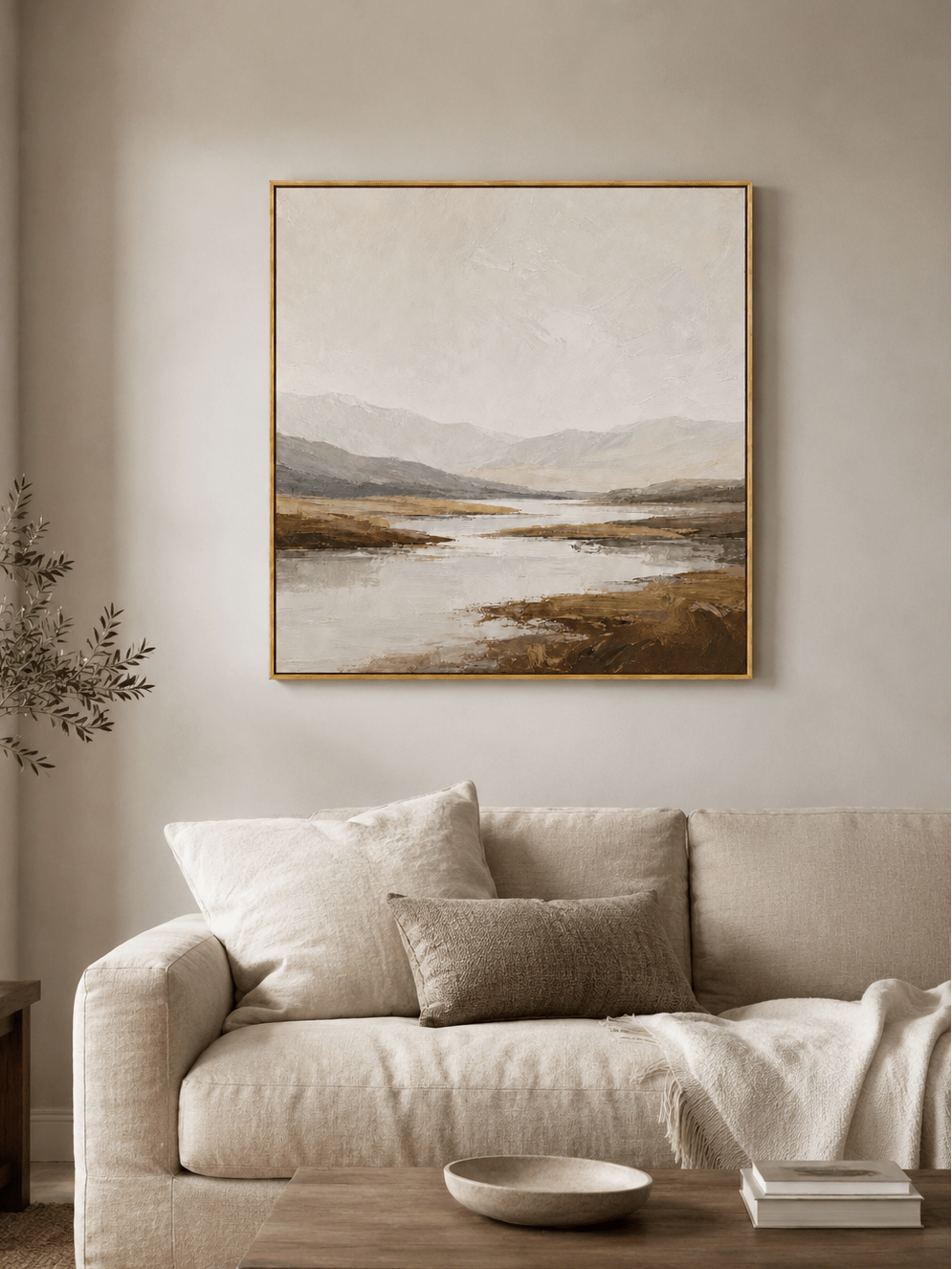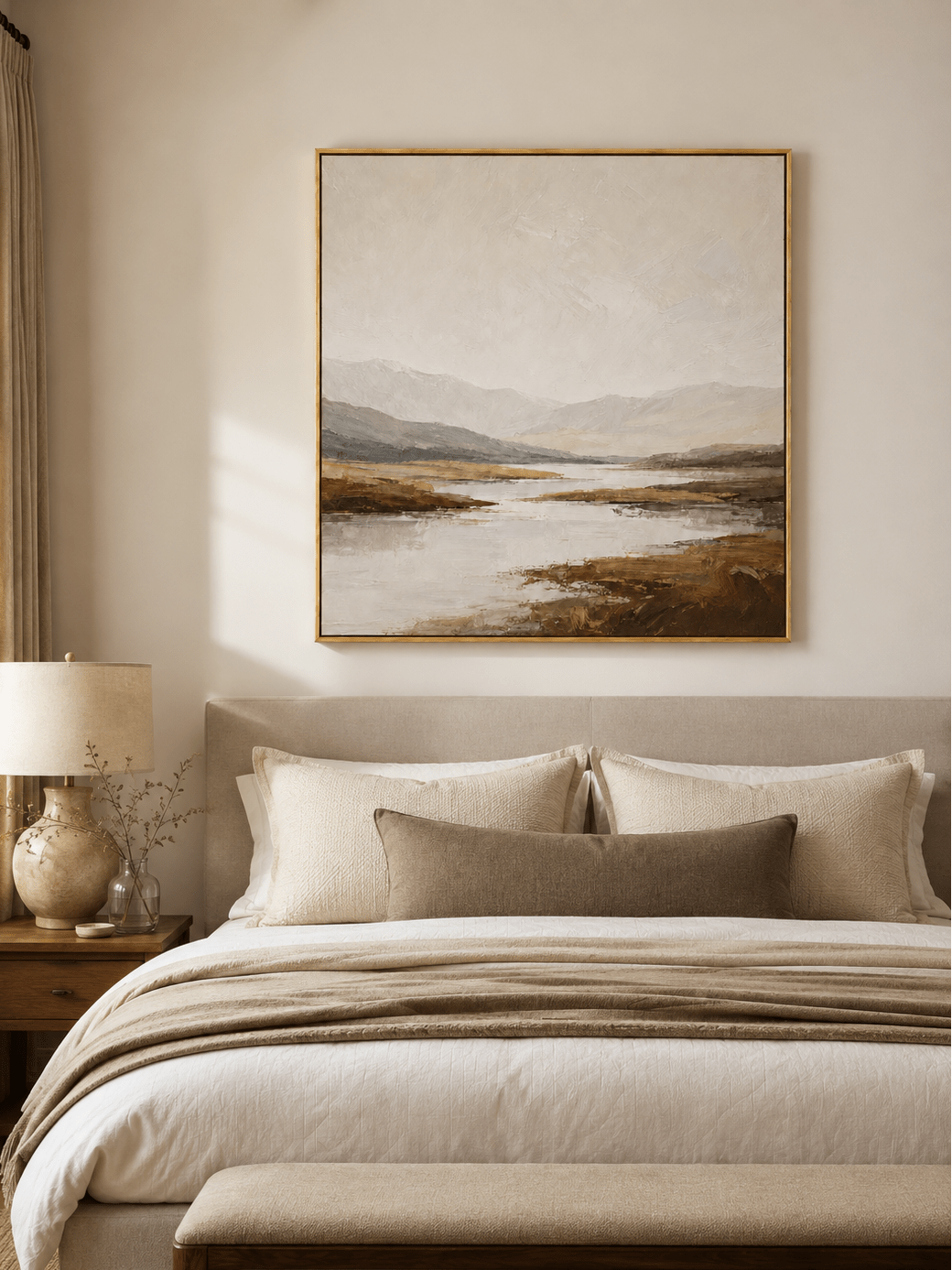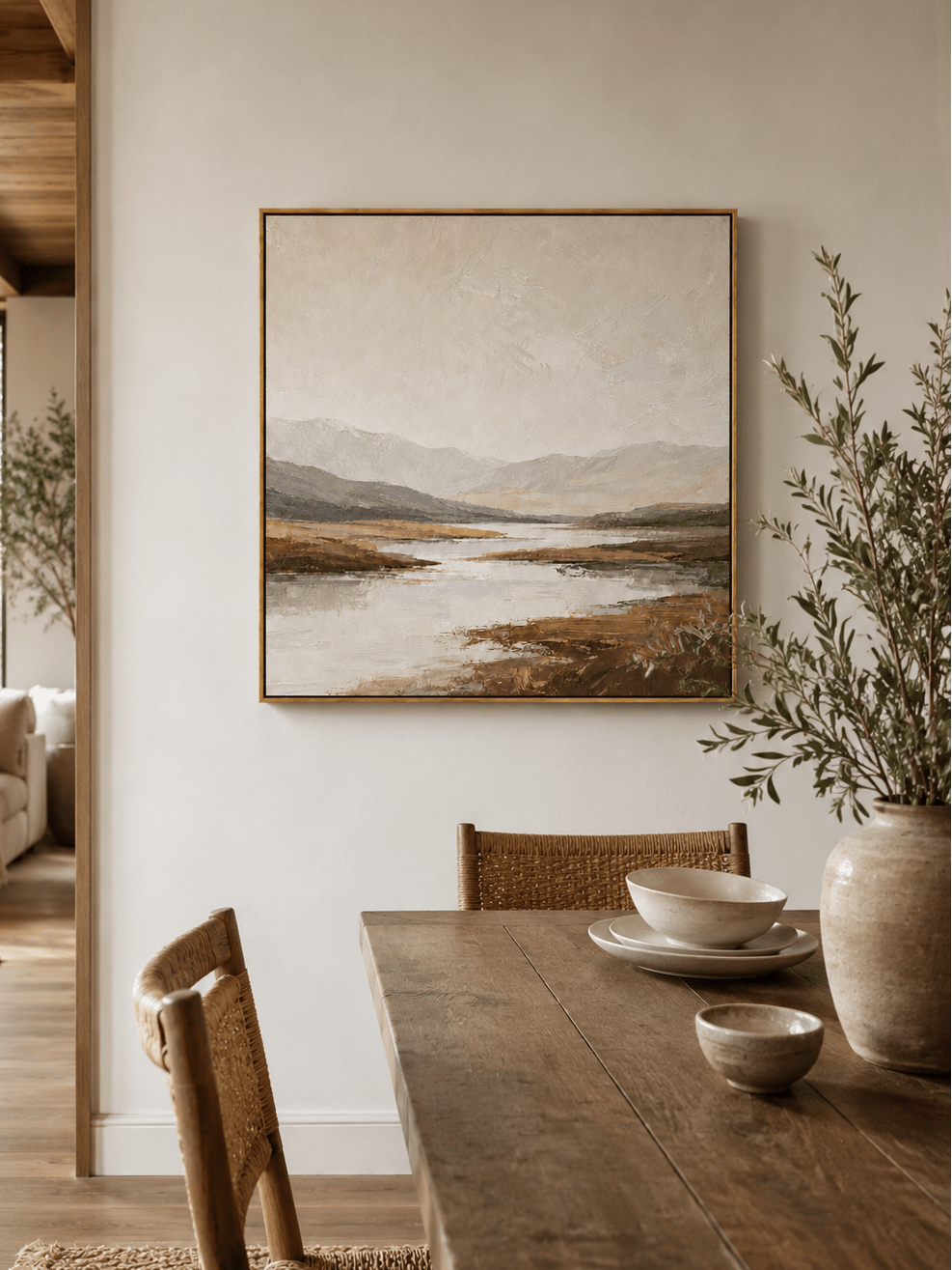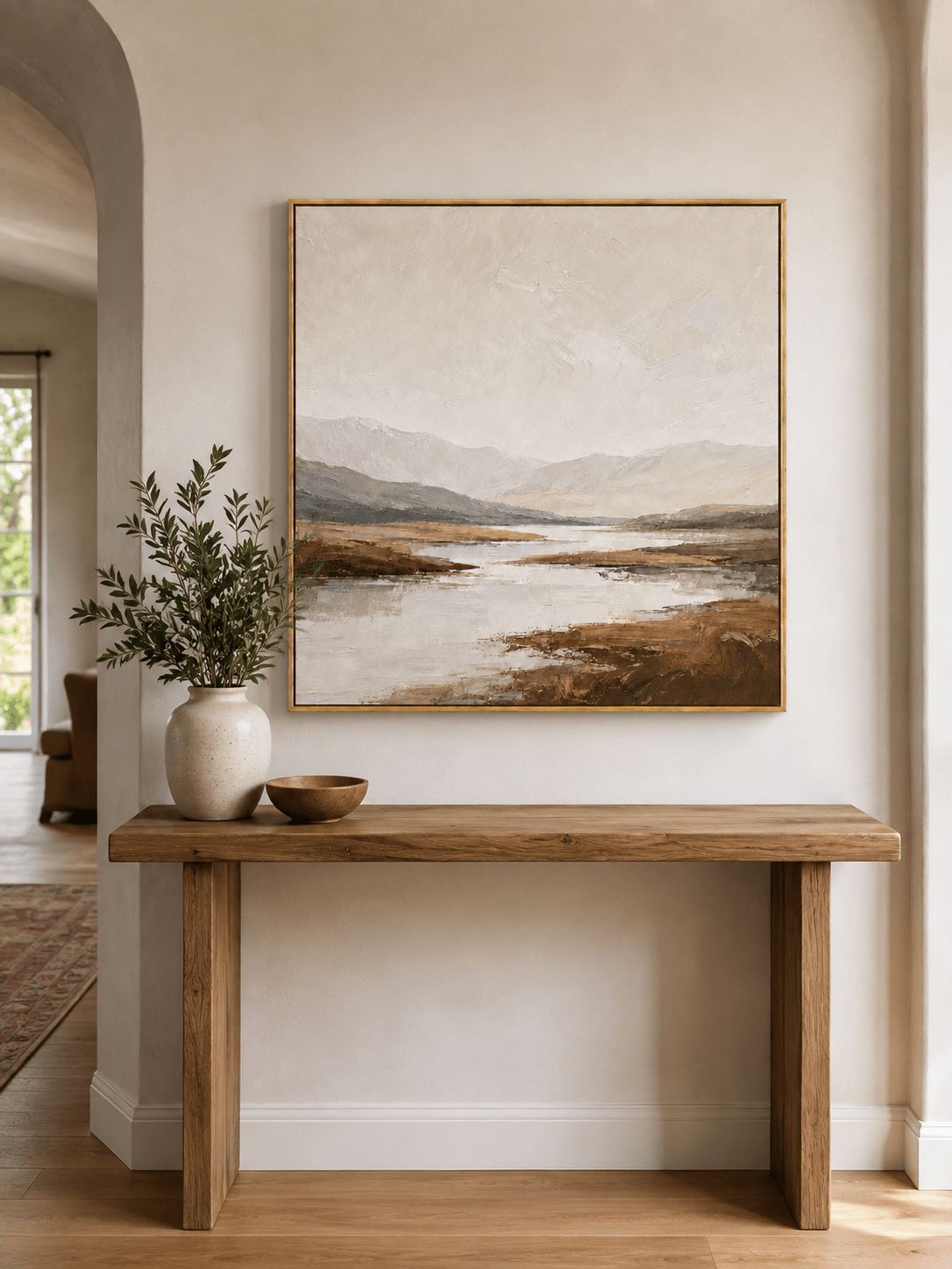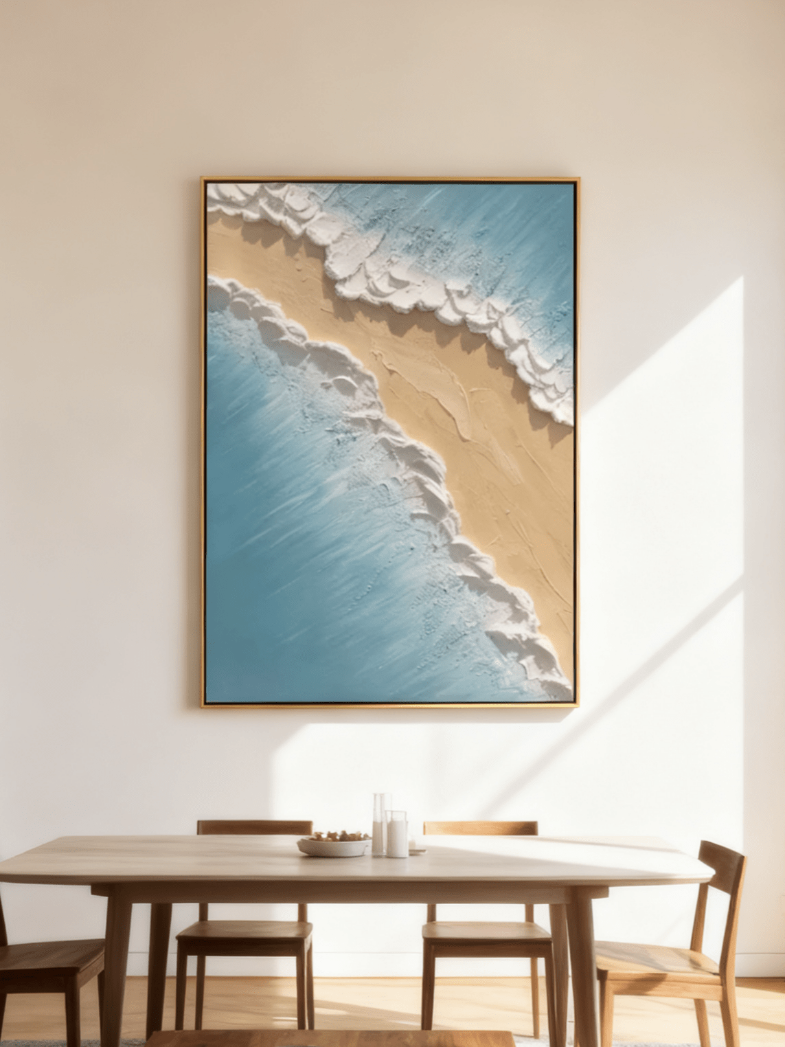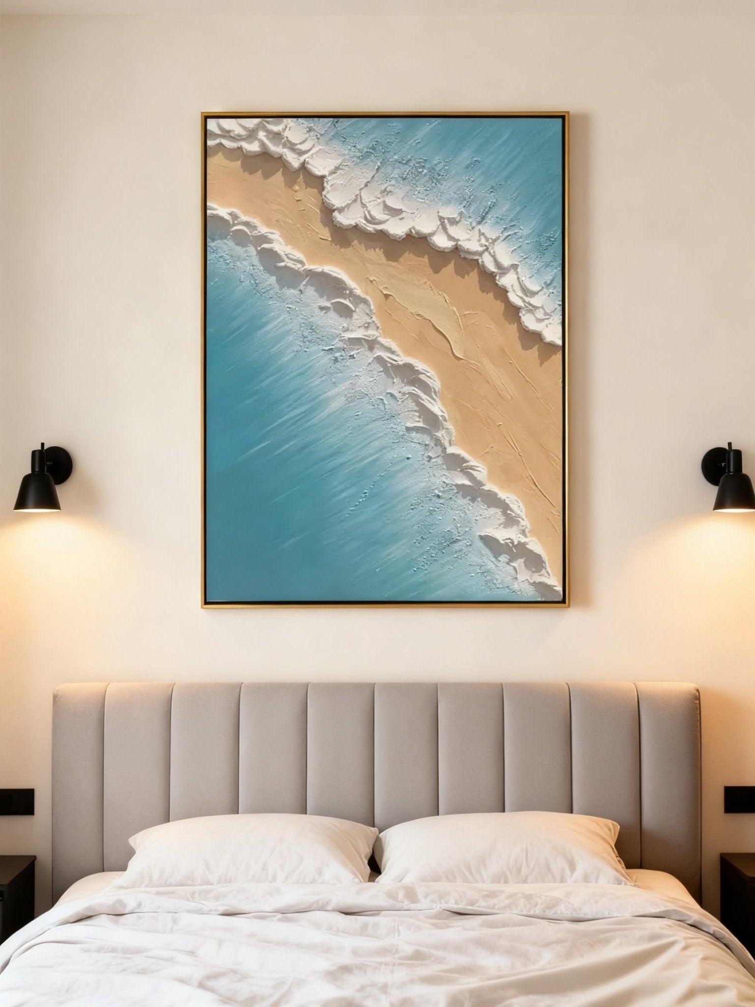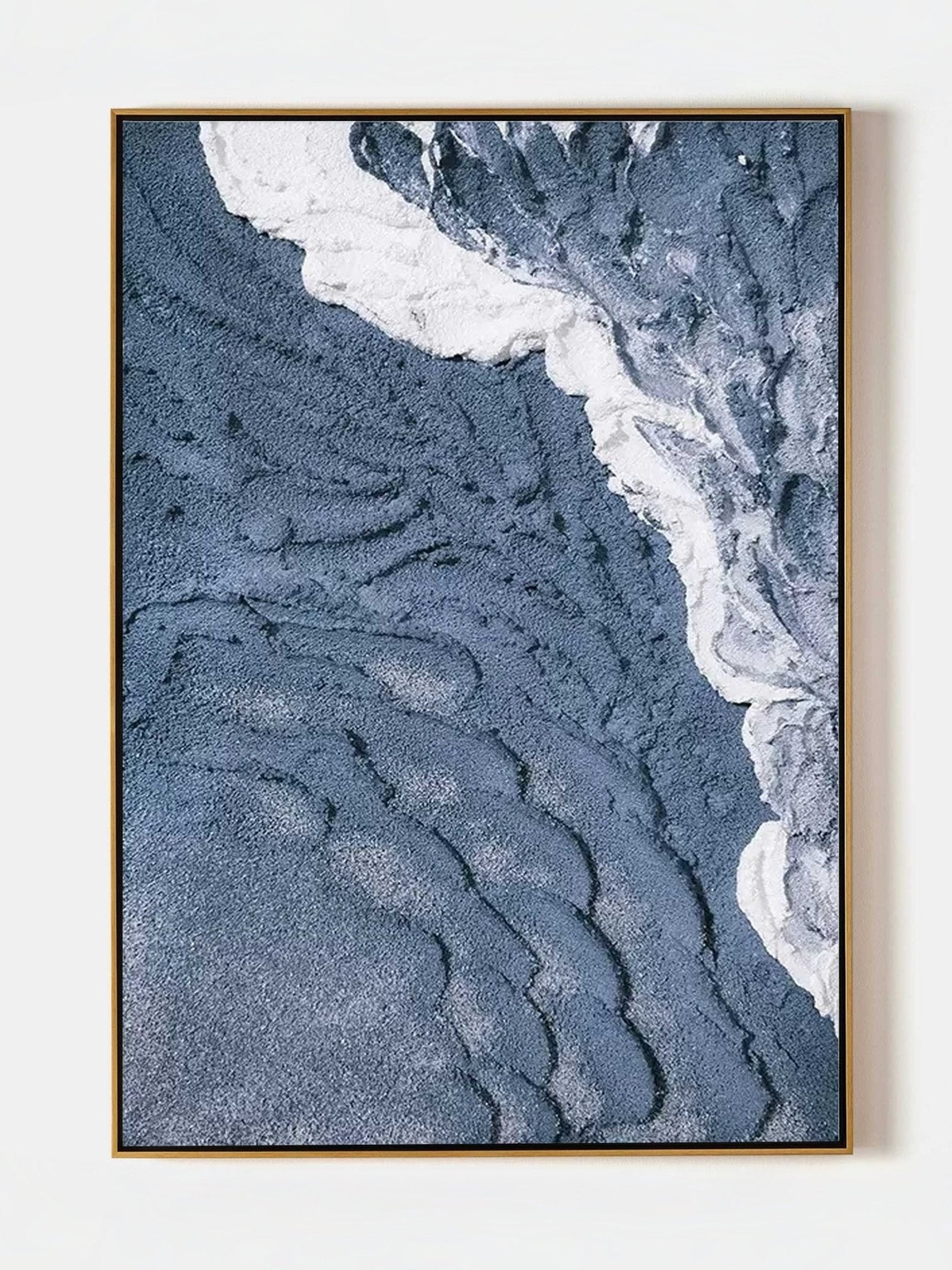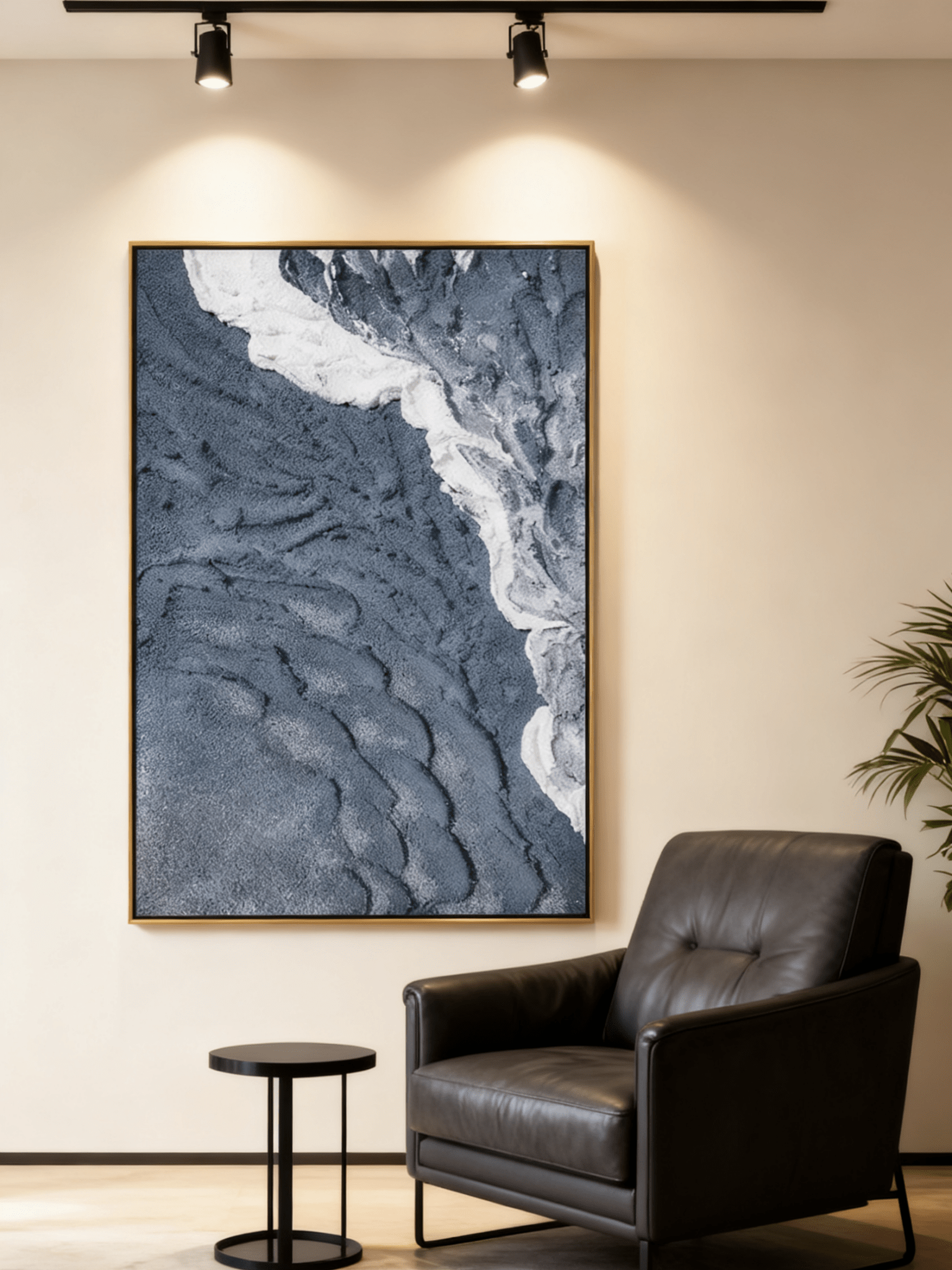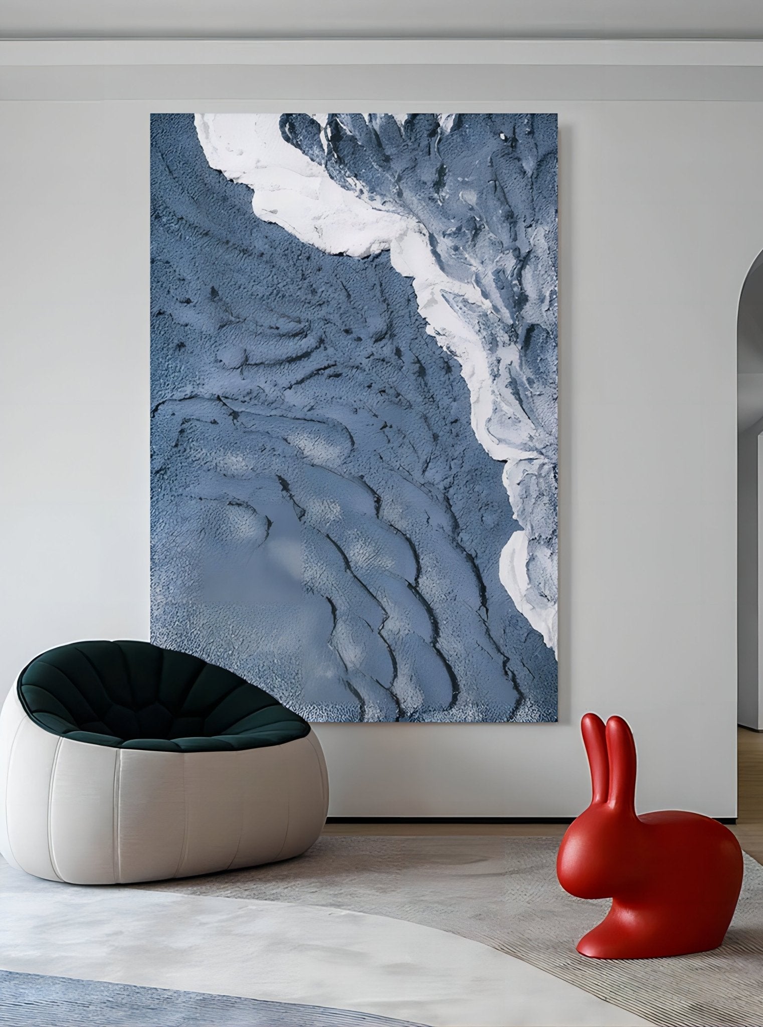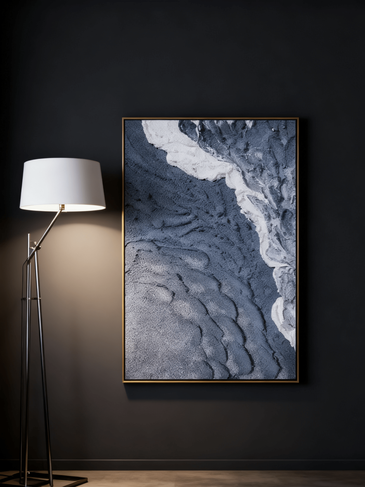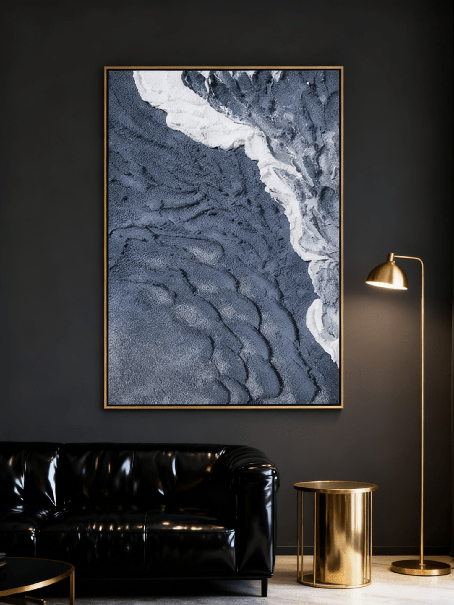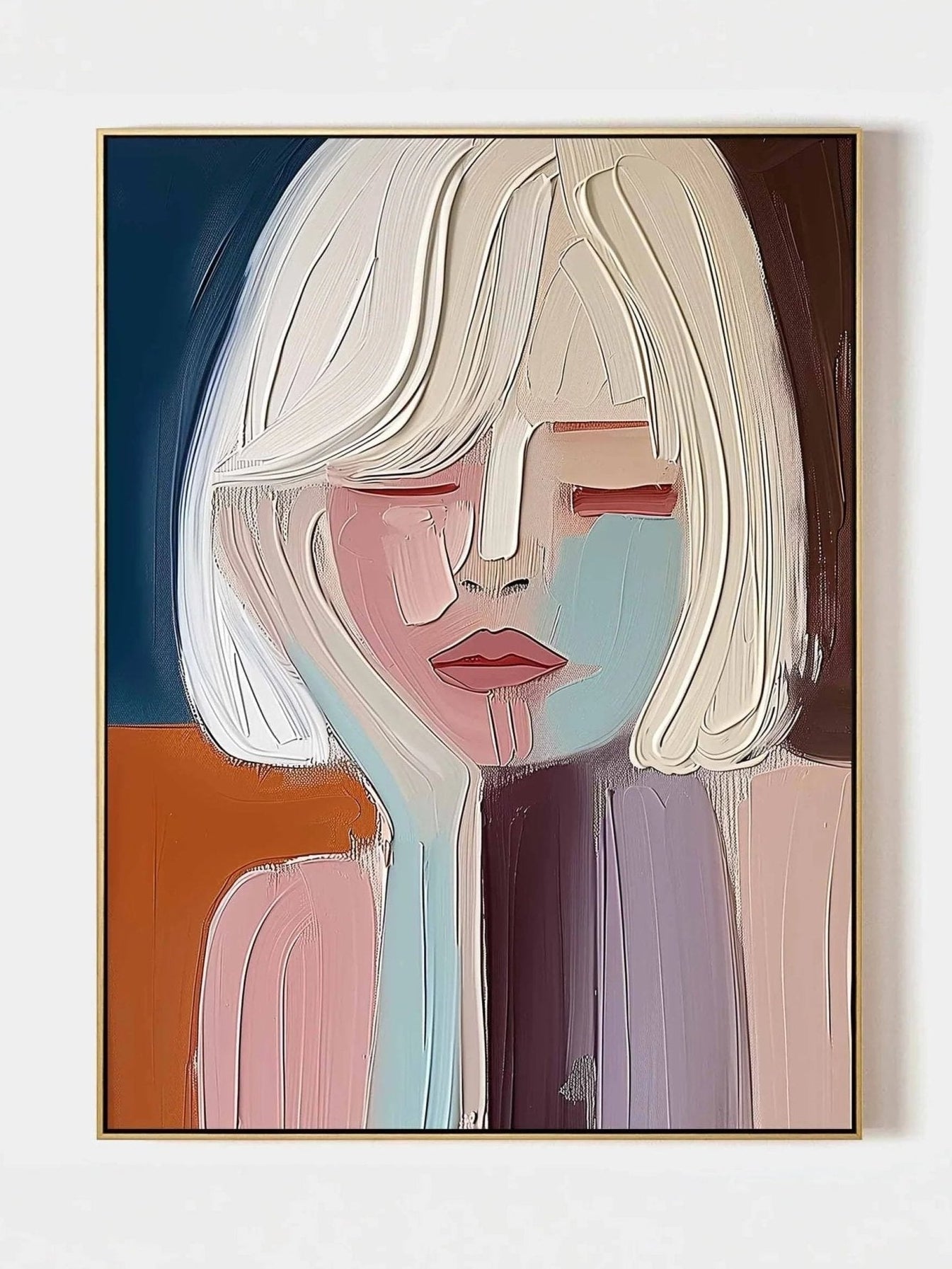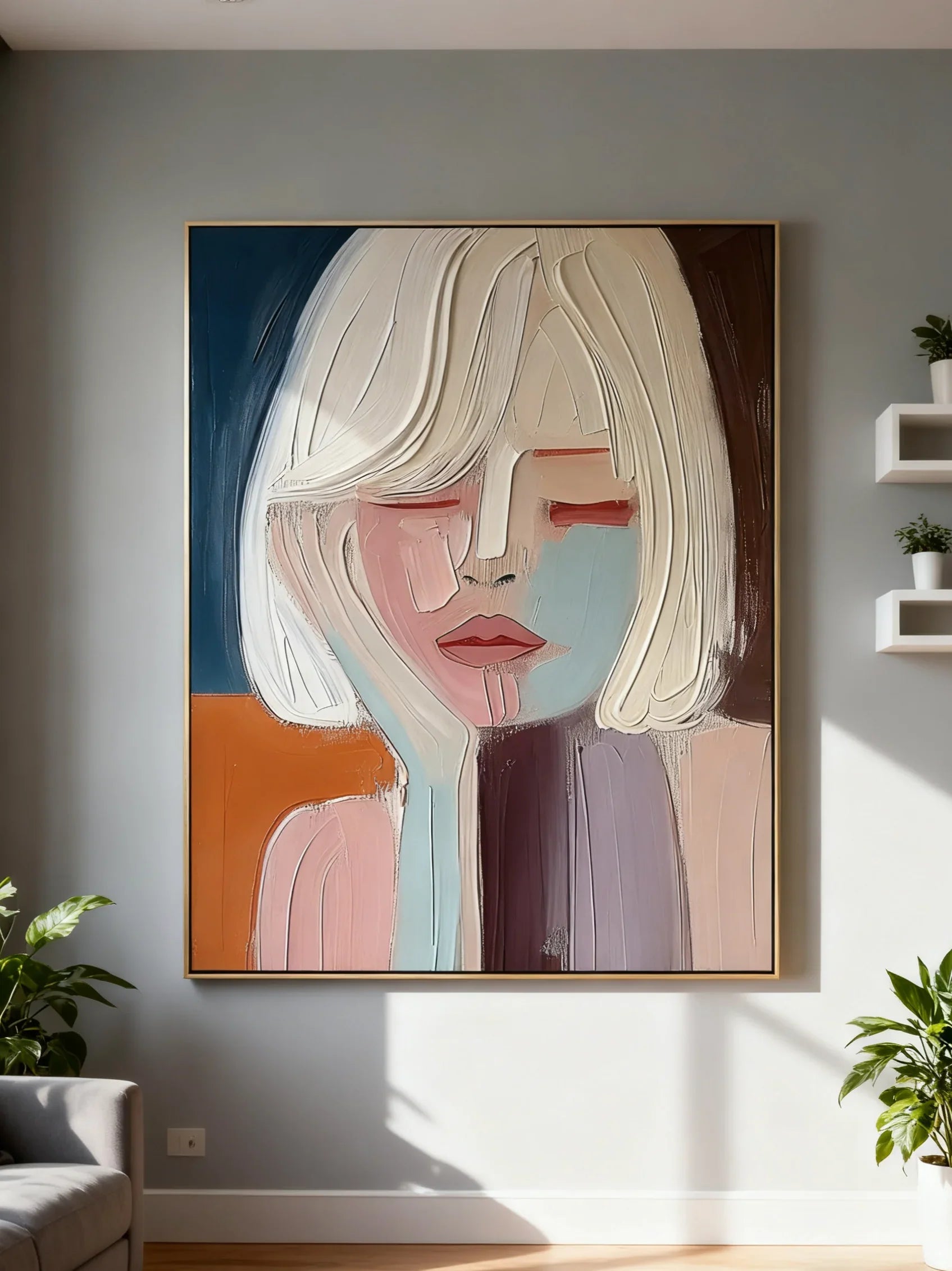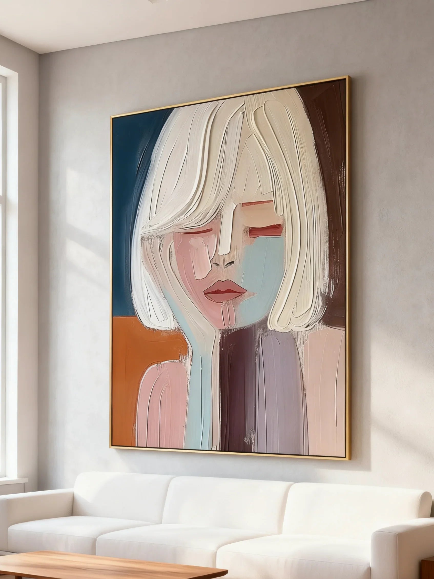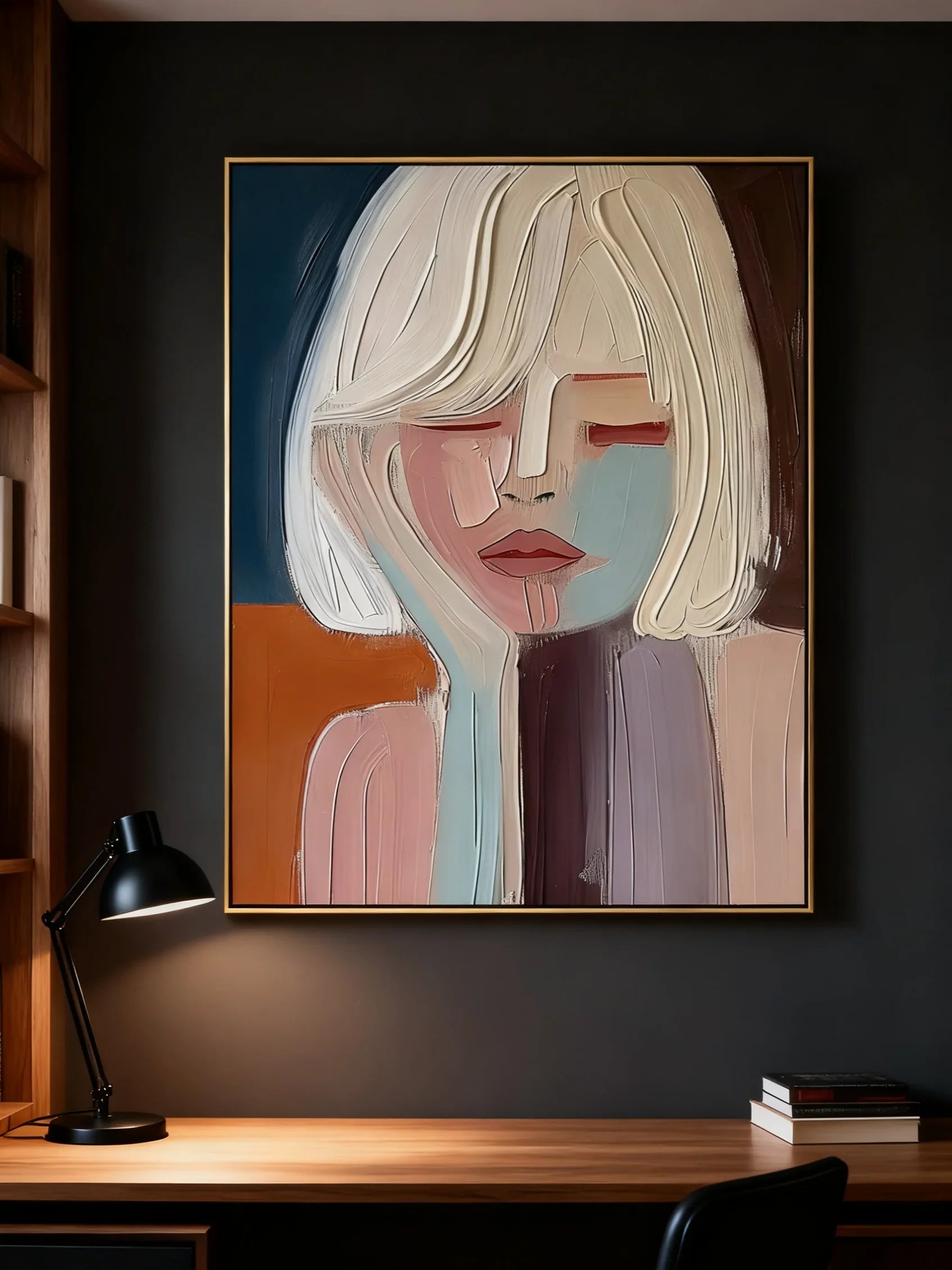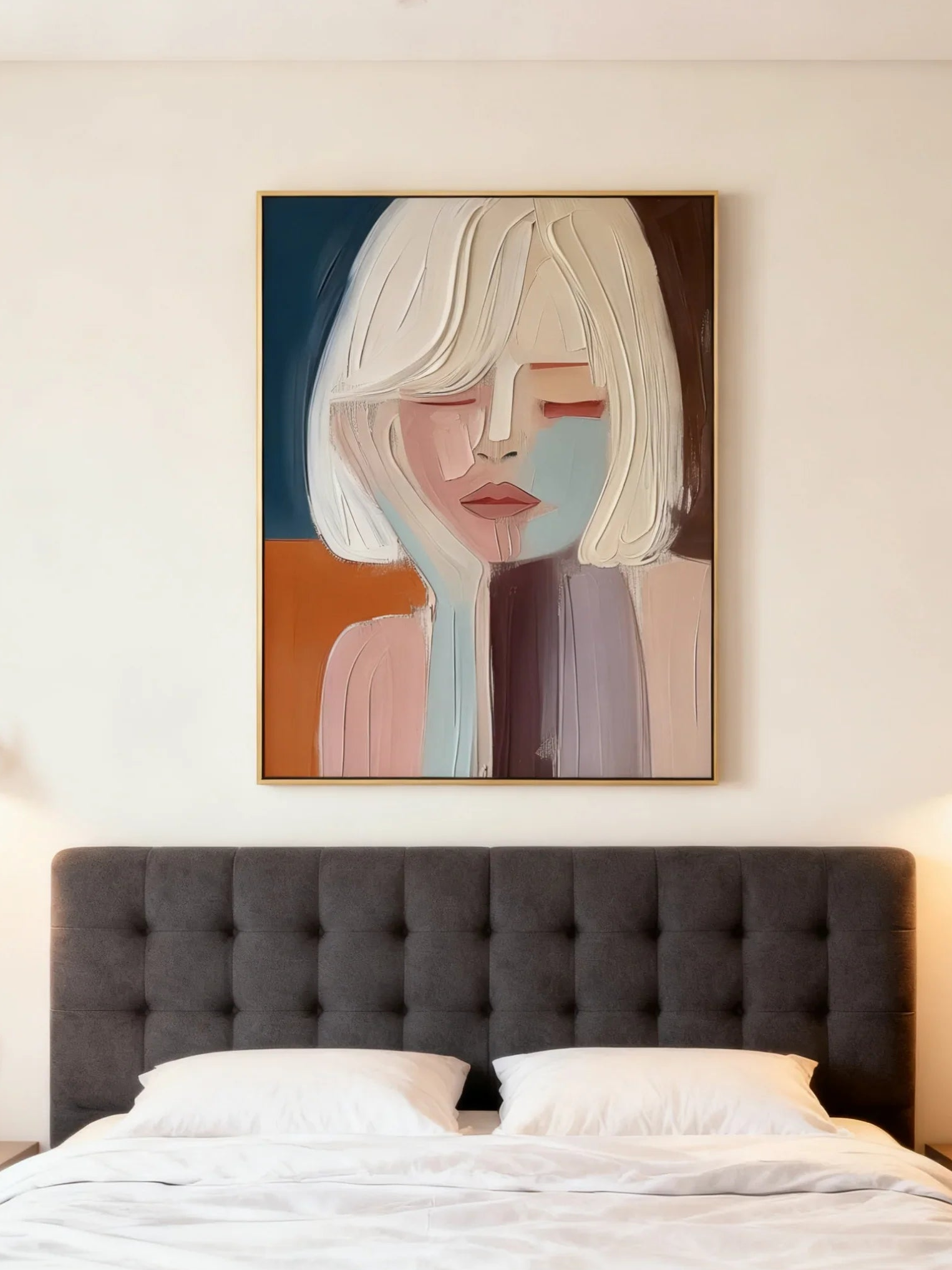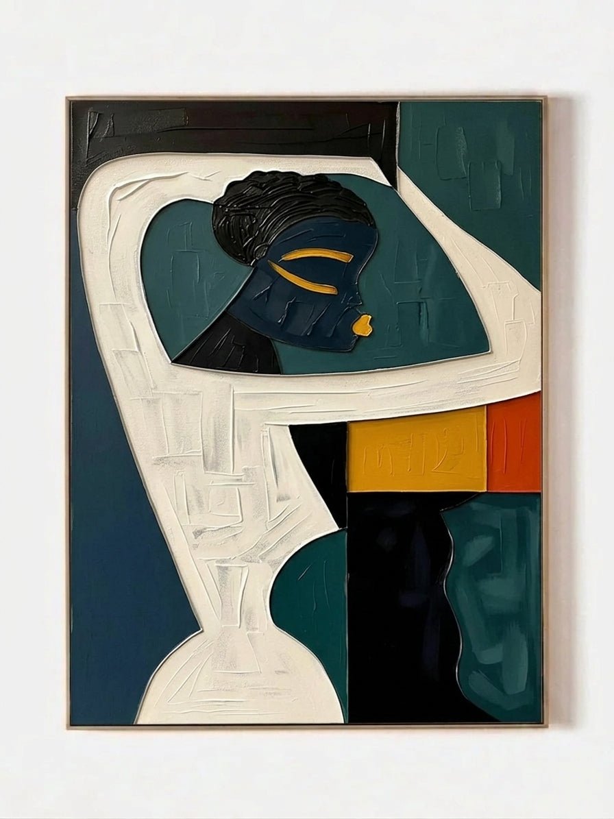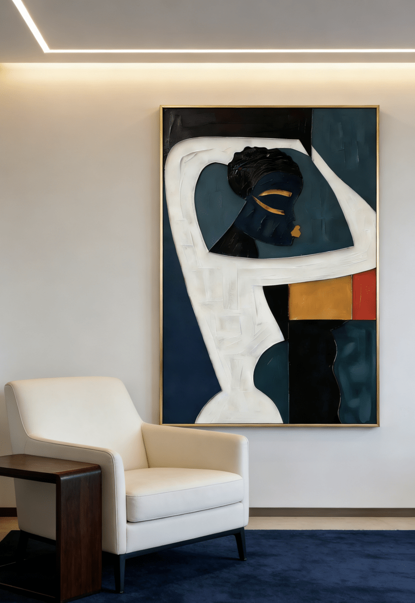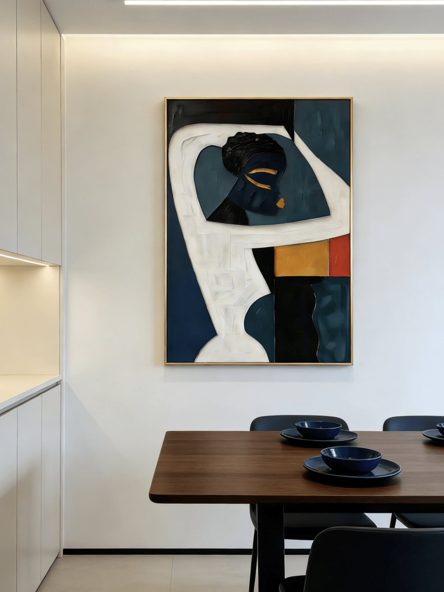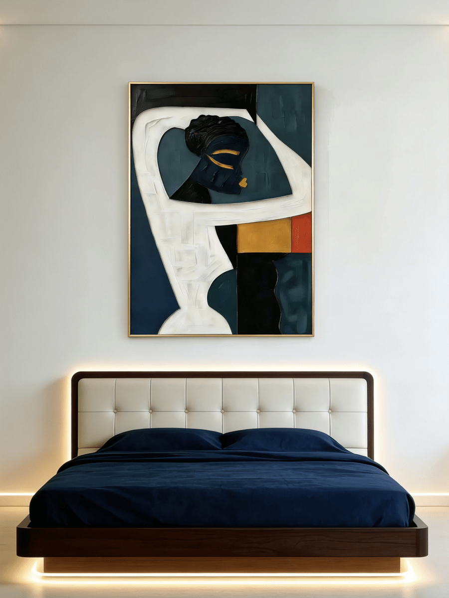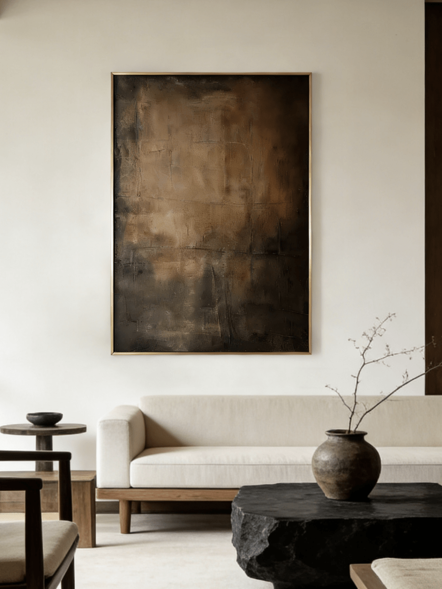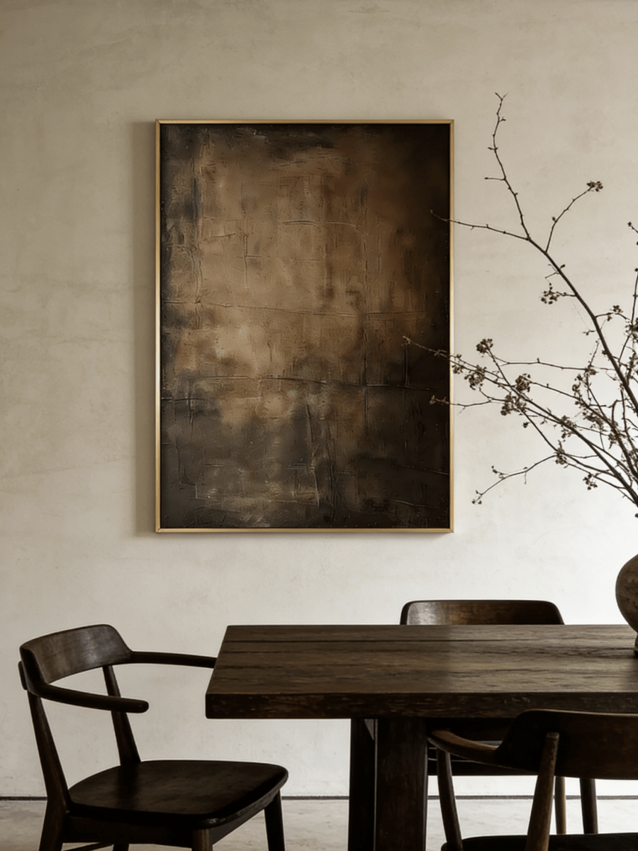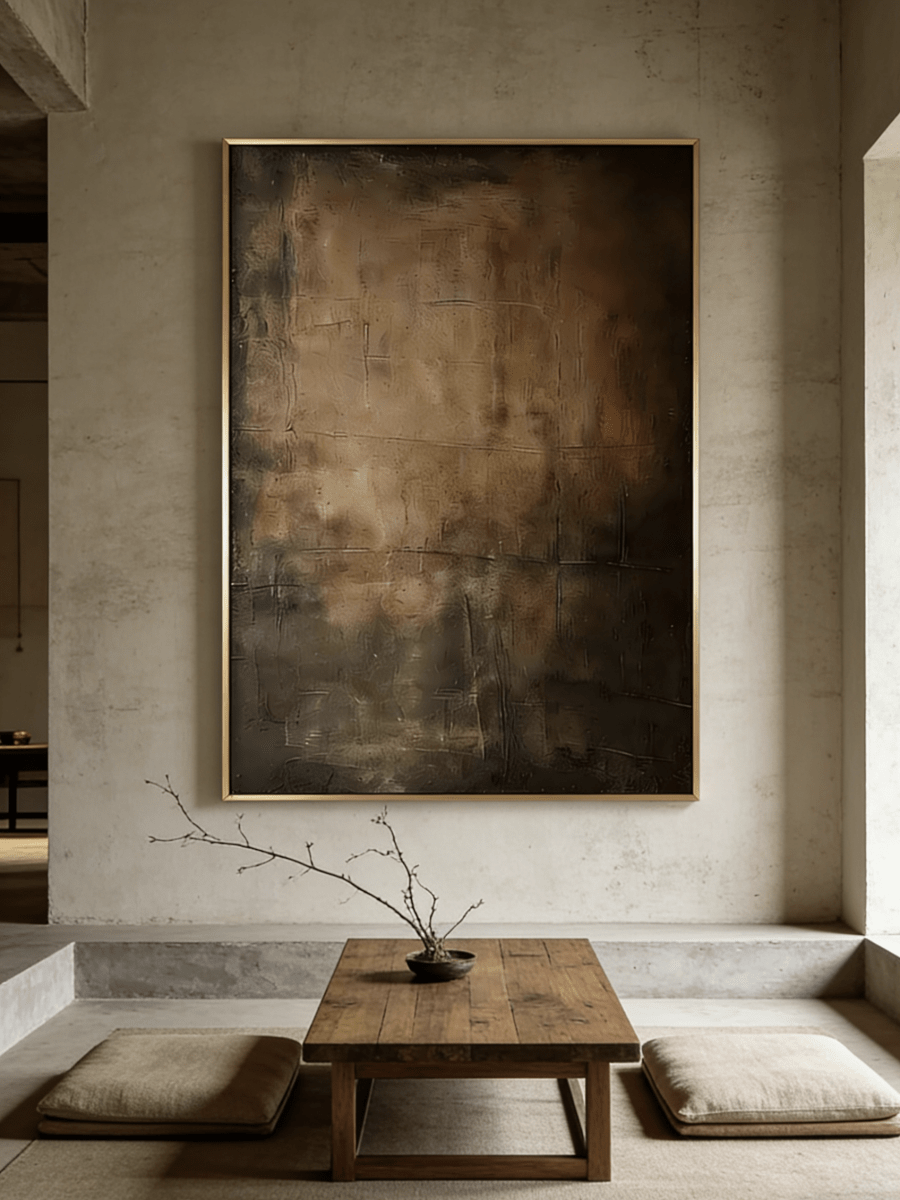

Chocolate brown is warm, architectural, and remarkably versatile—but because a brown sofa already carries so much visual weight, the wall art above it needs to do more than simply “match.” The best painting either brings light, introduces a cooler counterpoint, adds tactile depth, or gives the room a deliberate tonal mood.
Chocolate brown has returned to the center of contemporary interiors for a good reason. It feels richer than beige, softer than black, and more grounded than many trend-driven accent colors. A chocolate sofa can work in an organic-modern living room, a refined minimalist apartment, a moody library-inspired space, or a relaxed home layered with linen, wood, stone, and hand-made objects.
The challenge is that brown is visually dense. Add walnut furniture, warm flooring, a taupe rug, and low evening light, and a beautiful room can quickly become one continuous band of warm mid-to-dark tones. Wall art is one of the easiest ways to correct that balance without replacing anything you already own.
This guide explains which wall-art colors work best with a chocolate brown sofa, how texture changes the result, what size to hang above the couch, which frame finishes feel intentional, and how to choose a WABI Wall Art piece that connects with the room while still creating a focal point.
The quick answer: Ivory and cream make a chocolate sofa feel lighter; sage and olive make it feel natural; misty blue creates temperature contrast; black and charcoal sharpen a modern room; terracotta and bronze build a warmer, moodier palette. Choose texture according to the sofa material, then size the artwork to the sofa—not to the entire wall.

1. First, Read the Brown Sofa You Actually Have
“Chocolate brown” covers a surprisingly wide range. Before choosing artwork, look at the sofa in daylight and decide whether it leans warm, neutral, or cool. The undertone changes which colors feel calm and which ones feel disconnected.
Warm cocoa and chestnut brown
These browns contain noticeable red, caramel, or orange warmth. They pair easily with ivory, cream, olive, sage, dusty blue, charcoal, and muted terracotta. If the room already contains honey oak or warm brass, a painting with generous pale space can prevent the scheme from becoming overly amber.
True chocolate and neutral brown
A balanced chocolate brown is one of the most flexible upholstery colors. It can support cool blue, green, black-and-ivory abstract art, warm neutral texture, and atmospheric landscapes. Because the sofa itself is dark enough to anchor the room, the artwork does not need to be equally dark to feel substantial.
Espresso and cool dark brown
Espresso often contains gray, violet, or nearly black undertones. Light artwork becomes especially useful here. Think warm ivory, foggy blue-gray, pale mineral green, stone, or a high-contrast cream-and-black composition. A very dark painting above an espresso sofa can work in a deliberately moody room, but it needs lighter passages or strong wall contrast so the composition remains readable.
Fabric changes the equation, too
A matte linen or woven chocolate sofa absorbs light and usually welcomes stronger surface texture in the artwork. Smooth leather reflects more light, so heavy relief can create an attractive material contrast. Velvet already has visual depth and directional sheen; above it, restrained texture or an atmospheric landscape often feels more balanced than an aggressively sculptural canvas.
2. The Best Wall Art Colors for a Chocolate Brown Sofa
The easiest way to choose color is to decide what the room is missing. Does it need lightness, freshness, structure, warmth, or drama? The painting should solve that problem rather than repeat the sofa color by default.
Ivory, cream, and warm white: the safest way to add light
If your chocolate sofa sits against a warm white, greige, or taupe wall, light neutral art can open the seating area without making the room feel stark. The key is variation: ivory, chalk, sand, mushroom, and soft gray should appear in layers rather than as one flat beige field. Visible brushwork or raised texture keeps a pale painting from looking passive beside dark upholstery.
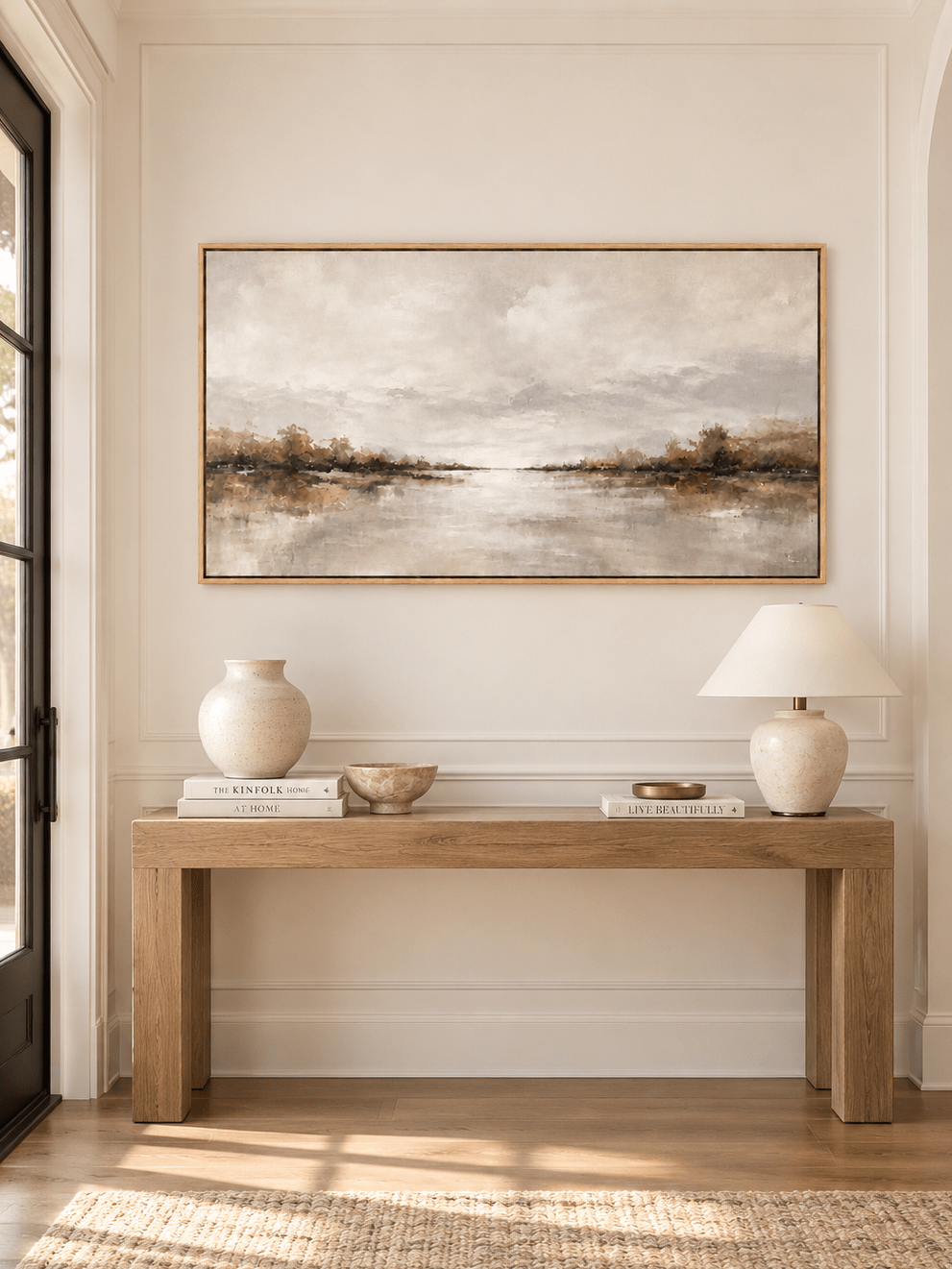
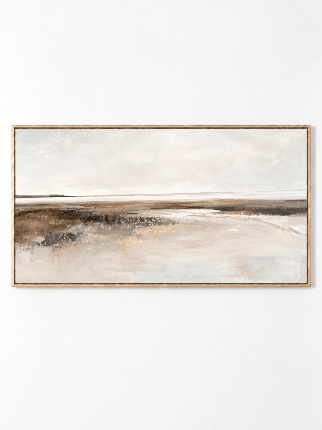
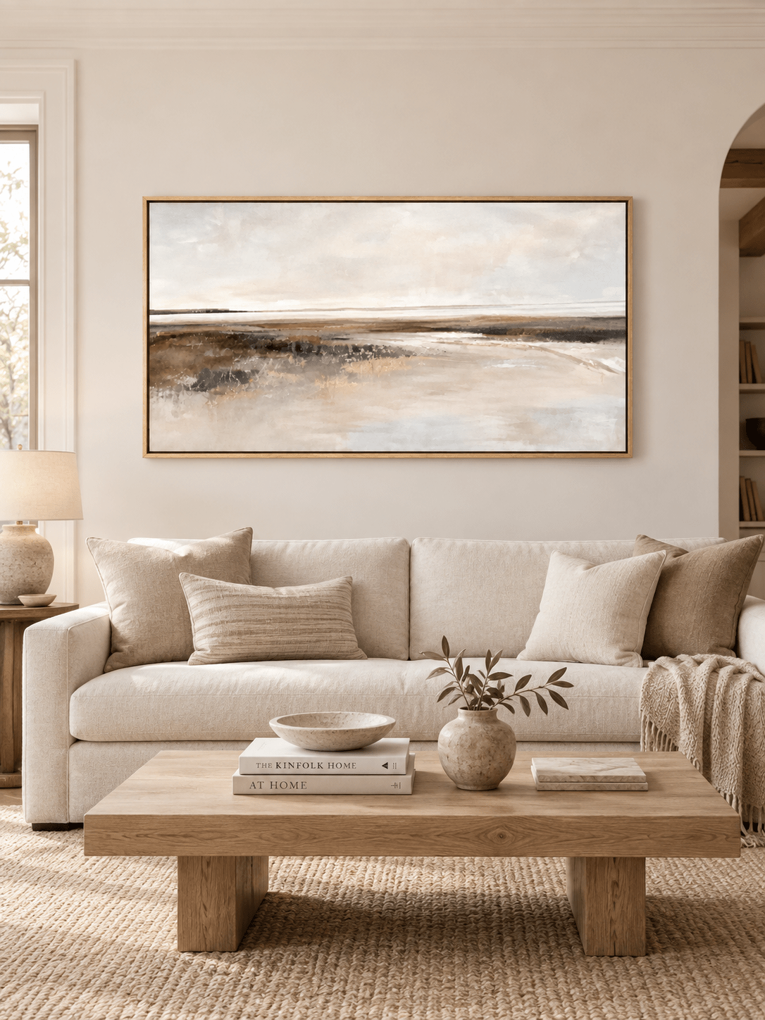
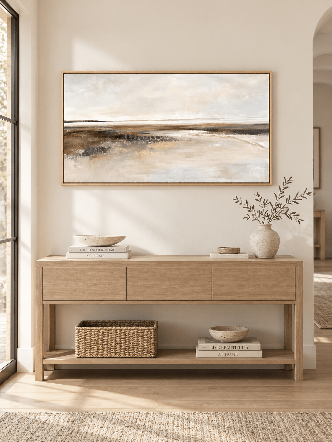
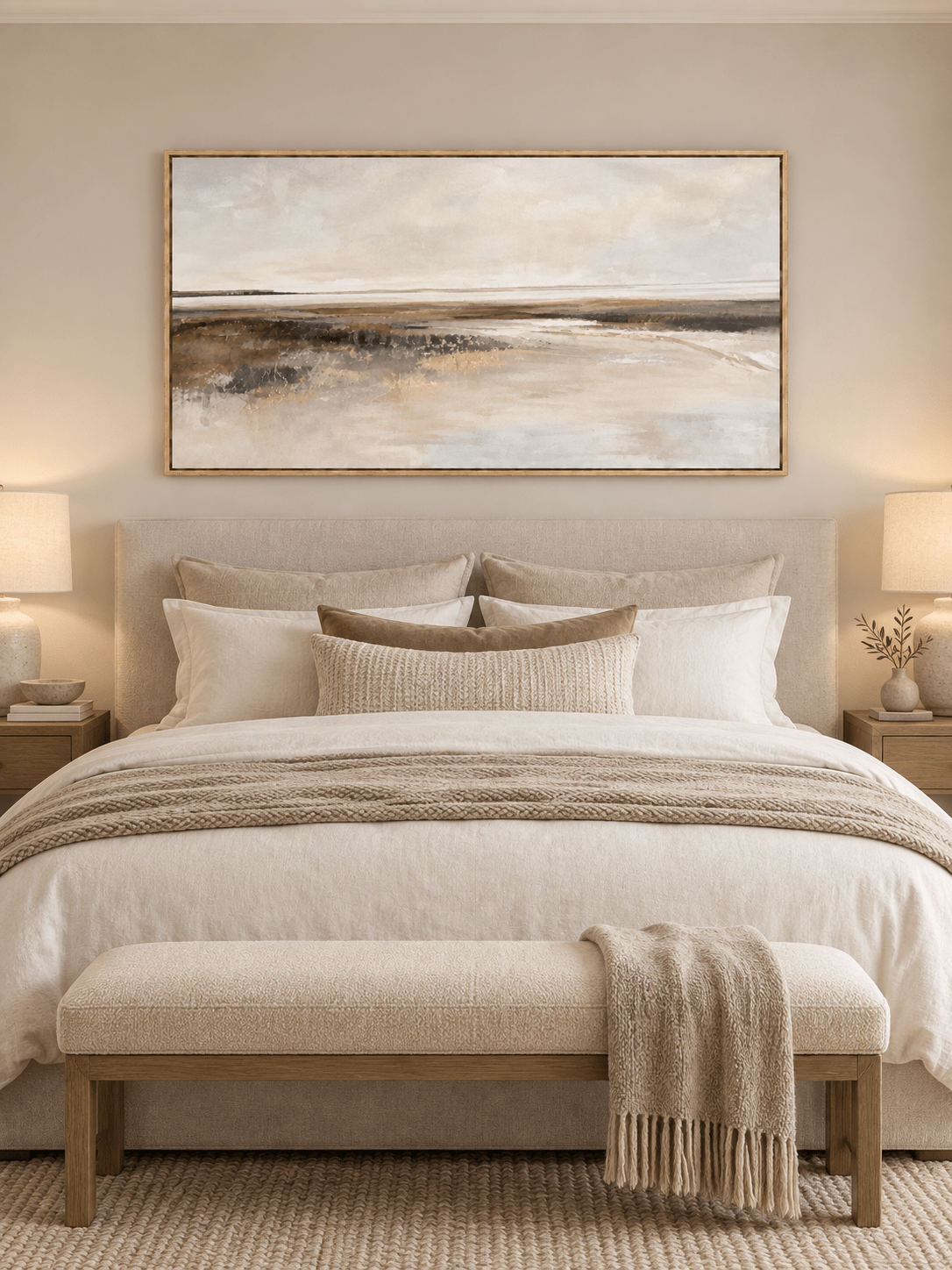
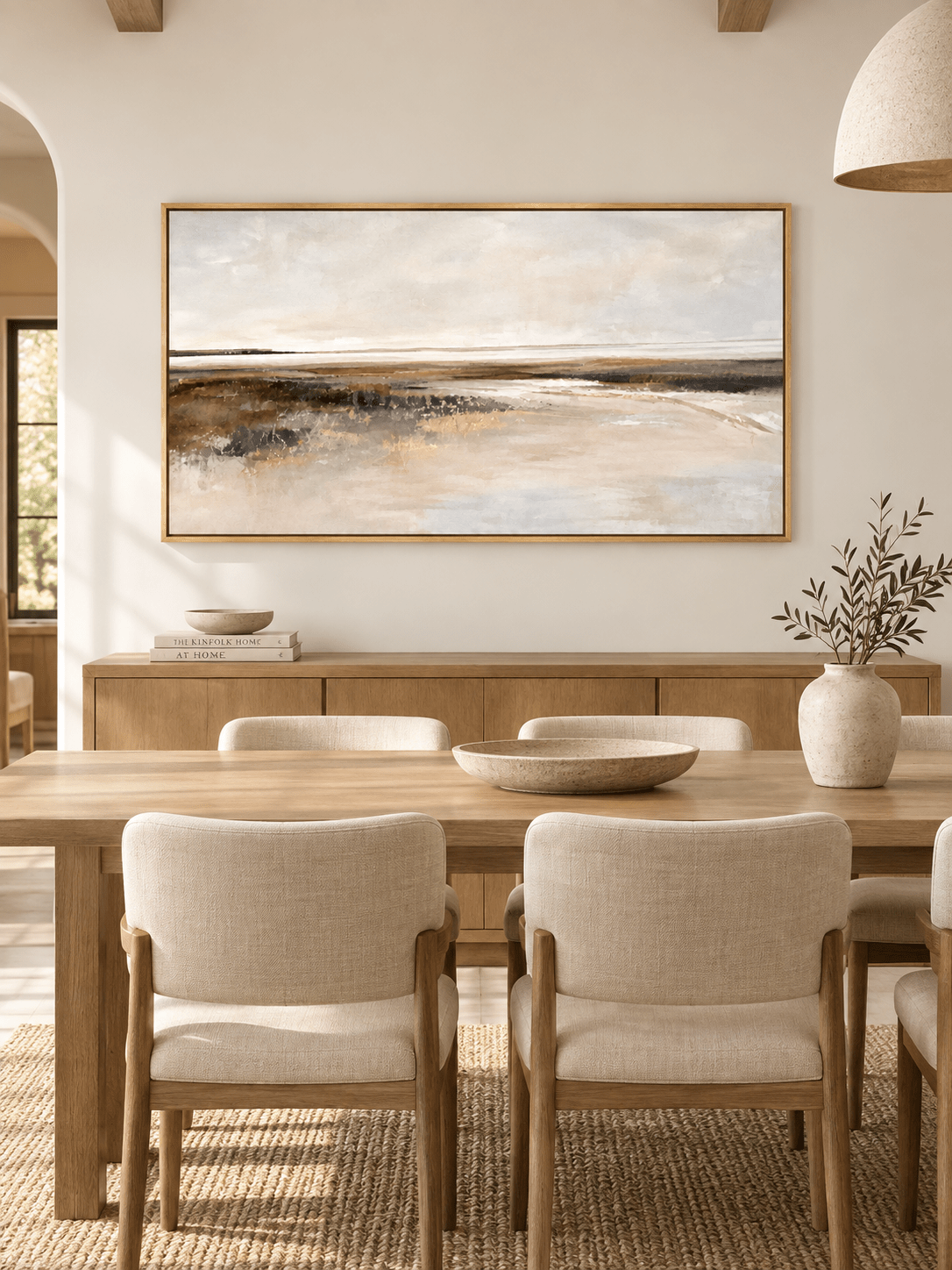
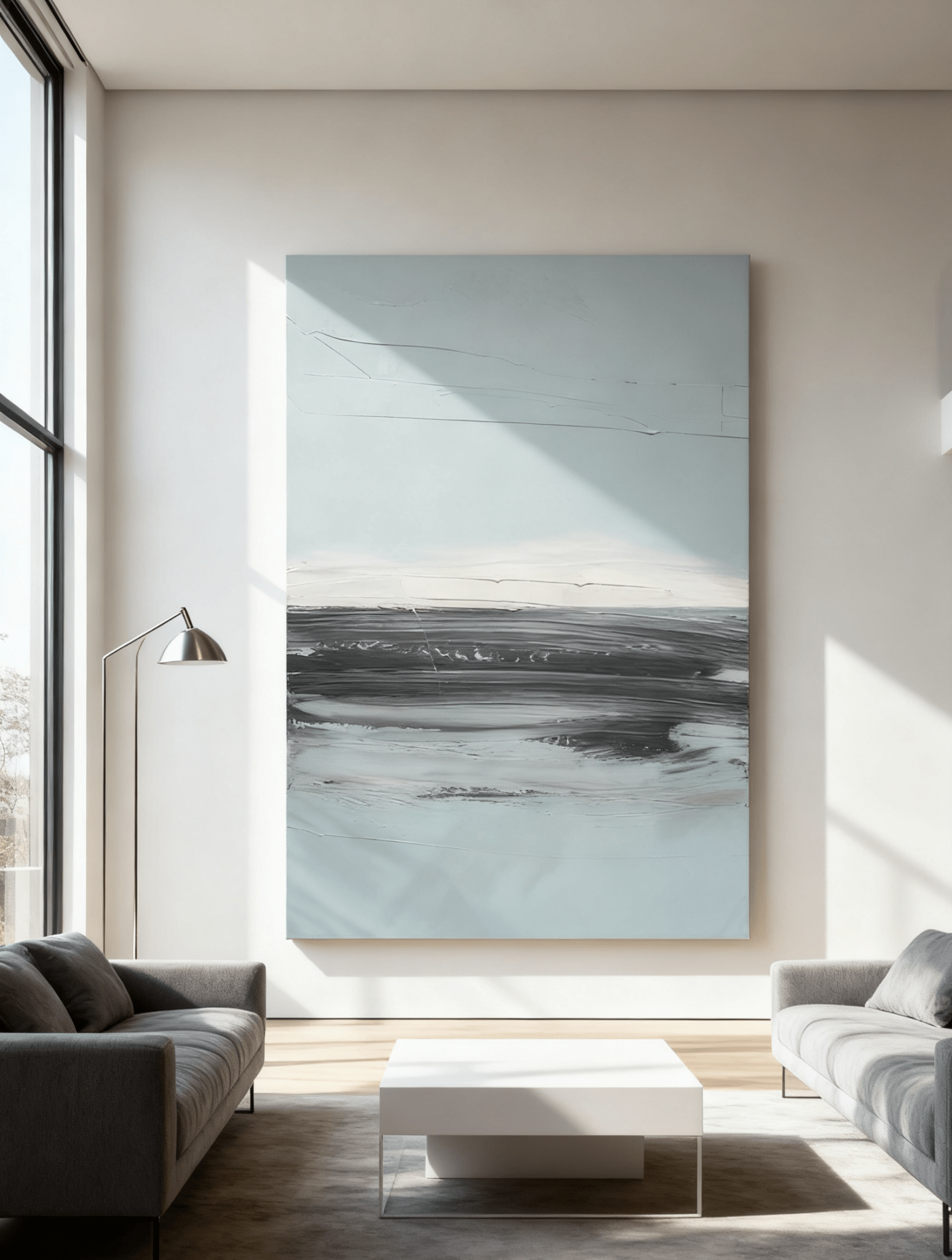
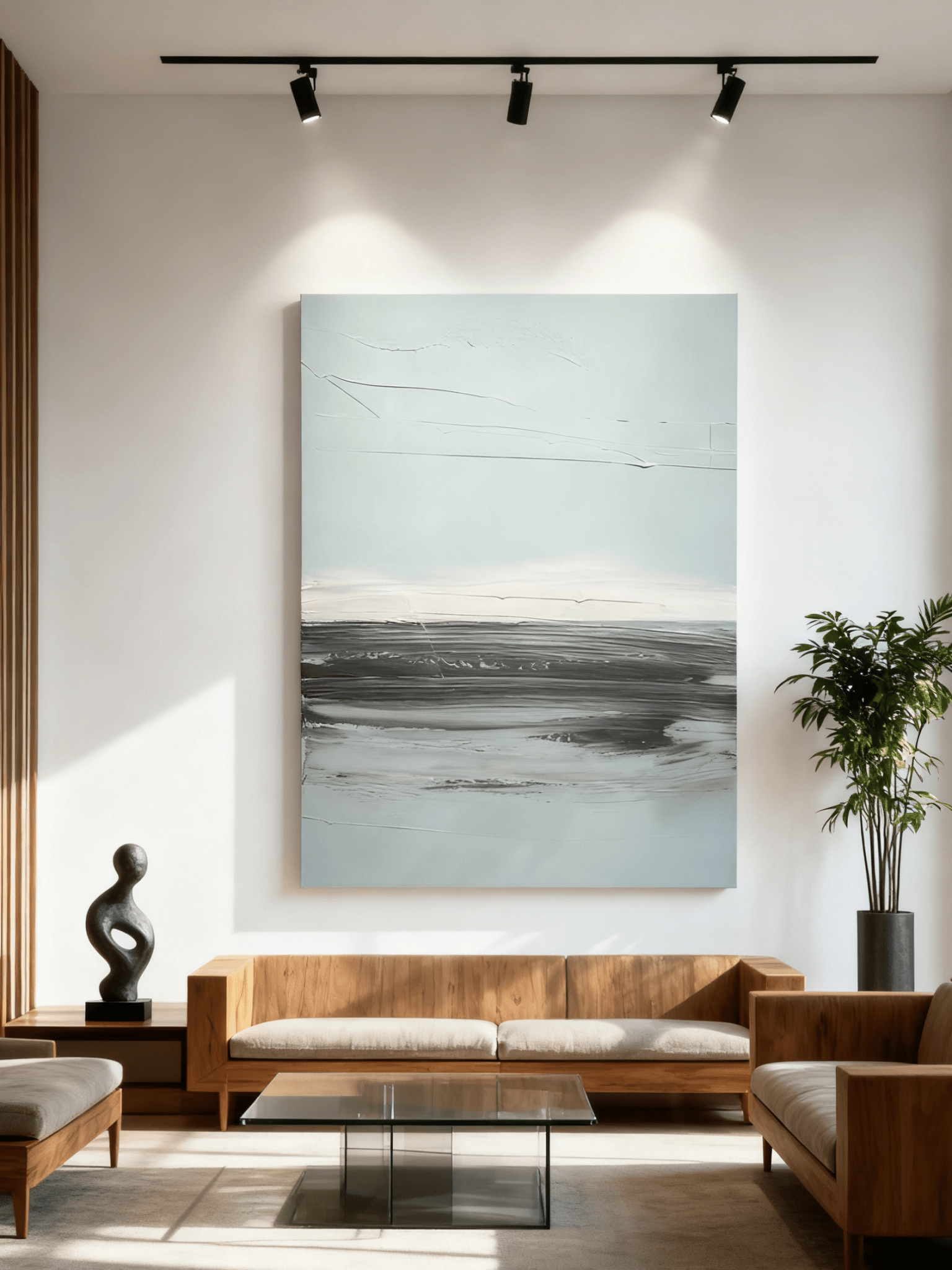
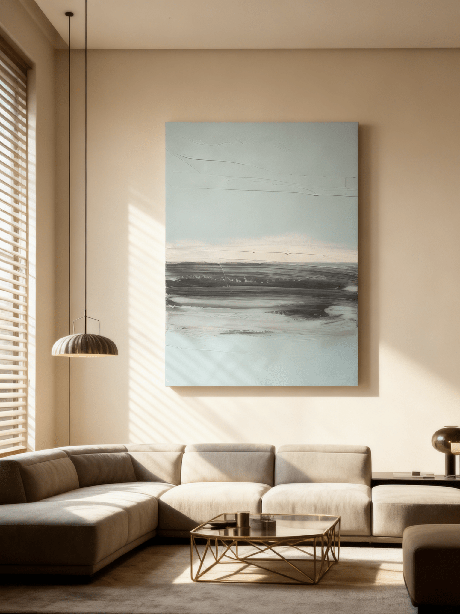
For a wide sofa, a horizontal piece such as WABI Wall Art’s Quiet Ivory Horizon works especially well because the pale upper field creates visual breathing room while the darker horizon still connects with brown furniture and warm flooring. For a light-value focal point, compare Quiet Ivory Horizon – EL#0307.
Sage, olive, and moss green: natural contrast without a hard color break
Green is one of the most convincing companions to chocolate brown because the combination already exists throughout nature—soil and leaves, bark and moss, stone and vegetation. Muted sage or olive brings life into a brown room without making the palette feel colorful in a loud way.
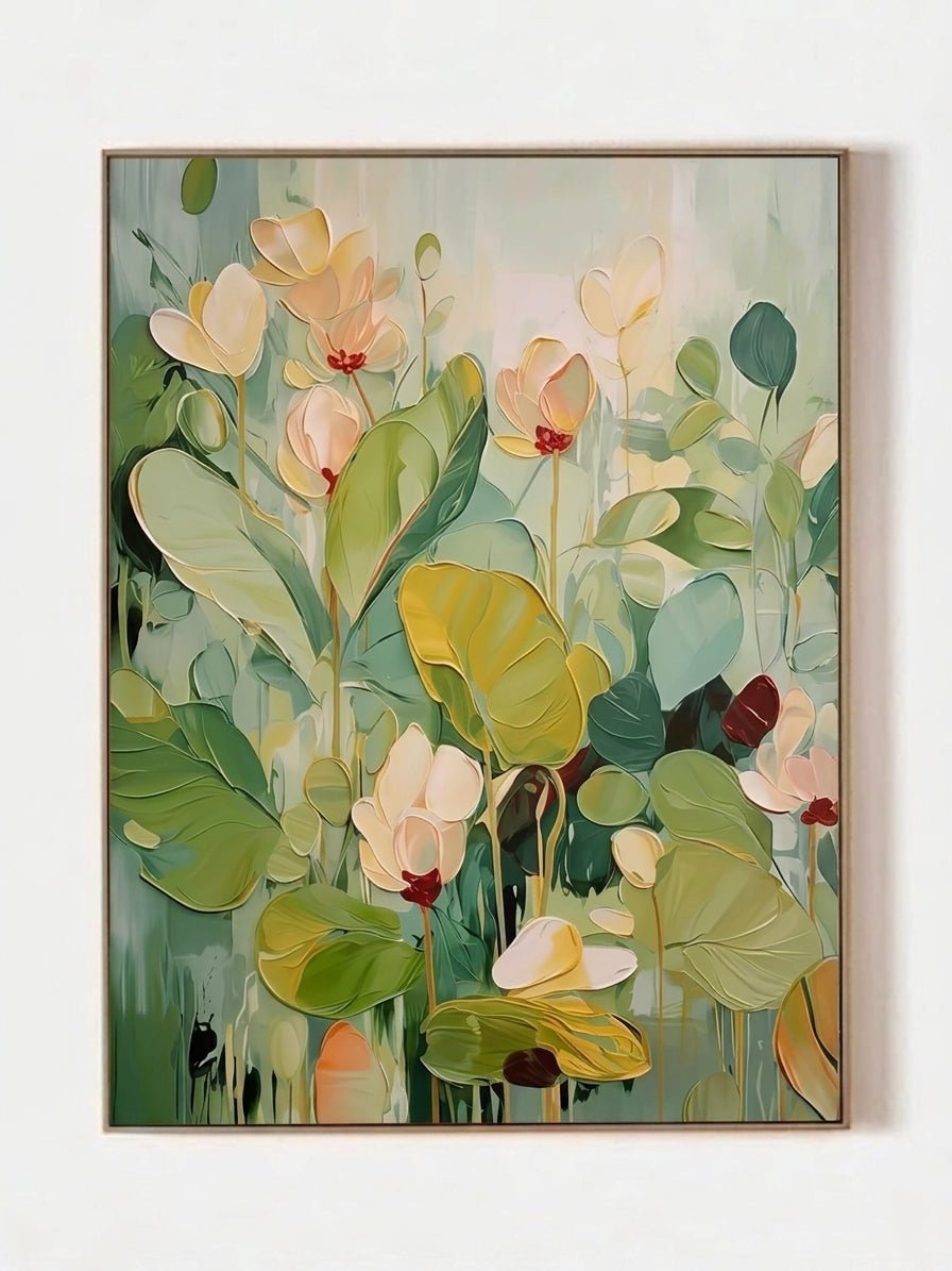
This pairing is particularly effective in organic modern, Japandi, and Wabi-Sabi-inspired rooms with oak, walnut, travertine, linen, ceramics, or blackened metal. Choose a green painting that still contains ivory, greige, or soft brown so the connection to the sofa feels intentional rather than decorative. This is also a natural place to browse Sage & Olive Green Wall Art.

Misty blue and blue-gray: the best temperature counterpoint
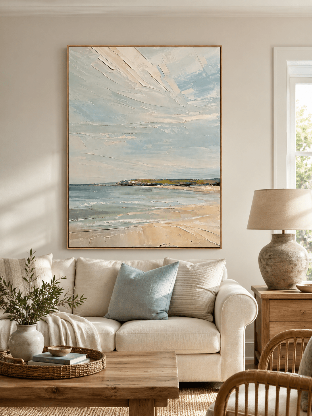
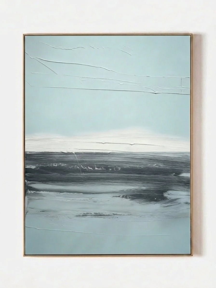
Brown is warm; blue is cool. That basic temperature contrast is why a restrained blue painting can make a chocolate sofa look richer rather than heavier. Pale blue, slate, mineral blue, and misty blue-gray work especially well when the room has warm lighting, walnut furniture, or cream walls.
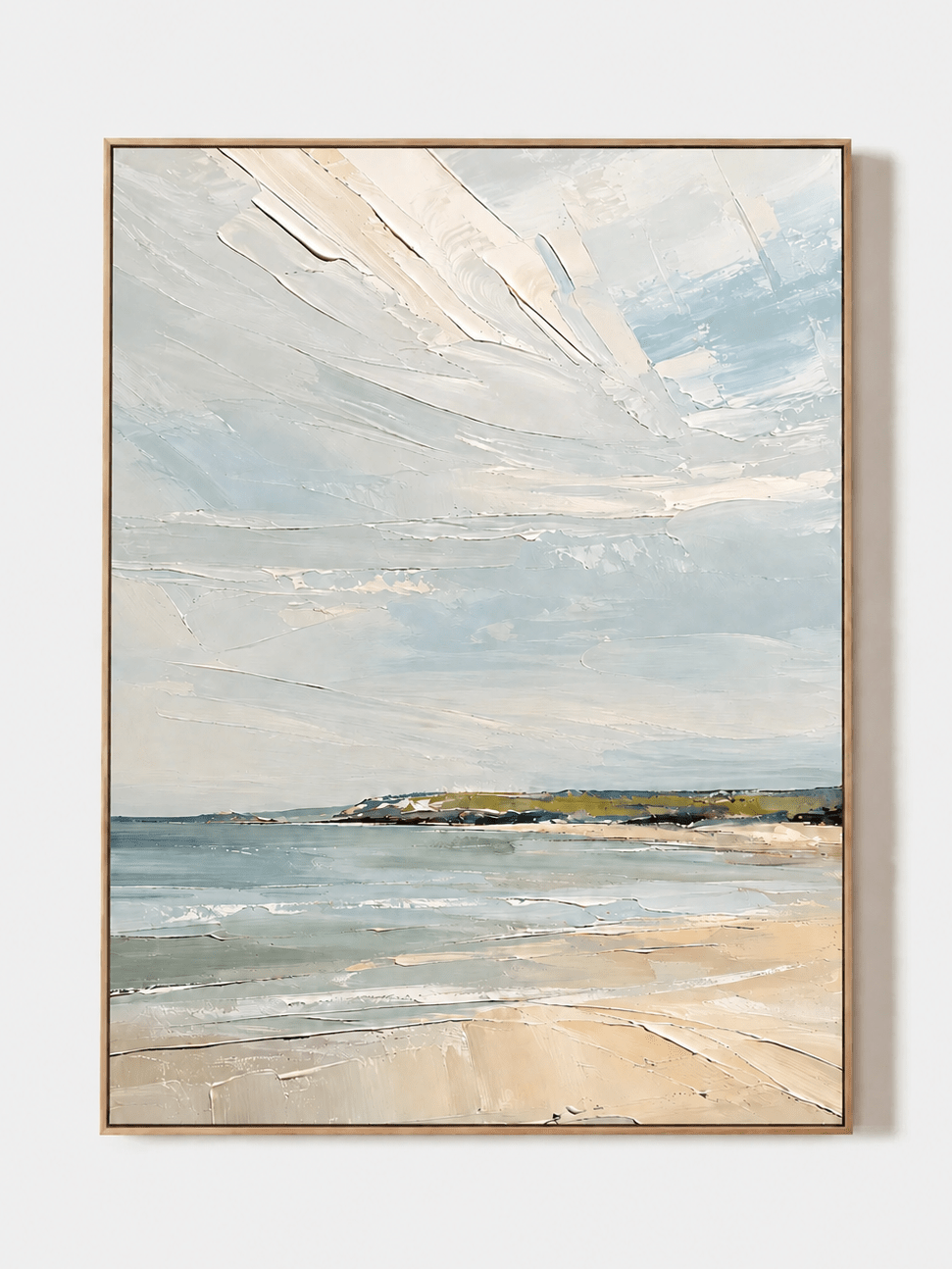
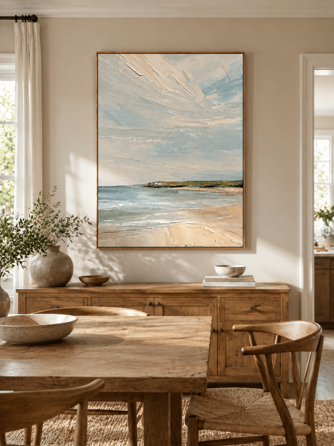
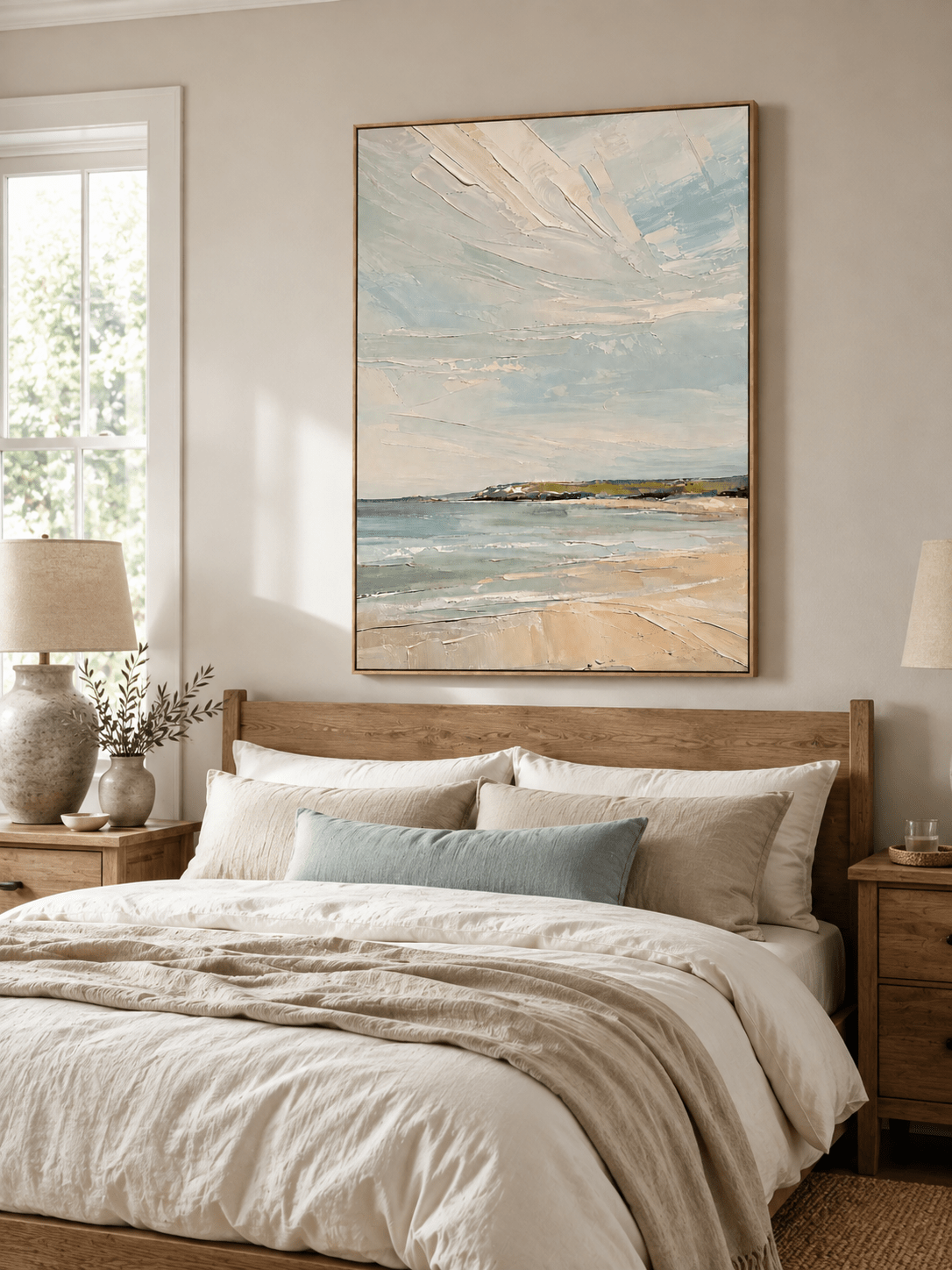
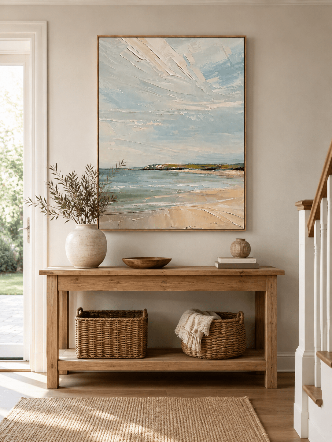
You do not need a coastal theme. A quiet abstract seascape or atmospheric landscape can introduce blue as a field of light and distance rather than as a nautical motif. If blue is your main direction, WABI Wall Art already has a dedicated guide to using blue wall art in a brown living room, so this article treats blue as one option within a broader palette rather than repeating that topic. Explore Cool Blue & Frosty-Tone Wall Art for more options, and see How to Use Blue Wall Art in a Brown Living Room for the focused companion guide.

Black and charcoal: for a cleaner contemporary edge
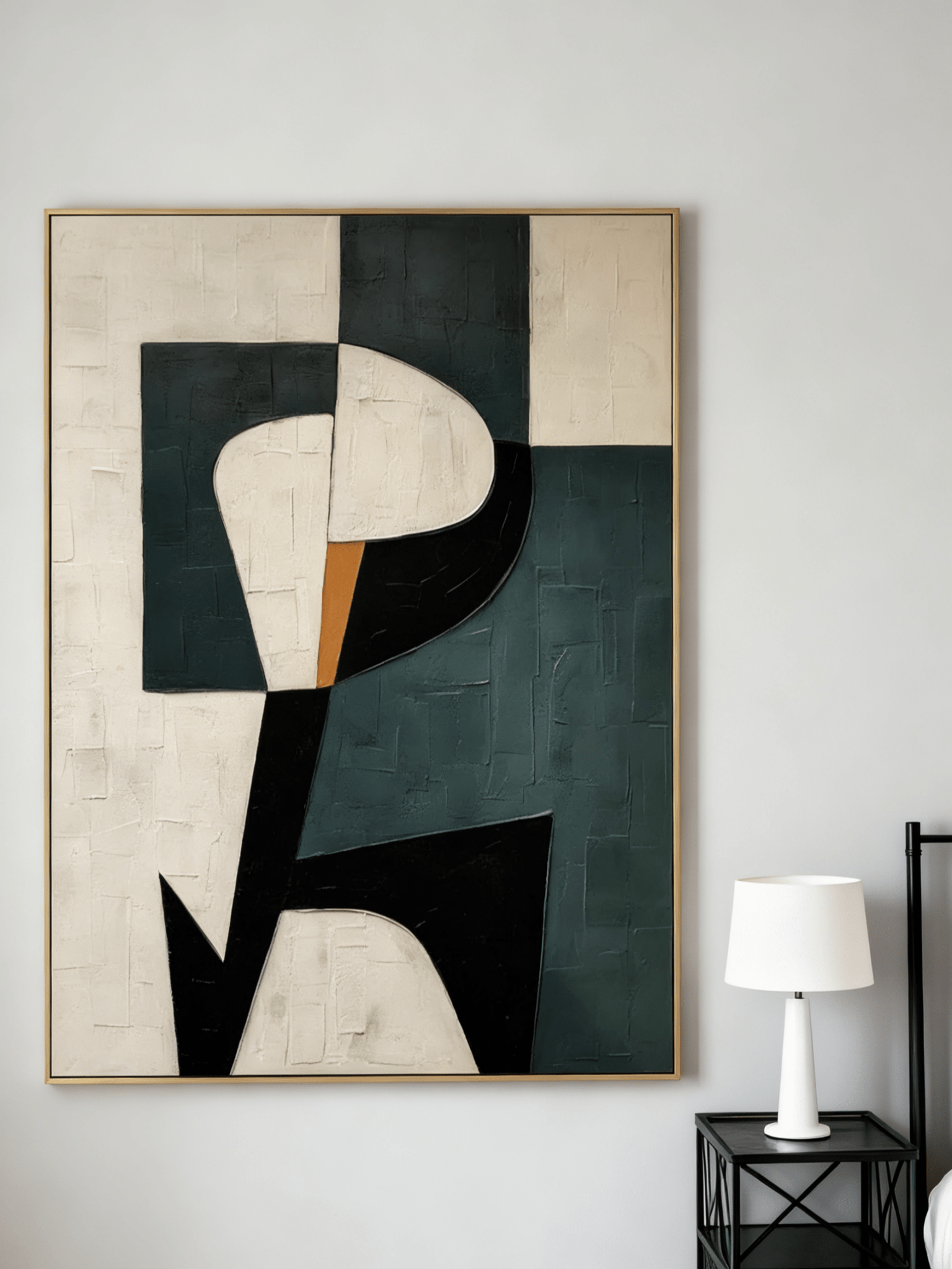
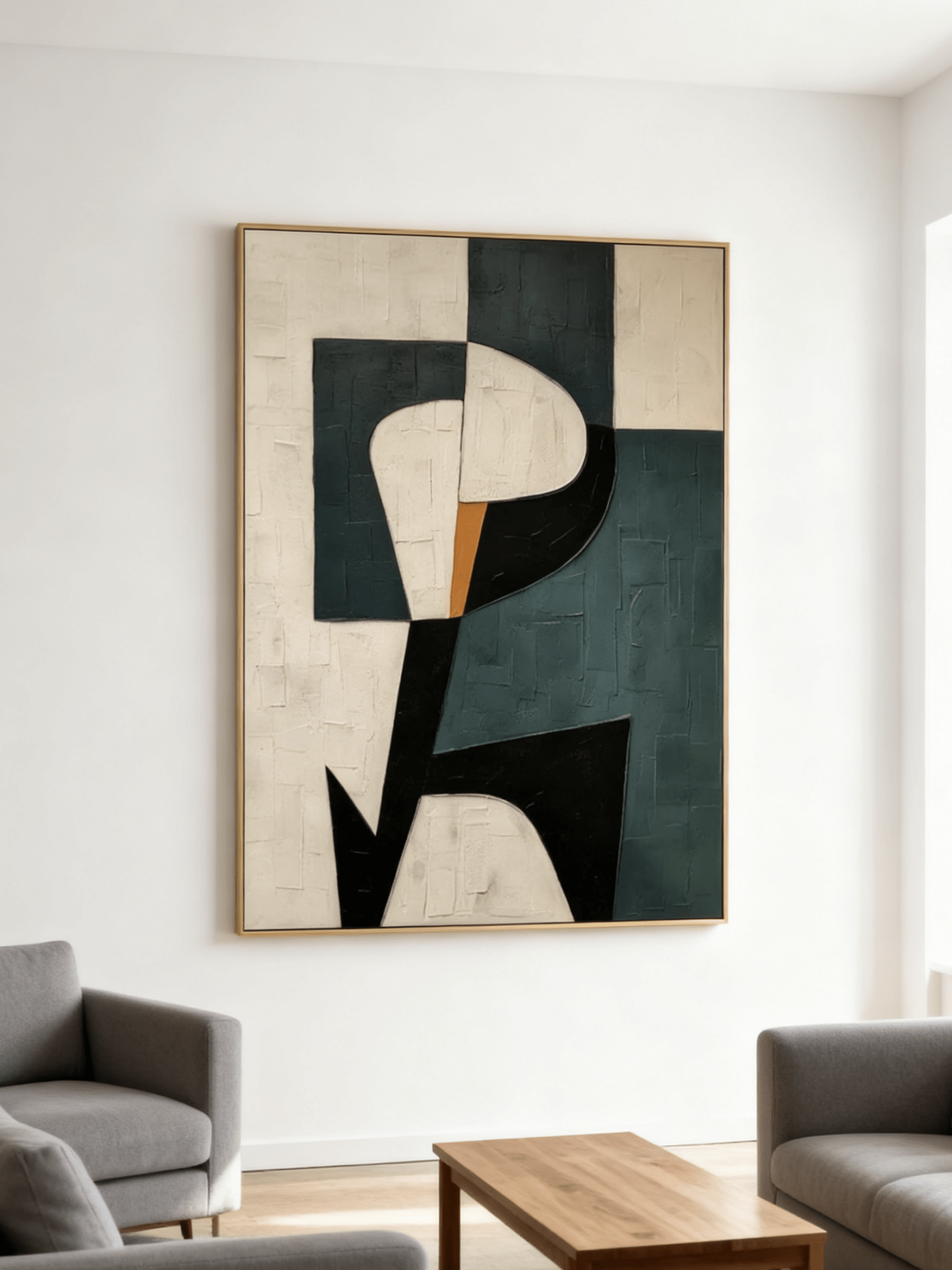
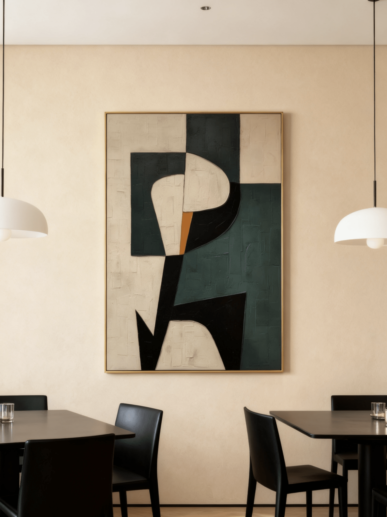
A chocolate sofa can sometimes make a room feel soft around the edges, particularly when the rug, curtains, and wood are all warm. Black or charcoal in the artwork introduces a crisp boundary. The most livable version is usually not an all-black canvas, but a cream, beige, or stone composition with dark structural marks.
This combination works beautifully with modern architecture, black metal lighting, dark window frames, and minimal accessories. It also gives a brown sofa a more graphic identity, moving the room away from rustic or traditional associations.
Terracotta, rust, bronze, and ochre: warm-on-warm, done carefully
Warm colors can absolutely work with a chocolate sofa, but the room needs tonal separation. Rust, clay, bronze, and ochre feel sophisticated when the artwork includes lighter ivory or darker charcoal to break up the warmth. A painting that is uniformly reddish brown can disappear into the sofa and wood furniture, making the room feel visually compressed. Browse Earth-Tone Wall Art when you want this warmer, collected direction.
Use these colors when you want the living room to feel enveloping, autumnal, collected, or heritage-inspired. They pair particularly well with aged brass, walnut, cream textiles, and handmade ceramics.

Plum, burgundy, and aubergine: a moodier 2026 direction
For a room that should feel intimate rather than airy, plum and burgundy can deepen chocolate brown in a more current way than simply adding more brown. The combination works best when a third, lighter color—ivory, stone, dusty pink, or warm gray—prevents the palette from becoming too dark. This is a strong direction for reading rooms, formal living rooms, and spaces with evening-focused lighting.
Chocolate Brown Sofa Color-Pairing Matrix
| Art color direction | Best effect | Works especially well with | Watch out for |
|---|---|---|---|
| Ivory / cream / mushroom | Lightens and opens the sofa wall | Dark or medium brown sofas, warm white walls, walnut | Flat beige with no texture or contrast |
| Sage / olive / moss | Adds organic color and calm | Wood, stone, linen, brass, organic-modern rooms | Bright grassy green with no neutral bridge |
| Misty blue / blue-gray | Cools a warm room and creates distance | Chocolate fabric, walnut, cream, warm lighting | Very dark navy in a dim room with dark walls |
| Black / charcoal + ivory | Adds structure and contemporary definition | Black metal, modern architecture, minimalist rooms | Large uninterrupted black fields above espresso upholstery |
| Terracotta / rust / bronze | Creates a warm, collected atmosphere | Cream textiles, walnut, aged metal, clay accents | Matching the sofa and wood too closely |
| Plum / burgundy | Builds a rich, moody scheme | Ivory, stone, warm metal, library-inspired rooms | Using only dark midtones with no light relief |
3. Texture Matters More When the Sofa Is Dark
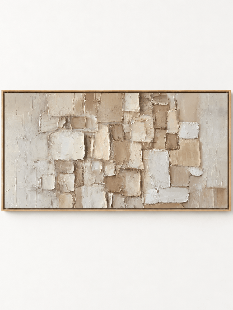
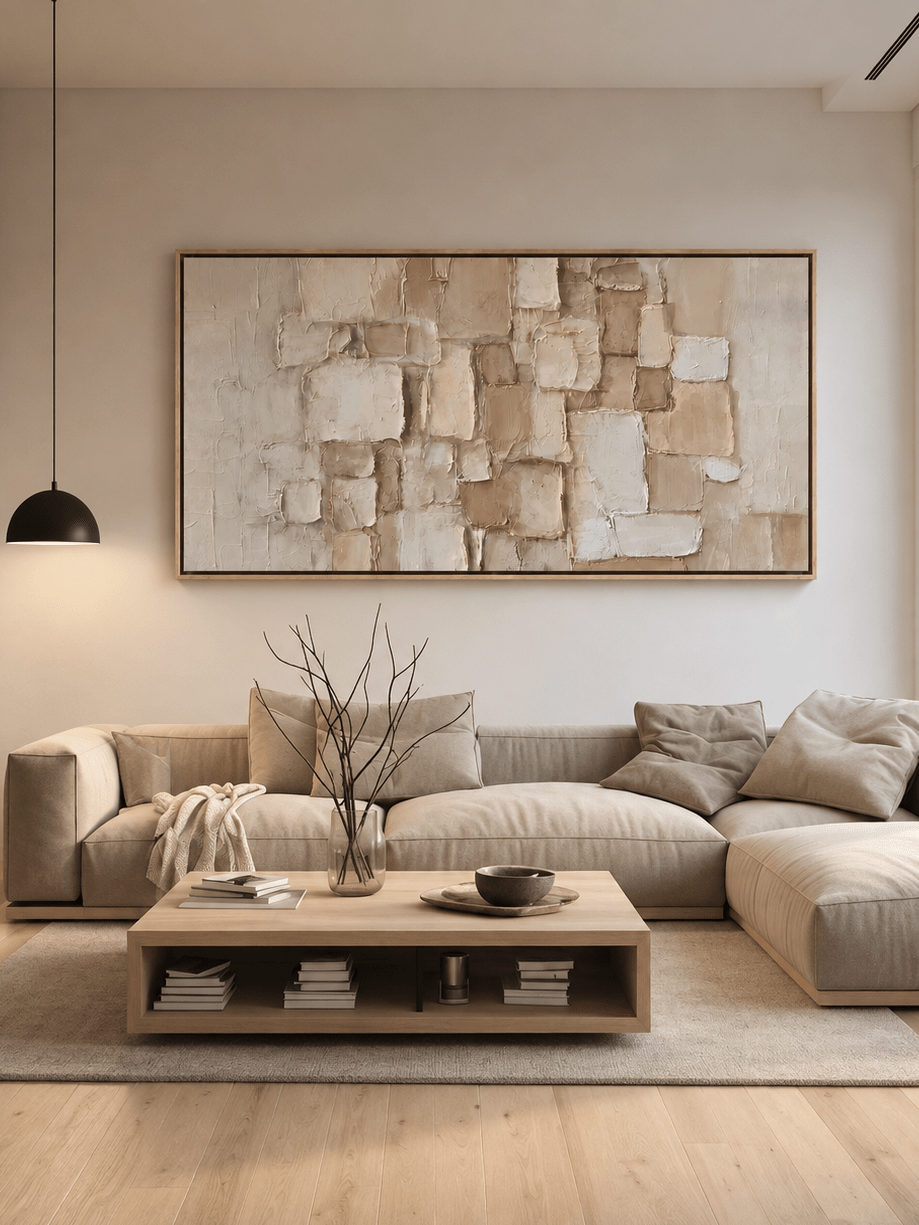
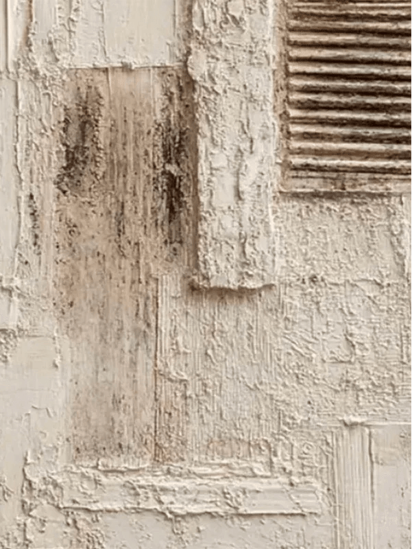
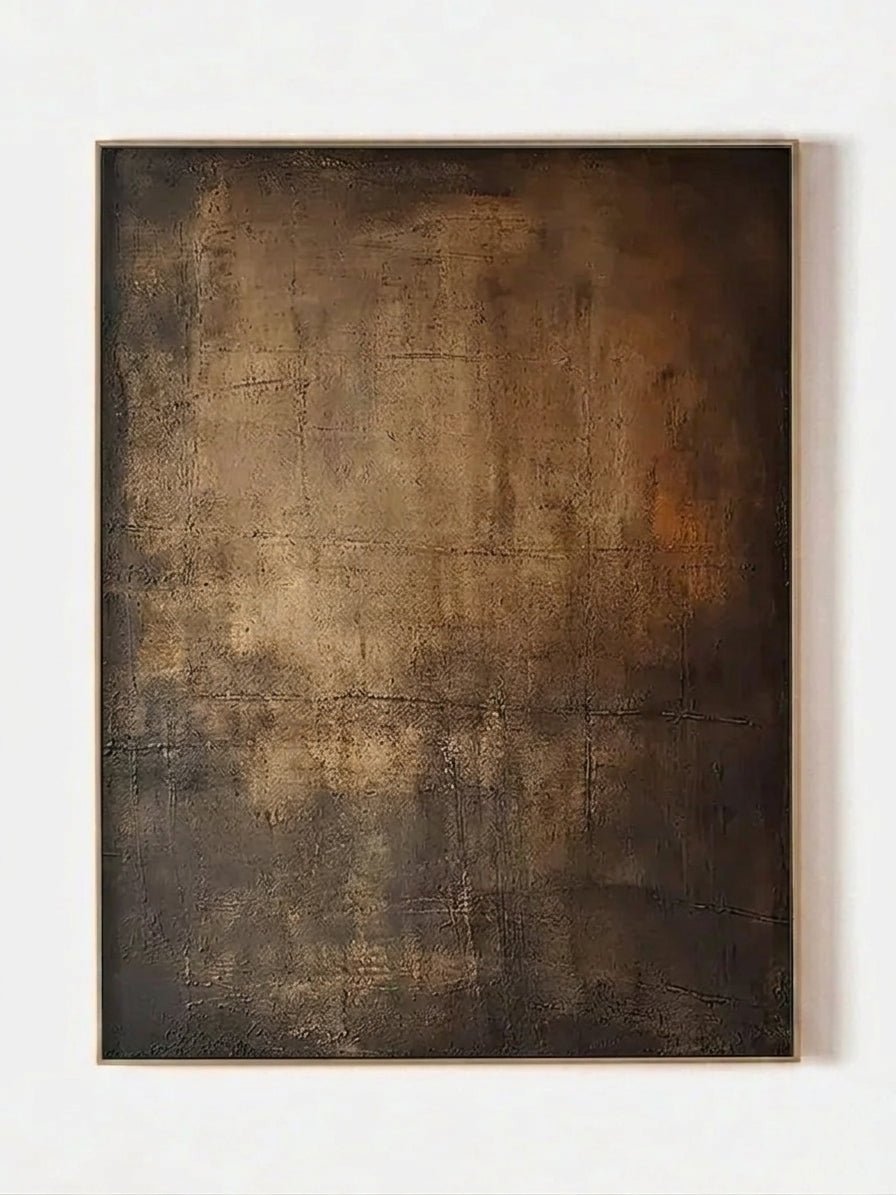
Color is only half the decision. Chocolate brown has visual mass, so a completely flat piece of wall decor can feel surprisingly weak above it. Hand-painted texture gives the wall its own material presence and helps the artwork change with daylight, lamps, and viewing angle. Browse Textured Wall Art for hand-painted surfaces with visible relief and brushwork.
With a chocolate linen or woven sofa
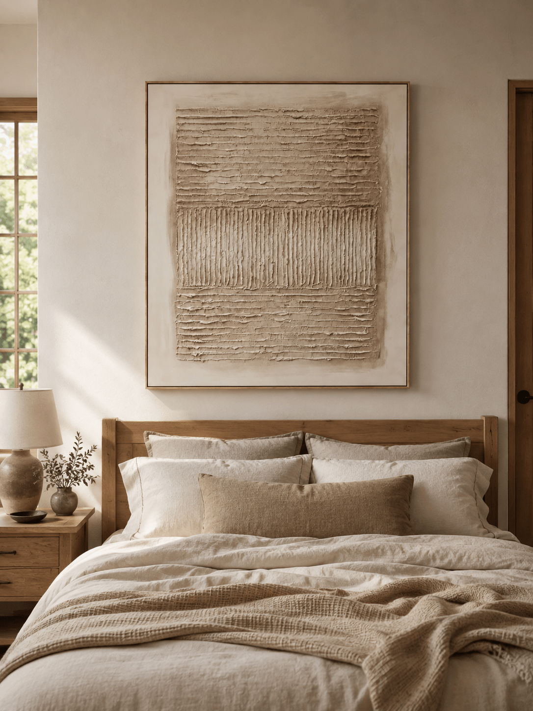
Use visible impasto, scraped surfaces, plaster-like relief, or directional brushwork to build on the tactile quality of the fabric. The artwork can be neutral because the surface itself supplies interest. A cream-and-stone textured canvas, for example, creates contrast without adding another strong color.
With a chocolate leather sofa
Leather is smoother and often more reflective. A textured painting creates a useful matte-versus-sheen contrast, but the palette should usually be lighter than the sofa unless the room is intentionally dramatic. Ivory, mineral gray, muted green, and beige-black combinations work particularly well.
With a chocolate velvet sofa
Velvet already has changing highlights and shadows. Choose texture that reads clearly but does not compete at every inch of the surface. Broad palette-knife passages, atmospheric landscapes, or one strong sculptural gesture can feel more refined than dense all-over relief.
Why hand-painted surfaces work with brown
Brown rooms tend to contain natural materials: wood grain, leather, wool, stone, woven textiles. A hand-painted canvas belongs naturally in that material conversation because the brush marks and raised surface are physical, not simulated. The result feels collected rather than digitally coordinated.

4. Match the Artwork to the Interior Style
Organic modern
Choose ivory, stone, sage, olive, and softened landscape forms with visible texture. Pair the painting with walnut or oak, limestone or travertine, linen curtains, and a low-pile wool rug. The sofa provides the dark anchor; the art should introduce air and natural movement.
Wabi-Sabi and Japandi
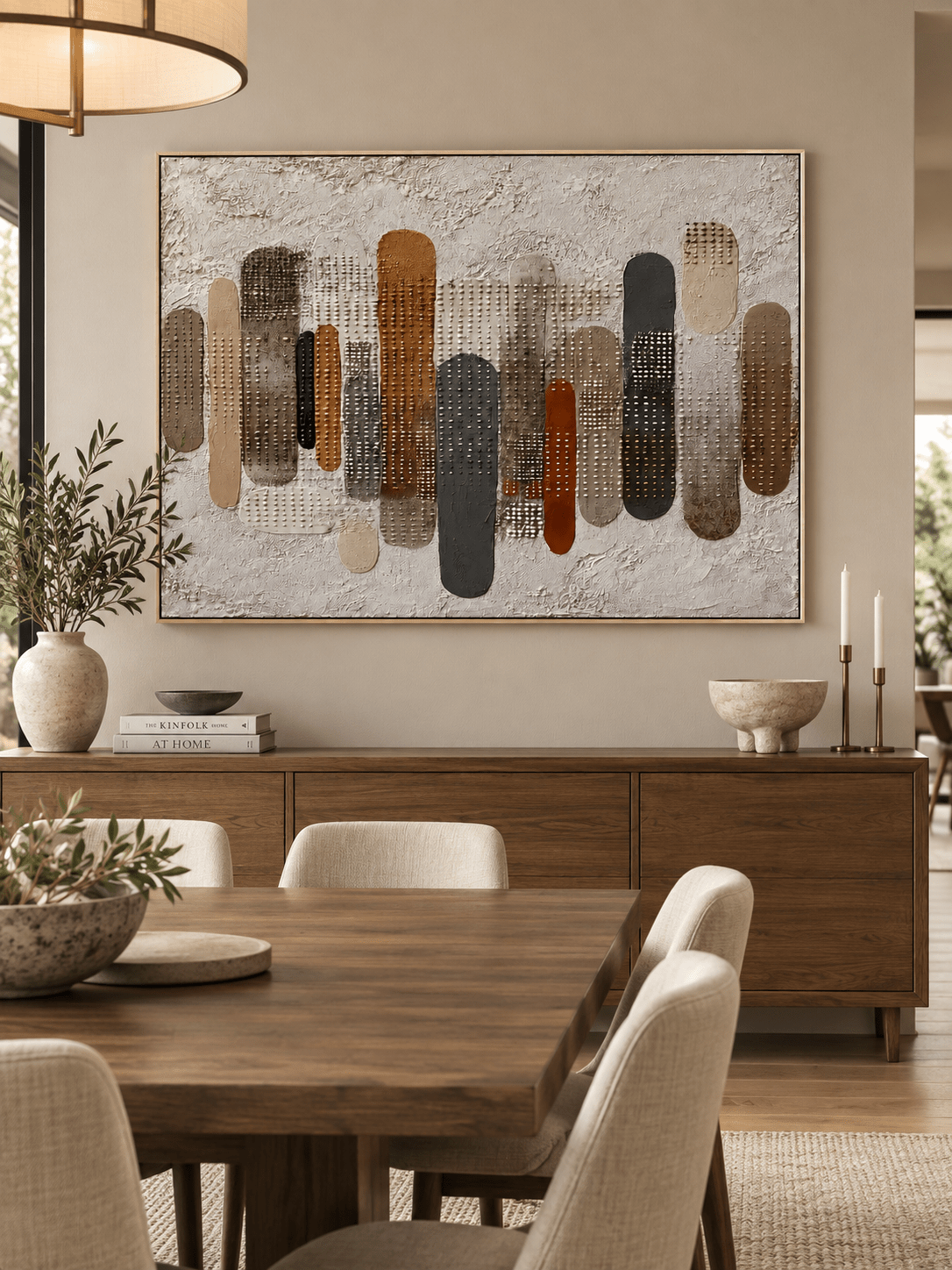
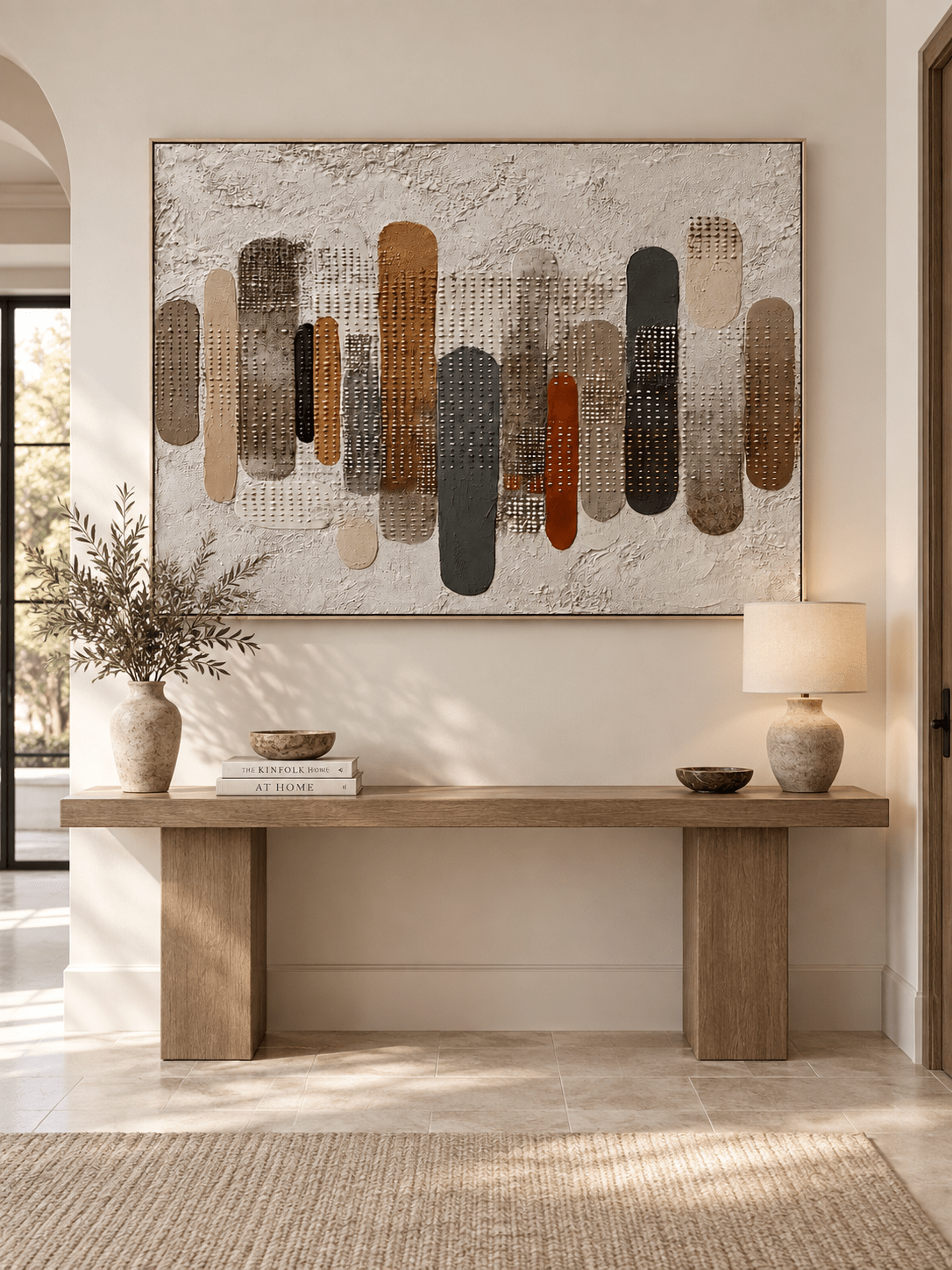
Look for irregular surfaces, restrained earth tones, asymmetry, negative space, and quiet geometry. A chocolate sofa works well here because it adds warmth without requiring extra ornament. Beige-and-black textured art or weathered earth-tone geometry can give the room structure while preserving calm. Browse Wabi-Sabi Wall Art for restrained geometry and irregular surfaces.
Contemporary minimalist
Use fewer colors and more value contrast. A large ivory canvas with charcoal marks, a soft blue-gray horizontal landscape, or a geometric composition with black and ochre can be enough. Keep accessories edited so the artwork and sofa read as the two main visual masses. Browse Abstract Wall Art for similarly restrained compositions.
Moody modern / heritage-inspired
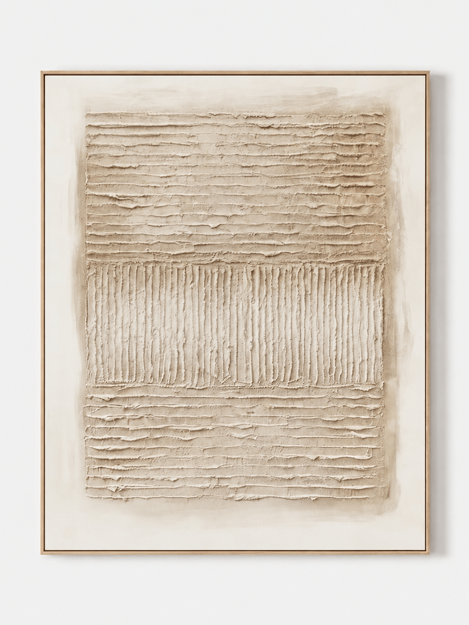
Lean into the richness rather than trying to brighten everything. Consider plum, burgundy, tobacco, bronze, charcoal, or deeper green—but make sure the artwork contains some luminous or lighter areas. Add warm picture lighting so the painted surface remains visible in the evening. For a warm brown relief direction, see Wabi-Sabi Brown Texture Wall Art – EV#0016 and the Moody & Heritage-Tone Wall Art collection.

Modern landscape
Atmospheric landscapes are an easy bridge between a brown sofa and a contemporary room. Horizons, mist, water, valleys, and simplified terrain introduce depth without looking overly traditional. A landscape with cream sky, sage hills, or blue-gray water can also pull the eye beyond the sofa, making the room feel less dense. Browse Landscape & Nature Wall Art for more atmospheric options.
5. Let the Wall Color Change the Art Choice
The same chocolate sofa can look completely different against warm white, greige, or a dark painted wall. Treat the wall as the background of the artwork—not as an afterthought.
Warm white or cream walls
You have the most flexibility. Light neutral art will feel soft and layered; green and blue will become clearer accents; black-and-ivory art will feel graphic. If you choose mostly ivory artwork, make sure the frame, texture, or darker passages create enough edge definition against the wall.
Greige, mushroom, or taupe walls
Midtone walls can make a midtone brown sofa and midtone painting merge. Push the artwork noticeably lighter, darker, greener, or bluer. Contrast does not have to be dramatic, but the painting should be readable from the doorway.
Dark brown, charcoal, or deep green walls
This is where pale artwork earns its place. Ivory, fog blue, mineral gray, or light sage can act almost like a window in the wall. If you choose dark art too, use directional lighting, a contrasting frame, or significant internal light areas to keep the composition from disappearing.
6. What Size Wall Art Should Go Above a Brown Sofa?
A dark sofa visually occupies more space than a pale sofa of the same dimensions, so undersized artwork tends to look even smaller above chocolate upholstery. Measure the sofa itself and use the furniture—not the full wall—as your starting reference.
A practical target is for the total artwork width to cover roughly 60% to 75% of the sofa width. That range is a starting point rather than a law, but it usually keeps the art connected to the seating zone without crowding nearby lamps, windows, or shelving.
| Sofa width | Useful artwork-width range | Common WABI-friendly direction |
|---|---|---|
| 72 in / 183 cm | 43–54 in / 110–137 cm | 48-inch horizontal, square, or compact diptych |
| 84 in / 213 cm | 50–63 in / 128–160 cm | 54–60-inch horizontal or wider multi-panel grouping |
| 96 in / 244 cm | 58–72 in / 146–183 cm | 60–72-inch horizontal statement piece |
| 108 in / 274 cm | 65–81 in / 164–206 cm | 72–80-inch horizontal or panoramic composition |
Horizontal, square, or a set?
A horizontal painting is the most straightforward choice above a long sofa because its shape echoes the furniture below. A large square can work when the wall has generous height, especially above a compact sofa or sectional segment. Diptychs and triptychs are useful when you want rhythm or need to adapt to a wide wall, but include the gaps between panels when calculating total width. For a related proportion reference, see What Size Wall Art Should Go Above a Sofa?
How high should you hang it?
Keep the artwork visually connected to the sofa rather than floating near the ceiling. In many living rooms, leaving approximately 6 to 10 inches between the top of the sofa and the bottom of the artwork creates a comfortable relationship. Test the exact placement with painter’s tape and check it while seated as well as standing.
7. The Best Frame Finishes With Chocolate Brown Upholstery
The frame does not need to match the sofa or coffee table. Its job is to define the edge of the painting and connect it to one or two finishes already present in the room.
- Natural oak or light wood: creates welcome contrast and works well with ivory, sage, and blue artwork.
- Walnut or dark wood: creates a tonal, furniture-like effect; best when the painting itself contains enough lightness.
- Black: gives a clean contemporary boundary and works especially well with ivory, beige, green, or graphic abstract art.
- Muted gold or bronze: adds warmth and suits earth-tone, plum, or atmospheric landscapes; keep other metallic accents restrained.
- White: can make a pale painting feel lighter on a dark wall, but it may feel too sharp in a heavily warm, heritage-style room.
If the room already contains several wood species, do not try to match all of them. Choose the frame that best supports the painting, then repeat that finish once elsewhere if the room needs a clearer connection.
8. Five WABI Wall Art Directions That Work With a Chocolate Brown Sofa
These are not the only suitable works in the WABI catalog; they illustrate five different ways to solve the same design problem. Always confirm the current size, framing, and customization options on the individual product page before ordering.
Modern Textured Landscape Wall Art – Quiet Ivory Horizon – EL#0307 — Best for making a dark brown sofa wall feel lighter. Its horizontal ivory, sand, greige, and charcoal layers create breathing room while the darker horizon keeps the painting grounded. View artwork.
Wabi Sabi Moss Green Abstract Wall Art – AK#0329 — Best for an organic-modern room. Moss, olive, ivory, and greige connect naturally with chocolate upholstery, wood, linen, and stone without turning the room into a strict green-and-brown scheme. View artwork.
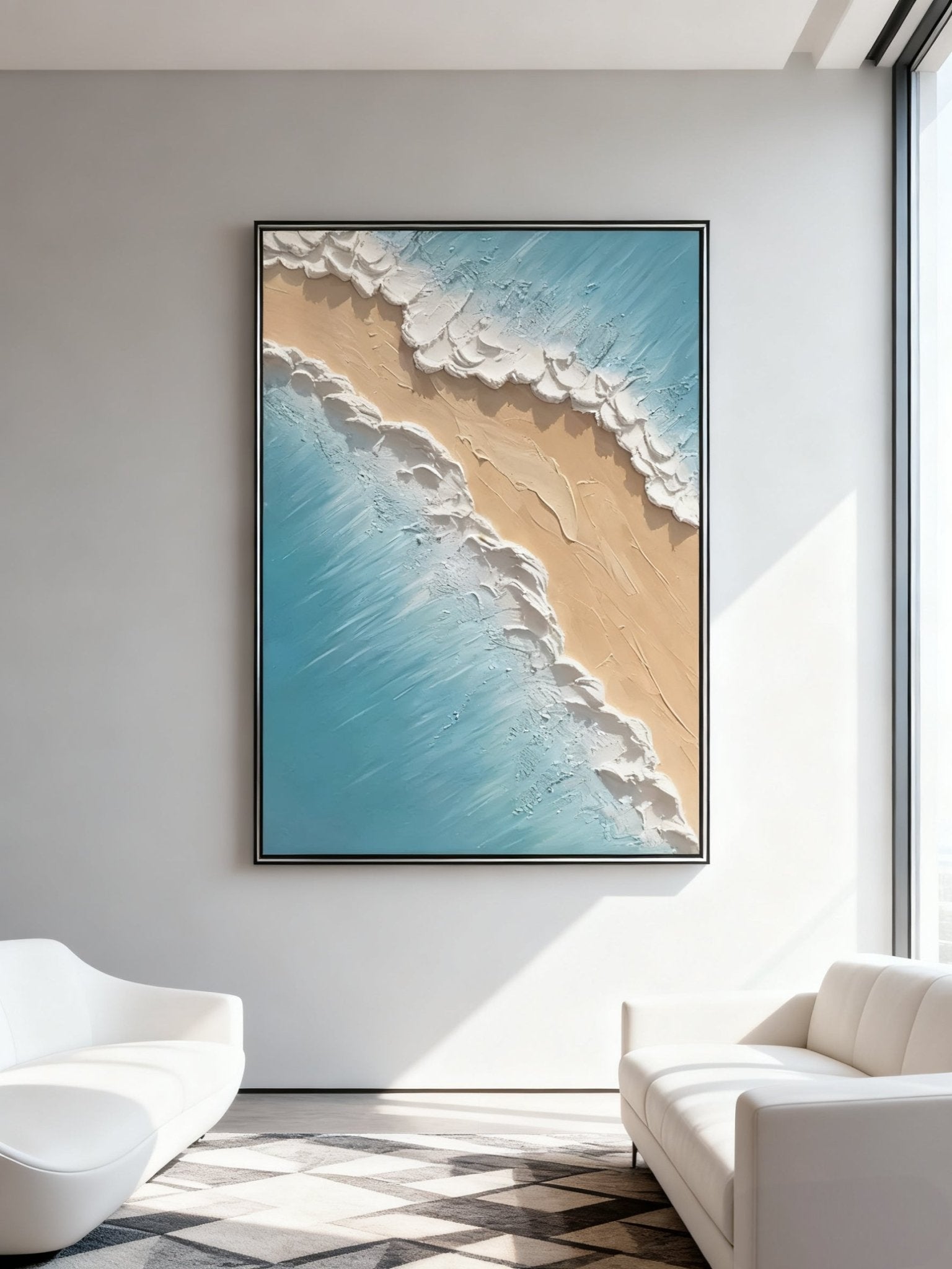
Modern Abstract Seascape Wall Art – Quiet Blue Shore – EL#0310 — Best for cooling a warm room. Pale blue, ivory, sand beige, and misty gray create temperature contrast while still relating to natural materials around a brown sofa. View artwork.
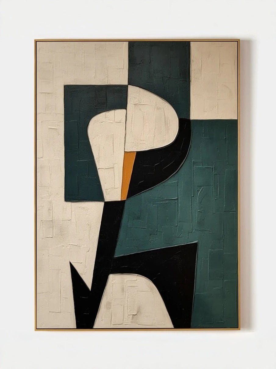
Beige & Black Wabi-Sabi Textured Wall Art – EV#0027 — Best for a sharper contemporary look. The beige field connects to warm neutrals while black structure and tactile surface detail prevent a chocolate sofa from making the room feel overly soft or traditional. View artwork.
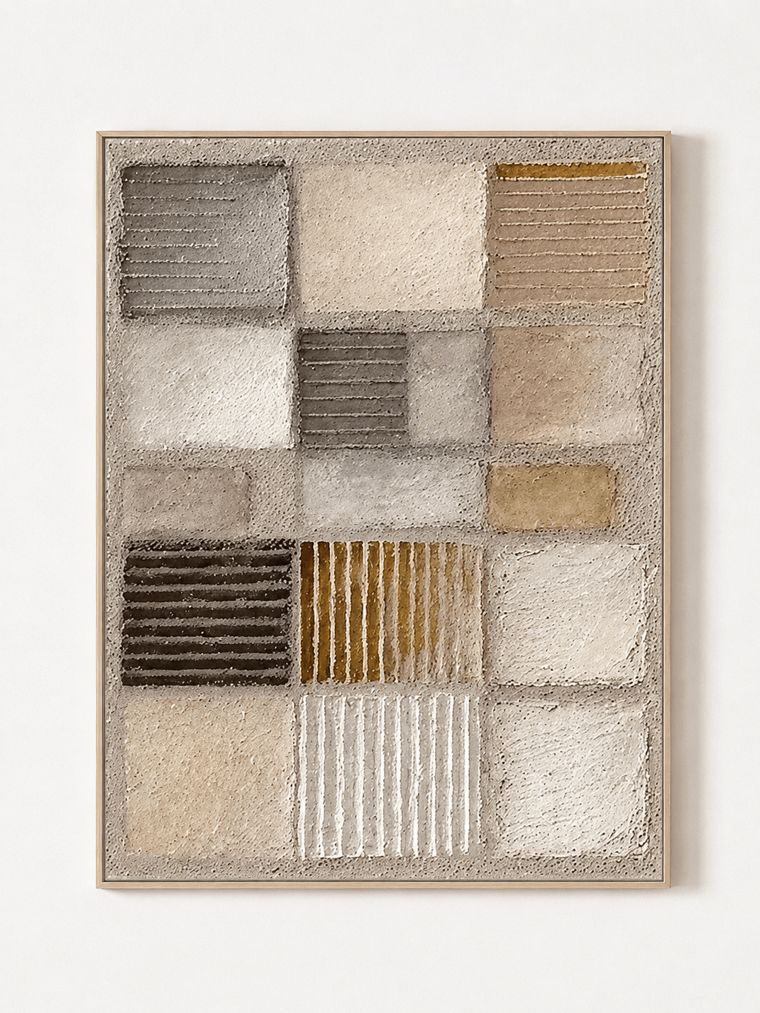
Wabi-Sabi Textured Wall Art – Earth Tone Geometry – EV#0269 — Best for a tonal, architectural room. Warm beige, charcoal, taupe, ochre, and clay-brown accents echo the sofa’s warmth, but geometric contrast and raised texture keep the palette layered instead of repetitive. View artwork.
9. Four Easy Room Formulas
If you want a faster starting point, choose the formula that feels closest to the room you want to create, then adjust the artwork size and exact colors to your light and wall finish.
Bright organic modern
Chocolate sofa + warm white wall + ivory textured landscape + light oak + travertine + cream wool rug + one olive accent. The art supplies light, while the sofa remains the grounding element.
Natural green and walnut
Chocolate sofa + mushroom wall + sage or moss artwork + walnut table + linen curtains + aged brass lamp. This is one of the easiest combinations for a warm, collected room that still feels current.
Cool contemporary contrast
Chocolate sofa + cream wall + misty blue or blue-gray painting + black metal details + pale stone + a small amount of warm wood. The cool art prevents the room from feeling yellow or overly brown.
Moody evening room
Chocolate sofa + deep olive or warm taupe wall + plum/bronze/charcoal artwork with ivory passages + walnut + aged brass + warm picture light. Here the goal is atmosphere, not brightness, so lighting and tonal separation matter more than using a pale palette.
10. Common Mistakes to Avoid
- Choosing art that is the exact same brown as the sofa. Tonal rooms need variation in value, texture, or temperature to feel intentional.
- Using a very dark painting on a dark wall without adequate light. The composition may disappear after sunset.
- Buying a small canvas because the product thumbnail looked balanced. Measure the sofa and preview the actual dimensions on the wall.
- Repeating every artwork color in pillows and accessories. One or two subtle echoes are enough; excessive matching can make the room feel staged.
- Ignoring the sofa material. Leather, linen, velvet, and bouclé reflect light differently, so the same painting can feel heavier or lighter depending on the upholstery.
- Choosing frame color before choosing the painting. Let the artwork determine the boundary it needs, then connect the frame to the room.
A 5-Minute Pre-Purchase Checklist
- Photograph the sofa wall in natural daylight and again with evening lights on.
- Identify whether the chocolate upholstery leans warm cocoa, neutral brown, or cool espresso.
- Decide what the art must add: lightness, coolness, natural color, structure, or deeper mood.
- Measure the sofa width and target an artwork or grouping around 60%–75% of that width.
- Check the product close-ups for real brushwork, relief, and color variation—not only the styled room image.
- Preview the final dimensions with painter’s tape and view the outline from the doorway and the main seating position.
- Choose the frame only after confirming the painting and wall color work together.
Frequently Asked Questions
What color wall art goes best with a chocolate brown sofa?
Ivory, cream, sage, olive, misty blue, blue-gray, black-and-beige, terracotta, bronze, and selected plum or burgundy tones can all work. The best choice depends on whether you want the artwork to lighten, cool, sharpen, or deepen the room.
Should wall art above a brown couch be lighter than the sofa?
Often, yes—especially if the sofa is dark chocolate or espresso and the room has limited natural light. A painting does not need to be pale overall, but including ivory, cream, sky, stone, or other light passages helps create separation.
Does green wall art go with a brown sofa?
Yes. Sage, olive, moss, and muted jade are natural partners for brown because they relate easily to wood, plants, stone, and other organic materials. Choose softened greens rather than highly saturated lime tones for a calmer living room.
Does blue wall art work with chocolate brown furniture?
Yes. Blue provides a cooler counterpoint to brown. Pale blue, mineral blue, slate, and blue-gray are particularly versatile, especially when the painting also includes ivory, sand, or warm gray that bridges back to the room.
Can I use brown or earth-tone art above a brown sofa?
Yes, but avoid exact matching. A tonal scheme works when the artwork varies the value and material character—for example, ivory and bronze, charcoal and ochre, or beige with sculptural texture. The painting should still separate from the sofa at normal viewing distance.
What size artwork should go above a chocolate brown sofa?
A useful starting point is to choose artwork—or the total width of a multi-panel grouping—at roughly 60% to 75% of the sofa width. Then check nearby windows, lamps, ceiling height, and the visual weight of the specific painting before finalizing.
What frame color looks best with a chocolate brown couch?
Light wood creates contrast, black gives a crisp modern edge, walnut creates a tonal effect, and muted gold or bronze adds warmth. The frame should support the painting first; it does not need to duplicate the sofa or coffee table finish.
What wall color works with a chocolate brown sofa and wall art?
Warm white, cream, mushroom, greige, taupe, muted green, and even deep charcoal can work. On darker walls, choose artwork with enough light value or a contrasting frame so the painting remains distinct.
Final Takeaway: Let the Artwork Add What Brown Is Missing
A chocolate brown sofa already gives a living room warmth, weight, and character. The most successful wall art does not compete with those qualities or copy them exactly. It adds the element the room still needs.
Choose ivory when the wall needs light. Choose sage or olive when the room needs a natural bridge. Choose misty blue when warm woods and upholstery need temperature balance. Use black and charcoal for modern definition, or bronze, terracotta, and plum when you want a deeper, more enveloping atmosphere. Then let real brushwork and texture give the painting enough physical presence to stand beside a substantial brown sofa.
When the color, texture, scale, and frame all respond to the same room, the sofa and artwork stop looking like separate purchases. They begin to read as one deliberate composition.
Explore WABI Wall Art’s hand-painted wall art collection to compare abstract, textured, Wabi-Sabi, landscape, and color-led paintings for your living room.