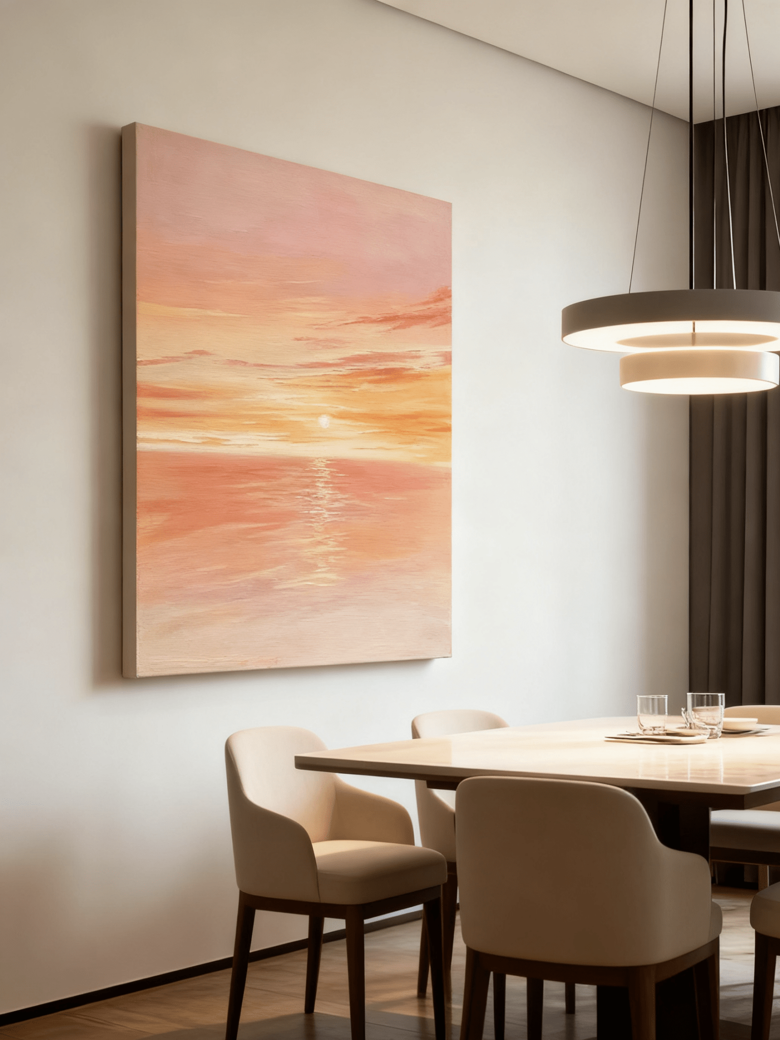
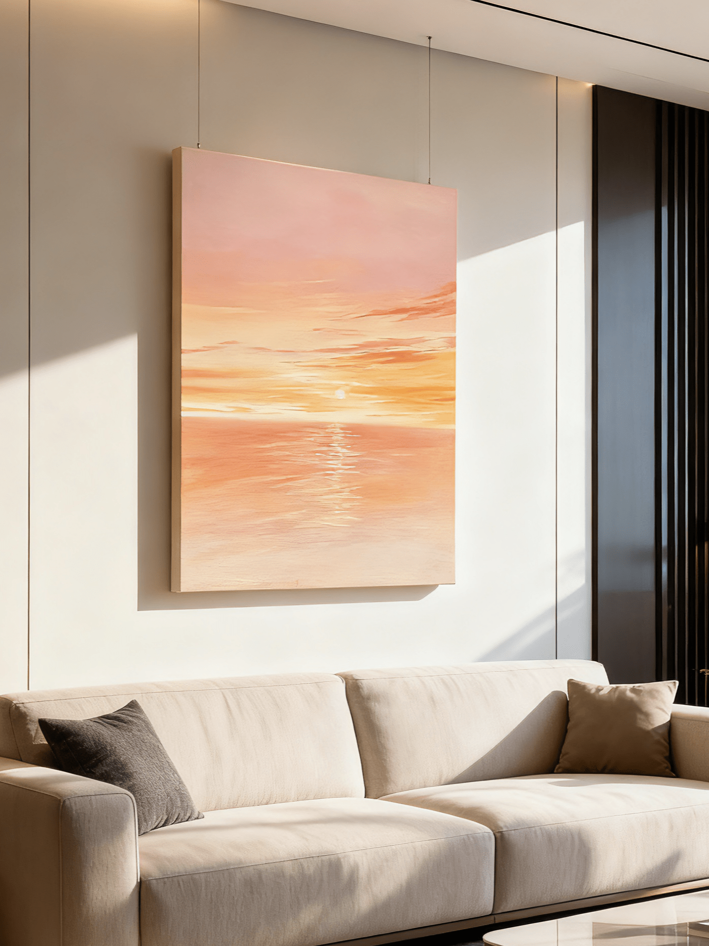
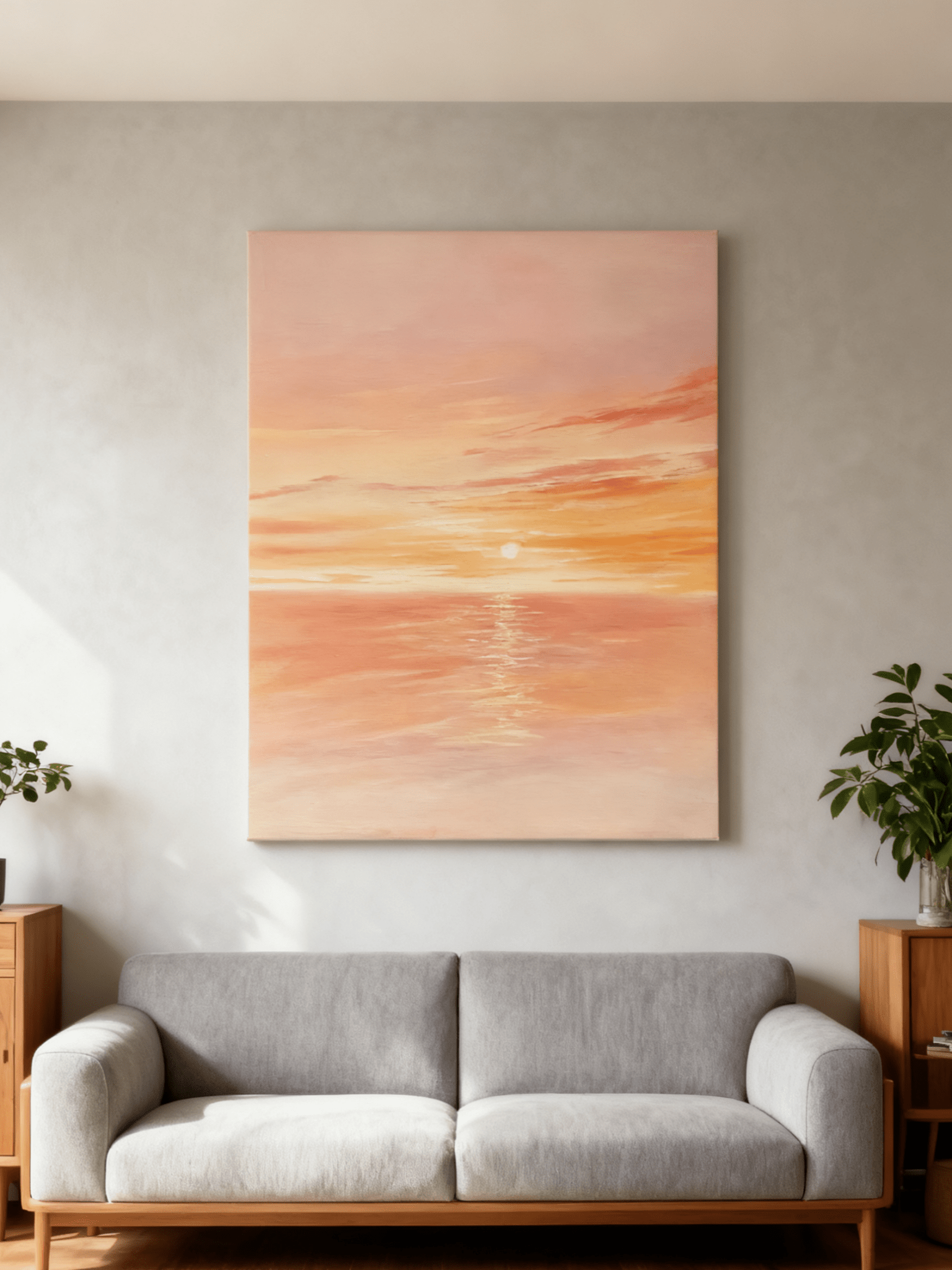
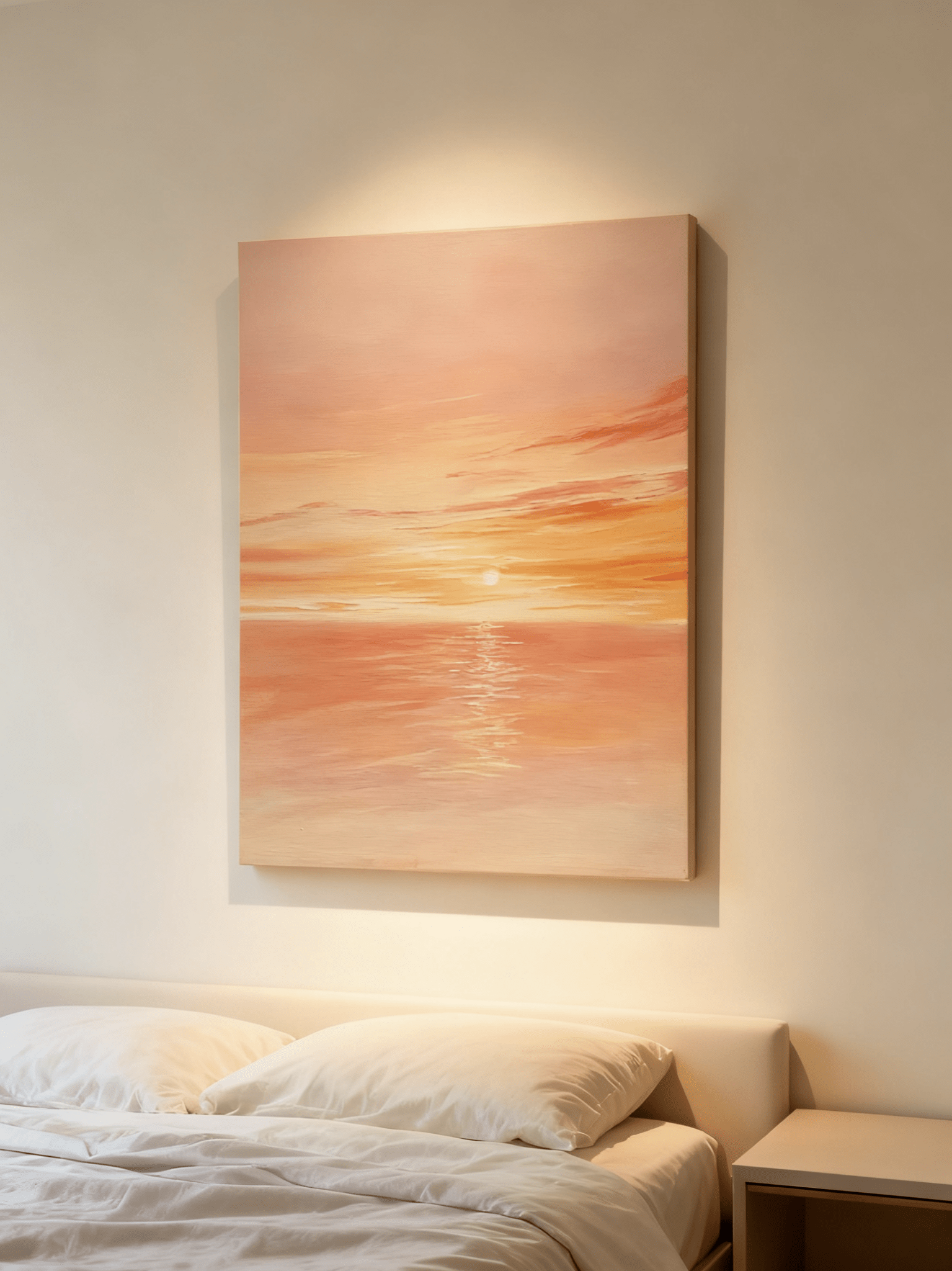
The rug is staying. You like its worn red border, its small blue flowers or the uneven stripes that make the room feel personal. The difficult decision is what to put on the wall without making the whole room feel busy.
Start by separating color from pattern. Wall art for a patterned rug can share one of the rug's colors while using entirely different shapes. A painting can also provide a broad, quiet surface that gives the eye somewhere to rest above an intricate floor.
There is no requirement to match the rug's style. A traditional carpet and a contemporary painting can work comfortably together when their colors, contrast and amount of detail have a clear relationship. The aim is to make both pieces easier to enjoy.
Read the rug from across the room
Stand where you normally enter the room, rather than studying the rug at your feet. Write down three things: the color that occupies the most area, the darkest visible mark and the size of the repeated motifs. These observations are more useful than a long list of every thread color.
A faded Persian-style rug may look beige from the doorway even though it contains rust, navy and sage. A checkerboard might use only two colors but create a much stronger pattern. Color count alone does not tell you how much visual activity the rug contributes.
Separate the background from the accents
The background usually gives you the easiest connection for a large painting. An ivory ground in the rug can relate to cream areas in the artwork. This lets the painting and carpet belong together even when their subjects and mark-making differ.
A smaller rug accent offers another route. If olive appears only in thin borders or leaves, a painting with an olive field can bring that color onto the wall. Before choosing it, ask whether you want that minor color to become much more important in the room.
Account for wear and contrast
A softly worn pattern behaves differently from a crisp new design. Its edges blend, so the rug may act almost like a textured neutral at a distance. Such a room can often accommodate a painting with a stronger dark mark than you would expect from a close-up rug photograph.
Do this assessment with the furniture in place. A coffee table may conceal the central medallion, leaving the border as the dominant pattern. Coordinate with the rug as you actually see it, not with its unobstructed retail image.
Choose one relationship between the artwork and the rug
Try one of three approaches first. You can refine it later, but starting with several competing ideas makes it harder to recognize why an arrangement feels unsettled.
Quiet painting, intricate rug
Use broad color areas, open sky or restrained abstract forms above a detailed rug. The artwork can still be textured. What matters is how its major shapes read from the seating area, not whether its surface is completely smooth.
An olive color field beside an intricate rust-and-green carpet is one example. The green connects the pieces, while the painting's larger uninterrupted area gives a different rhythm. Keep the sofa and curtains plain so that the connection remains easy to see.

Larger marks, smaller motifs
An abstract with a few large brown and ivory shapes can coexist with a rug covered in small repeated flowers. The difference in scale separates them. Problems are more likely when similarly sized checks, grids or stripes repeat on both wall and floor with equal contrast.
This is not a ban on repeated geometry. Compare the pair from the doorway: can you tell which pattern leads, or do they seem to vibrate against each other? If both demand equal attention, simplify one or increase the difference in motif size.
Related colors, different subjects
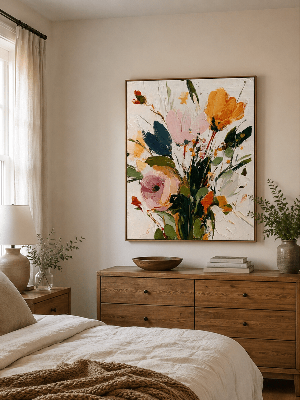
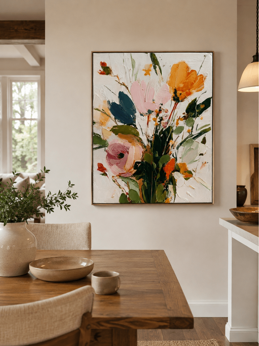
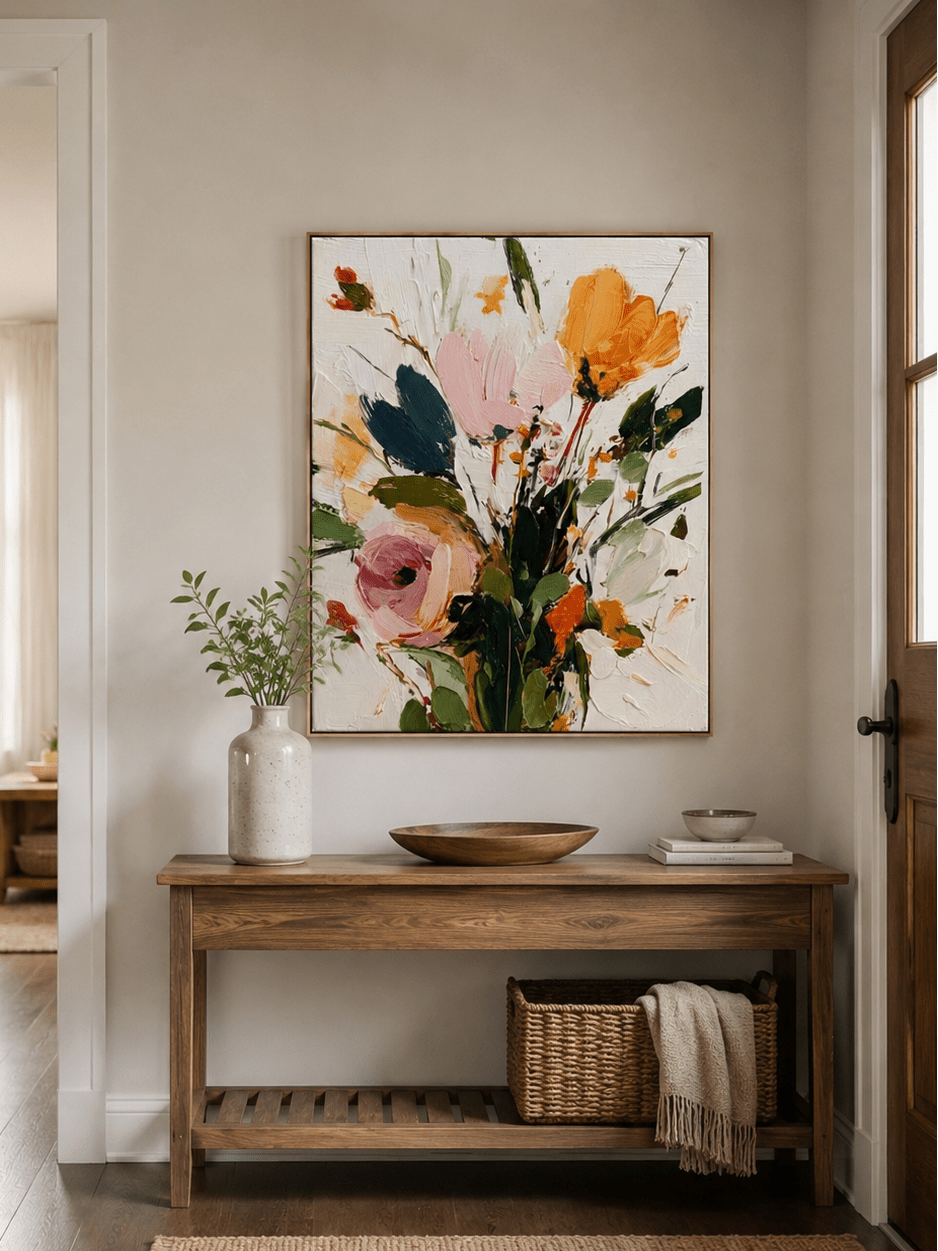
A muted countryside painting can work with a traditional patterned rug through shared cream and green tones. It does not need a painted floral motif to echo flowers in the carpet. Repeating the whole motif can feel more literal than repeating a small part of the palette.
Rugs.com's guidance on coordinating art and rugs also discusses color connections and the balance between detailed and restrained pieces. Treat these as useful starting points, then judge the particular rug and painting together in your room.
Give the wall and furniture some breathing room
The wall between the painting and the furniture is part of the arrangement. A plain cream or warm white background helps separate a painting from patterned upholstery, books and the rug below. If the wall is already heavily patterned, reduce the number of competing objects in that same view.
Try removing the patterned cushions for a moment. If the artwork and rug suddenly feel comfortable together, the conflict may have been the third pattern rather than the painting. This small test can save you from replacing something you actually like.

A frame can provide a useful boundary. A slim dark frame gives pale artwork a definite edge; natural wood can make the transition softer. Avoid choosing a decorative frame simply because the rug has a traditional border. The frame should serve the image and the whole room.
Scale also affects how much pattern you notice. Enlarging a painting makes its individual marks larger, but it does not necessarily make the room busier. A generous canvas with a small number of forms may feel calmer than several little pictures scattered above a complex rug.
Use paper to test the painting's full framed outline. Check that it relates to the furniture beneath it and leaves room for lamps or shelving. Do not calculate its width from the rug's width: the rug organizes the floor, while the artwork belongs to a particular wall and furniture group.
Compare before buying, then check the real surface
Make a simple comparison using a straight-on photo of your room and the product image. Keep the artwork's original aspect ratio and approximate its proposed size. This is a layout aid, not a reliable color proof, but it can reveal when a canvas has too many dark marks for the setting.
Look at the pair once in color and once as small thumbnails. Color reveals the connection; a smaller view makes competing shapes and dark areas easier to notice. Avoid increasing image saturation to make the painting seem like a closer match.
Ask what the artwork contributes that the rug does not already provide. It might add height, open sky, a broad quiet field or a darker point of focus. If you can only describe it as matching, compare one alternative with a different composition.

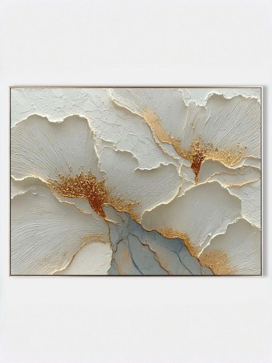
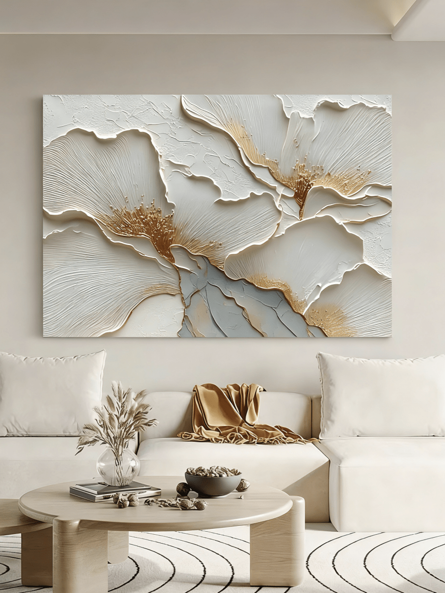
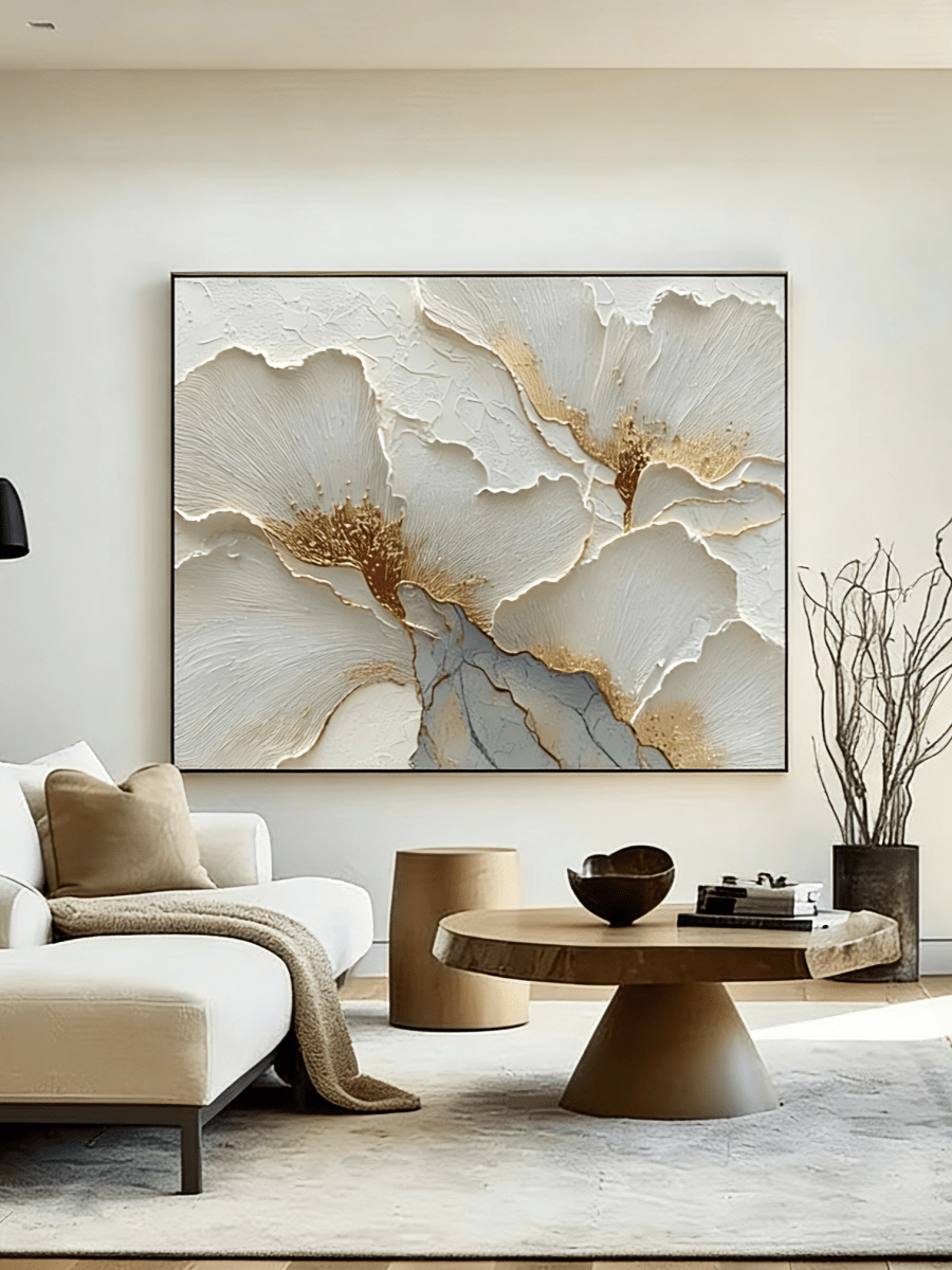
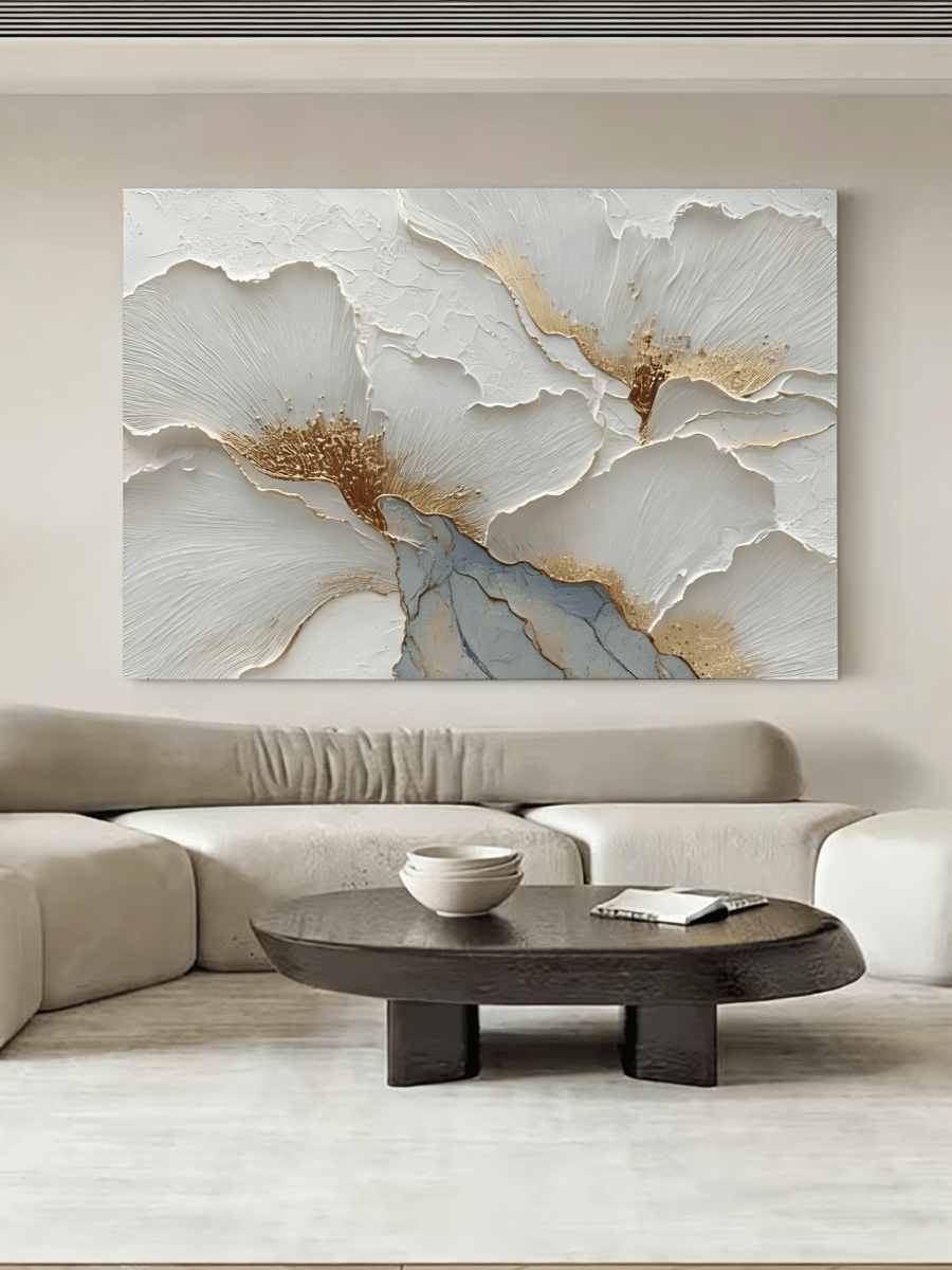
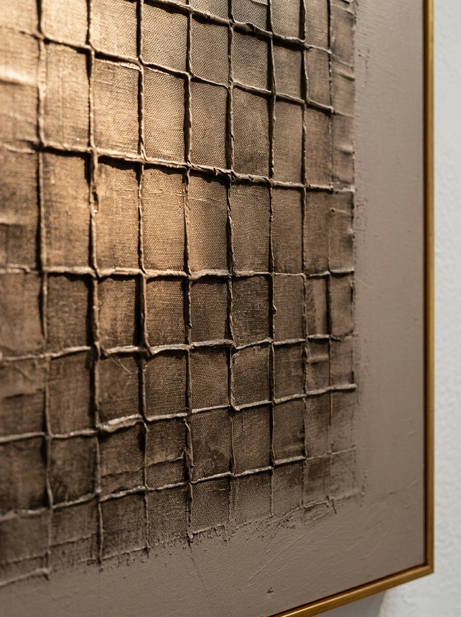
Hand-painted texture is worth reviewing separately. Raised paint can create stronger shadows under side lighting, even when the palette is neutral. Ask for close-ups and confirm the material and finishing options on the actual product page before deciding that a pale painting will be visually quiet.
Current interest in handcrafted surfaces provides context, not a reason to add texture everywhere. Etsy's spring and summer 2026 report highlights handmade detail and personal displays. A thoughtful room can express that interest through a single painting alongside a rug you already own.
Four artwork directions to compare with your rug
The following paintings illustrate different ways to solve the relationship. Choose according to your rug's visible colors and pattern, rather than treating these as a matching set.
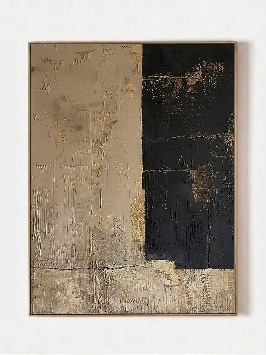
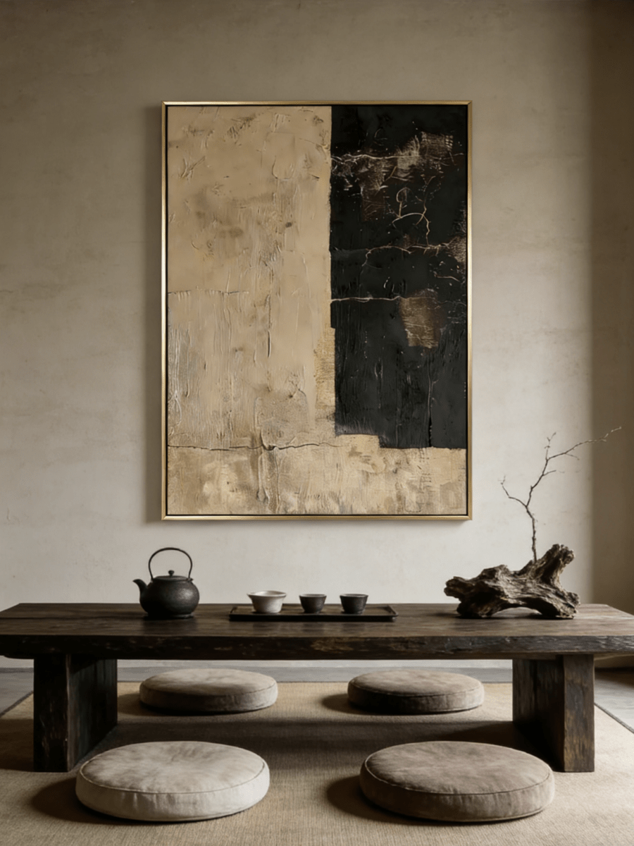
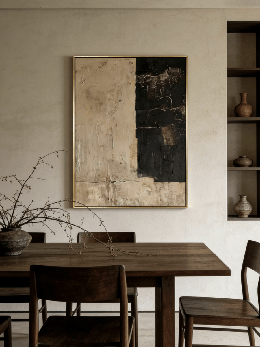
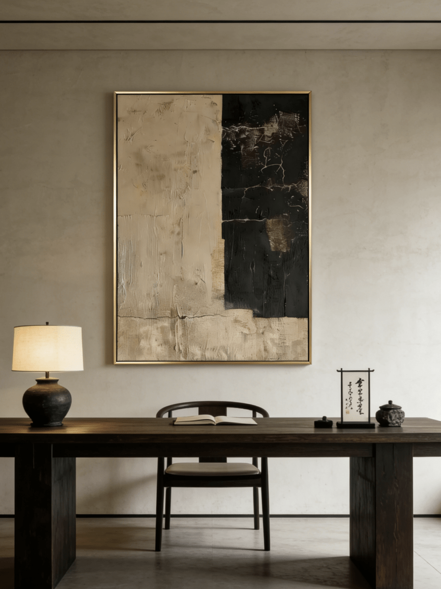
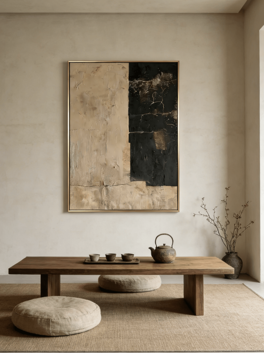
Warm structure: Wabi Sabi Textured Abstract Painting — EV#0450
EV#0450 uses broad cream, tan and brown areas with irregular dark accents. Those large forms can provide a useful scale contrast to a small, detailed rust-and-ivory rug pattern while relating to warm wood in the room.
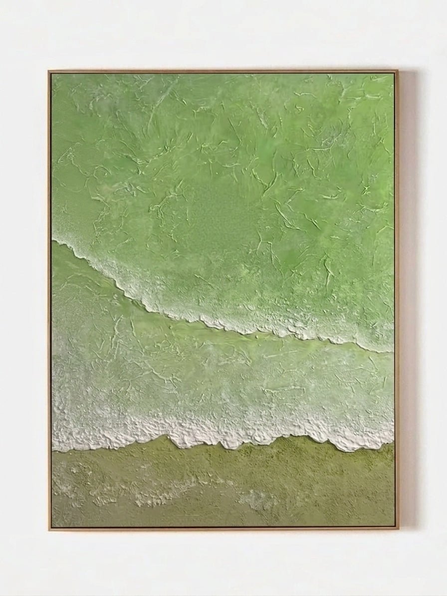
A broad color field: Minimalist Olive Green — AK#0365
AK#0365 brings olive and deep green into a largely open composition. Consider it when green is already a quiet accent in the carpet and you want to make that connection more visible without adding another set of small motifs.
A pale interval: Organic Modern Textured Neutral Abstract — EV#0359
EV#0359 pairs a mostly ivory surface with warm beige and restrained linear texture. It offers a lighter wall presence beside a patterned rug, particularly when the floor already contains enough dark detail to anchor the room.
A change of subject: Minimalist Textured Countryside — EL#0353
EL#0353 brings an expansive pale sky and muted fields into the arrangement. It can relate to cream, sage or blue-gray rug accents while providing a landscape instead of another ornamental pattern.
Compare these with the abstract painting collection or the current New Arrival artworks. Confirm available dimensions and whether the price refers to rolled, stretched or framed canvas. Handmade marks and tonal transitions may vary slightly between finished paintings.
Frequently asked questions
Should wall art match the rug exactly?
No. One shared color or a similar level of warmth can be enough. Exact matching is rarely necessary and can limit your choices to paintings you would not otherwise enjoy.
Can abstract art work with a Persian-style rug?
Yes. Broad abstract forms can make an effective counterpoint to small traditional motifs. Compare the amount of dark contrast in both pieces, and use plain upholstery or walls to keep the overall view readable.
Can I use floral art with a floral rug?
You can, particularly when the two patterns differ in size or intensity. Large, loosely painted flowers will read differently from tiny repeated carpet motifs. Test the combination before also adding floral curtains or cushions.
What if the artwork and rug share no colors?
Look for another connection, such as similar warmth, softened edges or a frame that relates to the furniture. If the room still feels disconnected, repeat a modest accent through one accessory rather than replacing every textile.
A final room check
The painting and rug should each have a reason to be there. Keep a useful color connection, vary the scale of detail and leave some plain surfaces between them. A room feels more personal when its pieces belong together without looking identical.