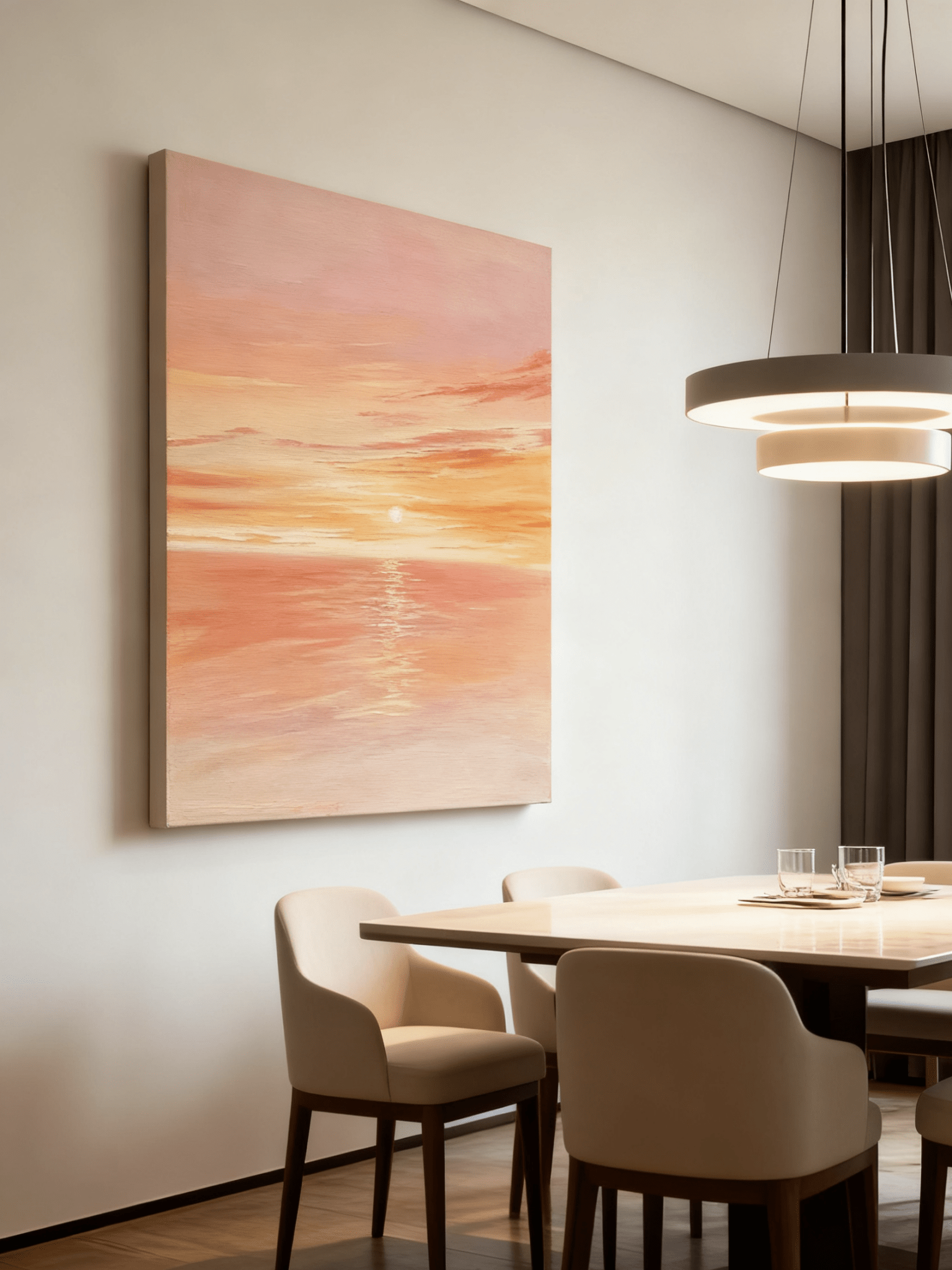
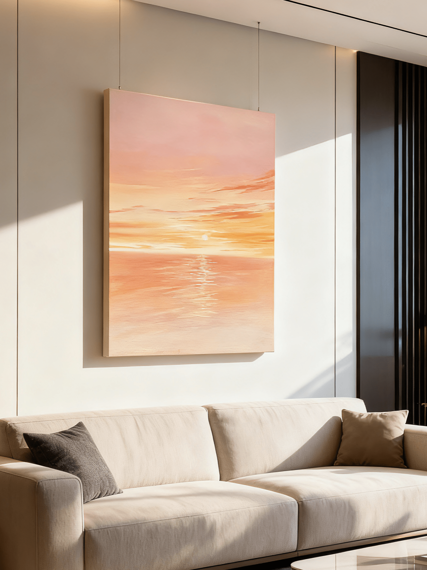
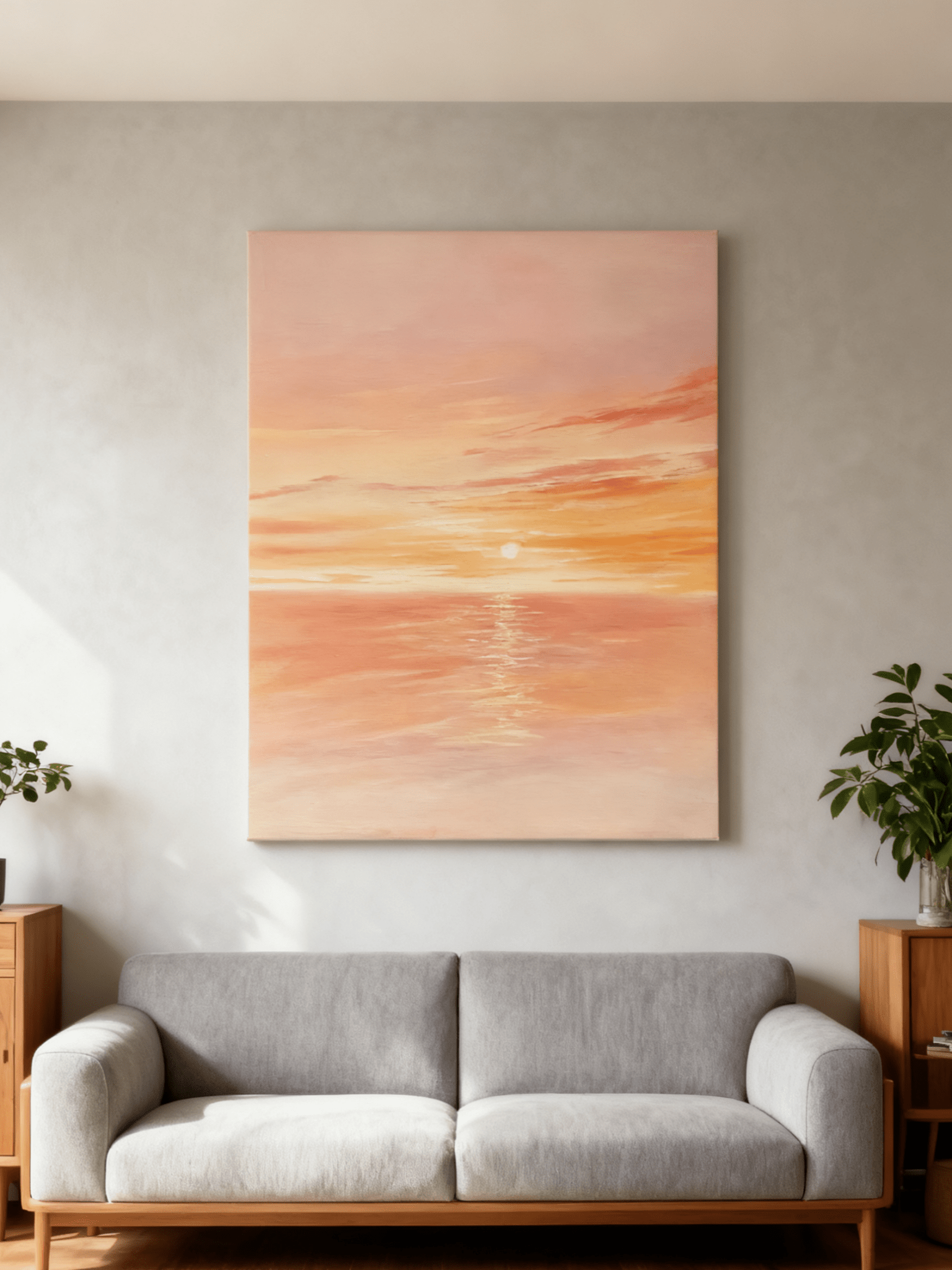
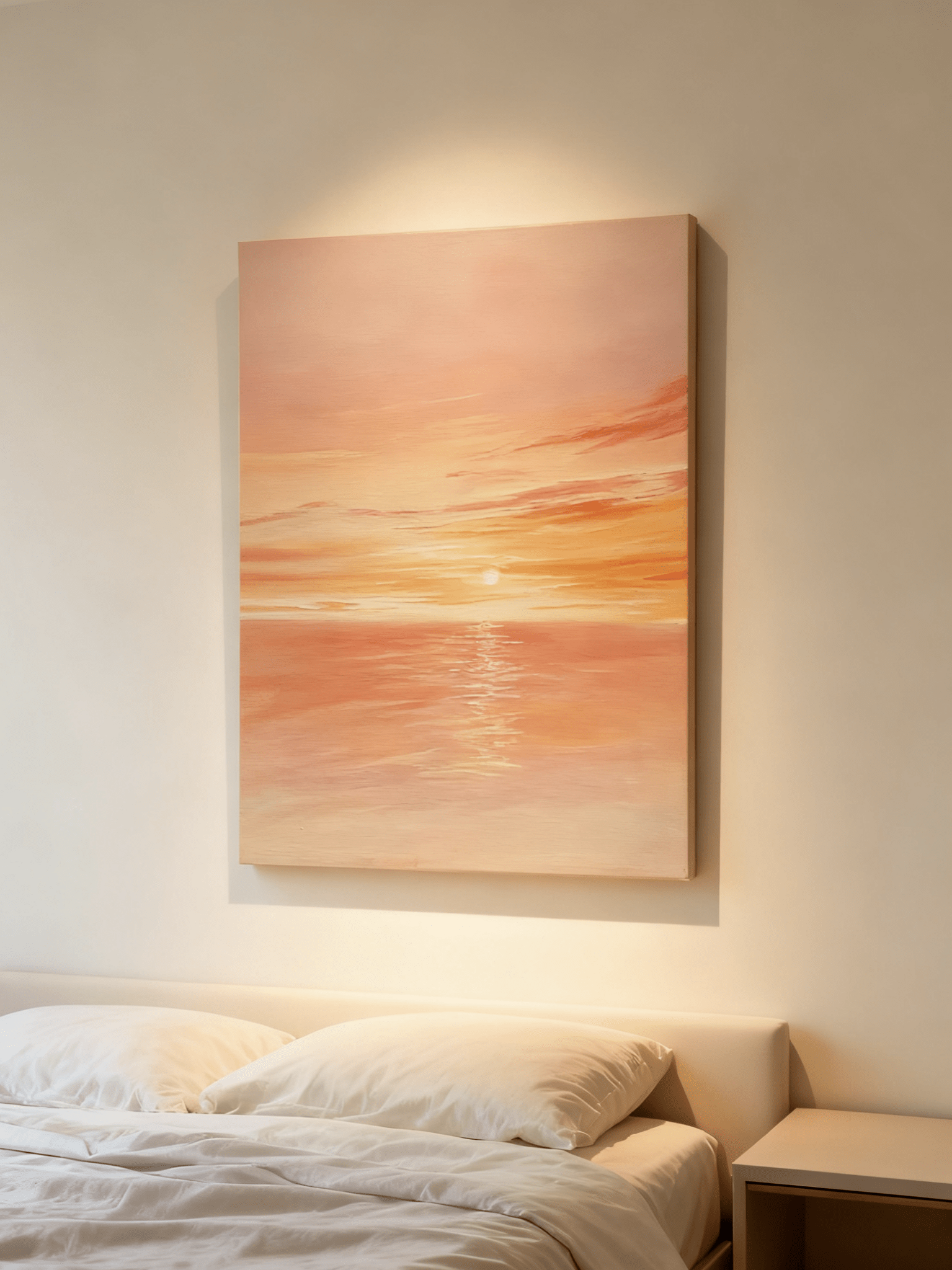
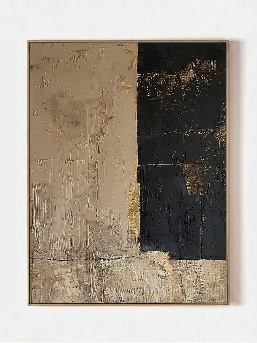
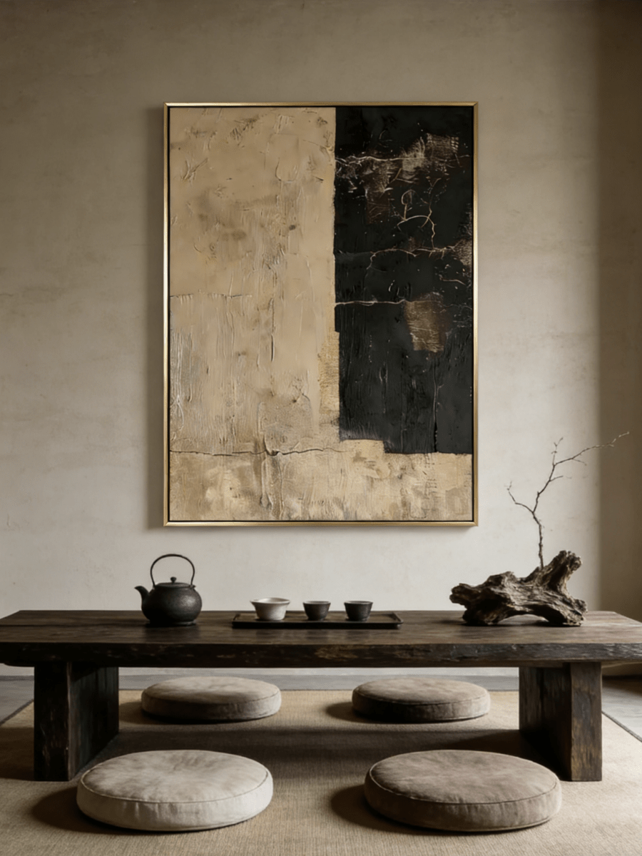
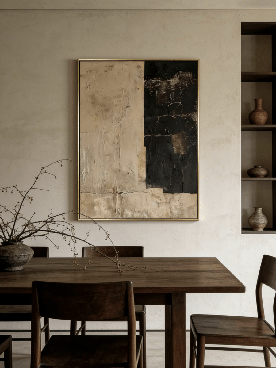
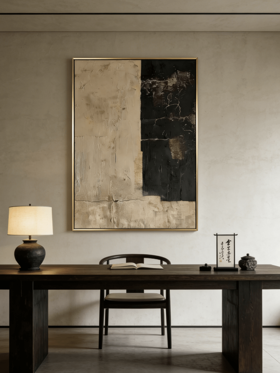
The photograph matters because of who is in it. The painting matters because you want to live with it. A good gallery wall gives both a place without asking every image to share the same subject, color, or frame.
To mix paintings and family photos, begin with one visual anchor, choose a small group of photographs, and repeat one framing detail. Arrange the group as a whole before filling individual gaps. That approach leaves room for personal history while making the wall easy to read from across the room.
Personal collecting is also part of the current decorating conversation. Etsy's Spring and Summer 2026 trend report highlights expressive, individual interiors and renewed interest in wall decor. The useful idea here is simple: a wall can reflect your household without looking like a coordinated set bought in one afternoon.
Start with the photographs you actually want to see
Sort the photographs before choosing a layout. Select moments you would enjoy passing every day, then look for visual variety within that meaningful group. A close-up portrait, a landscape with a person in it, and a candid scene offer different viewing distances.
You do not need to display every important person or event on the same wall. Too many similar portraits can make the group feel crowded even when the frames are small. Keep a few images in reserve to rotate later, especially if the available wall is narrow.
Separate emotional importance from printed size
A favorite photograph does not always need the largest frame. A small image with a generous mat can invite a closer look, while a painting establishes the wall's shape from a distance. The hierarchy of sizes is a design choice, not a ranking of the people shown.
Check the resolution of each photo before ordering an enlargement. An old scan may look more convincing as a smaller print. A larger mat and outside frame can give that print a presence alongside a canvas without enlarging the file beyond what it can support.
Keep color when color is part of the memory
Black-and-white photographs simplify the palette, but converting everything is optional. A red coat, blue sea, or yellow kitchen may be part of why you love the picture. Keep those colors and choose a painting that gives them somewhere to belong.
Look for one shared tone, not a complete match. An earthy painting can sit beside photos with warm skin tones and timber backgrounds. A flower painting can relate to a garden photograph through green leaves while introducing colors that appear nowhere else in the group.
Decide what anchors the group
The anchor is the piece you notice first. Often it is the painting because its larger surface and visible brushwork carry more weight than small photographs. Set it slightly off center if that makes the surrounding photo arrangement easier; symmetry is only one way to create order.
For a compact wall, try one painting and three photographs as a starting study. Place the painting on one side and the photographs in a smaller cluster on the other. This is an example to test, not a prescribed number for every home.
Balance visual weight, not frame counts
A dark photograph in a black frame can pull more attention than two pale photographs in light frames. A vivid vertical painting may outweigh a wider but quieter image. Step back and assess these differences before adding another piece to make the numbers even.
Imagine the arrangement as a loose rectangle. Its edges need not be perfectly aligned, but the pieces should look as if they belong to one group. A small frame stranded far beyond the others often looks accidental rather than relaxed.
Include the furniture below
If the gallery sits above a console, position the whole arrangement in relation to that console. Consider lamps and tall objects as part of the view; a lampshade that hides a photograph will interrupt the layout you planned on the floor.
In a hallway, allow for closer viewing. Small photographs can work particularly well where people naturally slow down, provided the frames do not intrude into the walking space. Avoid selecting a large canvas solely to fill the largest empty patch.

Use frames and mats to create continuity
Choose one detail to repeat. It might be a warm ivory mat, a slim black frame, or a restrained wood finish. Repeating one element gives the photographs a relationship without forcing the painting into exactly the same treatment.
For example, a canvas in a warm metallic frame can sit with black-framed photographs when the mats share the painting's pale background. The relationship is visible inside the frames, even though their finishes differ.
Frame depth also matters. A substantial canvas has physical presence, while a photograph in a very thin frame may appear flatter. You do not need identical depths, but inspect the side view in a narrow hall where the difference will be obvious.
Choose mats around the pictures
A wide mat can give a small photograph more breathing room. Its outside dimensions also help it participate in the larger arrangement. Do not crop a meaningful detail merely to make every photo opening the same shape.
Compare mat whites in person when possible. A cool bright white beside a warm ivory painting may appear unexpectedly blue. A soft neutral mat is often easier to combine with cream, sand, and warm gray artwork, but the photograph itself should still look clear.
Leave intentional space between pieces
Try a consistent small gap between the nearest frame edges, then adjust by eye. Wider spacing can suit a sparse wall; tighter spacing can help several small images read as one group. The gaps need to feel related rather than mathematically identical at every point.
If two frames almost touch, separate them enough that the wall between them is visible. If one gap is much larger than the others, either close it or make that separation a deliberate division between groups.

Four paintings that can anchor a personal wall
Choose one of these directions according to the photographs you already own. The works are alternative anchors, with different color and subject relationships.
A quiet still life beside varied family photographs
Textured Pottery Still Life, EV#0378 groups warm neutral vessels against a pale background. Its broad quiet upper area gives the eye a rest beside photographs filled with faces, furniture, or outdoor detail. The lower grouping of vessels also has a domestic character without imitating a family portrait.
Pair it with photographs that contain cream clothing, warm interiors, or muted outdoor colors. Plain mats help preserve the distinction between the textured painting and the detailed photographic images.
A landscape with a connection to travel
Tuscan Countryside, ML#0375 has green hills, a winding pale path, and small buildings. It offers a recognizable setting that can relate to travel photographs or memories of being outdoors. The connection can be personal without implying that the painting depicts the exact location in your photos.
Because the greens are prominent, begin with fewer photographs and restrained frames. A pale wall and a clear console keep the colorful anchor from competing with many unrelated objects.
Flowers as the only strong color statement
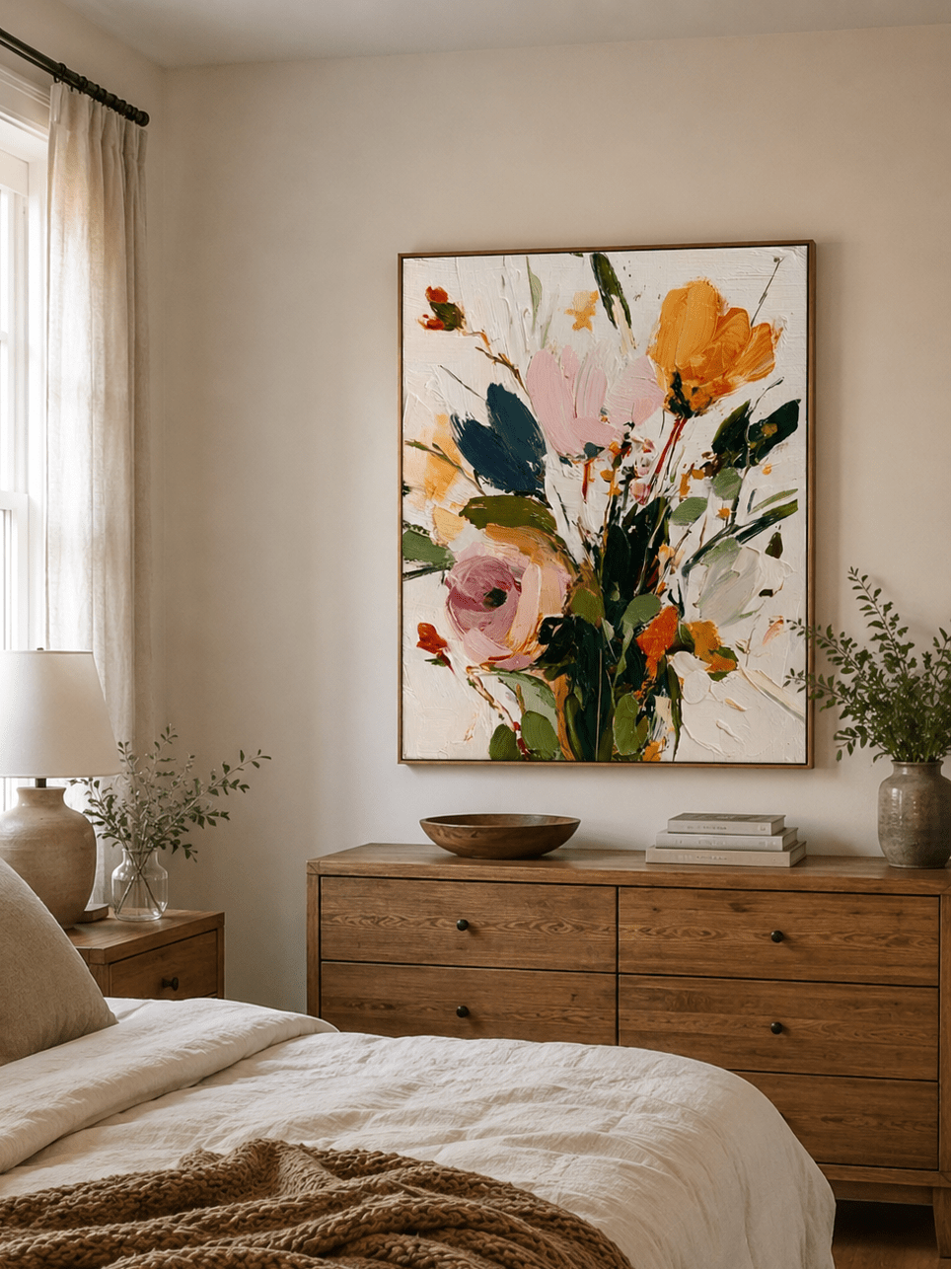
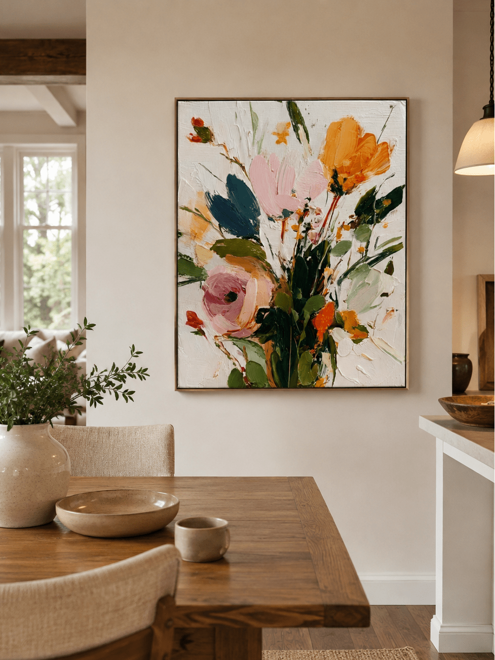
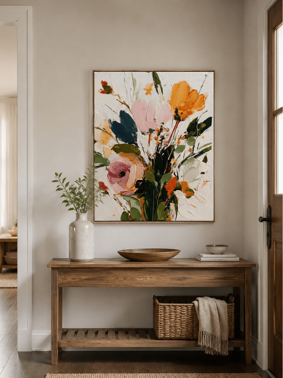
Abstract Textured Floral, LX#0322 brings pink, orange, yellow, and other floral colors to a light background. Beside monochrome photographs, it can supply most of the group's color. The photographs keep their own emotional focus while the painting sets a lively tone.
Give the vertical painting room on each side. Small photographs can gather beside it without needing to trace every edge or reach exactly the same height.
A figure drawing beside portraits
Minimalist Line Art, LP#0291 uses a spare figure outline on a light ground with dark accents. It relates to portrait photography through the human subject while using a different visual language. Its open areas offer breathing room beside closely cropped faces.
A small group of black-and-white photographs can pick up the dark linework. If you keep color photos, look for restrained backgrounds so the drawing does not become the least visible piece on the wall.

Build the layout before buying additional pieces
Lay the existing frames on the floor and use paper to represent the painting at its full outside dimensions. Photograph two or three arrangements from above. The photograph makes it easier to compare the overall shape without becoming absorbed in each individual image.
Next, transfer the arrangement to the wall with paper templates. Use a surface-safe method appropriate for the wall finish. Mark the furniture position and check the layout from both close range and across the room before installing hardware.
If the group looks unsettled, remove one piece first. A larger painting is not always the solution, and another small frame can make the problem harder to diagnose. Try reducing the number of frame finishes, shifting the anchor, or consolidating scattered photographs into a clear cluster.
Before ordering anything new, confirm:
- The outside dimensions of every frame, including mats.
- Which painting or photograph will be the first thing you notice.
- The relationship between the mat color and the artwork's background.
- Whether any lamps, doors, or furniture will obstruct the view.
Use WABI's hand-painted artwork selection to compare possible subjects after the layout is clear. The New Arrival collection can provide a new anchor, but the photographs you want to live with should remain part of the decision.
Gallery wall questions
Can you mix family photos with paintings?
Yes. Give the group a clear anchor and repeat a framing detail such as mat color or frame finish. Different subjects can work together when the spacing and relative sizes make the arrangement feel intentional.
Do all the frames on a gallery wall need to match?
No. A small number of repeated finishes is easier to organize than a different finish on every piece. Matching photo mats can also connect the group when the canvas has a different frame.
Should family photos be black and white on a gallery wall?
Only if you prefer that treatment. Monochrome can simplify a mixed group, but color photographs can relate to a painting through one shared tone. Keep colors that are meaningful to the photograph rather than converting everything automatically.
How do you add a painting to an existing photo wall?
Take down or template the current arrangement and test the painting as an anchor. You may need to remove or relocate a few photographs. Rebuilding the group usually gives a more coherent result than squeezing the canvas into the last available gap.
Keep room for the collection to change
A personal wall can grow slowly. Start with a composition that feels complete today, keep a few photographs available for rotation, and add a new piece when it contributes something you actually want to see. The connection between the images matters more than filling every inch.