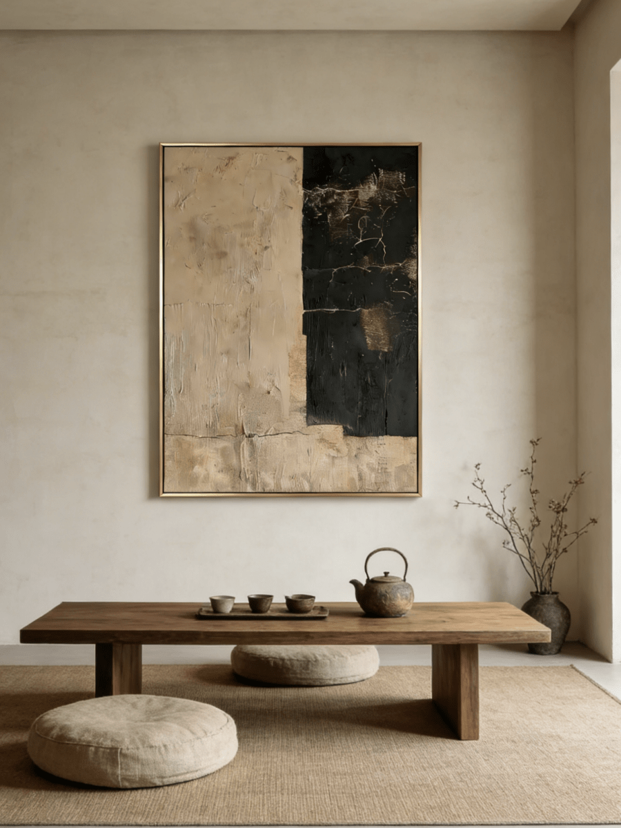
A neutral room can have every ingredient that should make it inviting—a beige sofa, pale walls, warm wood, linen curtains—and still feel unfinished. The problem is rarely that the room needs more beige. More often, it needs a clearer temperature, a deeper value, or a tactile surface that gives the eye somewhere to rest.
That is where earth-toned art becomes useful. Beige can soften; clay can add handmade warmth; terracotta can create a focal point; and brown can give the whole room weight. Learning how to decorate with earth tone wall art is less about matching swatches and more about choosing the role the artwork should play. This guide explains how those four color families behave, which walls and materials they complement, and how to keep a warm neutral interior layered rather than flat.

What Is Earth Tone Wall Art?
Earth tone wall art draws its palette from materials found in nature: soil, sand, clay, wood, stone, dried grasses, mineral pigments, and muted plant greens. The category includes more than brown. Creamy limestone, mushroom taupe, reddish terracotta, ochre, charcoal, olive, and weathered gray can all belong to an earthy palette when their saturation feels natural rather than synthetic.
The appeal of earthy wall art is its ability to bridge architecture and furnishings. A painting can repeat the warmth of an oak floor, introduce contrast to a cream sofa, or connect a gray wall to a walnut dining table. Because these colors already appear in common household materials, they tend to feel established rather than applied as a trend.
This makes earth tone wall art especially adaptable in modern homes. It adds softness to strict contemporary lines, warmth to minimalist spaces, material depth to organic interiors, and imperfect texture to wabi-sabi rooms. The goal is not to make every surface brown. It is to build a controlled relationship among warm, cool, light, dark, smooth, and tactile elements. WABI Wall Art’s live Earth-Tone Wall Art collection brings together clay, beige, umber, terracotta, and related grounded palettes for that purpose.
Understanding Different Earth Tone Colors in Wall Art
Beige, clay, terracotta, and brown overlap, but they do different work in a room. Before choosing a painting, decide whether you need the artwork to blend, warm, energize, or anchor the space.
Beige Wall Art: Soft, Calm, and Timeless
Beige is the lightest and most visually forgiving of the four families. It can lean creamy yellow, rosy sand, gray-taupe, or pale oatmeal. That undertone matters: a cool gray-beige painting may look dull beside honey oak, while a warm flax beige can make the same wood feel intentional.
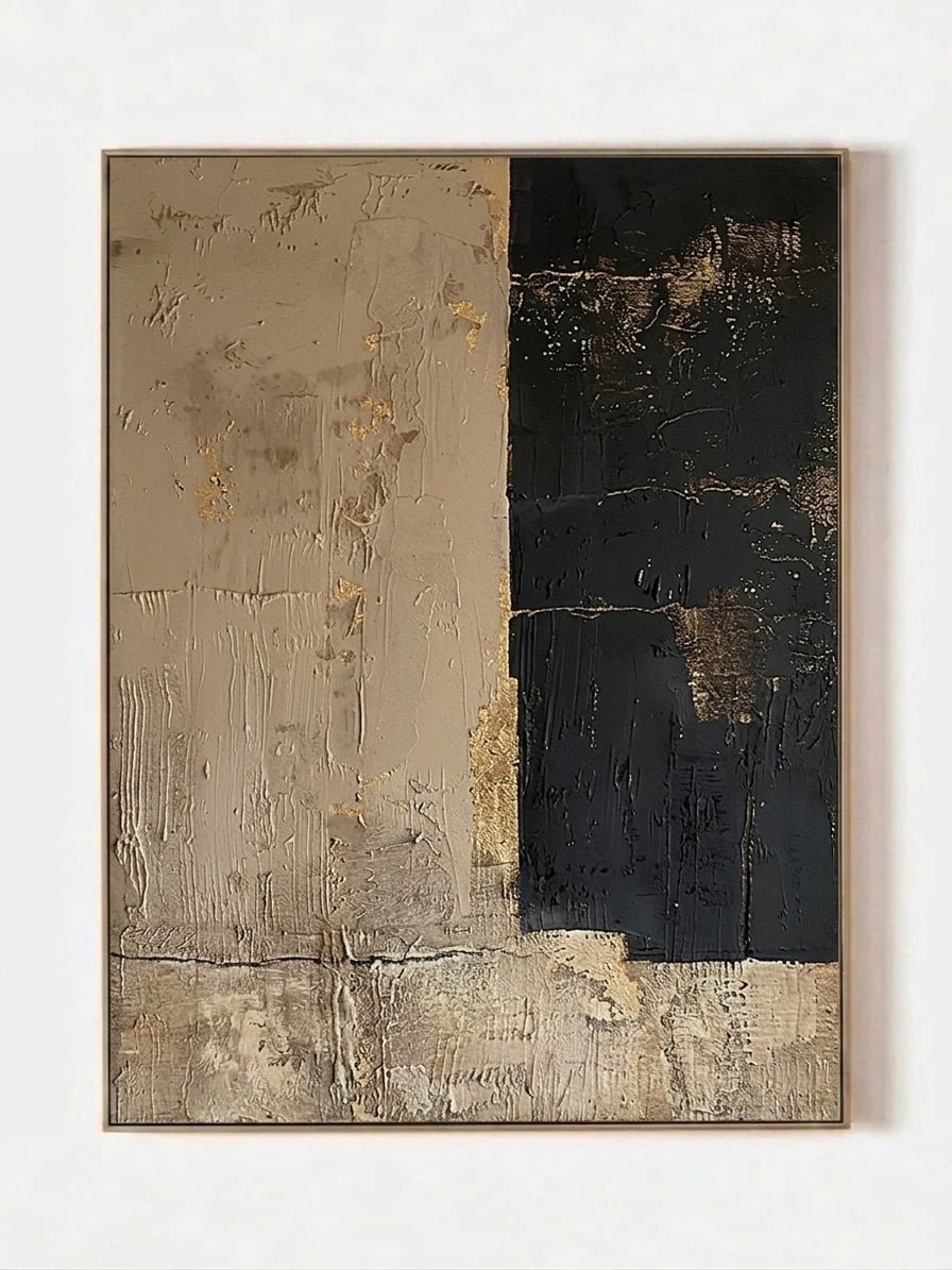
Beige art works well in Scandinavian interiors, minimalist homes, bedrooms, and quiet living rooms because it preserves brightness. To prevent it from disappearing against a pale wall, choose visible brushwork, relief, line work, or a frame with a little contrast. A composition such as Neutral Earth Tone Abstract Lines – SR#0123 uses white organic lines and layered oatmeal brush fields to create movement without raising the room’s visual volume.
Beige and brown wall art offers more definition than an all-beige canvas. The lighter field keeps the room open; the brown introduces enough value contrast to separate the artwork from cream upholstery and warm-white walls.
Clay Color Wall Art: Organic and Handcrafted
Clay color wall art usually sits between beige and terracotta. Think dried earthen plaster, muted adobe, putty, or soft cinnamon rather than bright orange. Clay often contains more red or brown than beige, but it remains quieter and dustier than classic terracotta.
Clay is particularly convincing in textured paintings because the color and surface tell the same story. It pairs naturally with limewash walls, oak, travertine, linen, boucle, woven wool, and handmade ceramics. The tone suggests warmth without demanding that the whole room become rustic.
Earthen Fold – LL#0301 is a good example for an organic modern living room: its monochrome clay-brown surface relies on sculptural shadow rather than multiple colors. It can hold attention in daylight while remaining quiet at night.
Terracotta Wall Art: A Warm Focal Point
Terracotta literally refers to baked earth, and as a color it usually falls between burnt orange and dusty red with a brown base. It is more saturated and assertive than clay. That extra chroma gives terracotta wall art the power to become the warm focal point in a living room, dining space, or relaxed boho interior.
Use terracotta where the room needs energy, not simply warmth. A mostly cream room may need only one concentrated terracotta field echoed by a small cushion, ceramic bowl, or rug detail. Repeating it everywhere can make the palette feel themed. Black, charcoal, deep walnut, olive, and warm white are useful counterweights.

Ember Horizon – AK#0315 demonstrates this balance. Its burnt-orange upper field supplies the focal color, while the charcoal base and pale horizon keep the result architectural rather than decorative.
Brown Wall Art: Grounded and Sophisticated
Brown is the anchoring color of an earth-tone palette. It can read as cocoa, tobacco, bronze, walnut, umber, or nearly black espresso. Darker browns add stability and formality; mid-tone browns feel warm and familiar; pale mushroom browns behave almost like beige.
Brown wall art is particularly effective with wood furniture and leather seating because it connects existing materials without copying them exactly. Avoid matching the artwork to one wood species. A walnut console can work with a warmer bronze canvas, while a pale oak room benefits from deeper umber or chocolate contrast.
Handmade Beige & Bronze Wabi-Sabi Textured Wall Art – EV#0071 uses a low-contrast brown grid to add depth without introducing a new accent color—useful in a bedroom or calm reading room.
How to Choose Earth Tone Wall Art for Your Home
The most dependable method for how to decorate with earth tone wall art is to evaluate the room before the artwork. Take a daylight photo, note the undertones of permanent finishes, and decide what is currently missing: warmth, contrast, texture, or scale.
1. Read the room’s light
North-facing and shaded rooms often make gray-beige and taupe appear cooler. A clay, ochre, or warm ivory painting can correct that temperature. Strong south- or west-facing light intensifies orange and red, so terracotta may feel bolder in the afternoon than it does on a product page. View your shortlist on a bright and cloudy day if possible.
2. Identify the wall undertone
Place a sheet of white paper against the wall. This simple comparison makes yellow, pink, green, and gray undertones easier to see. The artwork does not need to match, but it should either share the undertone or contrast deliberately. Warm clay can enliven a cool gray wall; a green-gray beige can bridge sage paint and pale wood.
3. Use furniture materials as evidence
Wood, leather, stone, metal, linen, and boucle already establish a palette. Select artwork that repeats one material color and adds one missing note. With a tan leather sofa and walnut table, for example, beige plus charcoal may be more useful than another solid brown.
4. Consider the flooring
Flooring is one of the room’s largest color fields. Honey oak, red oak, and terracotta tile reinforce warm pigments. Concrete, cool gray carpet, and pale stone can support clay as a warming counterpoint. If the floor is already dark, keep some ivory or open negative space in the artwork so the room does not become bottom-heavy.
5. Respect the existing style
Minimalist rooms usually need fewer colors and stronger composition. Wabi-sabi rooms can carry irregular texture and weathered surfaces. Mediterranean or boho spaces accept richer terracotta, while Scandinavian rooms often suit beige, muted brown, and small black accents. The Minimalist Wall Art collection is a useful direction when you want earth tones with cleaner forms and less visual information.
6. Choose scale before color nuance
An undersized painting will not anchor a room, no matter how perfect the palette is. Mark the listed dimensions with painter’s tape. Above furniture, a total artwork width around two-thirds to three-quarters of the furniture width is a practical starting point. On an open wall, preserve intentional breathing room and check the outline from the main entrance.
Earth Tone Wall Art for a Living Room
The living room is the most common setting for earth tone art for living room because it contains the widest mix of materials: upholstery, wood, rugs, tables, lighting, and often an open view into another space. A successful painting acts as the bridge among those finishes.
Above a Sofa
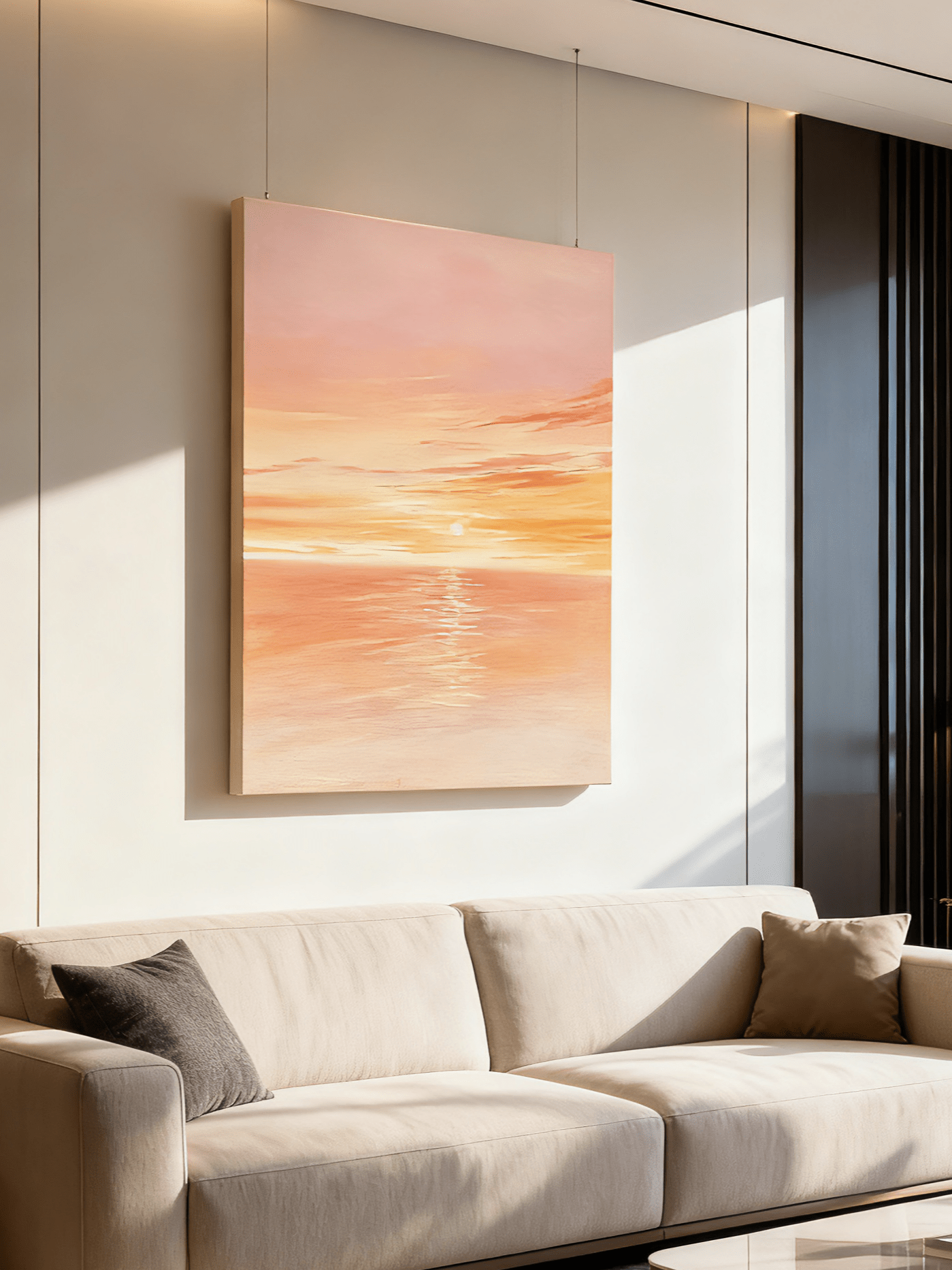
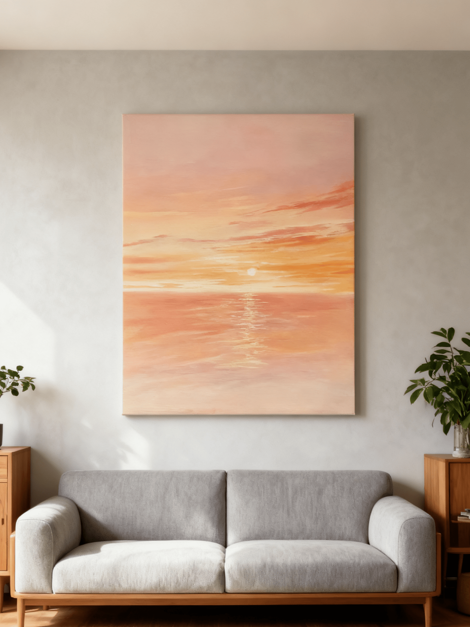
Center the artwork on the sofa, not automatically on the entire wall. Aim for an artwork width of roughly two-thirds to three-quarters of the sofa width. For a 96-inch sofa, that produces a useful target of about 64–72 inches. Leave approximately 6–10 inches between the sofa back and the lower frame so the two elements read as one arrangement.
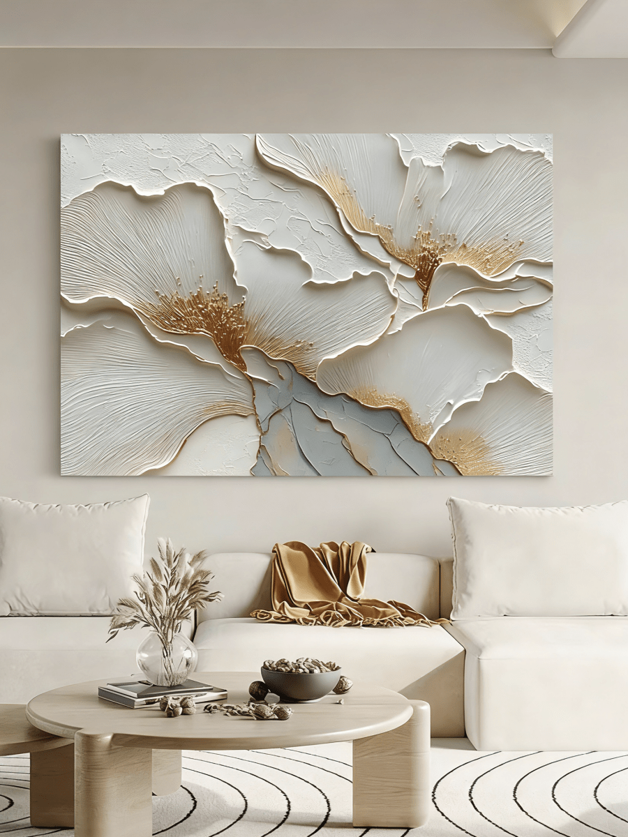
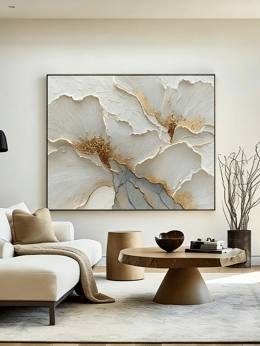
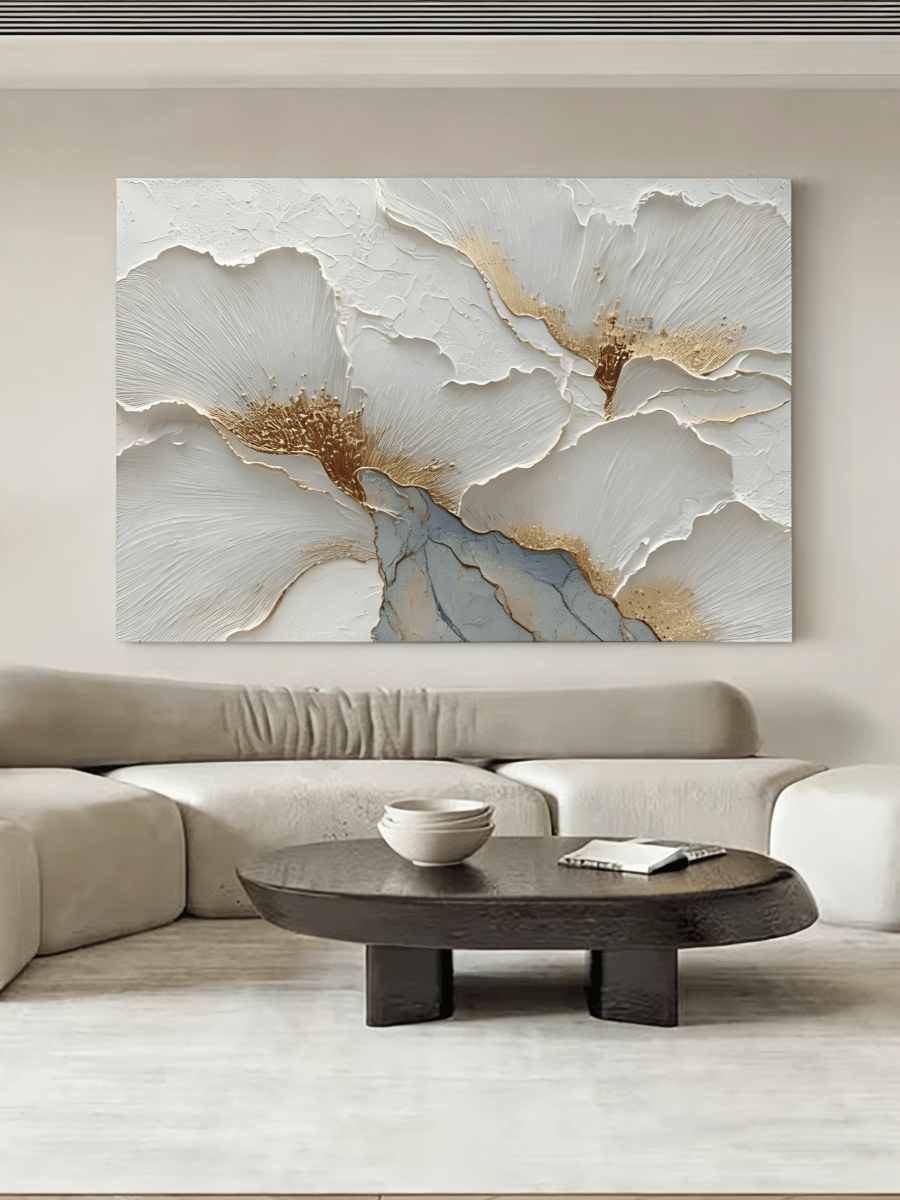
If the sofa is beige, ask what type of separation the wall needs. A dark umber or charcoal field creates graphic definition. Clay adds warmth with moderate contrast. A beige painting can still work, but it should offer heavy texture, distinct line work, or a darker frame. Earth Meets Ivory – LL#0302 combines brown and light relief so a neutral sofa wall feels layered rather than monochromatic.
For larger options in this color family, browse grounded earth-tone paintings for living rooms after measuring the sofa frame and usable wall width.
How to Match Earth Tone Wall Art With Wall Colors
White Walls
White provides the most flexibility, but determine whether it is crisp, creamy, or gray. Beige, brown, and clay all work on warm white. On a bright blue-white wall, include a pale neutral or charcoal transition so warm pigments do not look disconnected. A natural wood or black frame can make the relationship feel deliberate.
Warm Beige Walls
A warm beige wall already supplies softness, so the artwork should add a clearer value or temperature shift. Terracotta introduces energy; dark brown introduces depth; ivory relief catches light. Avoid a flat mid-beige canvas with no texture unless the frame supplies enough separation.
Gray Walls
Earth tones can warm gray without fighting it. Greige, taupe, clay, and mushroom are gentle transitions, while burnt orange creates stronger complementary tension against blue-gray. Repeat a little gray or charcoal inside the artwork so the new warmth feels connected to the wall.
Green Walls
Sage and olive walls naturally support an organic modern palette. Beige keeps the room light; terracotta creates a muted red-green contrast; dark brown repeats stems, soil, and wood. Keep one color quieter: deep olive plus vivid orange may feel heavy, while dusty sage plus soft clay remains calm.
How to Avoid a Room Feeling Too Neutral
An earth-tone room does not need to be a room in which every object is tan. The most convincing neutral interiors contain contrast in value, temperature, texture, and shape.
Add Black Contrast
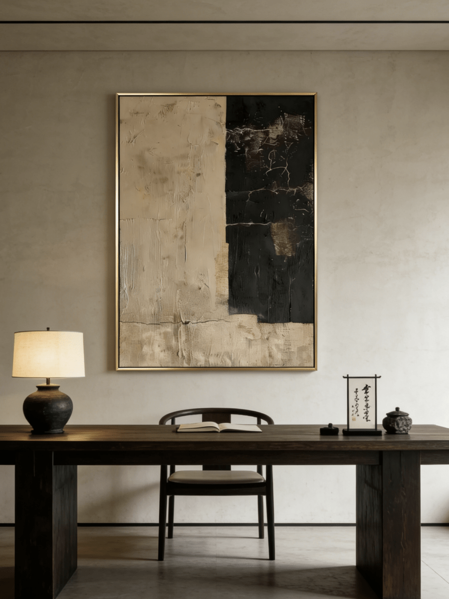
A thin black frame, charcoal horizon, black floor lamp, or dark side table gives pale colors an edge. Use black as punctuation rather than a second dominant palette. A few repeated points around the room are usually enough to make beige look intentional instead of washed out.
Add Green Elements
Plants, olive upholstery, or sage ceramics introduce a cool natural note without breaking the earthy mood. Green is particularly helpful when terracotta or warm wood begins to feel overly orange. One substantial plant often creates a cleaner result than many small accents.

Mix Textures
Texture is the main antidote to a flat neutral scheme. Combine linen with smooth wood, boucle with stone, woven wool with metal, and matte plaster with hand-painted relief. The colors can remain restrained because light changes across the surfaces. This is where handcrafted art provides more than a printed color field: raised paint and irregular marks remain visible as the room’s daylight shifts.
Earth Tone Wall Art and Organic Modern Interior Design
Organic modern wall art balances the clarity of modern design with natural material, softness, and irregular form. Earth tones are central because they connect clean architecture to oak, walnut, stone, linen, wool, plaster, and greenery.
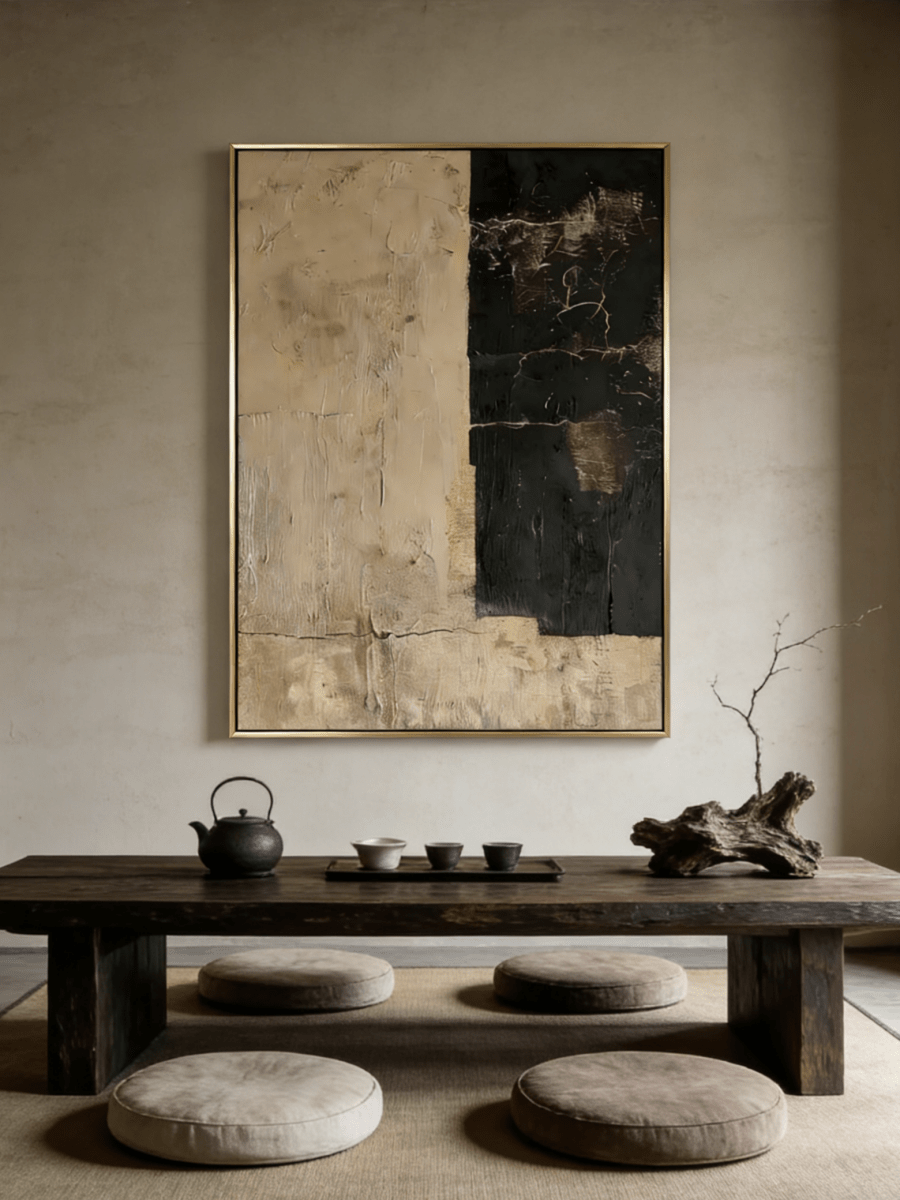
The artwork should not duplicate every material. Instead, let it translate them. A clay relief can echo a plaster wall; a beige linear composition can answer wood grain; an abstract brown-and-ivory boundary can repeat the meeting of stone and textile. Hand-applied texture introduces evidence of process, which prevents modern furniture from feeling mass-produced or impersonal.

If your room already uses curved furniture and natural finishes, the Wabi-Sabi Wall Art collection offers texture and imperfect geometry that can keep the result relaxed rather than overly polished.
Why Wabi-Sabi and Earth Tone Wall Art Work Together
Wabi-sabi values simplicity, natural change, irregularity, and beauty that does not depend on perfect symmetry. Earth colors support that idea because they are familiar from weathered stone, oxidized metal, soil, clay, wood, and plaster. Subtle variation looks appropriate rather than defective.
For this pairing, look for visible handwork: uneven boundaries, scumbled pigments, relief, scraped marks, or imperfect grids. Keep surrounding accessories edited so the art’s surface can be appreciated. A room with one textured statement work, one ceramic vessel, and natural linen often feels richer than a room filled with many small “earthy” decorations.
Explore hand-painted wabi-sabi compositions in natural colors when tactile depth matters more than a bold multicolor palette.
Best Rooms for Earth Tone Wall Art
Living Room
Choose clay, terracotta, or brown when the seating wall needs an anchor. Beige works when texture is pronounced. Use a horizontal piece over a long sofa or one substantial vertical/square work when the wall has generous height.
Bedroom
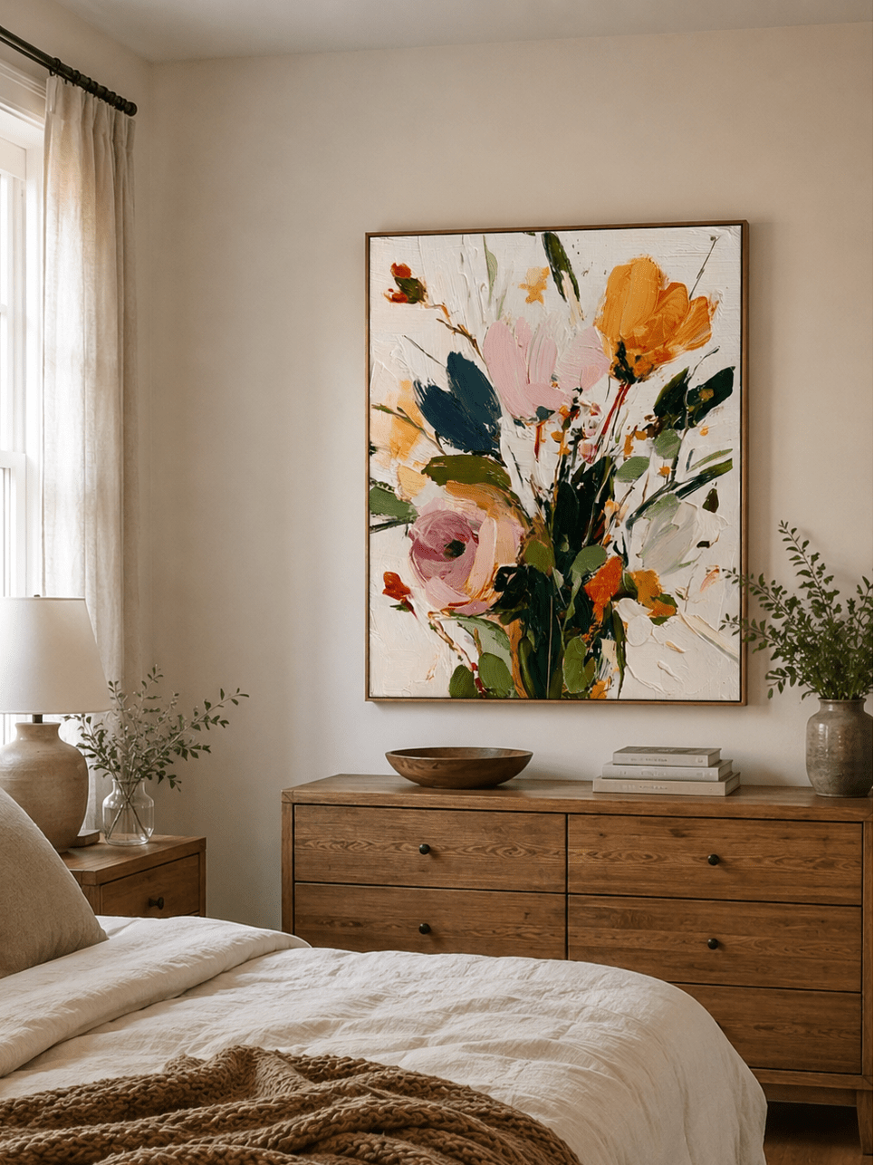
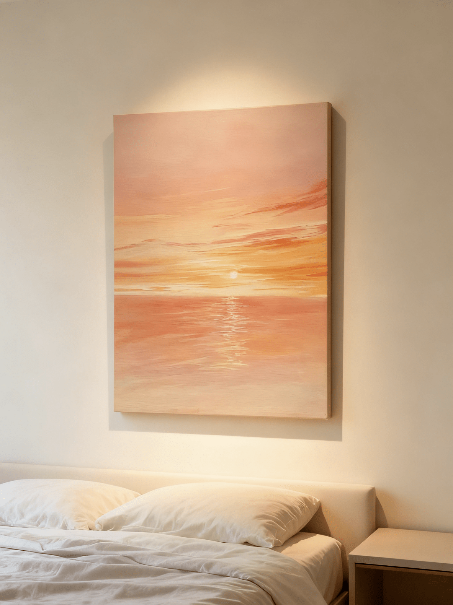
Favor low-contrast beige, mushroom, bronze, and soft brown. Measure the headboard and keep the lower frame around 6–10 inches above it. A square tactile composition can feel especially settled over a queen bed.

Dining Room
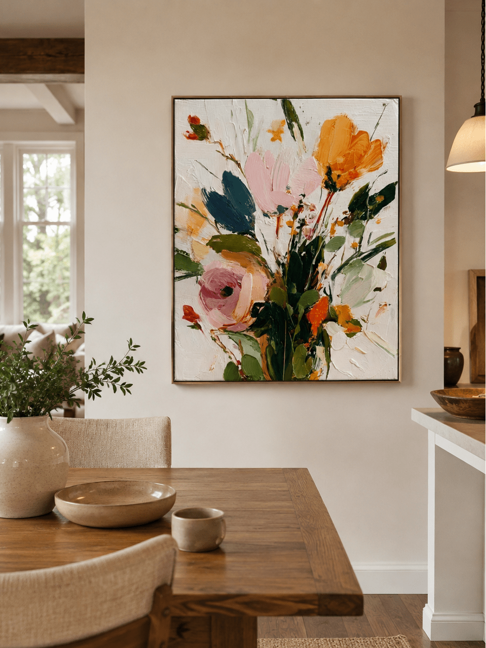
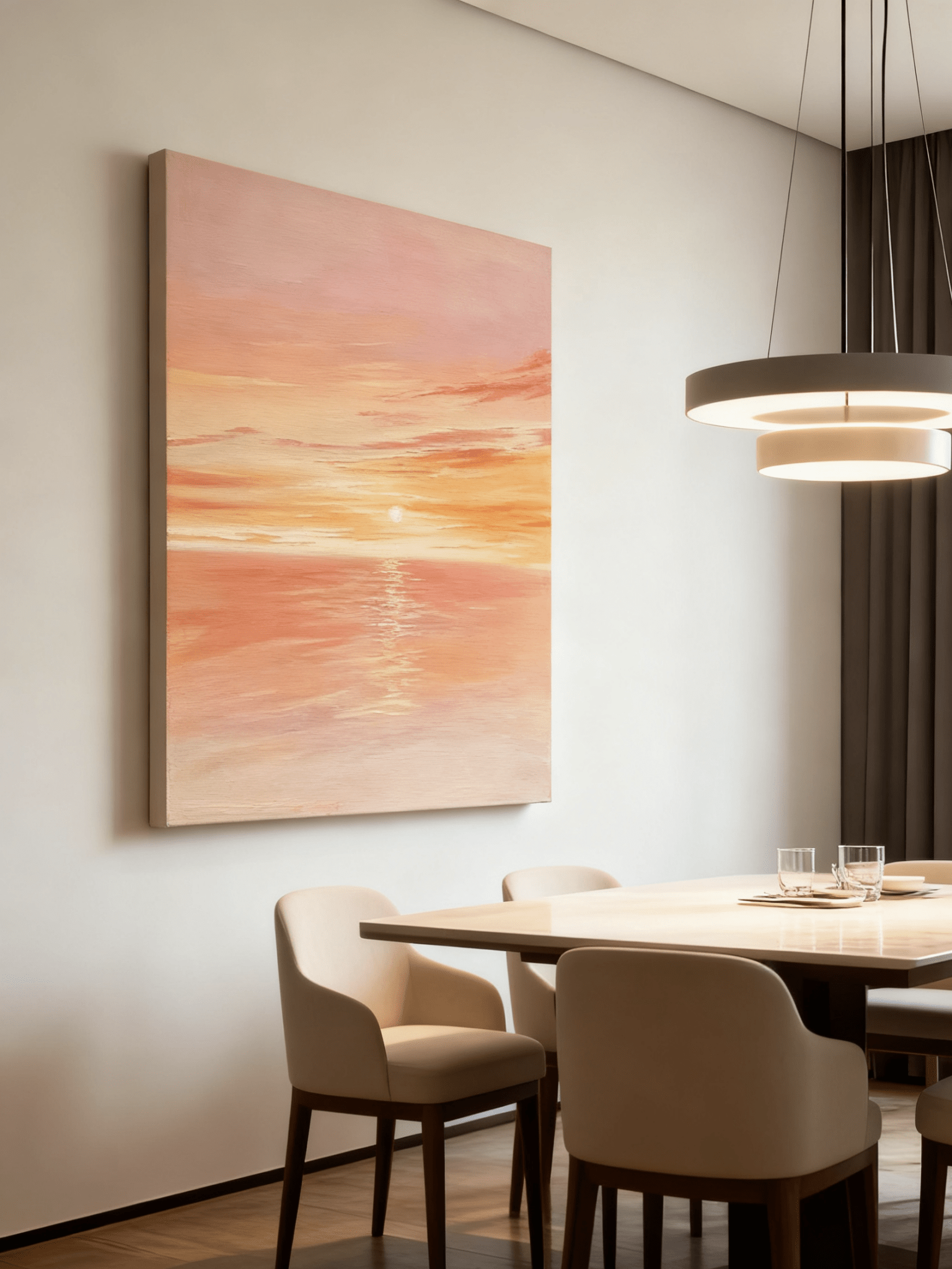
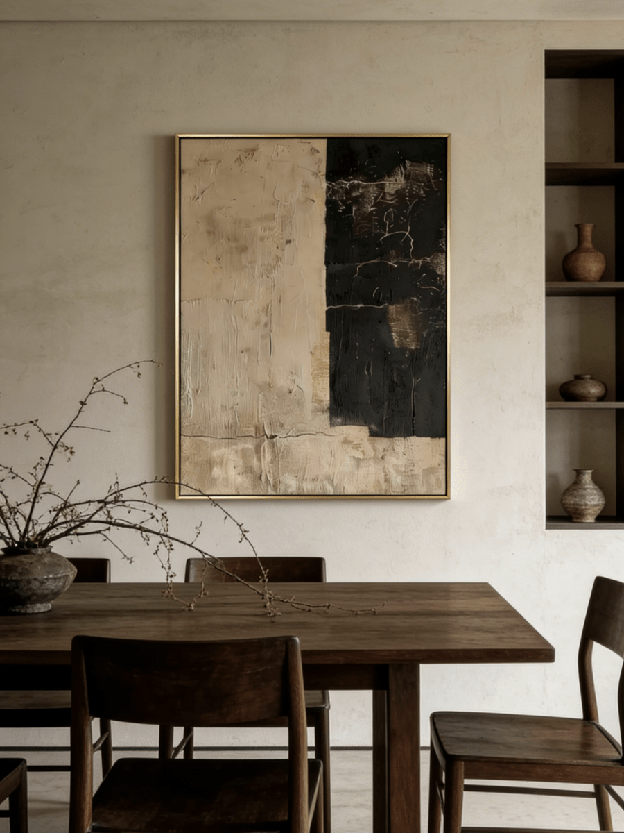
Dining spaces can support stronger terracotta, umber, and charcoal because they are active rooms viewed under evening light. A wide painting can echo a long table or sideboard. Check reflections from pendants and choose tactile matte surfaces when glare is a concern.
Entryway
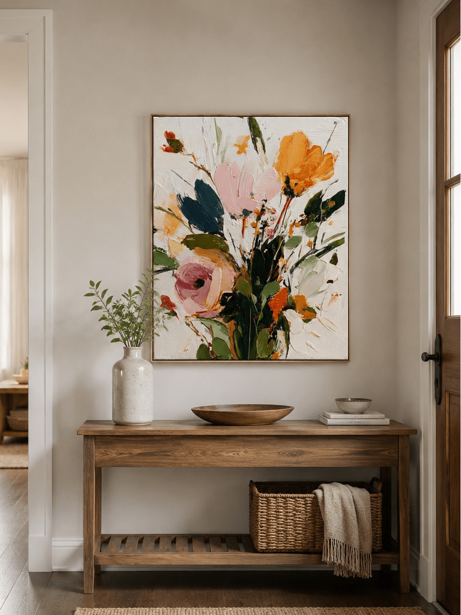
The entryway benefits from a clear first impression. A vertical clay relief or minimalist beige composition works above a console; target roughly two-thirds of the console width and leave enough surface space for a lamp or bowl without crowding the frame.
For quieter entryways and bedrooms, explore minimalist wall art with restrained palettes. For richer living and dining rooms, the Earth-Tone Wall Art collection offers a broader range of terracotta, clay, beige, and umber directions.
Final Thoughts
Earth tone wall art creates a warm, timeless interior when each color has a job. Beige softens, clay adds organic warmth, terracotta focuses attention, and brown anchors. Choose the role first, then verify the undertone in your room’s actual light, relate the artwork to permanent materials, and size it to the furniture beneath it.
If a neutral room feels dull, do not assume it needs a bright color. It may need a darker value, a cooler green note, a black edge, or a more tactile surface. Start with the room’s missing contrast and browse WABI Wall Art’s curated earth-tone paintings, wabi-sabi works, and minimalist compositions with your measurements and material samples nearby.
Frequently Asked Questions
What is earth tone wall art?
Earth tone wall art uses colors associated with soil, sand, clay, wood, stone, and muted plant life. Common tones include beige, terracotta, umber, brown, ochre, olive, charcoal, and warm gray.
How do you decorate with earth tone wall art?
Identify the room’s undertones and materials, then choose art that adds the missing warmth, contrast, or texture. Repeat one artwork color in a small accessory and size the piece to the furniture beneath it.
Is earth tone wall art good for living rooms?
Yes. Earth tone art can connect upholstery, wood, rugs, stone, and metal in a living room. Above a sofa, aim for artwork around two-thirds to three-quarters of the sofa width.
What colors go well with beige wall art?
Beige wall art pairs well with warm white, walnut, black, charcoal, olive, sage, terracotta, and muted bronze. Use texture or a contrasting frame if both the artwork and wall are pale.
What is the difference between clay and terracotta colors?
Clay is usually softer, dustier, and closer to muted beige or adobe. Terracotta is a more saturated baked-earth color between burnt orange and dusty red, usually with a brown base.
How do you style terracotta wall art?
Use terracotta as a focused accent and balance it with cream, charcoal, black, walnut, olive, or sage. Repeat the color once in a small textile or ceramic rather than throughout the entire room.
Can earth tone artwork work in modern homes?
Yes. Earth tones soften modern architecture and connect clean-lined furniture to natural materials. Minimal compositions and sculptural texture are especially effective in contemporary and organic modern rooms.
How do you prevent neutral rooms from looking boring?
Vary value, temperature, texture, and shape. Add a dark frame or light fixture, green foliage, wood, stone, linen, and textured artwork instead of relying on many nearly identical beige surfaces.
Does earth tone art work with wooden furniture?
Yes. Choose art that relates to the wood without matching it exactly. Pale oak benefits from umber or terracotta contrast, while dark walnut can be balanced with ivory, beige, clay, or muted bronze.
Where can I buy handmade earth tone wall art?
WABI Wall Art offers hand-painted earth-tone, wabi-sabi, textured, and minimalist artwork in multiple sizes and framing options for living rooms, bedrooms, dining rooms, and entryways.