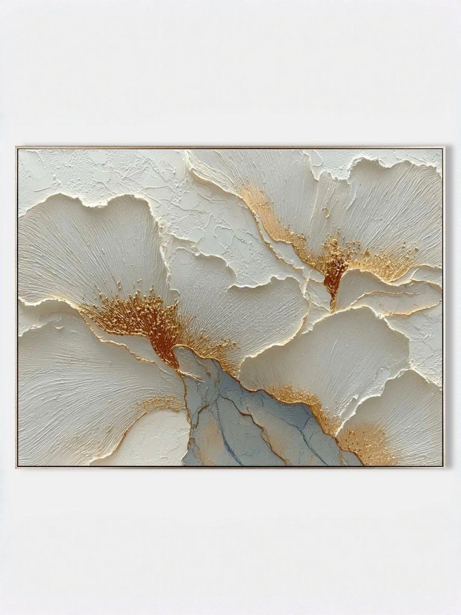
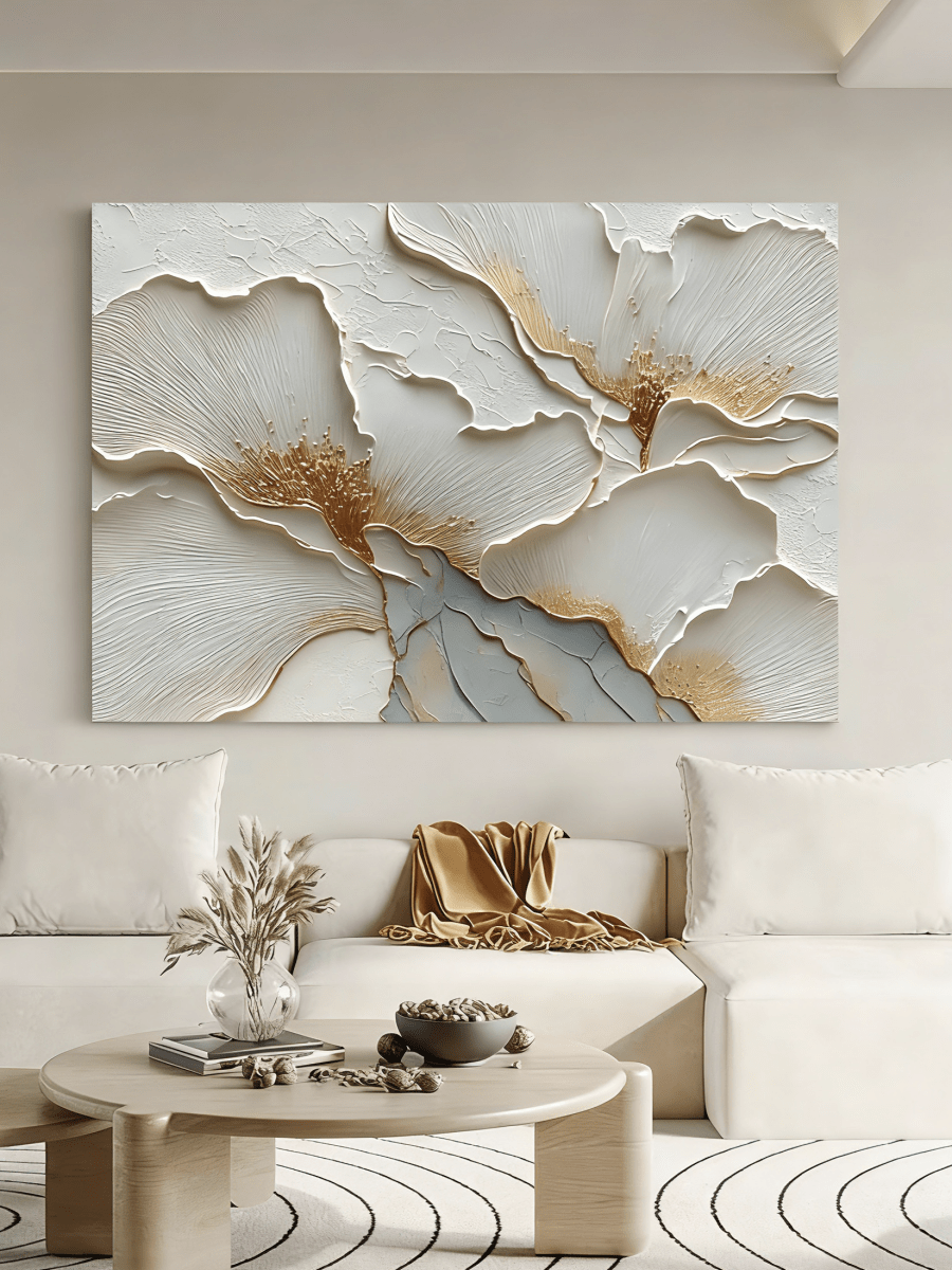
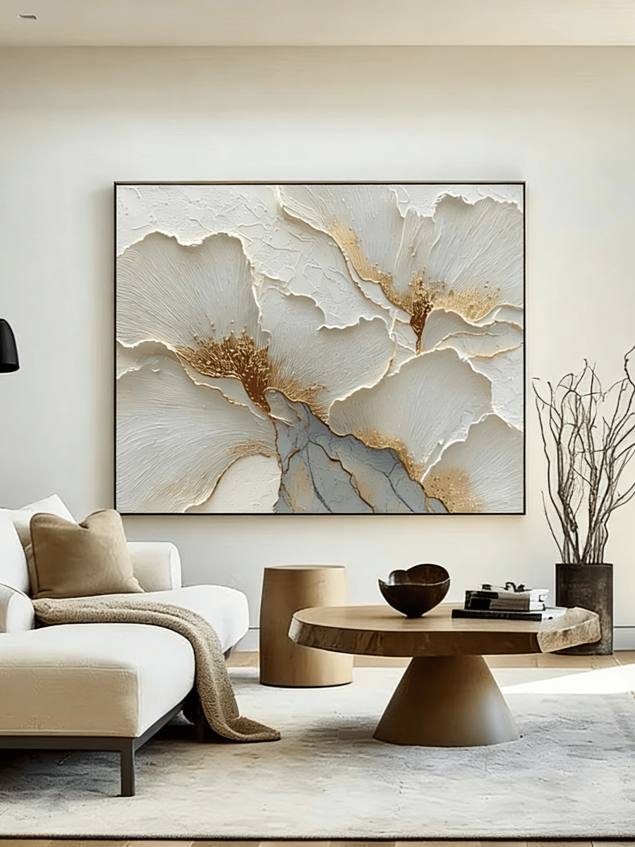
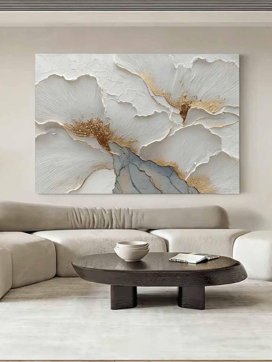
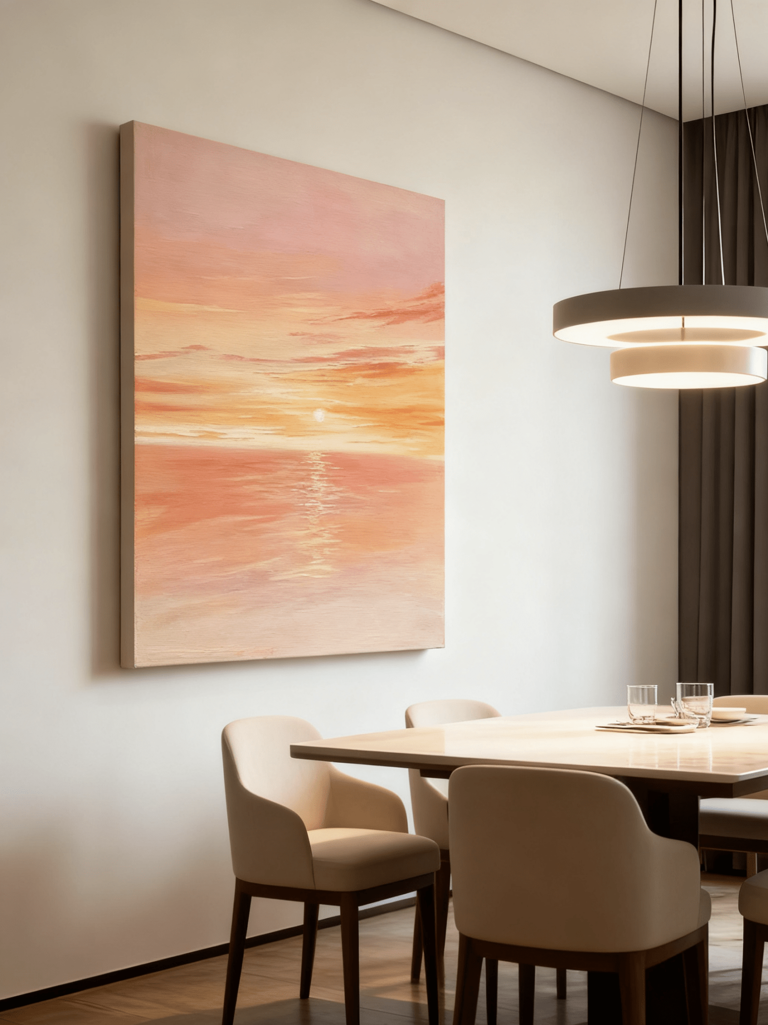
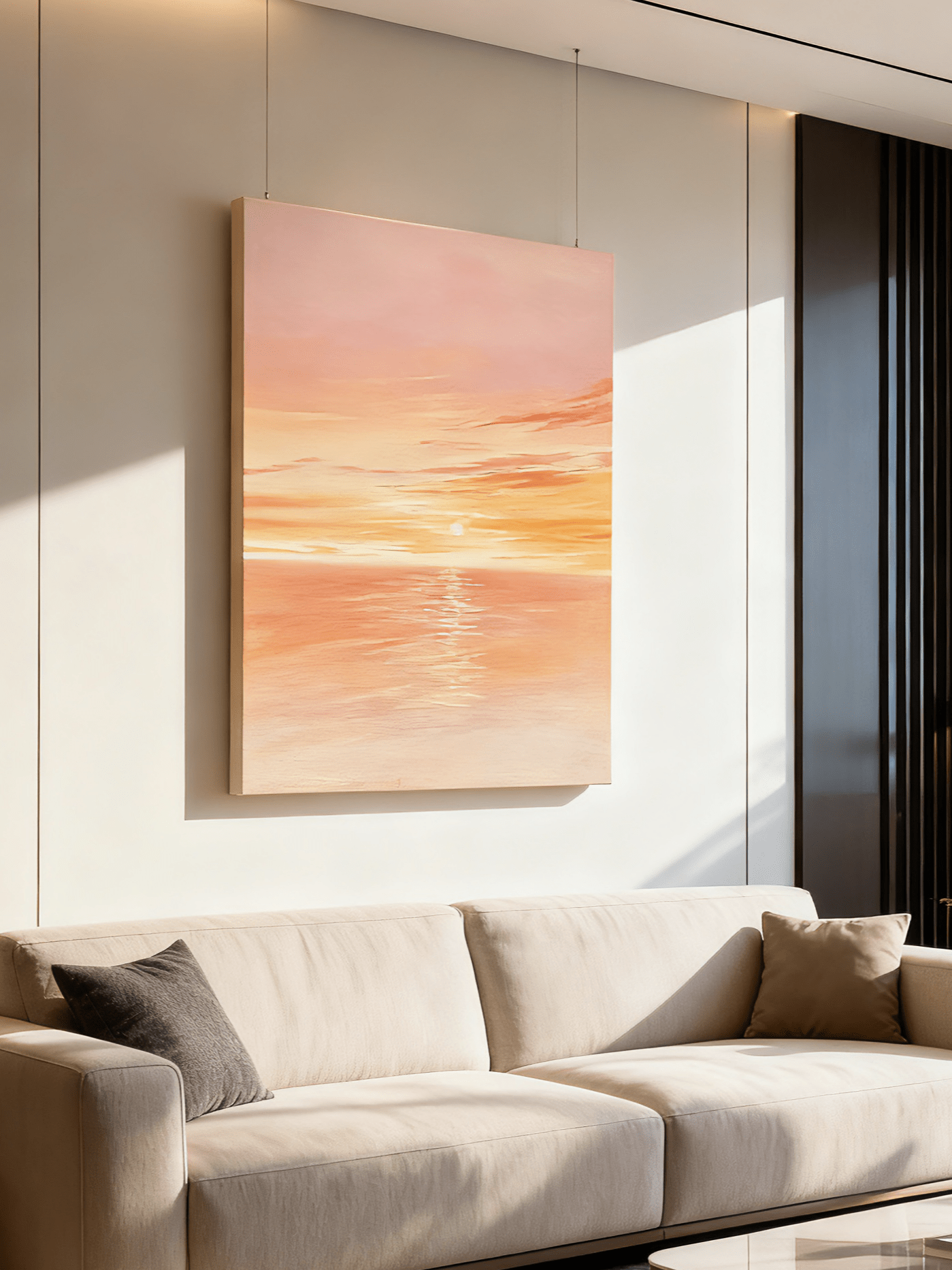
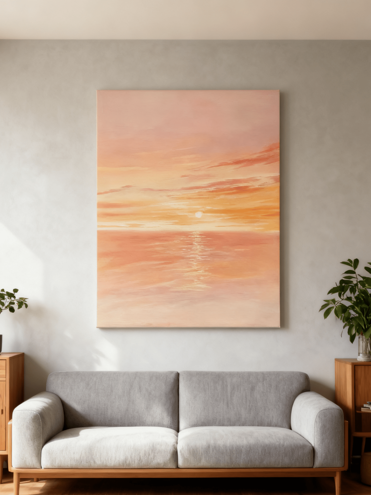
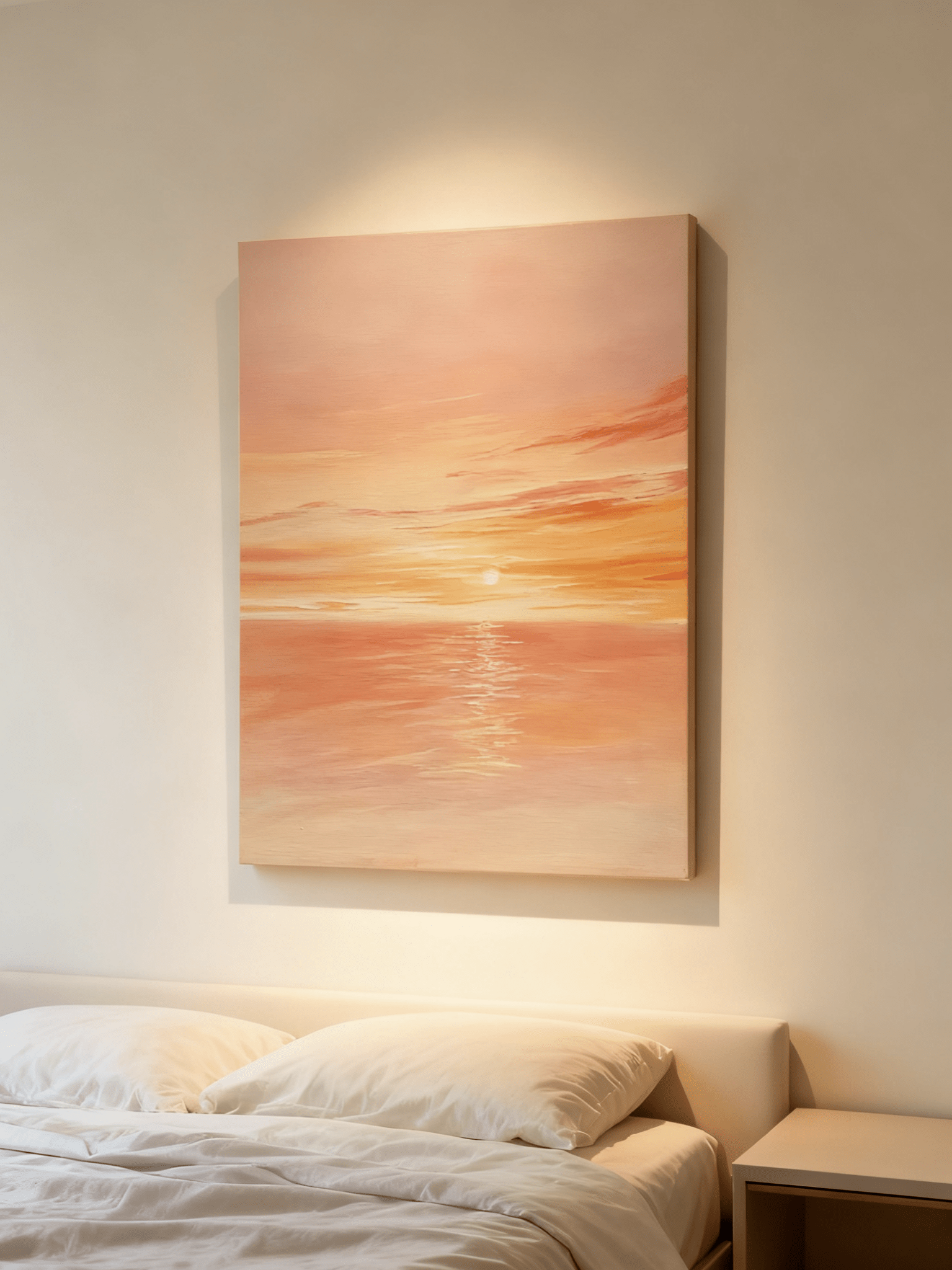
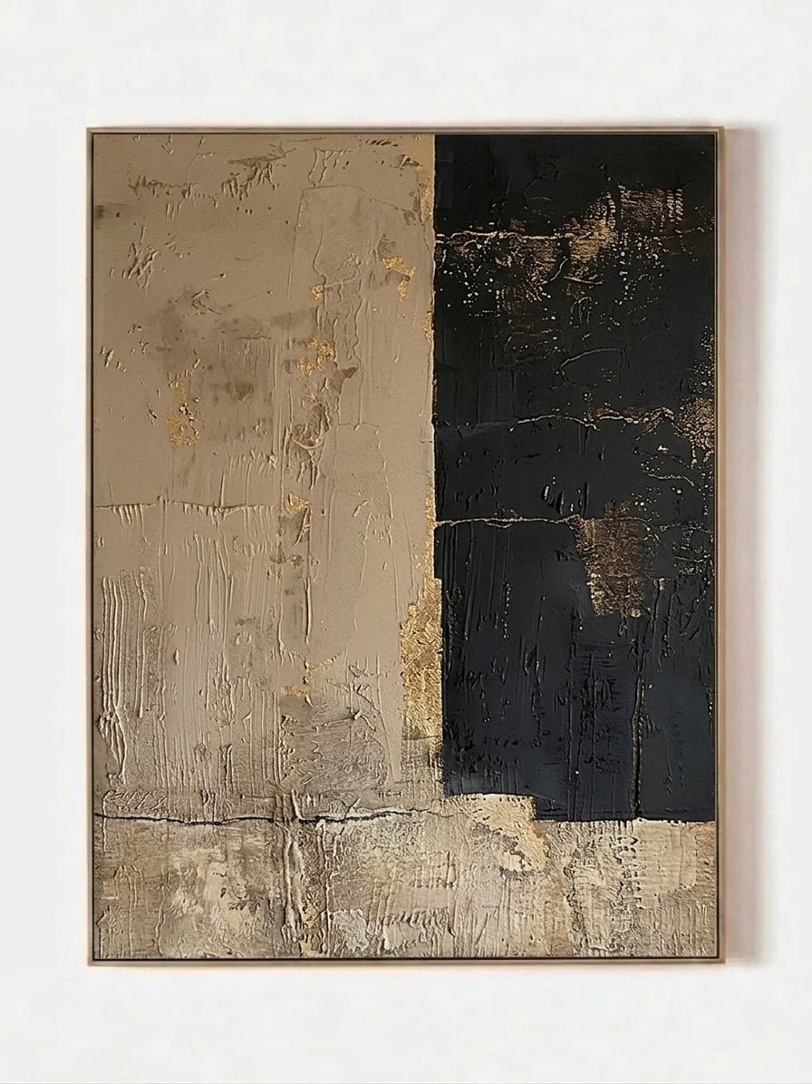
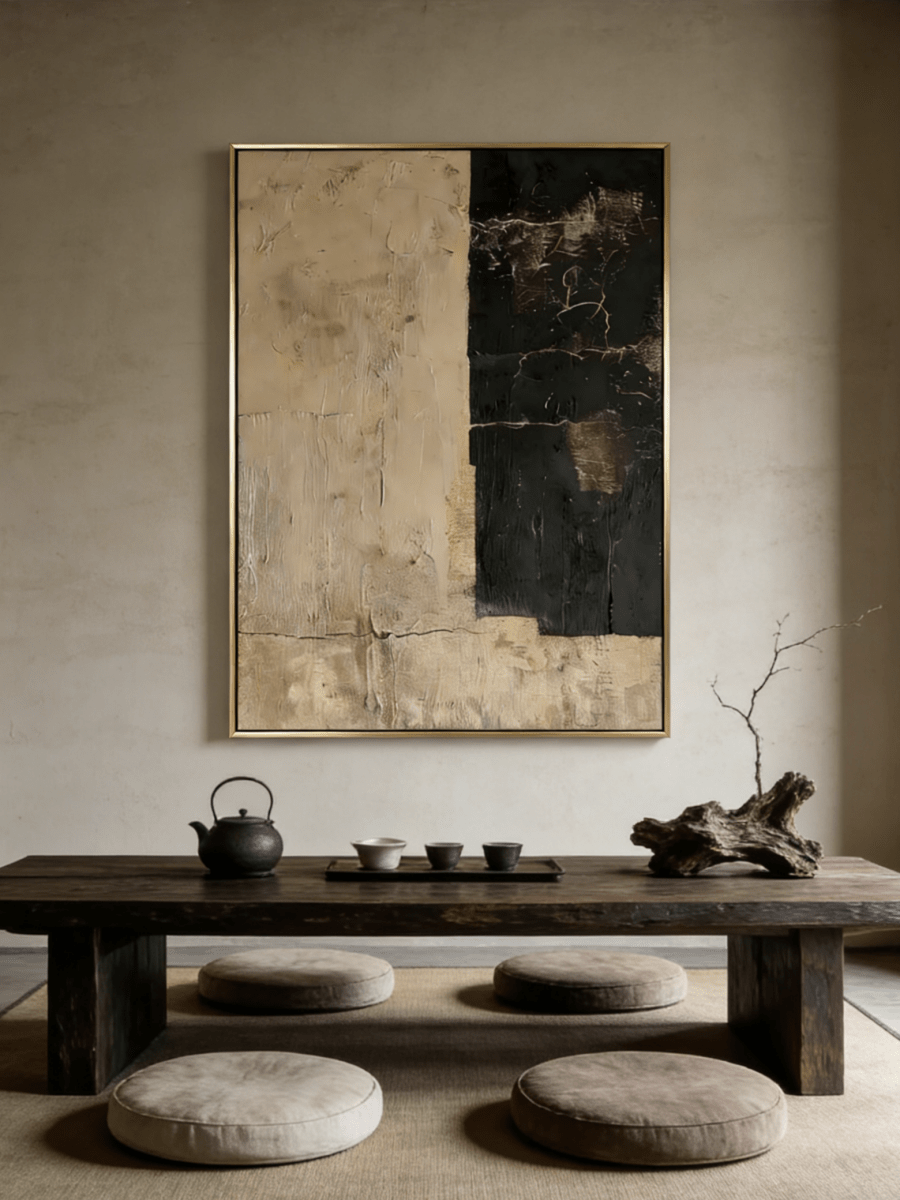
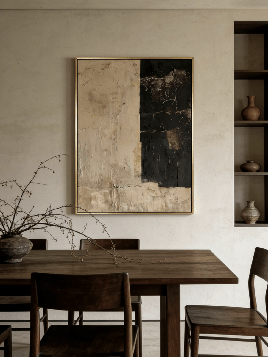
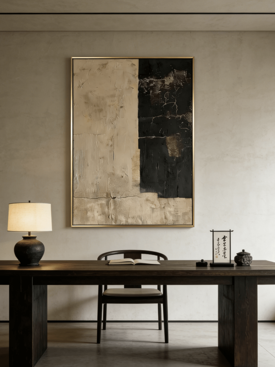
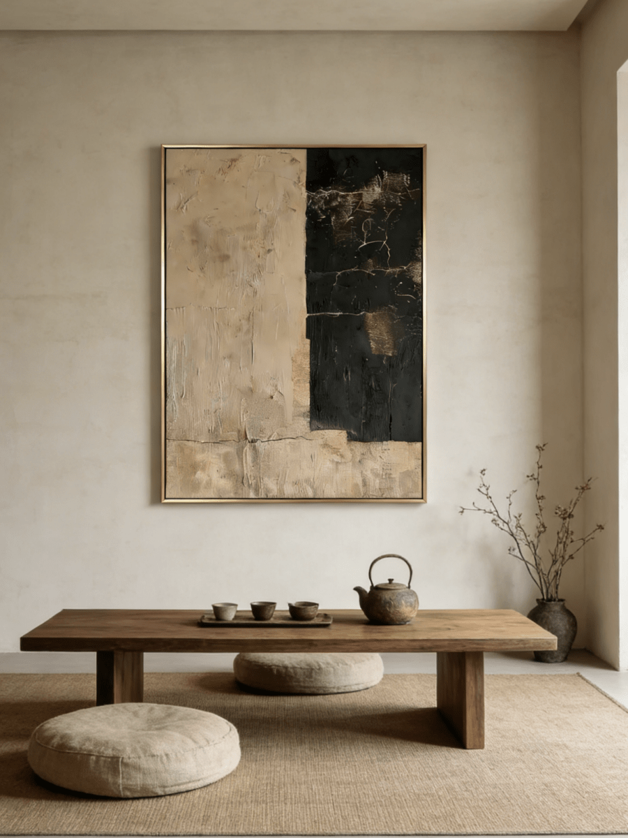
Buying original art online is wonderfully convenient, but it asks you to make a visual decision through a device. That naturally leads to one important question: Will the painting look exactly like the picture on my screen?
The honest answer is that a well-made product photograph can be a very useful representation, but a screen is not the artwork. The color accuracy of paintings purchased online depends on four connected factors: how the work was photographed, how your device displays the file, the light in which you view the physical painting, and the hand-mixed materials on its surface.
This does not make online art buying a guessing game. It simply means color should be evaluated as a range of evidence rather than from one bright thumbnail. In this guide, you will learn why painting color online vs real life can differ slightly, what to inspect before ordering, how to use approval photographs, and how to separate authentic handmade variation from a genuine mismatch.

Why Do Painting Colors Look Different Online?
A photographed painting passes through a chain of interpretation. The camera records reflected light. Editing software translates that record into a digital file. A website prepares the file for browsers, and your phone, laptop, or monitor emits its own light to display it. The physical artwork, by contrast, reflects the light already present in your room.
Every link in that chain can influence apparent color. Professional photography and color management reduce unnecessary variation, but no seller can control the brightness, display mode, age, or ambient lighting of every buyer’s device. This is why two people can open the same product page at the same time and describe the image differently.
Screen Technology
An iPhone, Android phone, office laptop, gaming monitor, and professionally calibrated display can render the same RGB file with different contrast, black depth, saturation, and white point. Some modern phone screens favor vivid color because it looks appealing; an older laptop may have a narrower color range and weaker contrast. Viewing angle can also affect many laptop panels, making a pale beige look warmer or grayer when the screen is tilted.
Color-management systems use device profiles to translate image values for a particular display. The International Color Consortium’s color-management guidance explains that cameras and displays need profiles to relate device data to a standard color space. In ordinary use, however, many buyers do not work on calibrated monitors—and they should not need professional equipment to make a sensible art choice.
Screen Brightness
Brightness changes more than how light the image looks. At maximum brightness, pale highlights may appear cleaner, metallic accents more luminous, and saturated colors more energetic. On a dim screen, shadow detail can close up and midtones can seem heavier. Automatic brightness may change the image while you move between a window and a darker room.
Before judging a painting, set the screen to a comfortable middle brightness. Avoid comparing it in direct sun, where you may compensate by turning the display unusually bright. Also check that battery-saving mode has not dimmed or altered your screen.
Color Temperature
A display can lean warm, making whites look creamier, or cool, making them look slightly blue. Features such as Night Shift intentionally warm the screen; adaptive display modes may adjust both color and intensity to match ambient light. Apple, for example, explains that True Tone and Night Shift can alter display color temperature.
For a useful comparison, turn off strong night-reading modes temporarily and view the product on at least two devices if possible. The goal is not to identify one screen as perfectly “correct.” It is to notice which color relationships remain consistent: Is the green muted or vivid? Is the background warm ivory or stark white? Is the gold a dominant field or a small accent?
How Lighting Changes the Appearance of Artwork
A screen produces light. A painting reveals color by reflecting light. That distinction is central to artwork color accuracy. The pigment has not changed when you move the painting from morning daylight to an evening lamp, but the mix of wavelengths reaching the surface has changed. Texture, sheen, and metallic material can amplify the difference.
Natural Daylight
Soft indirect daylight is usually the most informative condition for reviewing a new painting. It tends to make relationships among off-white, gray, blue, green, and earth tones easier to compare. Daylight is not constant, however. A north-facing room often provides softer, steadier illumination, while late-afternoon sun can become warmer and more directional.
Direct sun is not a good long-term display condition. It creates glare, exaggerates relief shadows, and can contribute to fading over time. The Canadian Conservation Institute notes that visible and ultraviolet light exposure can alter sensitive pigments and recommends controlling both intensity and duration. Use bright indirect light for inspection, then choose a wall protected from prolonged direct sunlight.

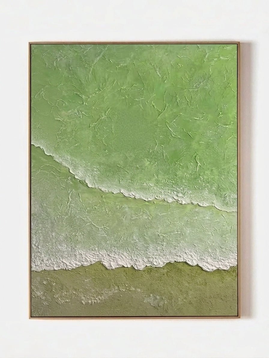
The olive-green relief in Wabi-Sabi Sage Green Abstract Forest Wall Art – AK#0041 is a useful example. Near a bright window, the green reads clearly against the white and gray field. In a darker corner, the same raised green can appear deeper because its shadows become more prominent.
Warm Indoor Lighting
Warm household bulbs—commonly around 2700K to 3000K—tend to reinforce cream, beige, terracotta, blush, and gold. Blue and cool gray may feel more subdued. A painting selected on a cool phone screen can therefore look unexpectedly cozy when installed beside a shaded evening lamp.
Color temperature is only part of lighting quality. Color rendering describes how faithfully a source reveals the colors of objects. The U.S. Department of Energy distinguishes a lamp’s warm or cool appearance from its color fidelity and notes that lighting products can vary substantially in color quality. For rooms where art matters, a good-quality, high-color-rendering lamp is usually more useful than choosing by Kelvin alone.

With Modern Blush Pink and Gold Leaf Abstract Painting – EL#0163, warm side lighting increases the visual warmth of the blush passages and makes metallic details catch the eye. Neutral daylight gives a more restrained reading. Both are valid views of the same material object.
Cool Lighting
Cooler lamps can make whites feel crisper and strengthen blue or green, while reducing the perceived warmth of beige, clay, or gold. Low-quality cool LEDs may also flatten subtle colors. If your home uses cool overhead lighting, compare the artwork in that condition before deciding whether its palette works with the room.
A practical approach is to judge the painting twice: once in indirect daytime light and once under the lamps you actually use at night. Art lives in changing light, so a palette that remains pleasing in both conditions is often a stronger choice than one optimized for a single product photo.
Why Handmade Paintings Have Natural Color Variation
A hand-painted artwork is not produced by instructing a printer to repeat identical color values. The artist mixes pigments, moves a brush or palette knife, builds layers, and adjusts relationships by eye. Even when a made-to-order painting follows a reference composition, the process creates small, meaningful differences.
Handmade painting color variation can come from several sources:
- Hand-mixed pigments: a warm gray may be mixed from several colors rather than taken from one fixed digital code.
- Brush and palette-knife movement: a thin edge reflects light differently from a thick ridge.
- Paint thickness: opaque impasto and translucent passages can make the same pigment family appear different.
- Canvas absorption and ground: the prepared surface influences how paint settles and how matte or saturated it looks.
- Natural material behavior: metallic leaf, mineral texture, and layered mediums respond differently to angle and light.
These variations are evidence of making, not evidence that color standards are irrelevant. The overall palette, principal shapes, visual temperature, and major color blocks should still correspond to what was ordered and approved. Authenticity is not a license for a seller to substitute a different design.
The dimensional surf in Modern 3D Textured Ocean Beach Canvas Art – LL#0218 demonstrates why a single front photograph cannot communicate everything. Small differences in sculpted white edges create different shadows, yet the turquoise-water, terracotta-sand, and white-foam relationships remain recognizable.

Painting Approval Photos: Why They Matter Before Shipping
Listing photographs show the design and expected palette. Painting approval photos show the specific completed artwork made for your order. That makes them a valuable final checkpoint, particularly for made-to-order, customized, and heavily textured pieces.
WABI Wall Art’s review sequence is designed to keep the buyer involved:
- The artist completes the handmade artwork, typically within the stated production window.
- High-resolution photographs or videos of the finished painting are sent to the customer.
- The customer reviews the palette, composition, texture, and requested details and communicates any questions.
- After confirmation, the selected framing is completed and the artwork is professionally packed and shipped.
Approval photographs are generally closer to the final work than a general listing image because they document the actual piece. They are still photographs viewed on your screen, so use the same sensible viewing method: moderate brightness, night modes off, and more than one device when a subtle shade is important.

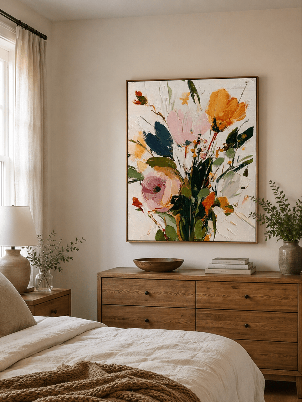
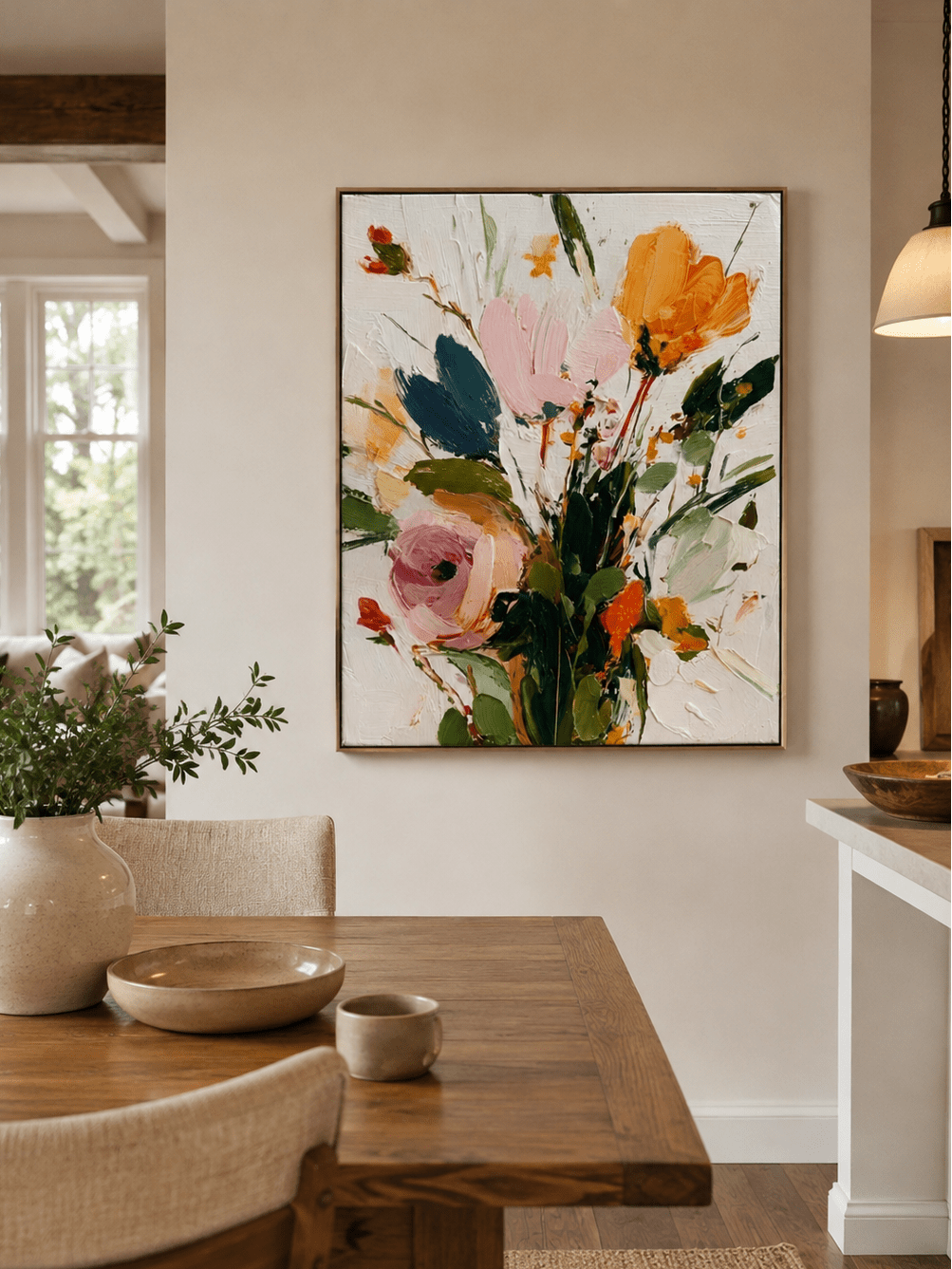
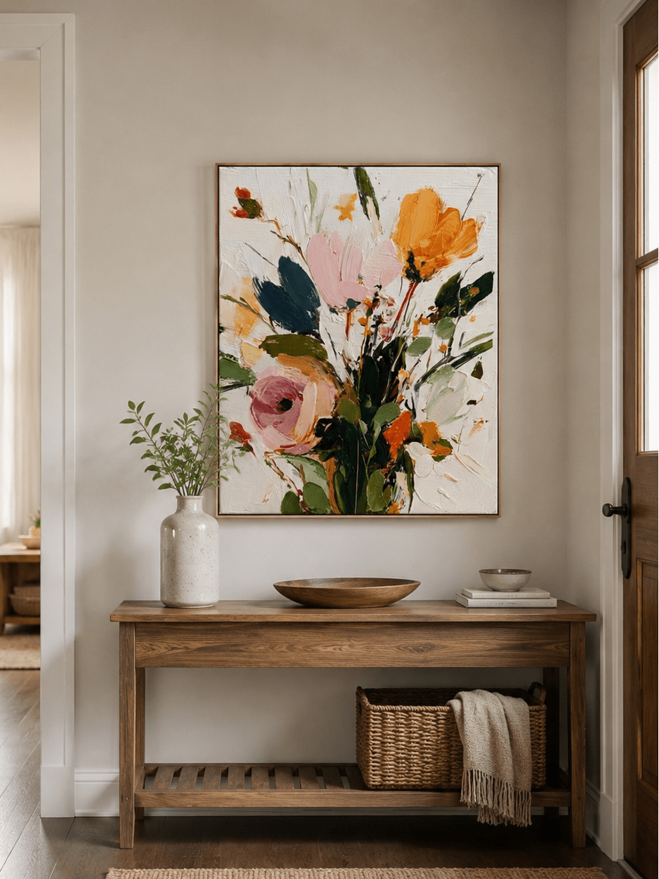
A work such as 3D Heavy Textured Flower Painting – LX#0012 benefits from both a straight-on photograph and a closer angled view. The first confirms flower placement and overall color balance; the second reveals the thickness of pink, orange, white, green, and blue-green strokes.
What Details Should Buyers Check Before Ordering Artwork Online?
Do not ask one product image to answer every question. A dependable decision comes from combining the main image, close views, room examples, written palette, dimensions, and the seller’s review process.
Overall Color Balance
Begin with proportions rather than isolated shade names. Which color occupies most of the canvas? Which one creates contrast? Which colors are accents? Multicolor Colorful Painting Vertical – SR#0006, for example, has a broad neutral field with energetic teal, navy, neon yellow, blush, and peach marks. It is not a solid “yellow painting,” even though yellow is visually memorable.
Texture Details
Look for angled photography and side shadows. True raised texture changes as the light moves; printed texture remains visually fixed. If tactile depth is important, browse original textured paintings and inspect their close-up views rather than relying only on styled room scenes.
Brush Strokes
Brush direction affects how color reads. A smooth field appears quieter and more uniform; broken marks allow the ground and neighboring colors to influence the eye. Heavy palette-knife strokes can show a brighter face and a darker edge at the same time.
Close-Up Images
Close views help you distinguish pigment from shadow, metallic material from a yellow color, and genuine relief from digital shading. They are also useful for understanding the artist’s hand. A detail image should complement—not replace—a full straight-on view.
Room Lighting Examples
Styled room images explain scale and mood, but remember that room wall color and lighting influence the artwork. Treat them as context, not as the only color reference. The clean product view is usually better for judging the palette.
Artwork Size
A color block can feel more dominant at a larger scale. Confirm the selected orientation and mark the dimensions on your wall with painter’s tape. Then view the outline from the room entrance and main seating position. If your wall requires unusual proportions or a carefully adjusted palette, discuss custom artwork options with an art advisor before placing the order.
How to Compare Online Artwork Photos With Your Home Interior
Your wall and furnishings create simultaneous contrast: the visual system judges a color in relation to what surrounds it. A beige painting on a crisp white wall may look warmer. On a greige wall, the same beige may look lighter. Against walnut wood, it can feel quieter and less brown because the wood supplies the stronger warm note.
Use this short pre-purchase check:
- Photograph the intended wall in daylight and again with evening lamps on.
- List the fixed colors nearby: wall paint, sofa fabric, rug, wood, metal, and stone.
- Identify whether you need the artwork to blend, bridge two palettes, or create contrast.
- View product photographs on a second device with excessive warmth and vivid modes disabled.
- Compare the painting’s dominant color family, not one small pixel or highlight.
- Use a room mockup when scale and surrounding color are difficult to imagine.
For a neutral room that needs an energetic accent, the Colorful Wall Art collection makes color relationships easier to compare across several works. For a quieter palette, the Original Hand-Painted Wall Art collection can be filtered by style, subject, and orientation.
Normal Handmade Variation vs. Actual Color Mismatch
Buyers deserve a clear distinction between individual craftsmanship and failure to follow the agreed design. Use the finished approval photographs as the reference for that conversation.
| Normal Handmade Variation | Possible Mismatch to Clarify |
|---|---|
| A slightly warmer or cooler version of the agreed neutral | A completely different dominant palette |
| Individual brush, knife, or edge movement | Missing major shapes or requested elements |
| Natural pigment blending and surface variation | A style that no longer matches the chosen design |
| Small differences in texture peaks and shadows | Incorrect orientation, dimensions, or major color placement |
| Metallic areas appearing brighter at a new angle | A requested color correction absent from the approval piece |
If something appears wrong, describe the difference specifically: “The approved background appears cool gray, but I requested warm ivory” is more useful than “the color is off.” Compare the main palette, marked custom requests, and complete composition. This keeps the discussion objective and gives the artist a clear direction.
Why Handmade Artwork Cannot Be Compared With Printed Canvas
A print reproduces a finalized digital image. In a properly controlled print run, copies can be nearly identical. A handmade painting is a physical performance of a composition. Its material depth, brush direction, paint mixing, and surface reflection are created again by hand.
| Feature | Hand-Painted Artwork | Printed Canvas |
|---|---|---|
| Texture | Physical brush or knife marks may create real relief | Texture is usually represented within a substantially flat printed image |
| Depth | Layers and edges create changing shadows | Apparent shadows remain fixed in the reproduction |
| Color reflection | Varies with pigment, sheen, metallic material, texture, and viewing angle | More uniform, governed mainly by ink and substrate |
| Uniqueness | Natural hand-worked variation makes each completed surface individual | Multiple copies can reproduce the same digital file |
That distinction changes how accuracy should be judged. A handmade work should be faithful to the selected design and agreed requests, but not expected to reproduce every ridge like a machine. If material presence is the reason you are buying art, explore hand-applied texture and impasto using both front and detail photography.
How WABI Wall Art Ensures Better Color Transparency
Color confidence is built through evidence and communication, not exaggerated promises that every screen will look identical. WABI Wall Art combines professional product photography, written palette descriptions, close surface views, artist communication, and pre-shipment approval photographs.
For made-to-order work, the approval stage lets the buyer review the actual completed painting before framing and dispatch. Customers can raise specific questions about shades and details while the artwork is still with the studio. WABI Wall Art’s artwork quality and custom-work policy also explains that subtle brushwork and color-blending variations are part of a hand-painted piece while the mutually confirmed artwork remains the relevant standard.
When you contact the team, attach a photograph of the intended wall and describe fixed room colors. Avoid relying on labels such as “beige” alone; one buyer may mean warm sand while another means cool greige. A room photograph, product reference, and simple sentence about the desired warmth provide a much clearer brief.
Final Thoughts
The most accurate way to buy a painting online is not to demand that one device deliver a perfect prediction. It is to use several consistent signals: professionally made product photographs, a written palette, close texture views, realistic room context, your own lighting conditions, and approval photographs of the completed piece.
Small differences in hand-mixed color and brush movement are part of original art. Major changes to the palette, composition, style, or agreed customization are different and should be clarified before shipping. When those boundaries are transparent, buyers can appreciate individuality without giving up clear expectations.
Explore WABI Wall Art’s hand-painted artwork collection, compare several pieces on a moderately bright screen, and use the approval process to make your final review with confidence.
Frequently Asked Questions
How accurate are painting colors online?
Professional photographs can represent a painting closely, but exact appearance varies with camera processing, screen settings, ambient light, and the artwork’s physical texture. Judge the dominant palette and color relationships across several images.
Why does artwork look different on my phone?
Phones vary in display technology, brightness, color gamut, adaptive settings, and night modes. True Tone, Night Shift, vivid modes, or high brightness can make the same artwork file appear warmer, cooler, or more saturated.
Will my painting look exactly like the website photo?
It should correspond to the design and overall palette, but it will not behave like a backlit screen. Real paint reflects your room’s light, and handmade brushwork or texture produces small individual variations.
What affects artwork color accuracy?
Photography white balance, exposure, color management, browser and screen behavior, screen brightness, room lighting, wall color, pigment, sheen, texture, and viewing angle all influence perceived artwork color.
Why do handmade paintings vary slightly?
Artists mix pigments and apply paint by hand. Differences in brush movement, paint thickness, blending, canvas response, and raised texture make each surface individual while preserving the agreed composition and palette.
Are approval photos closer to the final artwork?
Yes. Approval photos document the specific completed painting rather than a general listing reference. They remain digital images, so review them at moderate brightness, without strong night modes, and preferably on two devices.
How can I check painting details before buying?
Review the full front image, close-ups, angled texture views, written color palette, room examples, dimensions, and framing option. Ask for clarification when an important shade or material is not clearly shown.
Do lighting conditions change painting colors?
Lighting changes perceived color even though the pigment remains the same. Warm lamps strengthen cream, blush, gold, and terracotta; cooler light can emphasize white, blue, green, and gray.
How do I know if a color difference is normal?
A slight shift in tone, blending, brushwork, or texture is normal in handmade art. A completely different dominant palette, missing major element, wrong orientation, or ignored custom request should be clarified before shipping.
Where can I buy handmade paintings online?
WABI Wall Art offers original and made-to-order hand-painted canvas artwork with close product photography and pre-shipment approval photos, allowing buyers to review the finished piece before it is framed and shipped.