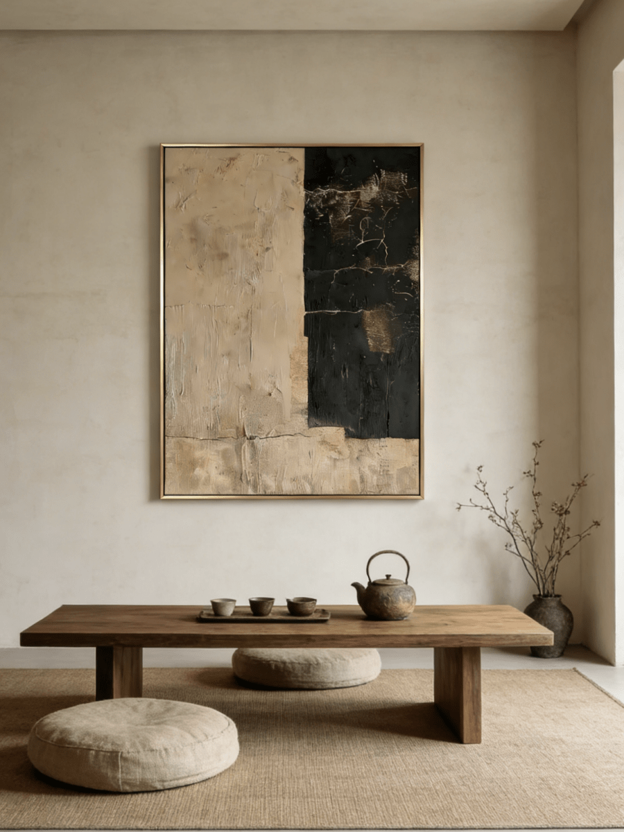
Wabi-Sabi art is a way of making and seeing art that values natural change, irregular form, visible handwork, and the quiet beauty of things that are not flawless or fixed. If you are asking “what is Wabi-Sabi art?”, look for restraint, asymmetry, tactile surfaces, and materials or marks that allow time, variation, and imperfection to remain visible.
It is not a checklist of beige colors or distressed finishes. Wabi-Sabi is better understood as an aesthetic attitude, and contemporary wall art is one of many ways that attitude can be interpreted.

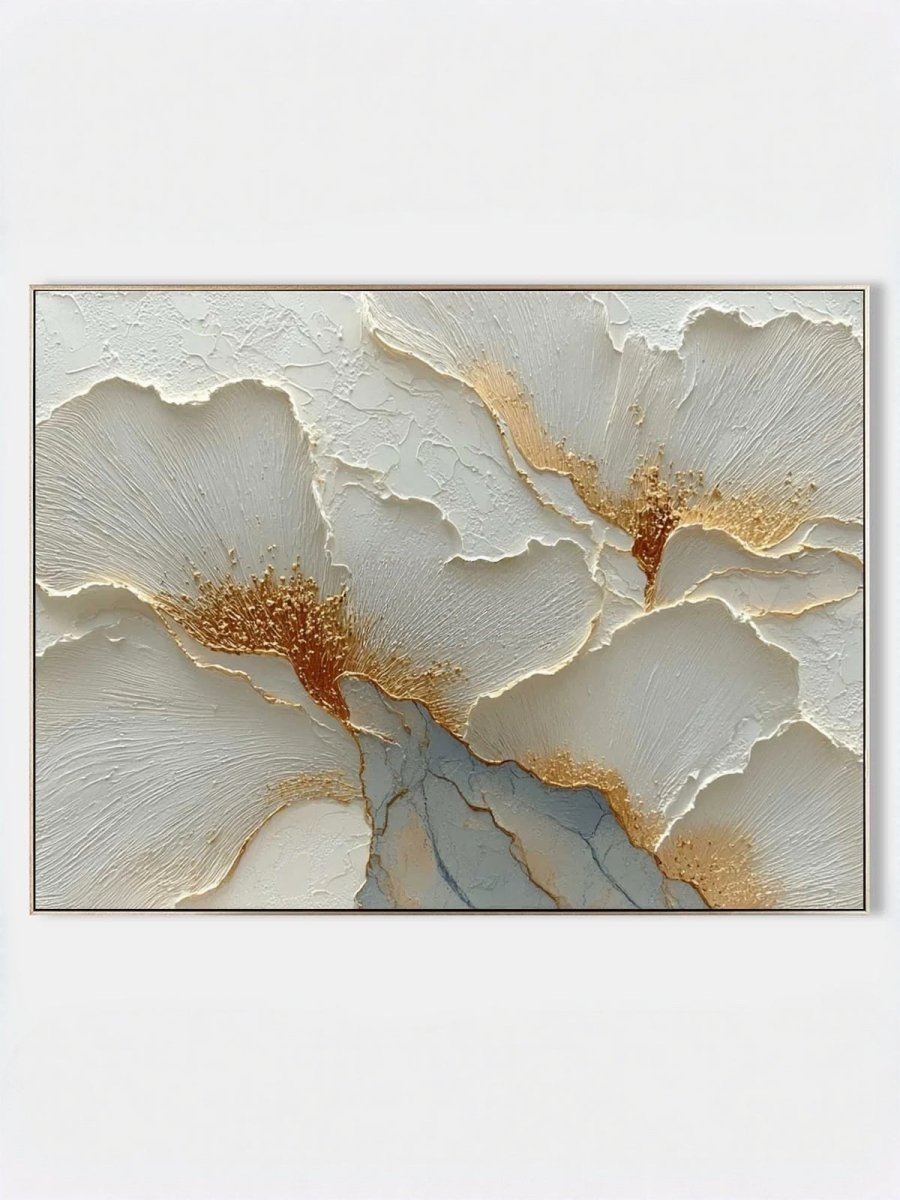
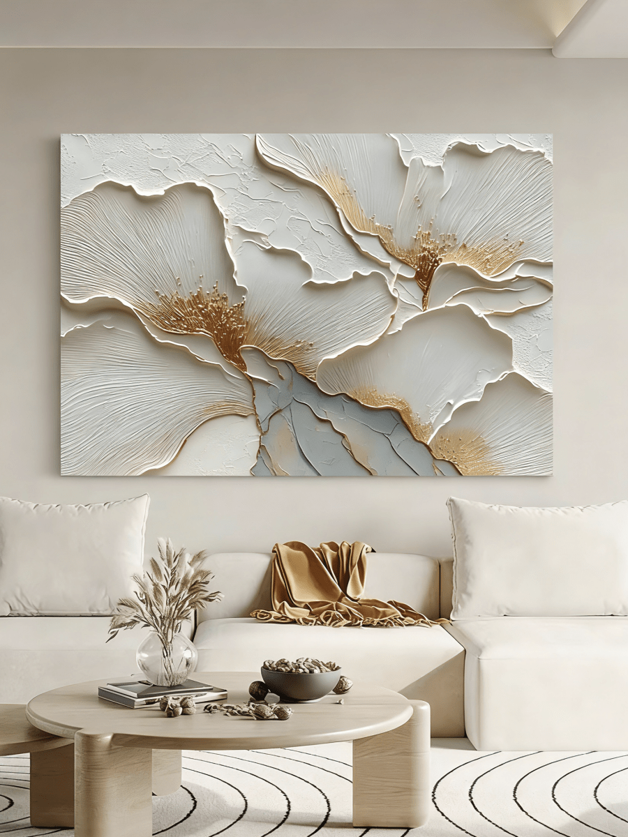
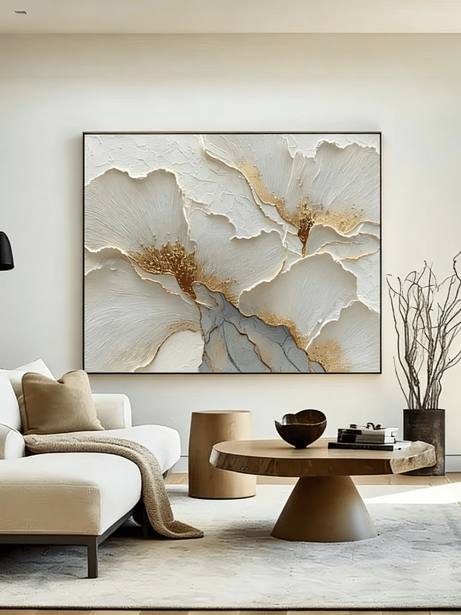
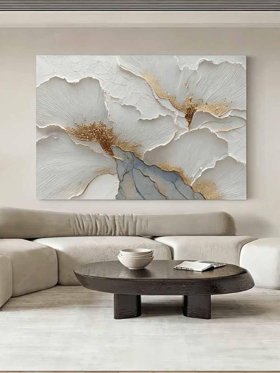
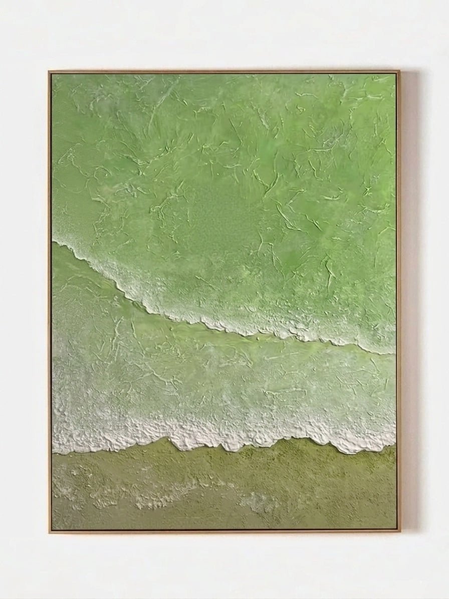
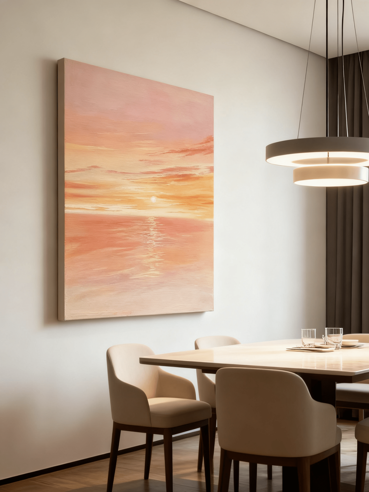
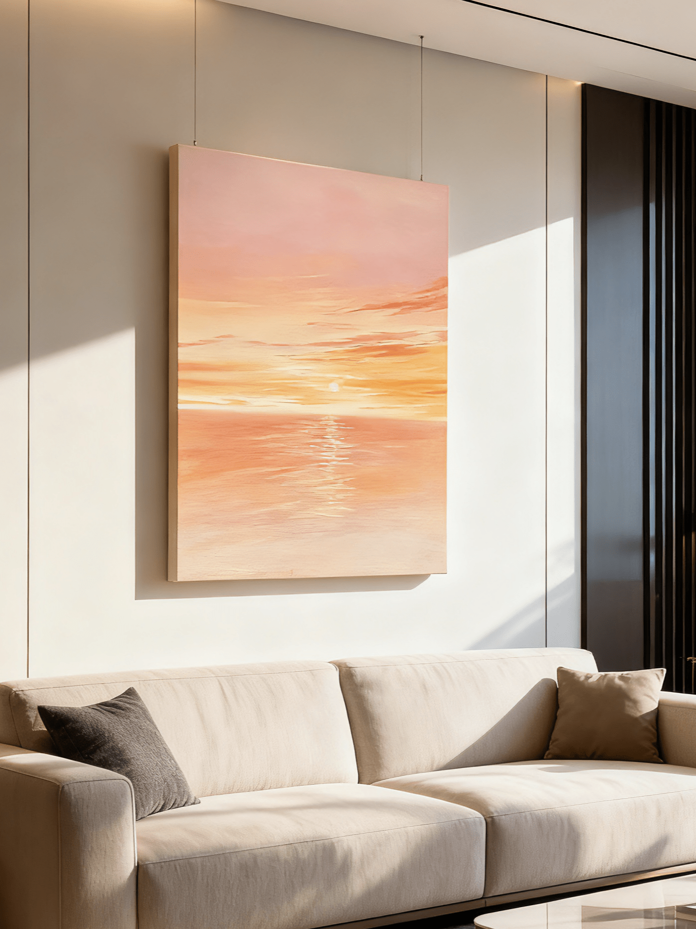
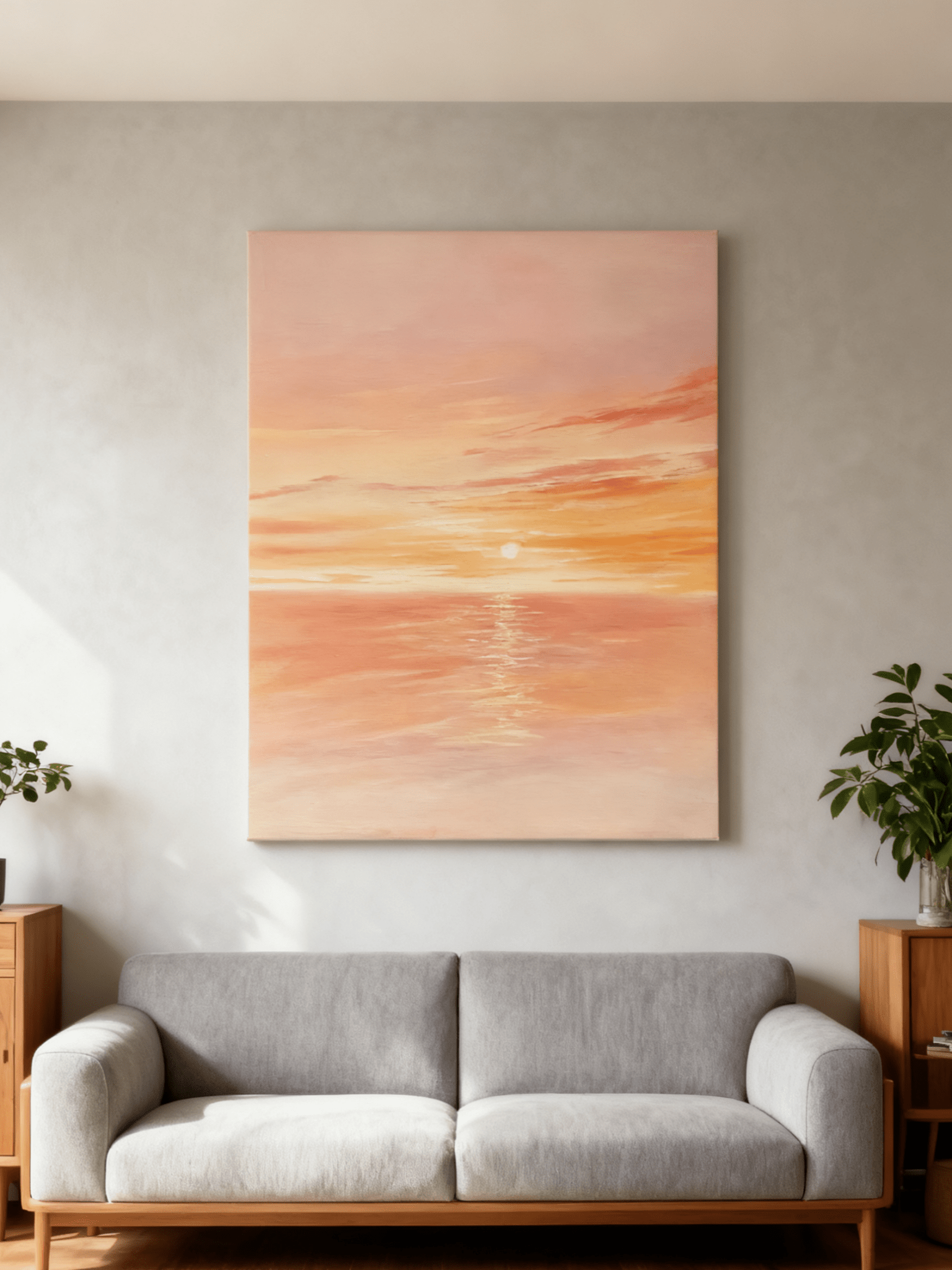
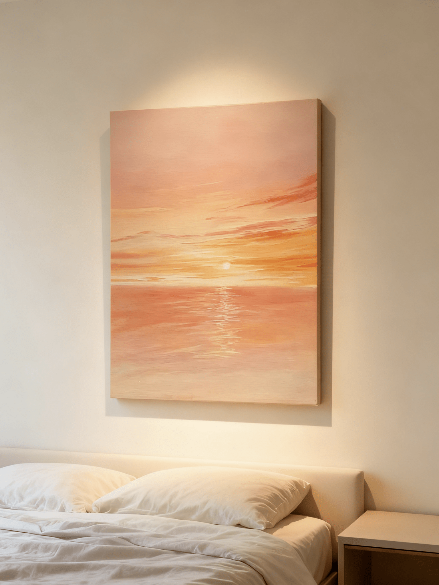
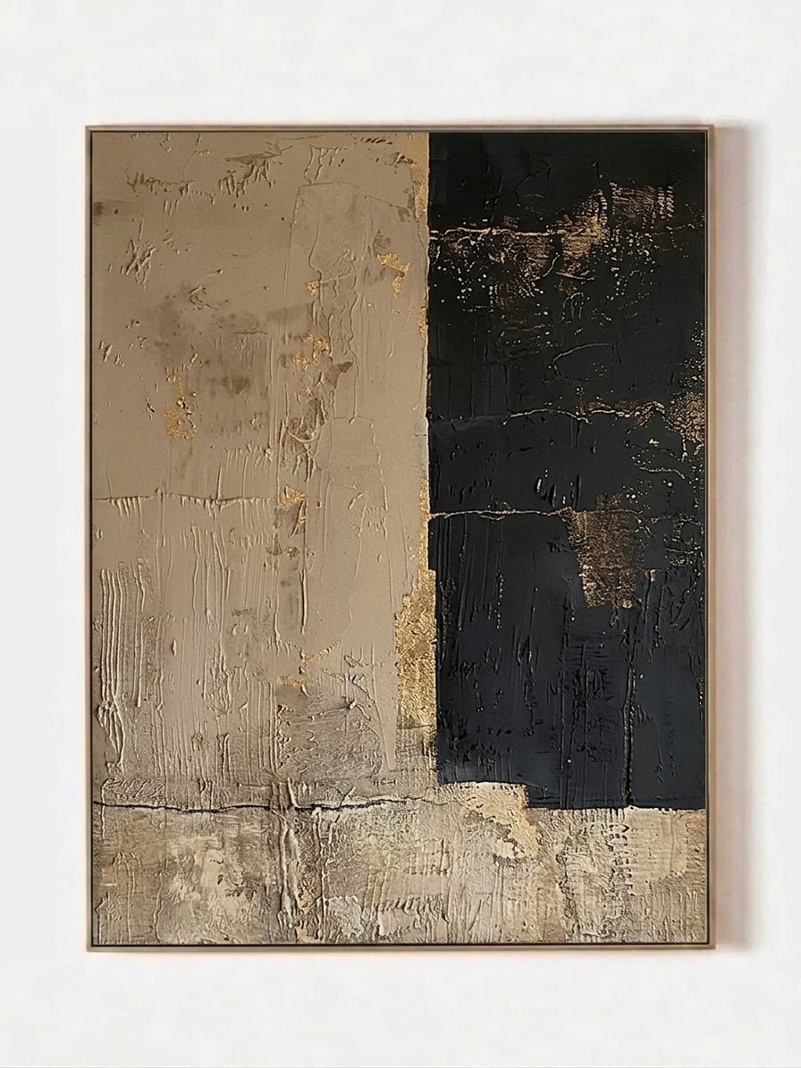
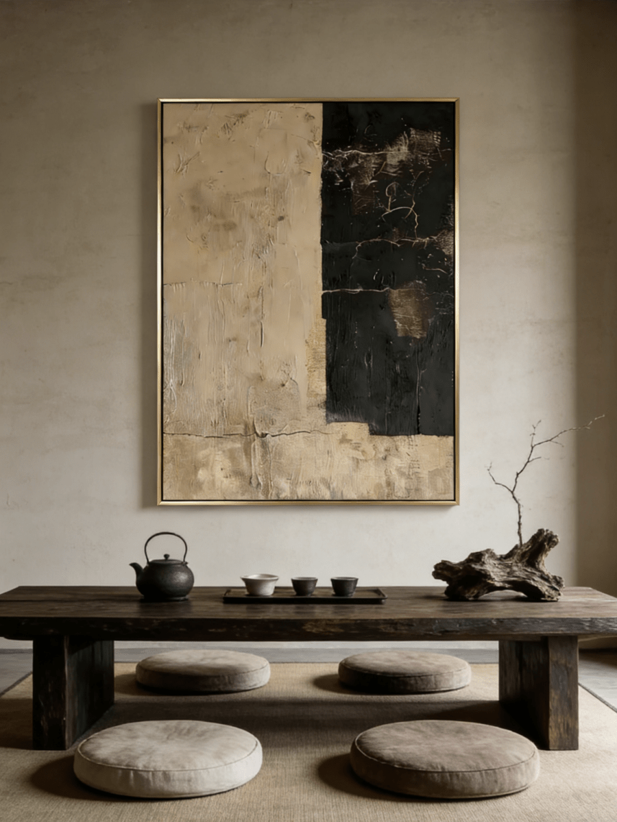
Raised, hand-painted relief changes with side light, giving a restrained neutral work depth without adding visual noise.
What Does Wabi-Sabi Mean?
Wabi-Sabi brings together two related Japanese aesthetic ideas whose meanings developed over time. They should not be reduced to one fixed pair of English translations.
In a useful contemporary shorthand, wabi points toward subdued, austere beauty and satisfaction without excess, while sabi suggests the beauty or tranquility found in age, weathering, and patina. The Stanford Encyclopedia of Philosophy treats them as distinct but connected ideas within a much wider field of Japanese aesthetics. Together, they direct attention toward impermanence, incompleteness, moderation, and the character that materials acquire through use and time.
That does not mean every cracked object is automatically beautiful, or that a room must be deliberately damaged. Wabi-Sabi depends on attention and judgment: an irregular edge, a repaired vessel, an unfinished passage, or an aged surface matters because of how it changes our experience of the whole.
What Is Wabi-Sabi Art?
Wabi-Sabi art expresses imperfect beauty through material, composition, and process rather than through one prescribed subject or palette.
A painting may leave broad areas open, place visual weight off center, preserve uneven brushwork, or let layers show through one another. A ceramic vessel may carry firing marks and an asymmetric profile. A photograph may dwell on fading, erosion, or an ordinary object shaped by use. The common thread is not “rustic decor”; it is a willingness to let variation, transience, and the maker’s hand remain part of the work.
This is why a beige abstract canvas is not automatically Wabi-Sabi. Color alone cannot create the idea. A convincing work usually has a relationship between surface, restraint, irregularity, and negative space. It feels considered without looking mechanically perfected.
Readers who want to see how those ideas translate into contemporary hand-painted work can explore Wabi-Sabi wall art after understanding the principles first.
The Main Characteristics of Wabi-Sabi Art
Wabi-Sabi art is recognizable less by a single motif than by a group of visual decisions that allow irregularity and material character to stay visible.
- Asymmetry: Forms may sit off center, vary in size, or balance through visual weight rather than mirror-image order.
- Imperfection: Uneven edges, breaks in a line, exposed underlayers, and small tonal shifts are treated as expressive information rather than defects to hide.
- Organic form: Shapes often feel grown, worn, deposited, or eroded instead of plotted by a perfect digital grid.
- Visible handwork: Brush drag, palette-knife marks, scraping, ridges, and pressure changes reveal how the surface was made.
- Layered or weathered surfaces: One passage may appear rubbed back while another remains dense, producing the sense of a wall, stone, earth, or metal altered over time.
- Restraint: A limited number of forms and colors gives each mark more consequence.
- Negative space: Open areas are active parts of the composition. They create pause, distance, and room for the eye to settle.
- Natural variation: Texture and tone shift across the work instead of repeating with industrial sameness.
Wabi-Sabi Colors
Wabi-Sabi colors are usually drawn from natural substances and aging processes, but the palette is broader than beige.
Warm white and chalk recall lime, paper, and plaster. Sand, taupe, greige, and clay bring in soil and fired earth. Stone gray and charcoal add mineral depth, while muted brown connects to wood, leather, and dried plant fibers. Moss and subdued green can suggest damp stone or quiet vegetation. Rust, burnt sienna, and aged bronze introduce the colors of oxidation and heat.
The useful question is not “Is this neutral?” but “Does the color feel embedded in the material?” Flat beige with no variation can look generic. Closely related layers of oatmeal, ash, umber, and gray create more depth because their boundaries soften and shift.
Lighting changes that reading. Warm evening bulbs strengthen clay, bronze, and cream; cool daylight can pull gray from taupe; side light can deepen every ridge and recess. Before choosing a neutral work, view a sample or product image beside the wall in both daytime and evening light.
Materials and Textures Used in Wabi-Sabi Art
Materials matter because Wabi-Sabi character is carried by real surface behavior, not only by a picture of texture.
Contemporary wall art may use linen canvas, acrylic or oil paint, handmade relief, granular additions, and layered finishes. Artists can build a plaster-like or mineral-inspired appearance through paint and texture mediums, then scrape, press, comb, or partially cover those layers. Raw or simply finished wood frames often support the same material language.
Descriptions should remain precise. “Looks like weathered plaster” is not the same claim as “made from plaster,” and a stone-like passage may be paint on canvas rather than mineral slab. The individual product page should be the source of truth for actual materials.
True hand-painted texture responds to light physically. In morning side light, raised marks cast narrow, crisp shadows. Under broad frontal light, the same relief becomes quieter. At night, a small lamp can warm the surface and soften the contrast. That changing behavior is one practical difference between tactile work and a flat image that merely uses a beige, distressed pattern.
Japanese Wabi-Sabi Art and Its Modern Interpretation
Wabi-Sabi belongs to a Japanese aesthetic history, but “Wabi-Sabi art” is not the name of one formal painting school or a label for every neutral abstract work.
The ideas became especially influential through poetry and the way of tea. The Metropolitan Museum of Art explains how tea practitioners valued certain unrefined, natural, and imperfect ceramic forms, including asymmetry and unpredictable kiln effects. A recent historical discussion from Nippon.com also emphasizes that the meanings of wabi and sabi changed across different cultural practices rather than remaining frozen.
Modern Western interiors often translate these ideas into tactile canvases, limewashed walls, quiet palettes, and organic materials. That translation can be thoughtful, but it is still a contemporary design interpretation. A hand-painted neutral canvas made outside Japan may be Wabi-Sabi-inspired; it should not be presented as traditional Japanese art simply because it is beige or minimal.
Wabi-Sabi Art vs. Minimalism
Wabi-Sabi and Minimalism can share restraint and open space, but they begin from different ideas: Minimalism usually reduces and orders, while Wabi-Sabi pays closer attention to imperfection, material change, and the trace of making.
| Dimension | Wabi-Sabi | Minimalism |
|---|---|---|
| Core idea | Beauty in impermanence, incompleteness, and natural variation | Clarity through reduction and removal of the nonessential |
| Visual order | Asymmetric, intuitive, and irregular | Often geometric, aligned, and controlled |
| Surface | Layered, tactile, weathered, or visibly handmade | Often smooth, precise, or deliberately uniform |
| Materials | Natural grain, patina, repair, and variation are welcomed | Materials are edited to support clean function and form |
| Color | Earth, mineral, plant, charcoal, rust, and aged-metal tones | Frequently limited, neutral, or high-contrast |
| Imperfection | Kept visible when it deepens the work | Often reduced to preserve formal clarity |
| Atmosphere | Intimate, grounded, reflective | Clear, calm, disciplined |
| Interior effect | Adds human touch and material depth | Creates visual breathing room and order |
A modern room can use both. Clean-lined furniture and open circulation provide Minimalist order; one irregular ceramic vessel or textured canvas supplies Wabi-Sabi material presence. The room does not need distressed furniture, damaged walls, or a fully aged finish.
Wabi-Sabi, Japandi and Organic Modern
These styles overlap in natural materials and quiet palettes, but they are not interchangeable.
Wabi-Sabi is an aesthetic orientation toward imperfection and change. Japandi is a contemporary interior style that combines Japanese-influenced restraint with Scandinavian function and warmth; it is usually cleaner-lined and more systematically furnished. Organic Modern softens modern architecture with rounded form, wood, stone, linen, and earth colors, but it does not necessarily value patina or incompleteness.
One textured work can sit comfortably in all three settings. The distinction comes from the larger room: Japandi emphasizes refined utility, Organic Modern emphasizes nature-softened modern form, and Wabi-Sabi gives more room to irregularity, handwork, and signs of time.
How to Use Wabi-Sabi Wall Art in Your Home
Use Wabi-Sabi wall art by reading the room’s scale, light, and materials before matching color.
Living Room
Begin with the usable wall above the sofa, not the wall from corner to corner. A horizontal work follows a long sofa; a large square creates a centered anchor. Width guidelines are only visual starting points, so tape the proposed outline on the wall and check it from the main seat. Oak, walnut, linen, wool, and matte stone give textured art a natural context without making every surface look aged.
Bedroom
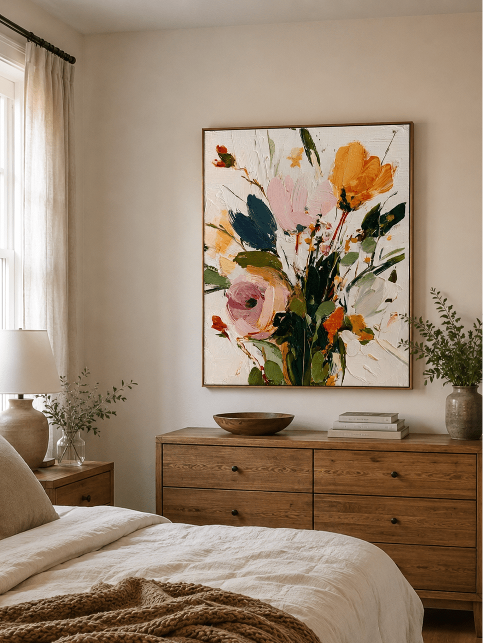
Choose lower contrast, quieter movement, and enough open space around the frame. Ivory, mist gray, muted green, sand, and soft charcoal can feel restful without disappearing. Avoid placing a highly reflective or densely patterned work where strong directional light will produce glare at eye level.

Dining Room
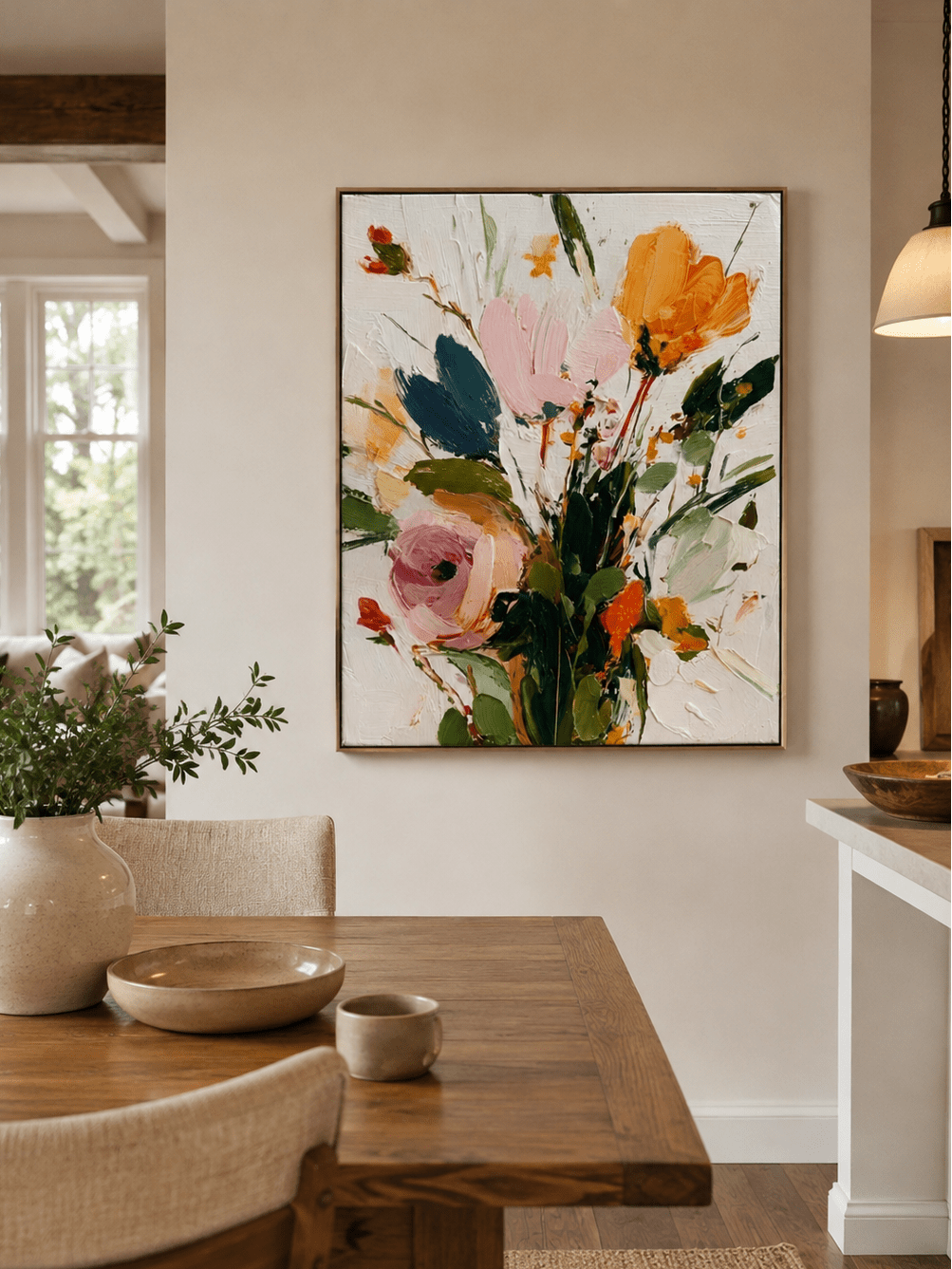
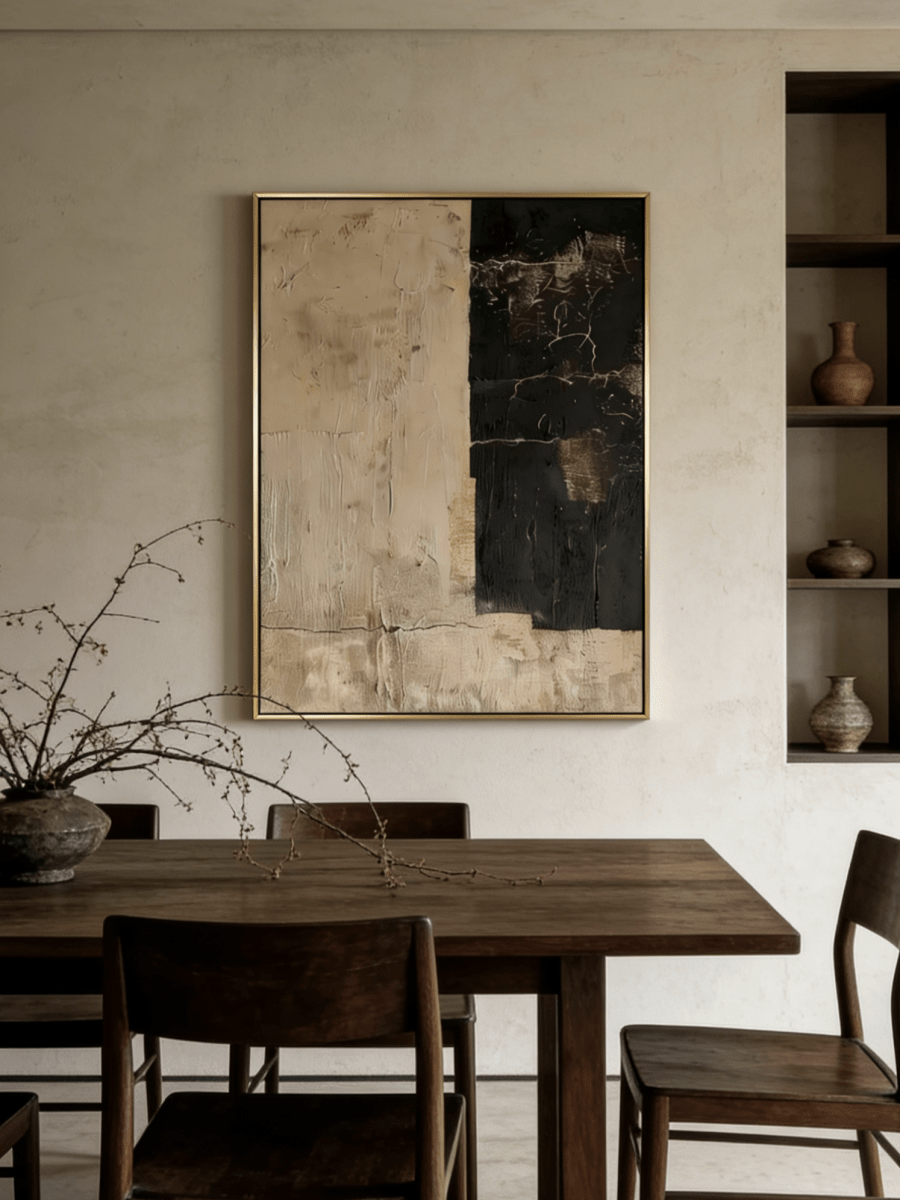
A panoramic or generous square work can relate well to the long line of a dining table or sideboard. Coordinate visual weight with the pendant: the artwork and light should not compete at the same height. Dark rust, charcoal, or bronze can become especially atmospheric in evening light when balanced by warm wood and an uncluttered wall.

Entryway
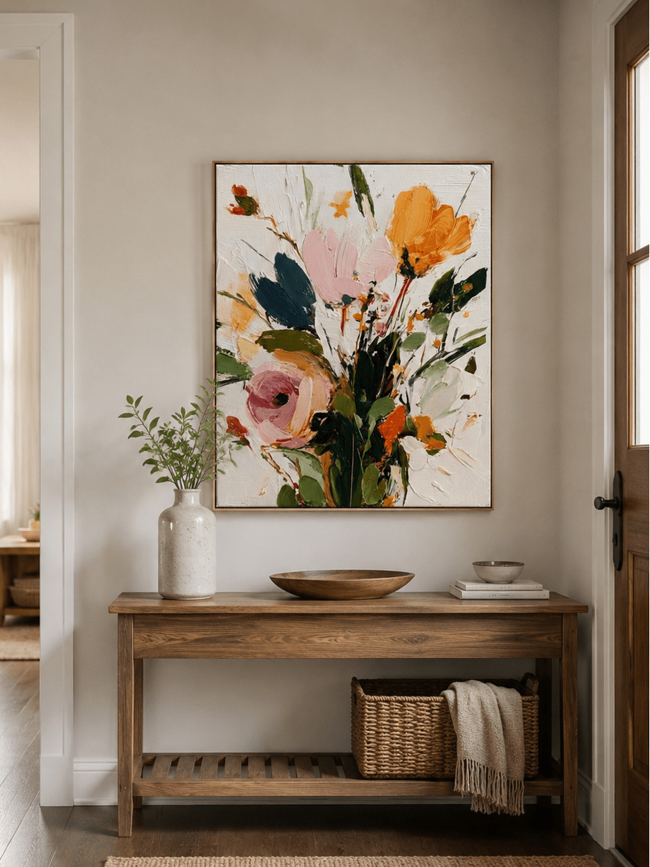
A vertical work can give purpose to a narrow wall; a square can steady a short console. Leave visible wall around the frame and keep objects below it low. The first view should read as one composition, not a row of accessories competing for attention.
Home Office
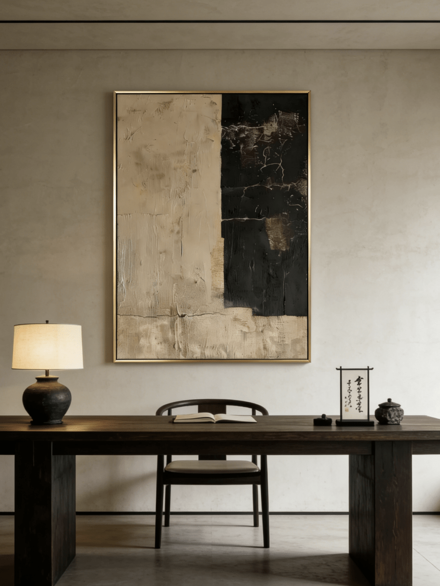
Texture can add depth without becoming distracting when the palette stays restrained. Place the work where side light reveals relief, but keep the strongest contrast away from the immediate monitor sight line. Greige, ivory, taupe, and charcoal pair easily with a wood desk and a simple shaded lamp.

How to Choose Wabi-Sabi Wall Art
Choose the piece that gives the room the right balance of calm, contrast, scale, and tactile depth.
- Read the room palette. Identify the temperature of the wall, flooring, upholstery, and wood. Repeat related tones rather than trying to match one exact beige.
- Measure the usable wall. Account for windows, doors, sconces, headboards, and furniture before choosing dimensions.
- Match orientation to architecture. Use vertical art for height, panoramic art for width, and square art for a contained focal point.
- Study close-ups. Look for real brushwork, relief, scraping, granular passages, and tonal layering—not only a neutral color filter.
- Check light at several times. Side light strengthens relief; flat frontal light subdues it; warm artificial light can shift gray toward taupe or bronze.
- Choose a frame after the painting. Raw or warm wood feels organic, black adds definition, white keeps the boundary quiet, and muted metal can repeat existing hardware.
- Decide what the room lacks. A visually busy room may need negative space; a flat neutral room may need deeper texture; a pale room may benefit from one charcoal or rust passage.
Wabi-Sabi does not require a fully weathered home. In a modern American interior, smooth cabinetry, clean upholstery, and simple architecture can remain intact. One hand-marked artwork, a ceramic vessel, and a natural textile may be enough to keep the space clean while making it feel less anonymous.
Examples from the WABI Wall Art Collection
These four active works show how different Wabi-Sabi characteristics can appear without collapsing into one all-beige formula.
Handmade Beige & Bronze Wabi Sabi Textured Wall Art – EV#0071
Eliot Vermeer’s square composition uses an irregular raised grid across beige and bronze linen canvas. The repeated cells create order, but their edges, depths, and tonal transitions remain visibly handmade. Side light produces hundreds of small shadows, so the surface changes more than the limited palette suggests. It is a useful example of the difference between neutral color and material presence. The stable square format works especially well above a console, compact sofa, or fireplace where the room needs one centered anchor.
Wabi Sabi Lone Tree Wall Art – AK#0319
Akari Kobayashi places a lone tree, fragmented wall, and fading steps within a pale square field. Ivory, mist gray, warm stone, and charcoal create a restrained landscape without describing a literal place in detail. The fractured surface and soft disappearance of the steps suggest time and incompleteness, while negative space keeps the darker marks from feeling heavy. This piece suits a bedroom, reading area, or entryway and demonstrates that Wabi-Sabi-inspired art can carry an identifiable subject as well as abstraction.
WABI SABI Abstract Wall Art – Ember Horizon – AK#0315
Ember Horizon, also by Akari Kobayashi, expands the palette into rust orange, copper brown, golden ochre, charcoal, and black. A narrow luminous band divides the panoramic composition, while scraping, fine cracks, and layered pigment give both fields a weathered depth. The work proves that Wabi-Sabi colors are not limited to cream and taupe. Its long format and strong lower weight make it a natural choice above a sideboard or dining table in a room with walnut, aged bronze, and warm evening light.
Modern Textured Abstract Wall Art – Silent Geometry – EV#0305
Eliot Vermeer builds this vertical work from rounded relief forms, fine ribbed passages, and one charcoal-brown block. Ivory, greige, taupe, and soft stone keep the contrast controlled, while changes in direction and surface density make the four-part structure tactile. The composition is geometric but not mechanically perfect, showing how Wabi-Sabi art and modern architecture can overlap. It works well on a narrow office wall, beside a doorway, or above a compact console where its portrait orientation can emphasize height.
For more examples, browse the WABI Wall Art Wabi-Sabi collection. Product pages provide the most current details on canvas, paint, framing, size, and customization. The brand’s Art Team page also confirms the artists represented here.
Frequently Asked Questions
What is the meaning of Wabi-Sabi art?
Wabi-Sabi art values beauty that includes imperfection, impermanence, restraint, and natural variation. Rather than polishing away every irregularity, it may preserve an uneven mark, aged surface, asymmetric balance, or open passage. The idea is broader than a decorating style and does not have one fixed visual formula.
Is Wabi-Sabi art always neutral?
No. Neutral and earth-derived colors are common because they support material subtlety, but rust, moss, oxidized bronze, ink black, muted blue, and other restrained colors can belong. What matters is the relationship among color, surface, composition, and change—not whether every canvas is beige.
What materials are used in Wabi-Sabi wall art?
Materials vary by artist and product. Contemporary works may use linen or cotton canvas, acrylic or oil paint, texture mediums, granular layers, handmade relief, and wood frames. Always distinguish actual material from appearance: a surface can look like plaster, stone, or aged metal while still being built primarily from paint on canvas.
Is Wabi-Sabi the same as Minimalism?
No. Both can use restraint and negative space, but Minimalism generally emphasizes reduction, order, and formal clarity. Wabi-Sabi is more willing to retain irregularity, visible handwork, patina, and the sense of time. They can coexist in one room without becoming the same concept.
What is the difference between Wabi-Sabi and Japandi?
Wabi-Sabi is a Japanese aesthetic orientation toward imperfection and impermanence. Japandi is a modern interior style that blends Japanese-influenced restraint with Scandinavian function and warmth. Japandi rooms are often cleaner-lined and more systematically ordered; Wabi-Sabi allows more visible wear, variation, and intuitive asymmetry.
Can Wabi-Sabi art work in a modern home?
Yes. It can make a modern room feel more human without adding clutter. Keep the architecture and furniture clean, then introduce one work with visible brushwork or relief. The contrast between a precise room and a hand-marked surface often has more impact than making every item rustic.
What rooms are best for Wabi-Sabi wall art?
Living rooms, bedrooms, dining rooms, entryways, and home offices can all work. Choose according to visual need: a living room may need scale, a bedroom low contrast, a dining room warmth after dark, an entryway a clear focal point, and an office texture that does not compete with concentration.
How do I choose a frame for Wabi-Sabi art?
Choose a frame that supports the nearby materials and the painting’s visual weight. Natural wood adds warmth, black sharpens pale art, white keeps the edge quiet, and muted gold or bronze can repeat hardware. A simple profile usually works better than an ornate frame, but the product’s actual options should guide the final choice.
A Quieter Way to Live With Art
Wabi-Sabi art asks for attention rather than perfection. Its value can sit in the drag of a brush, the shadow beside a raised edge, an off-center form, or a color that changes between morning and evening. Those details do not require a themed room. They need enough light, space, and restraint to be noticed.
If this way of seeing feels right for your home, take time with the close-up views, compare the work in different light, and explore the hand-painted Wabi-Sabi artwork with material and scale in mind.