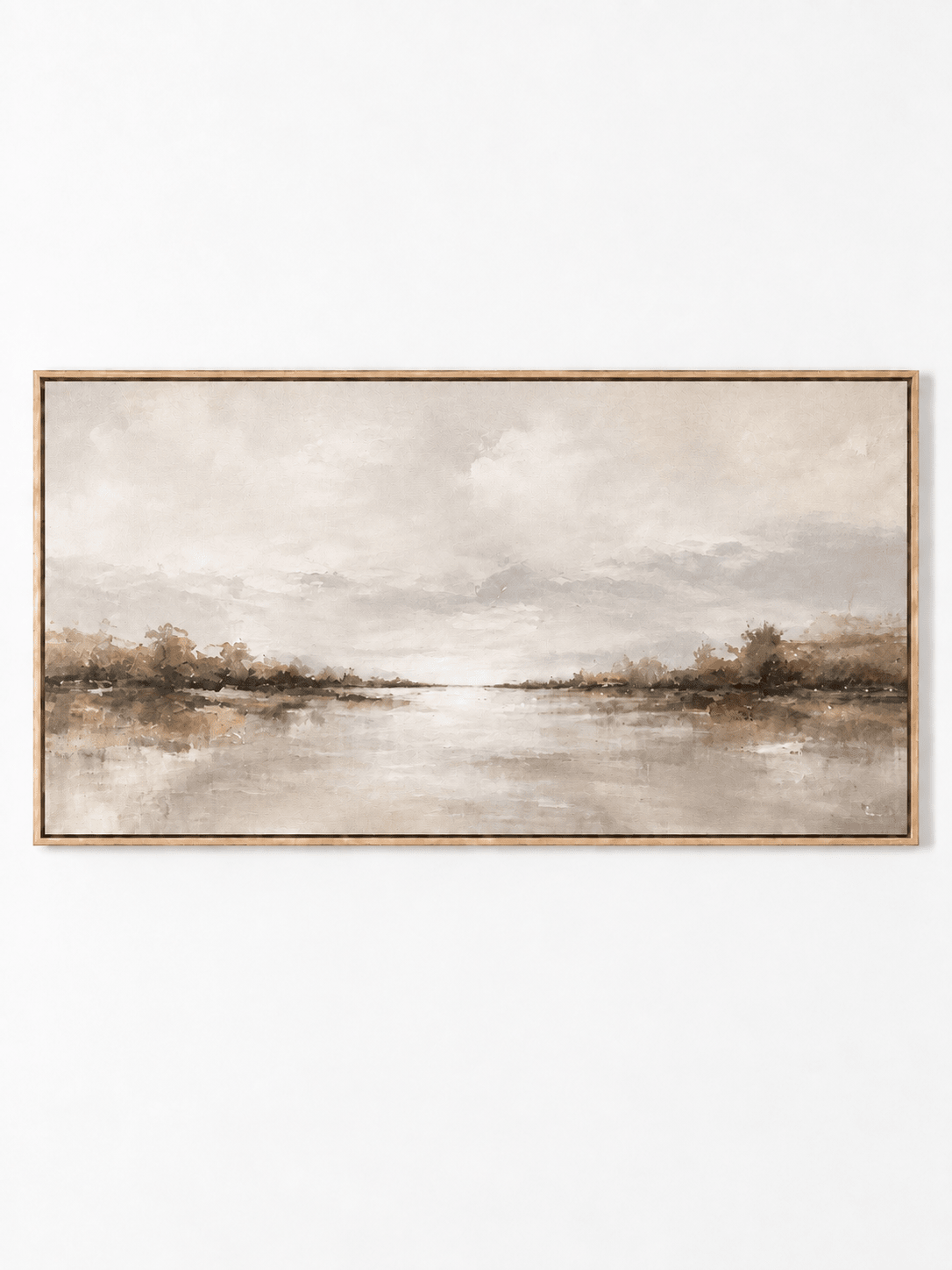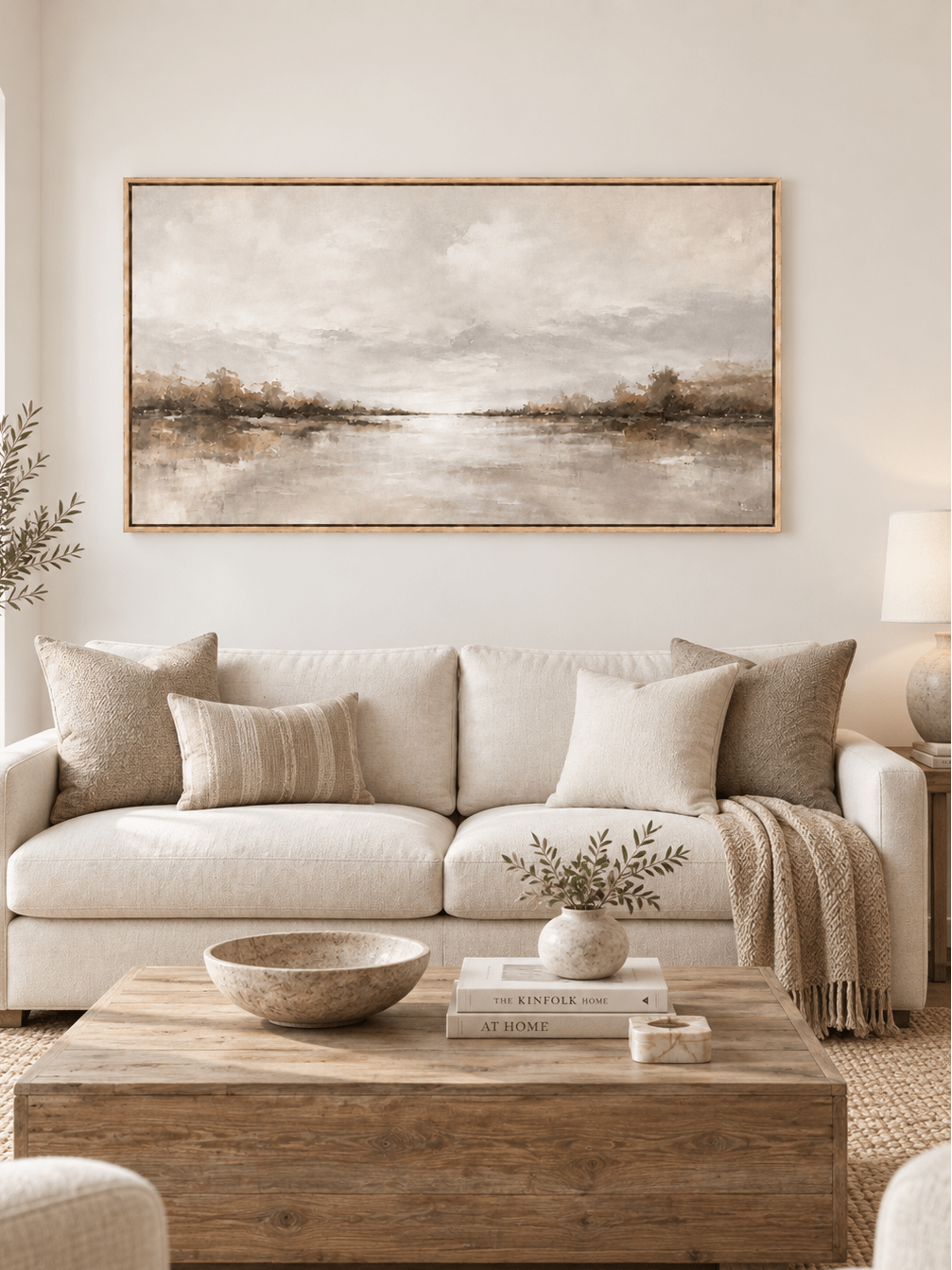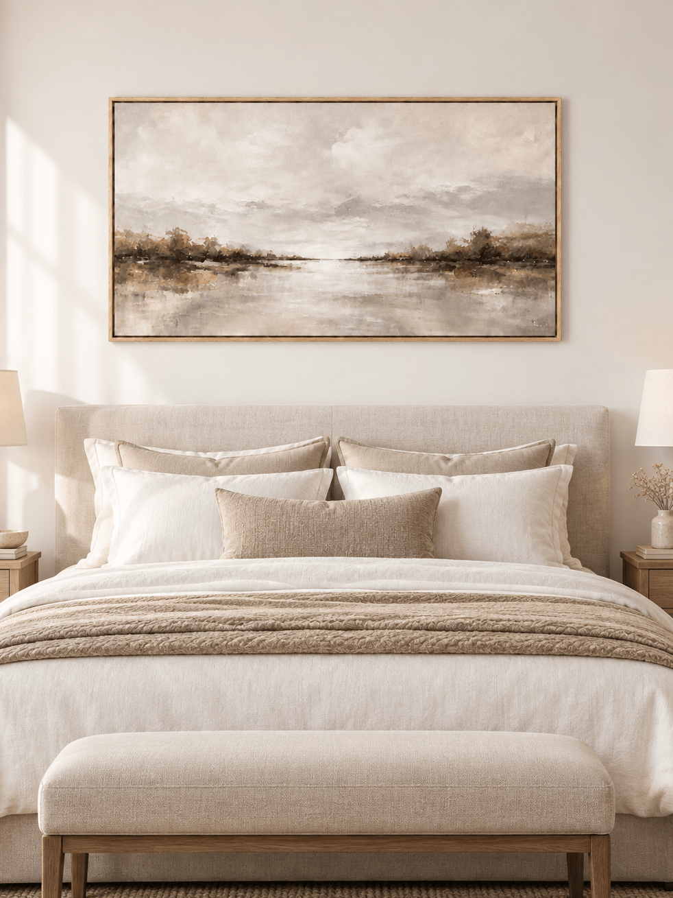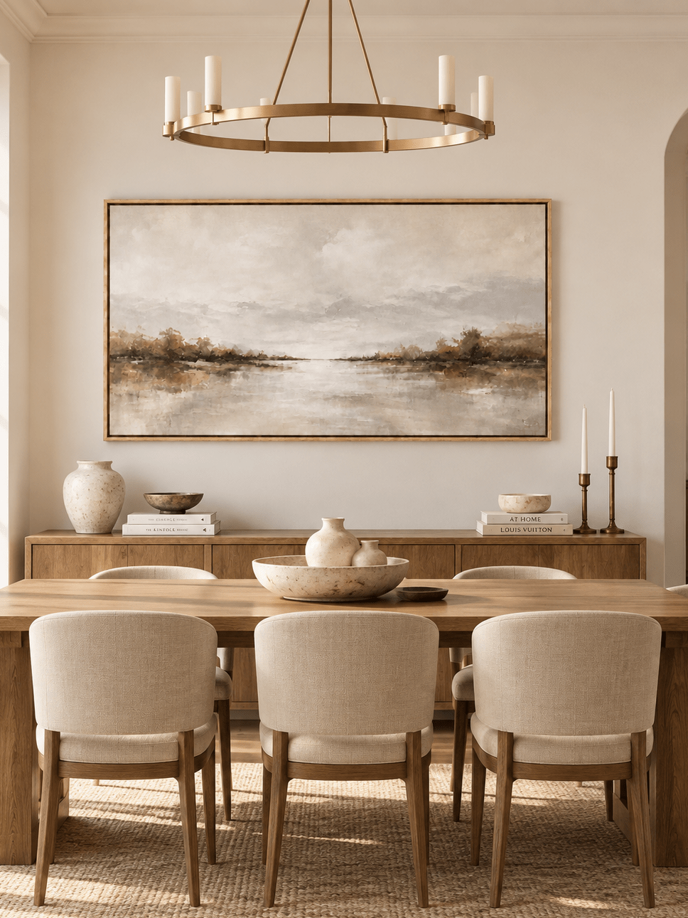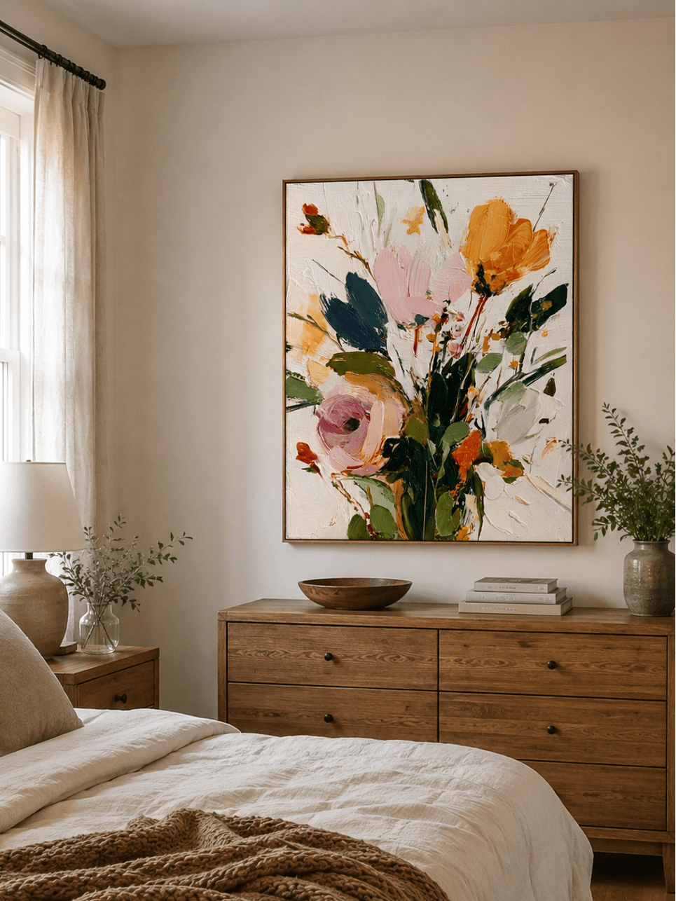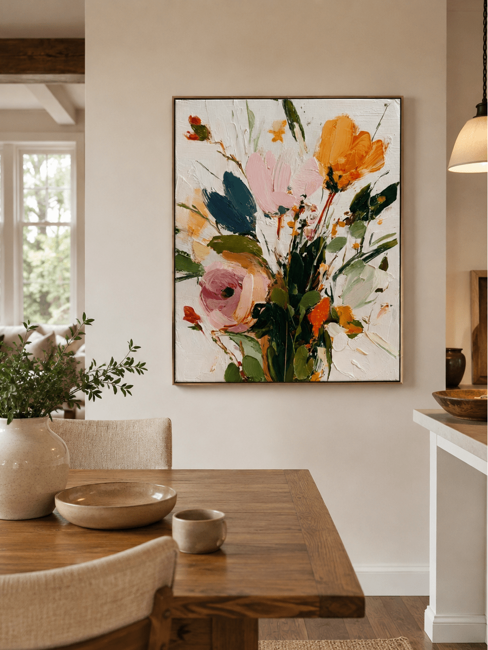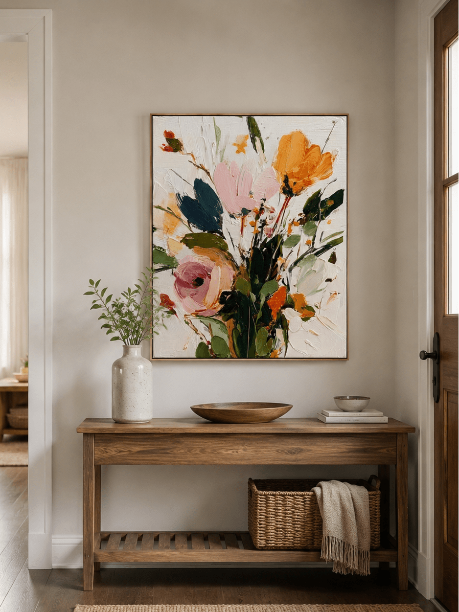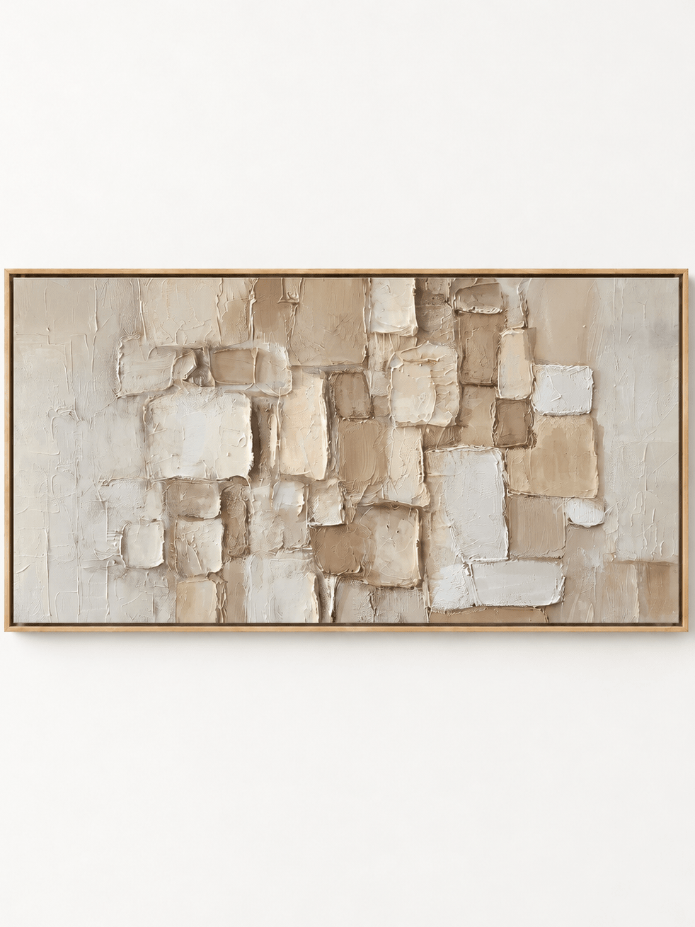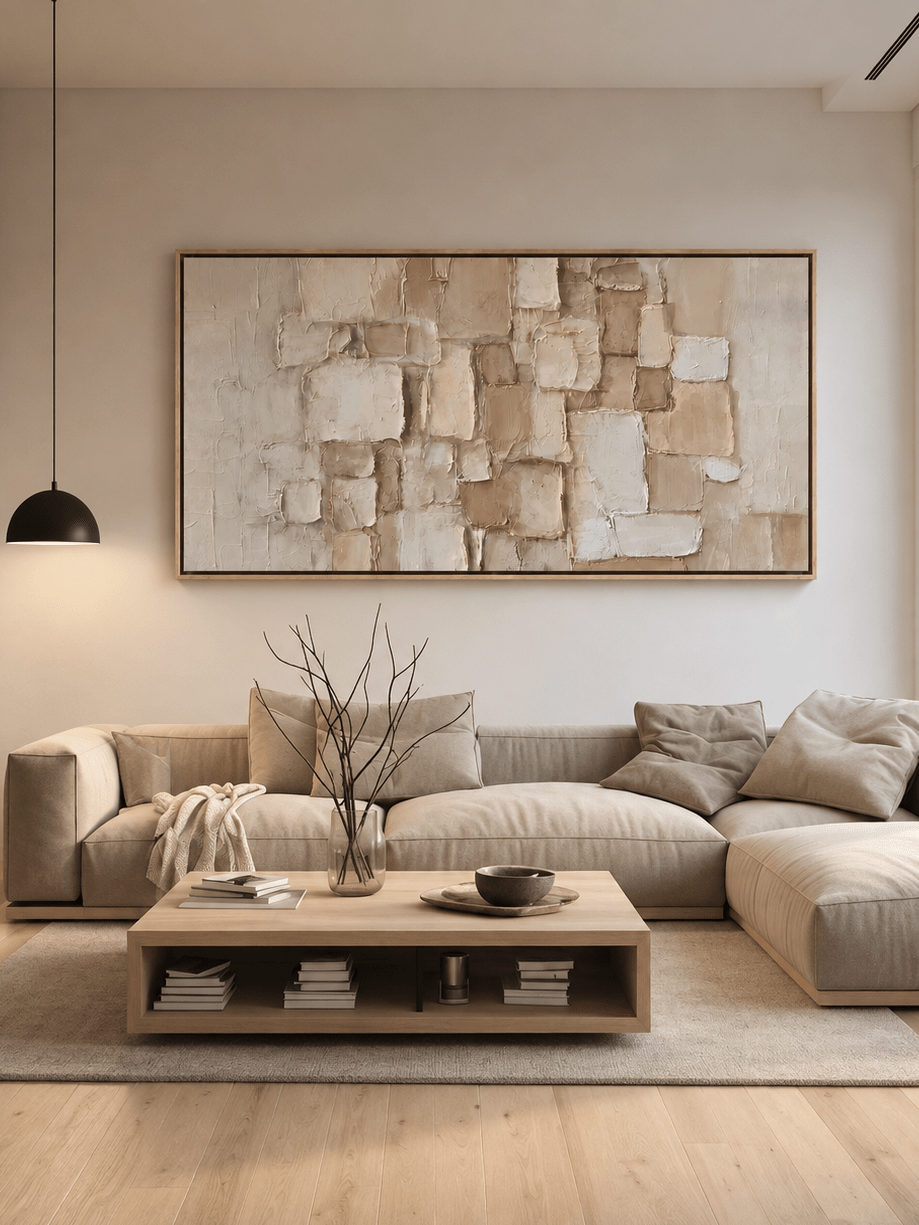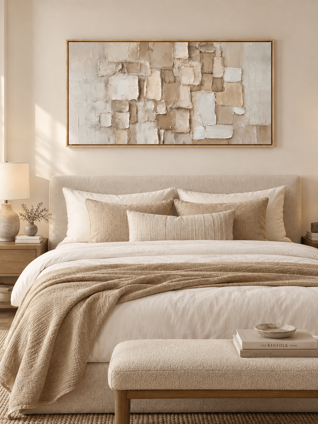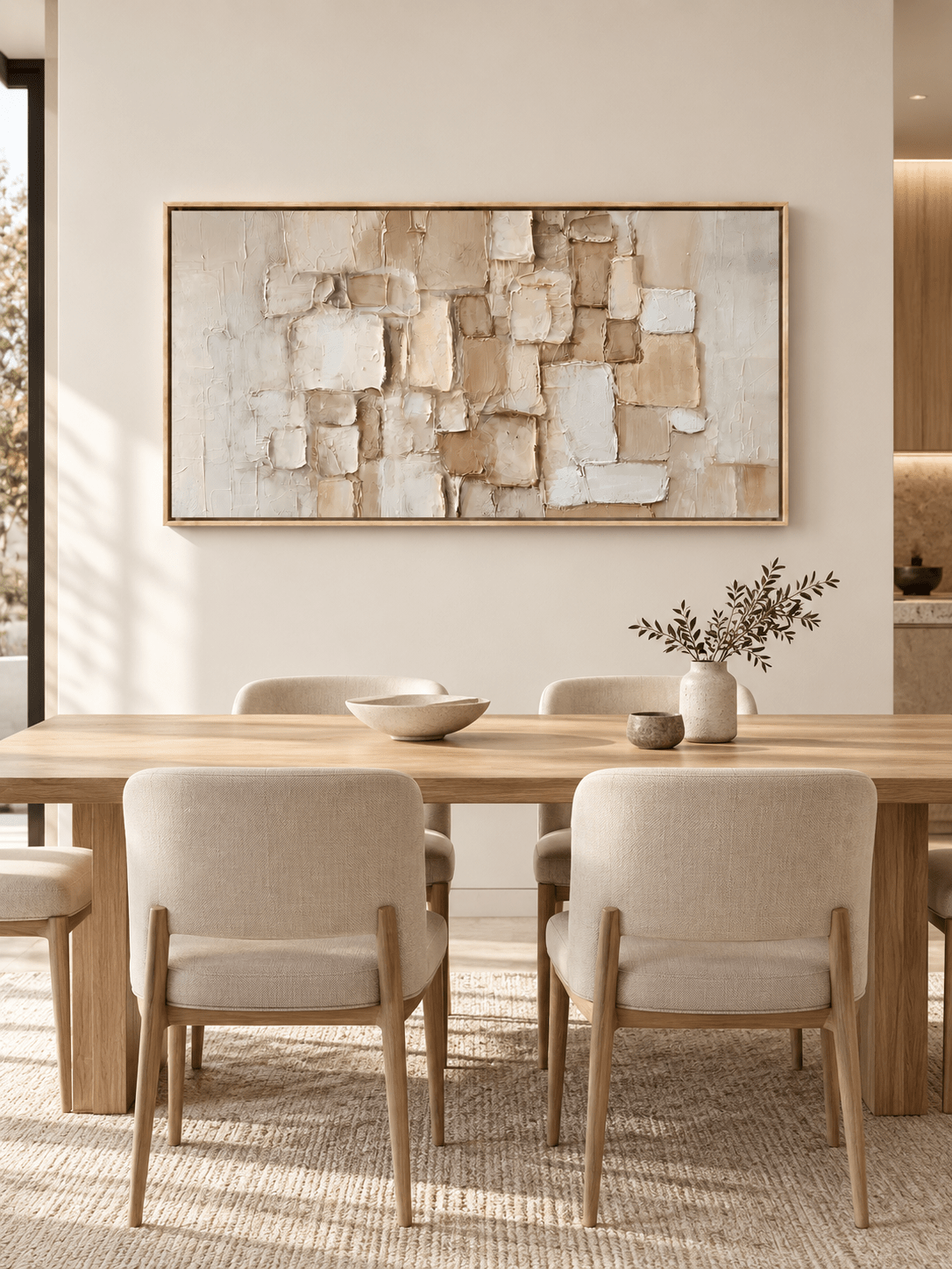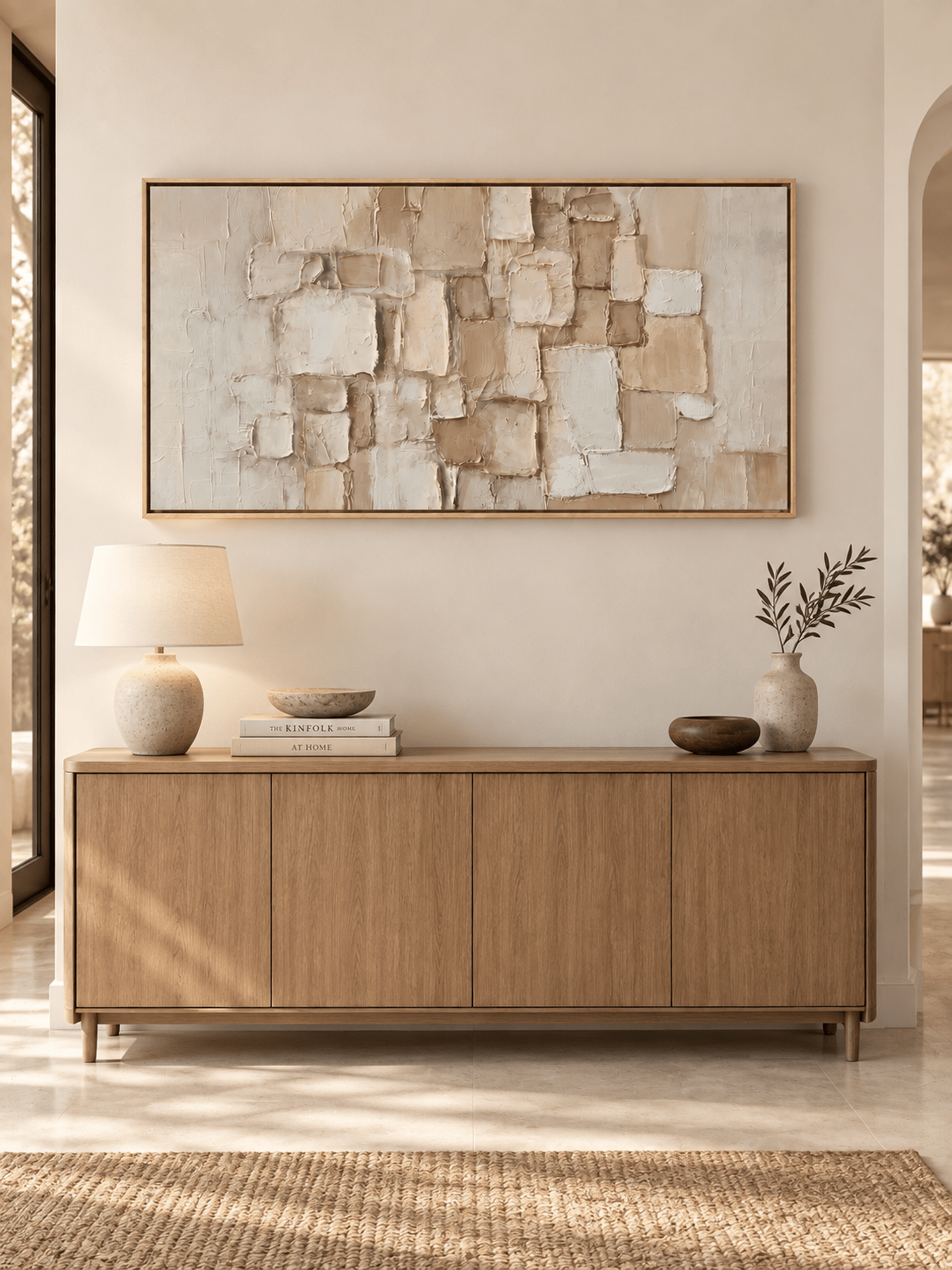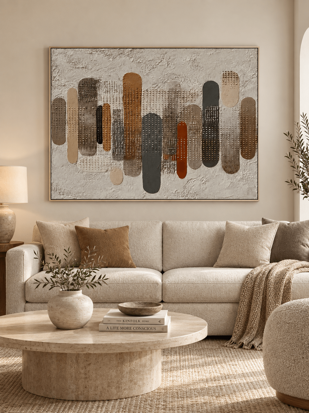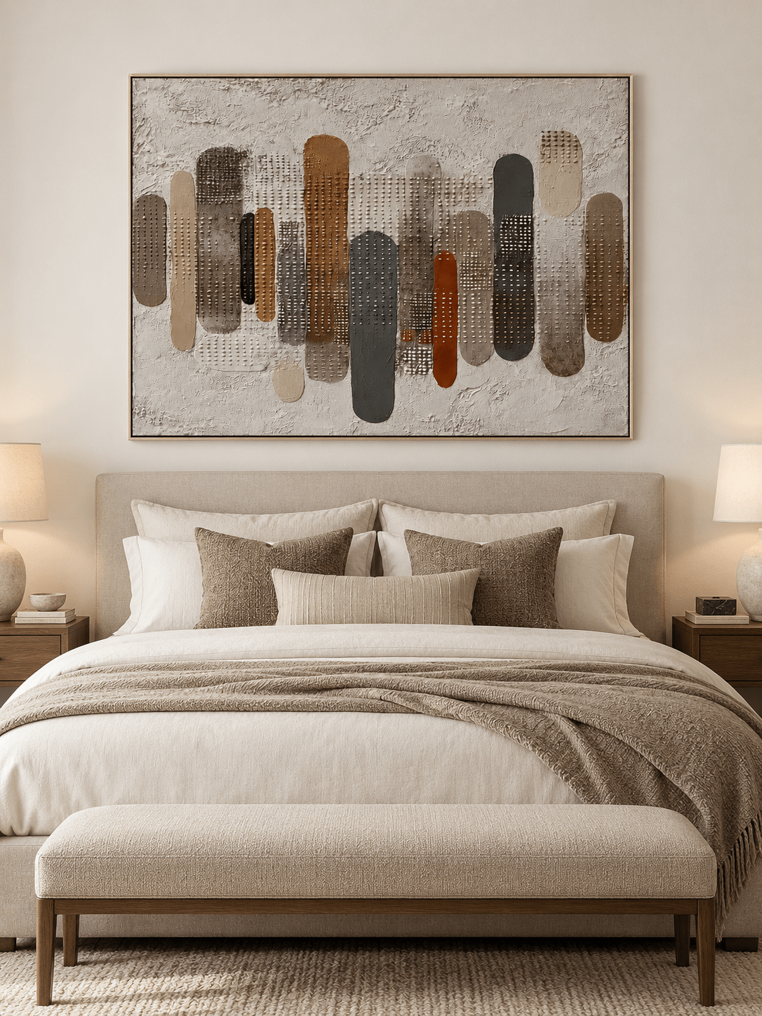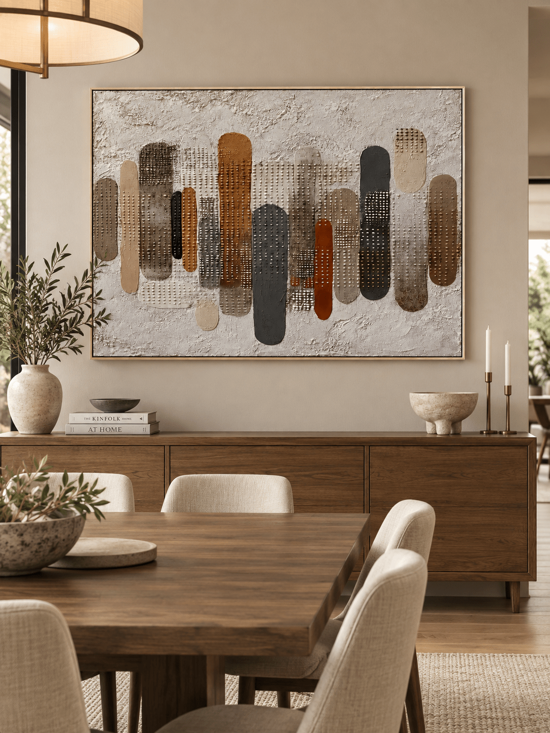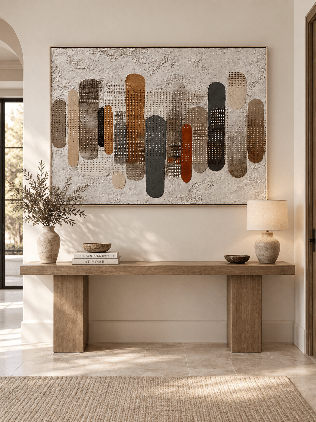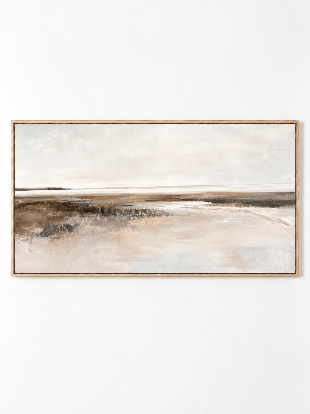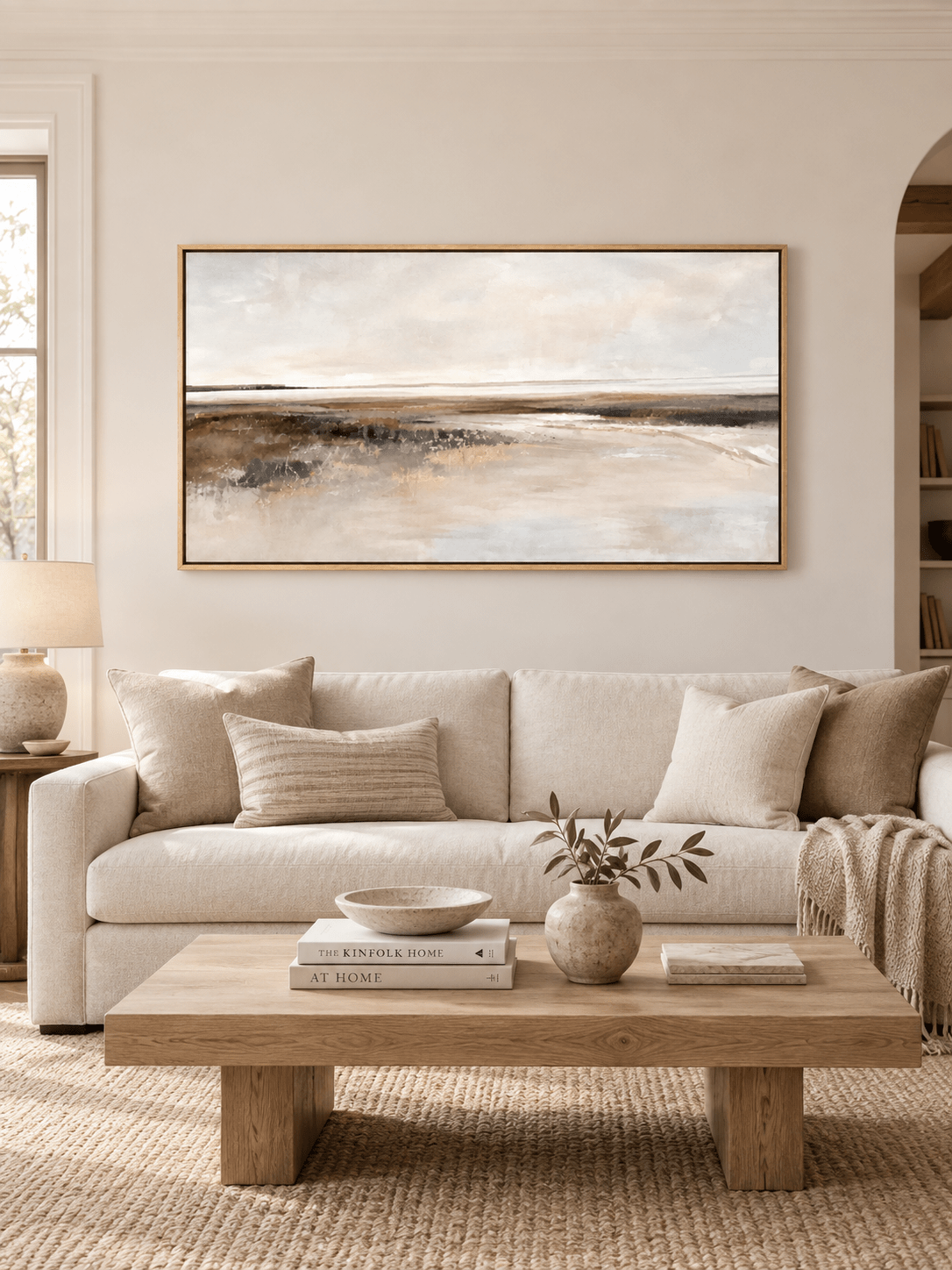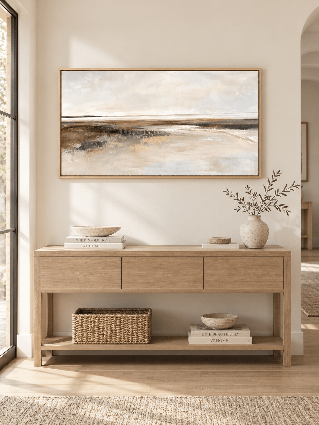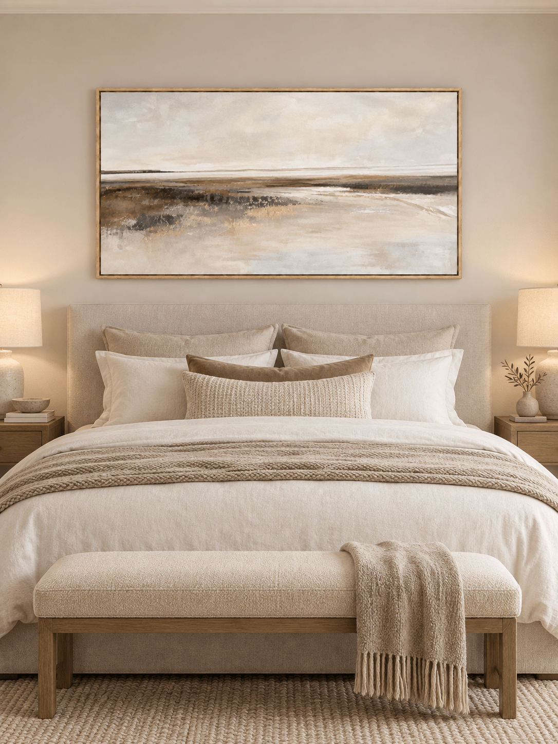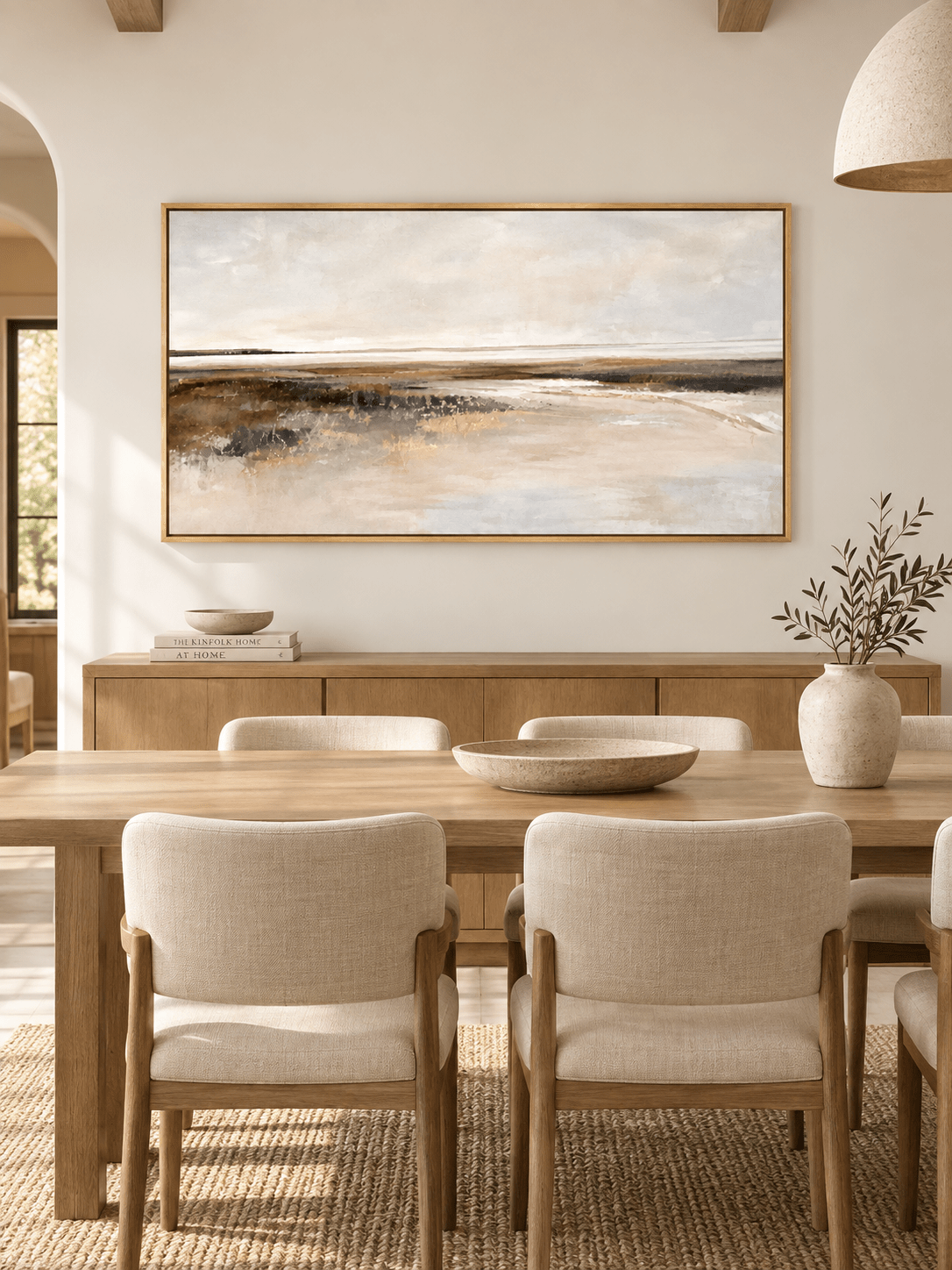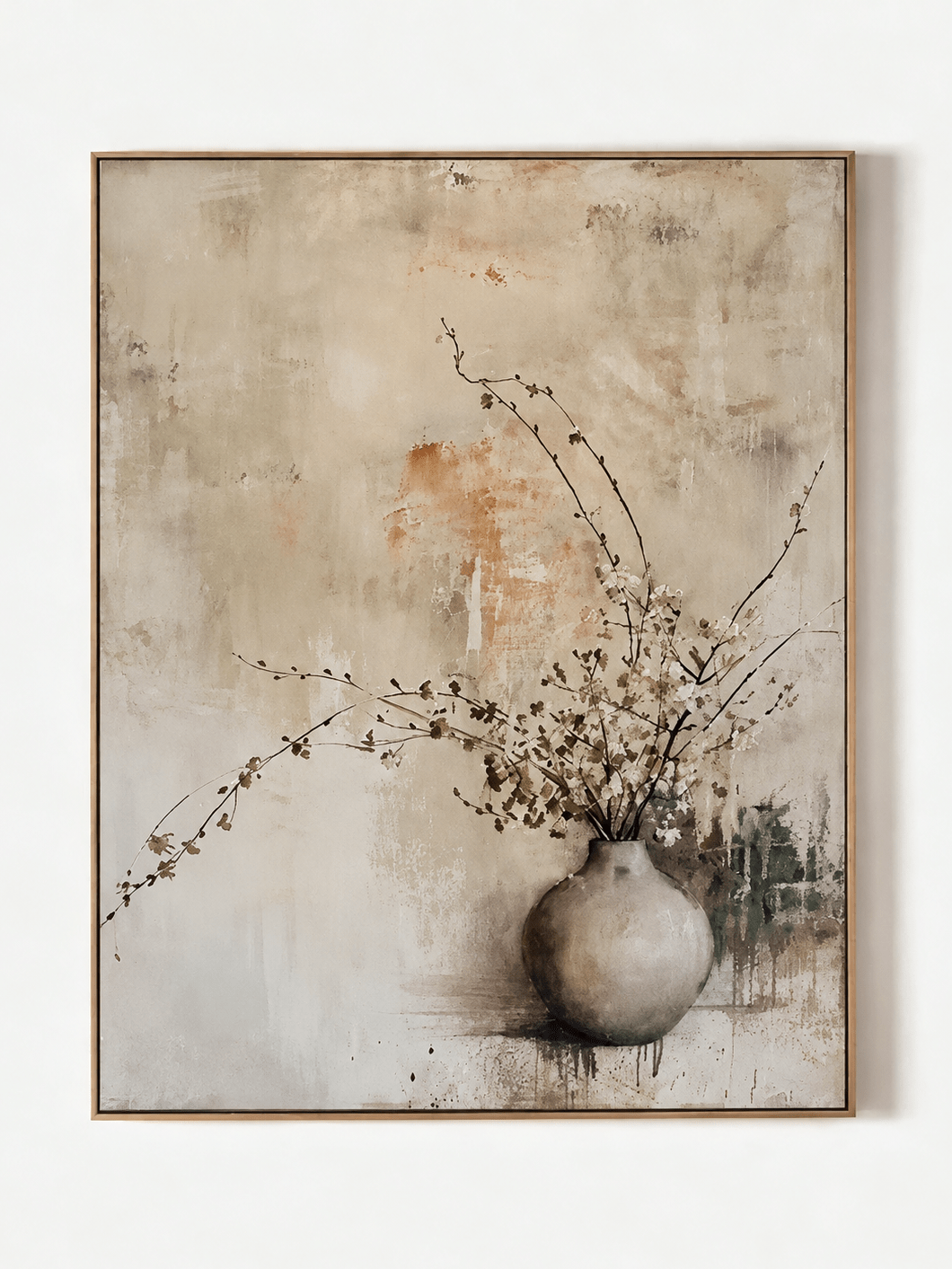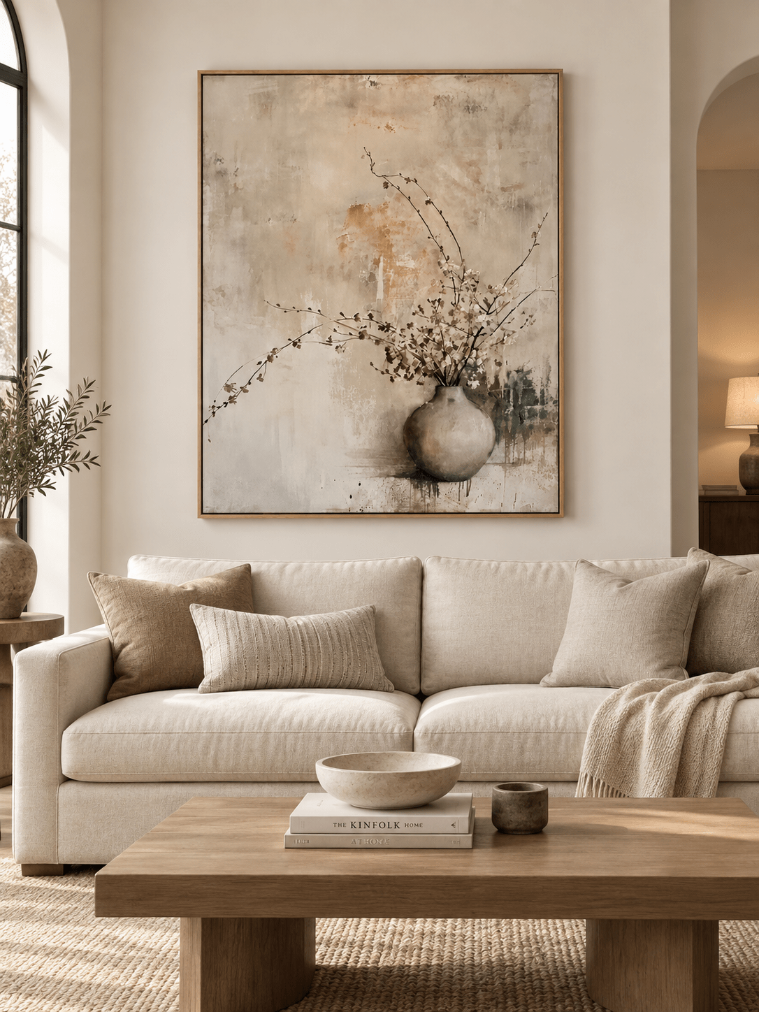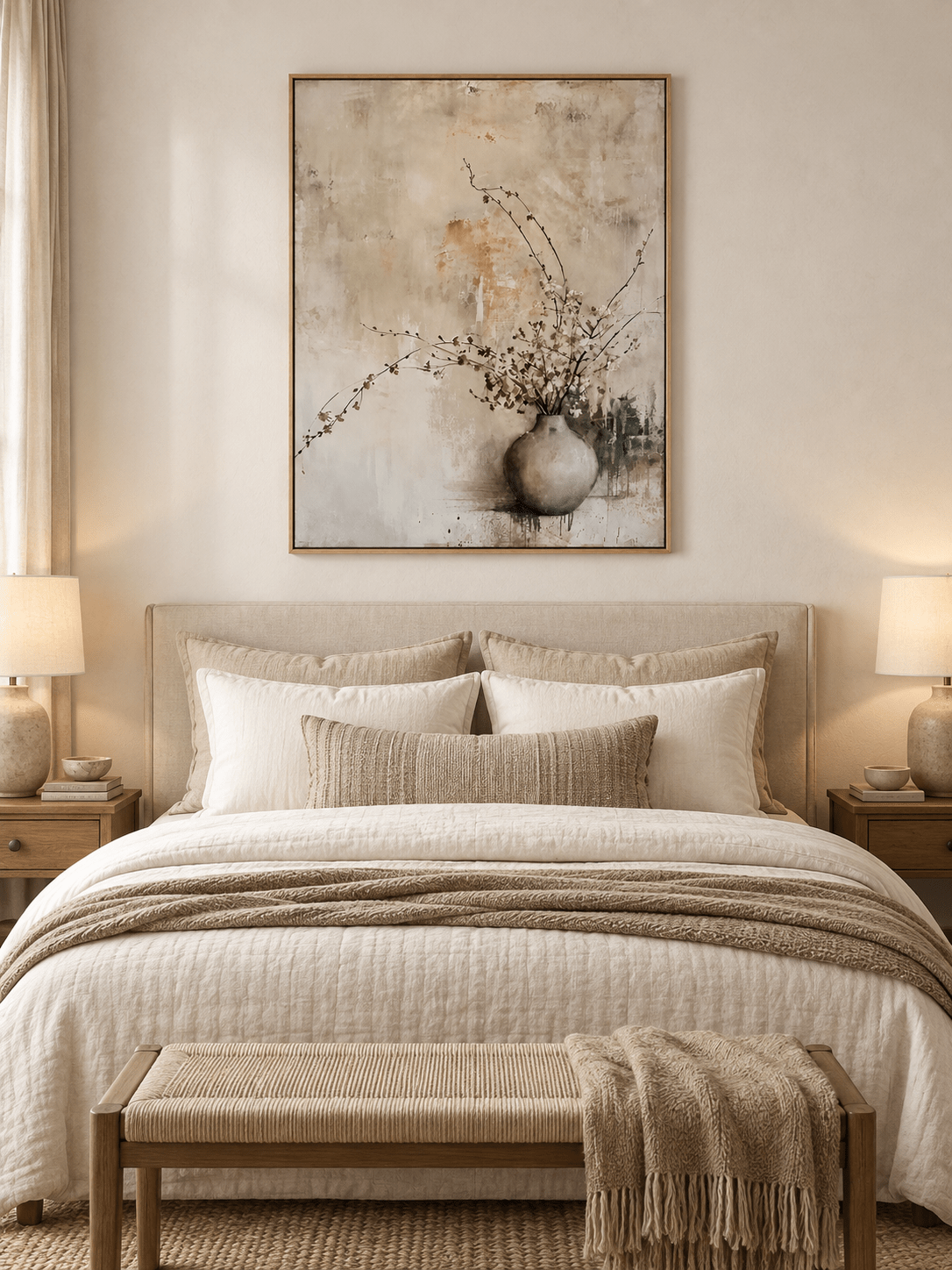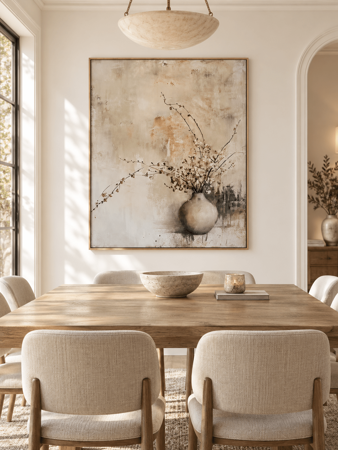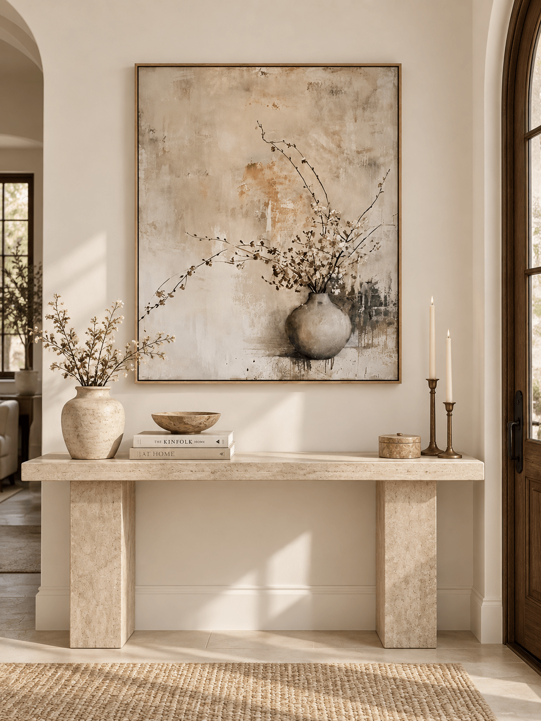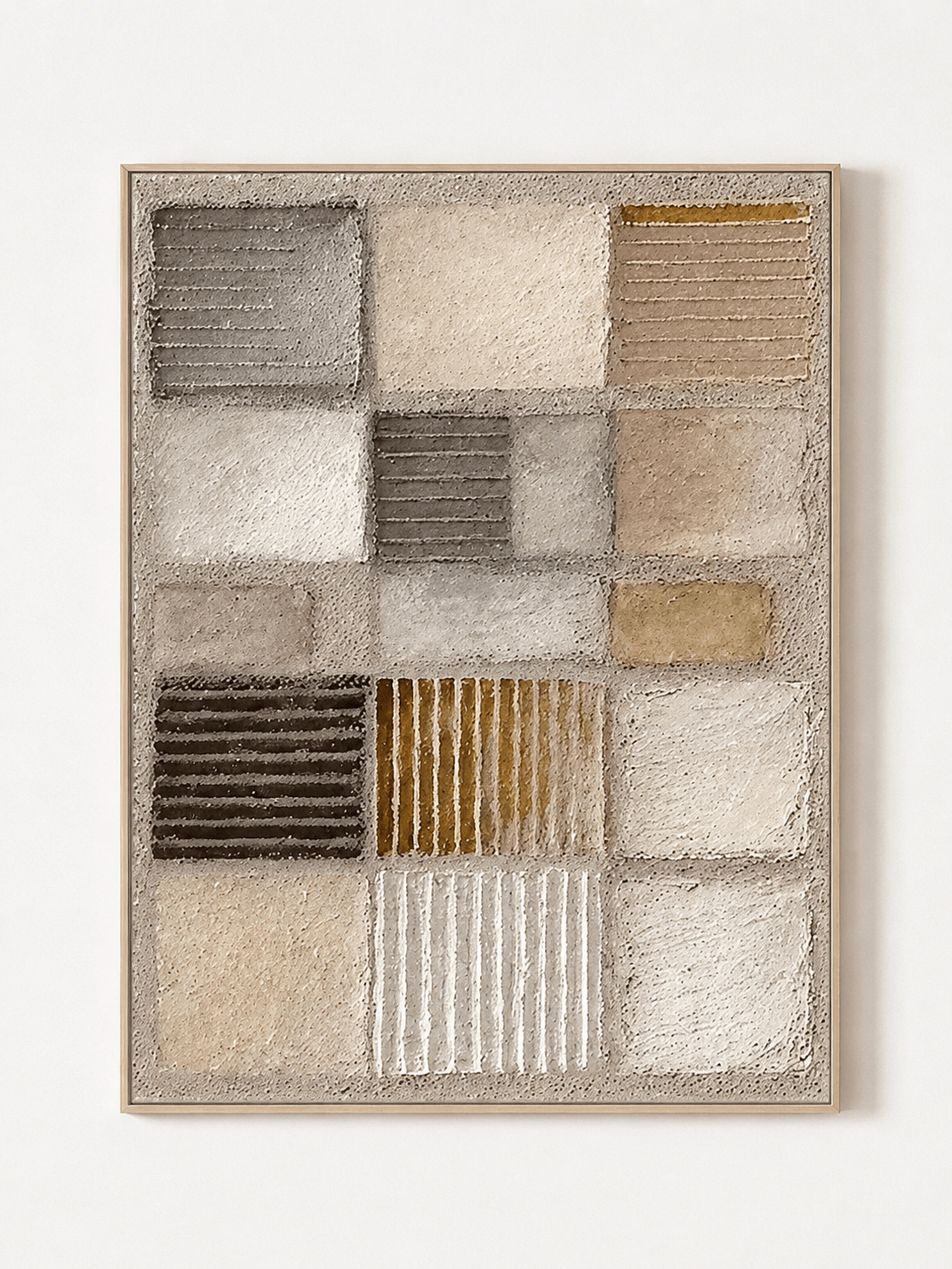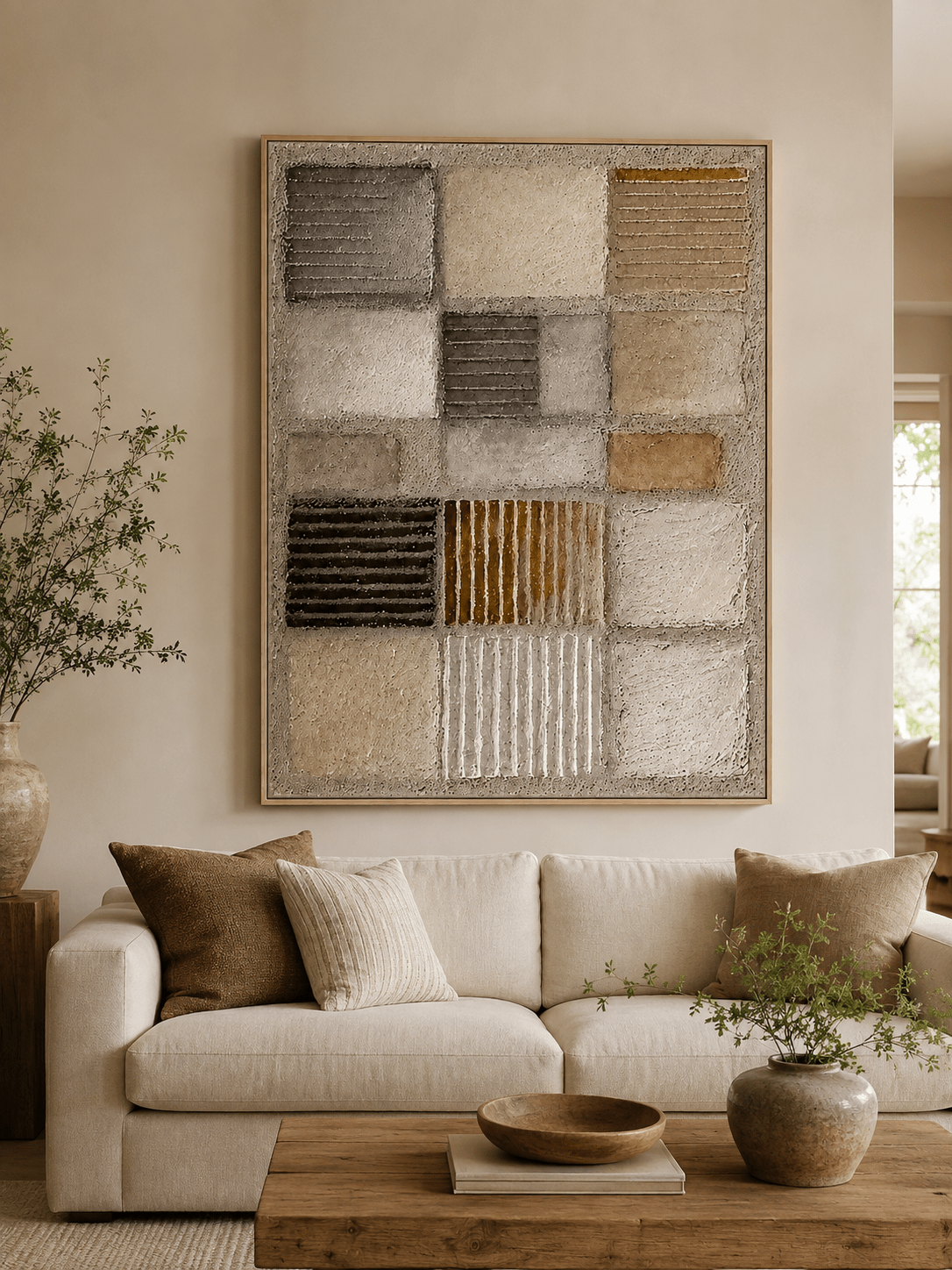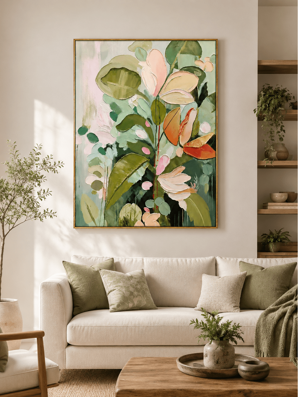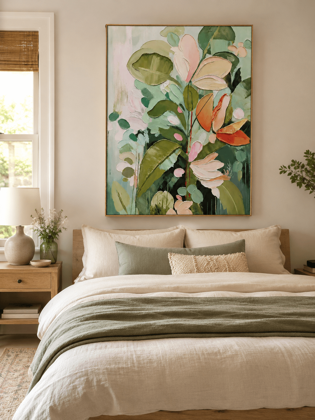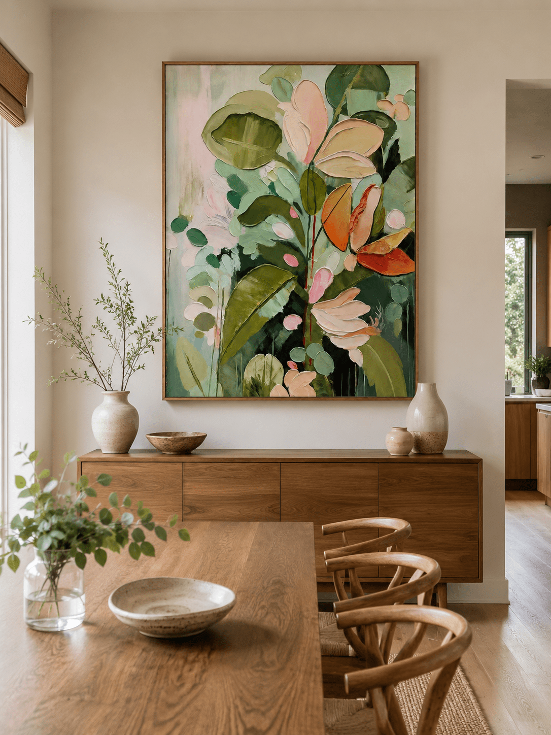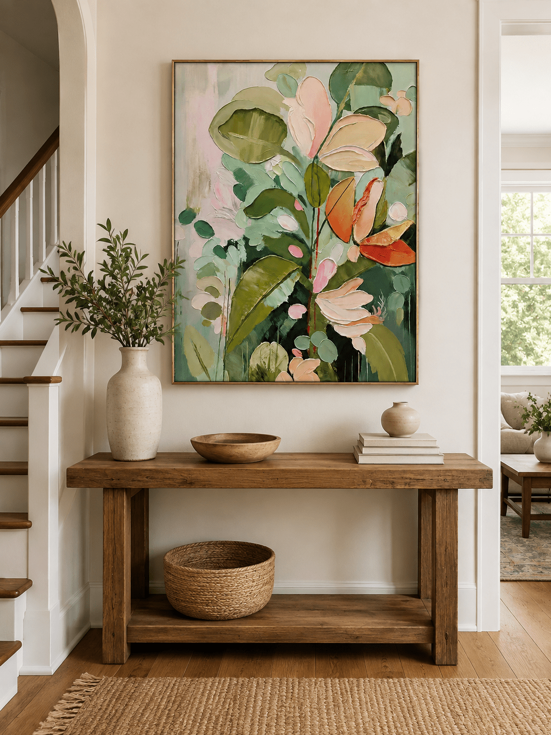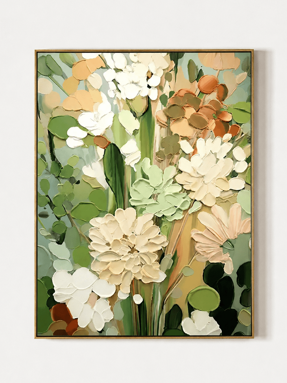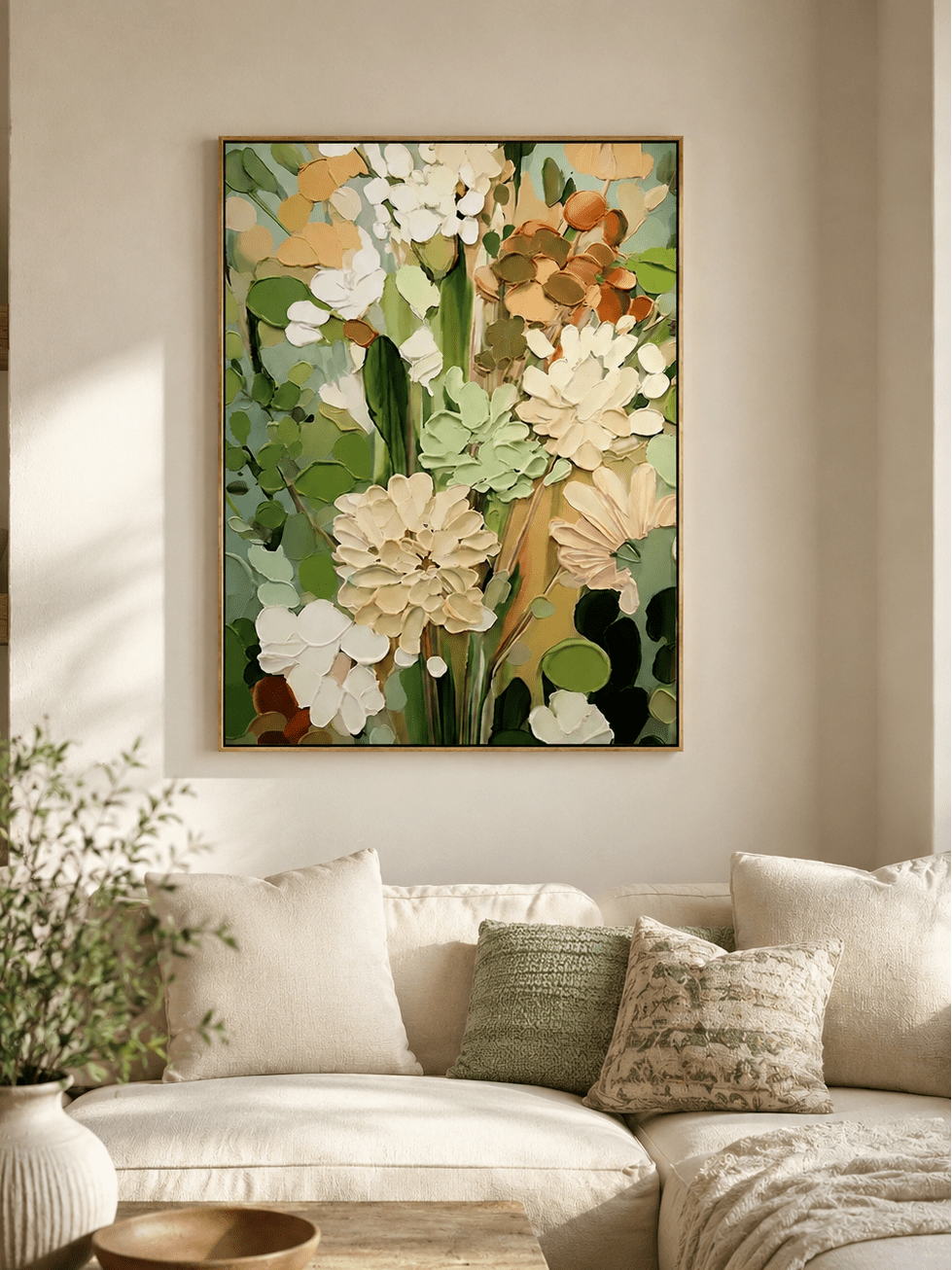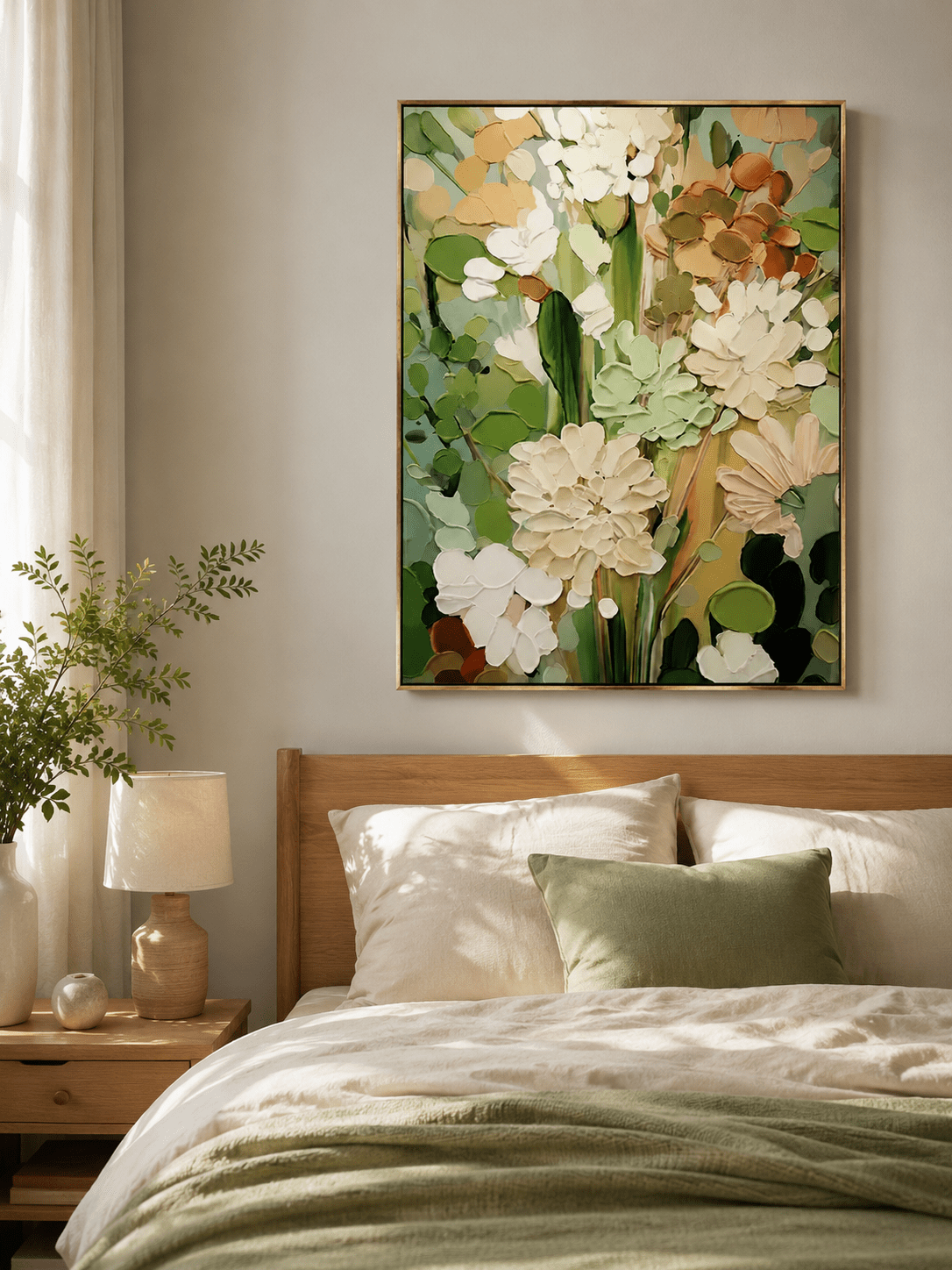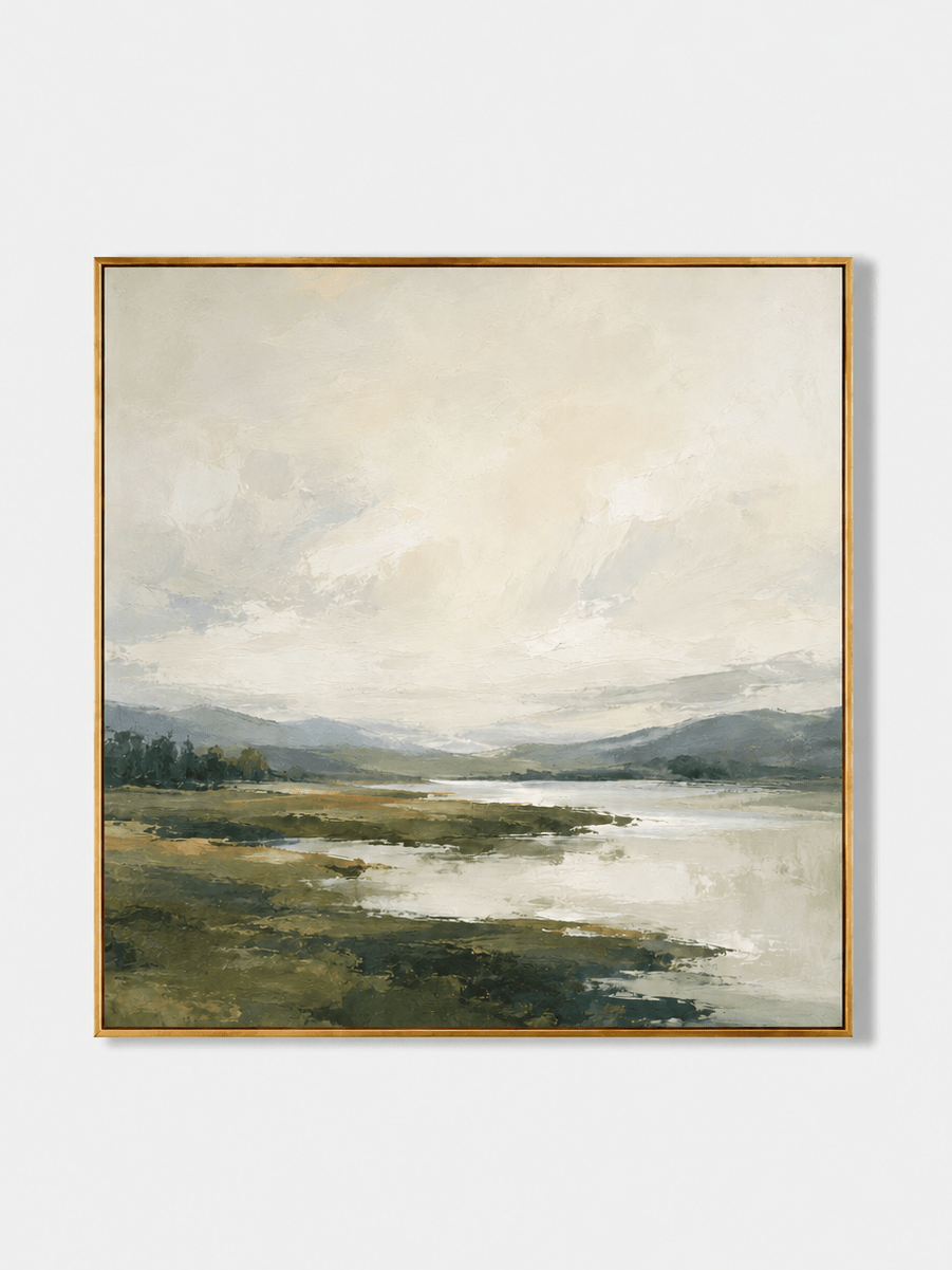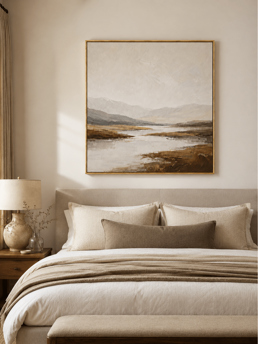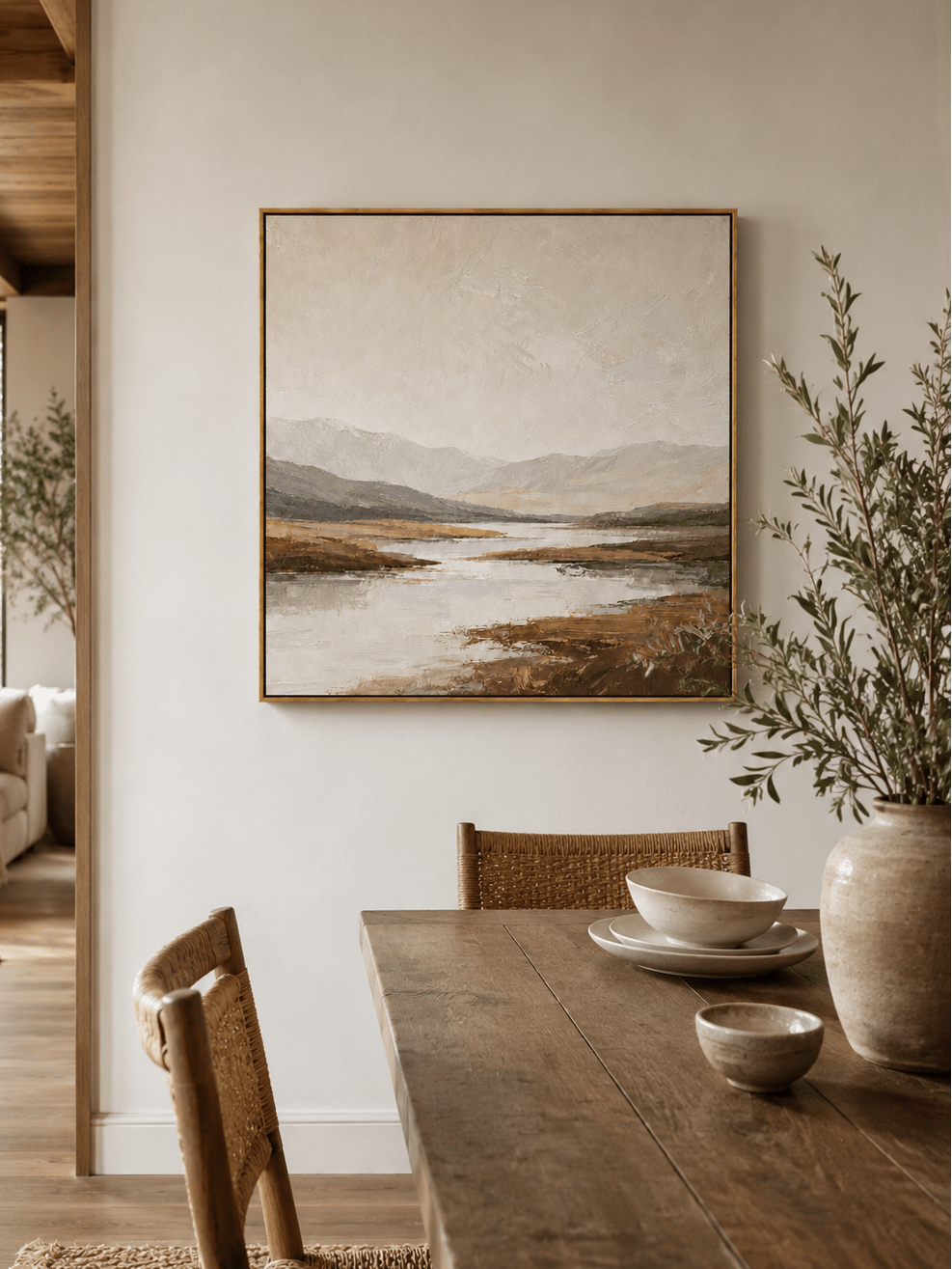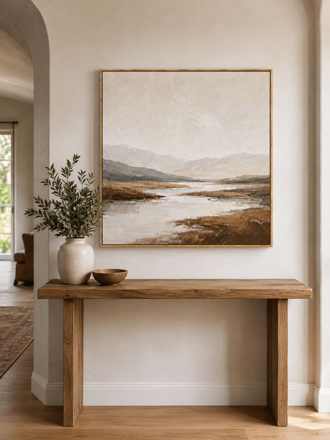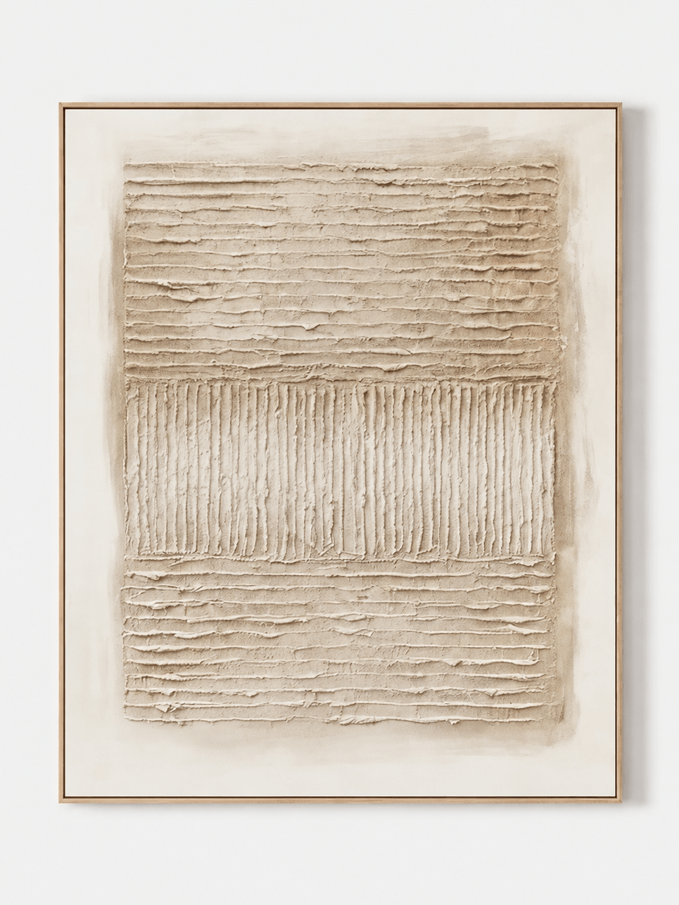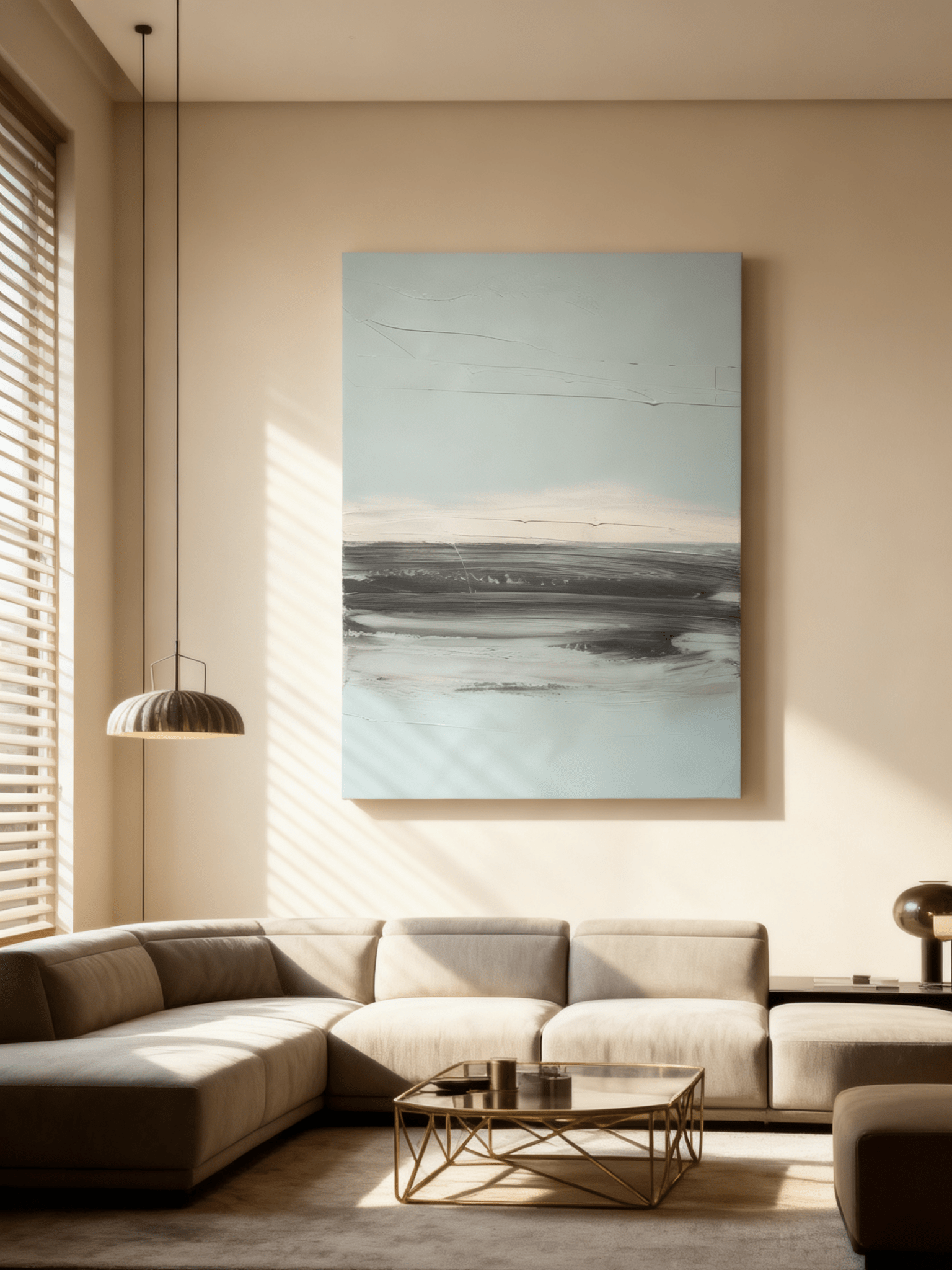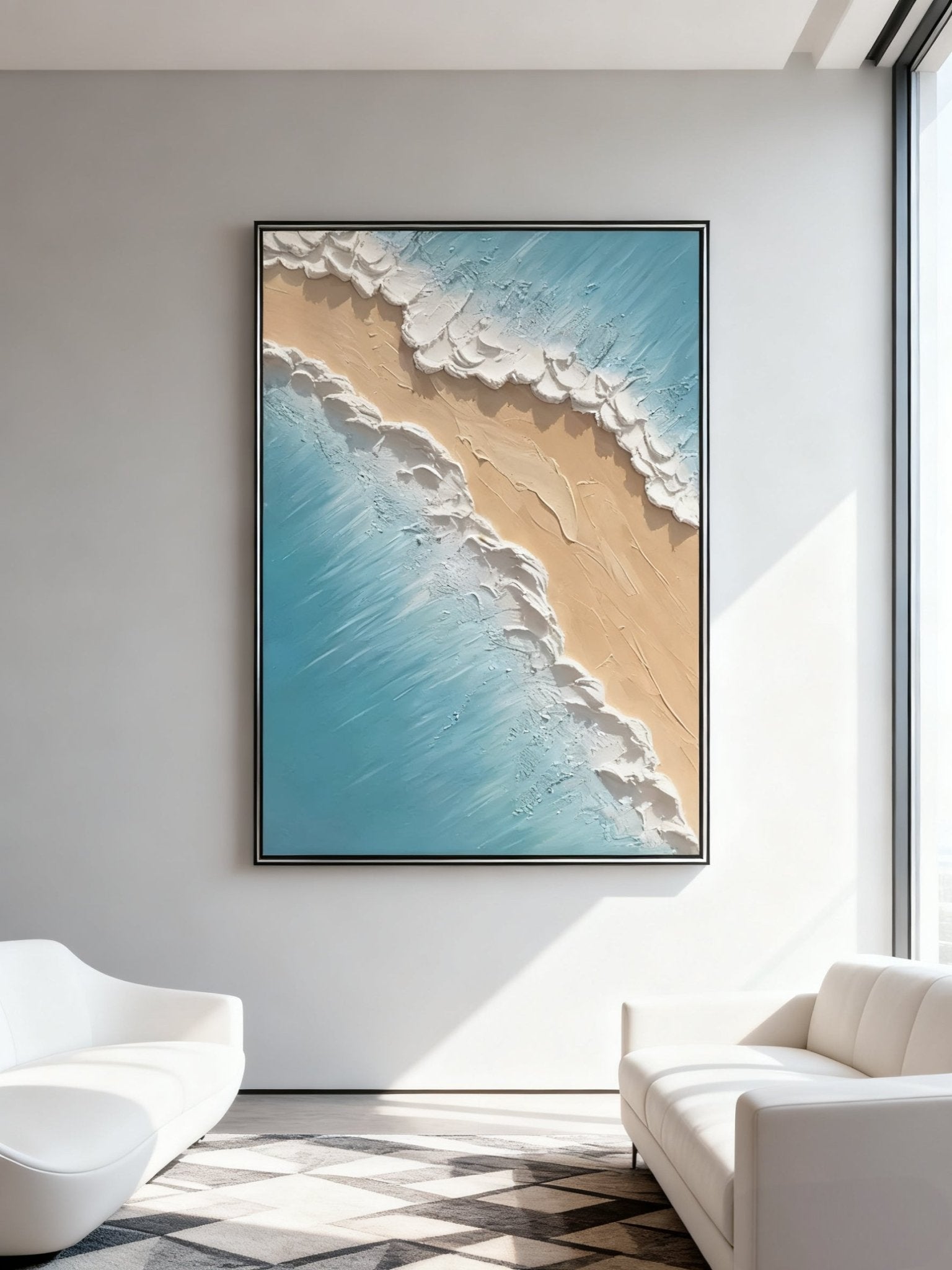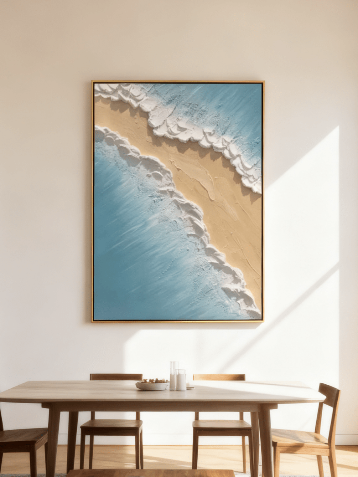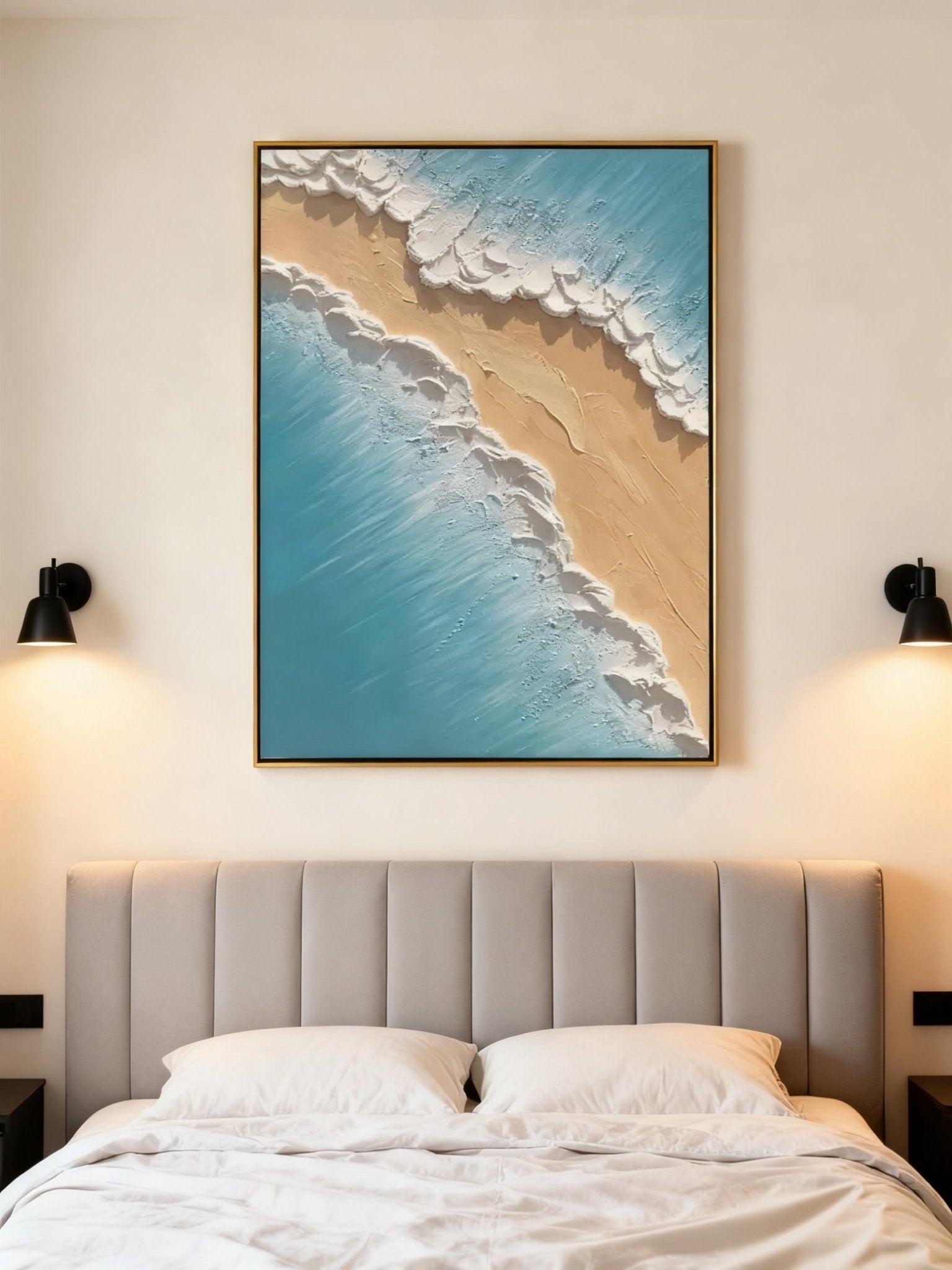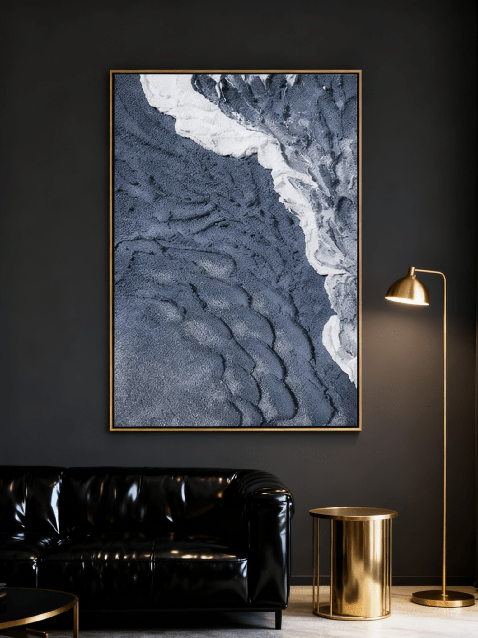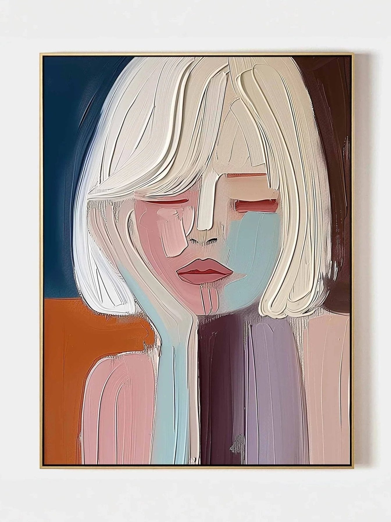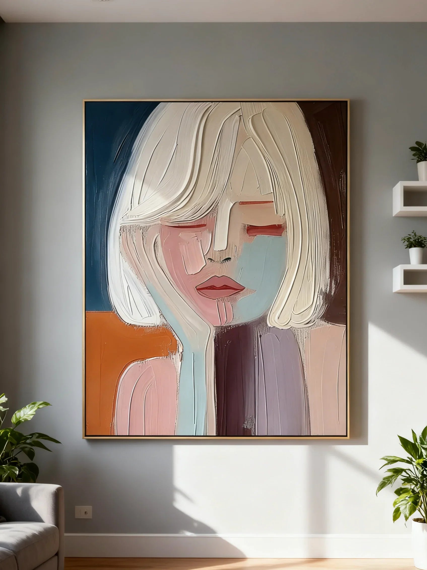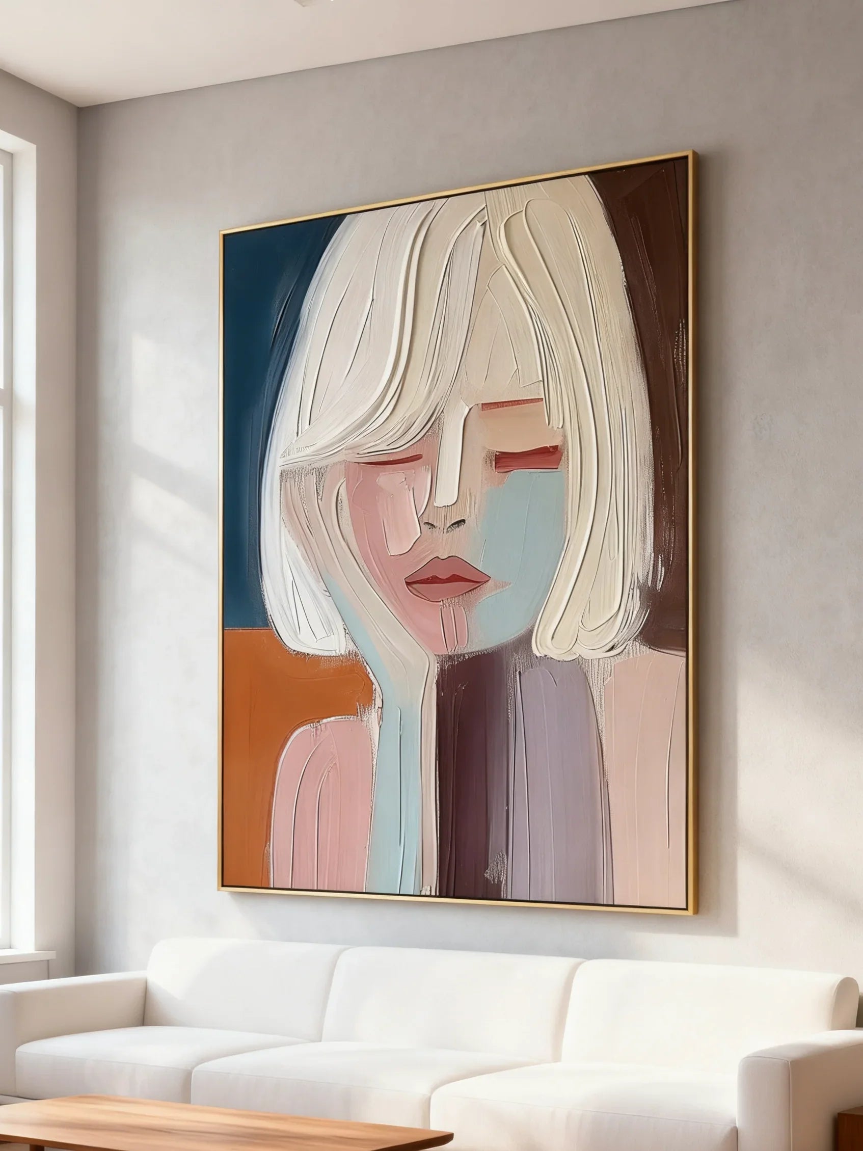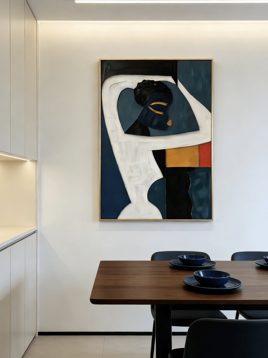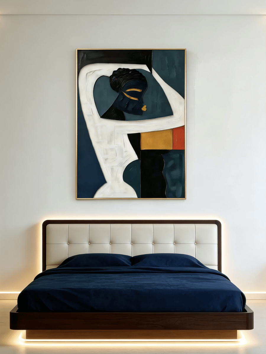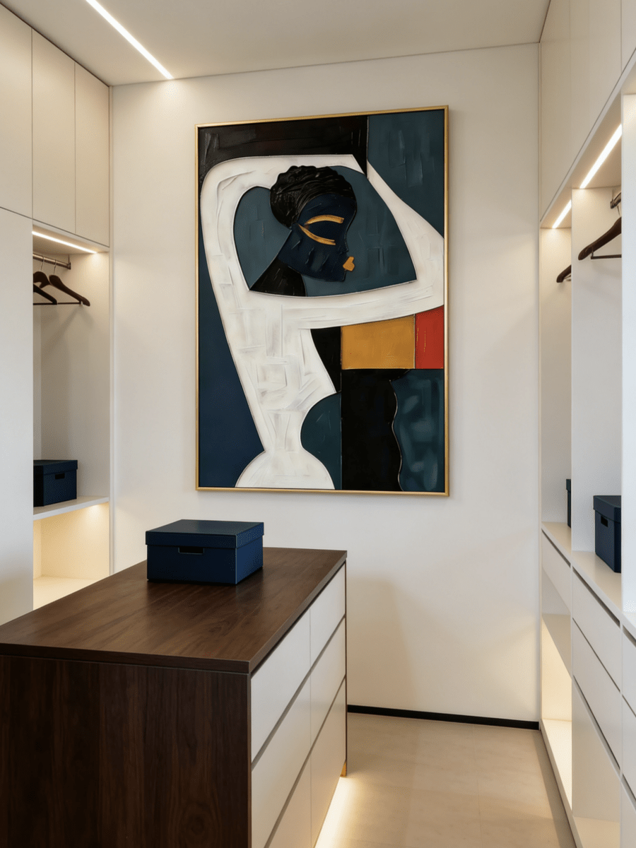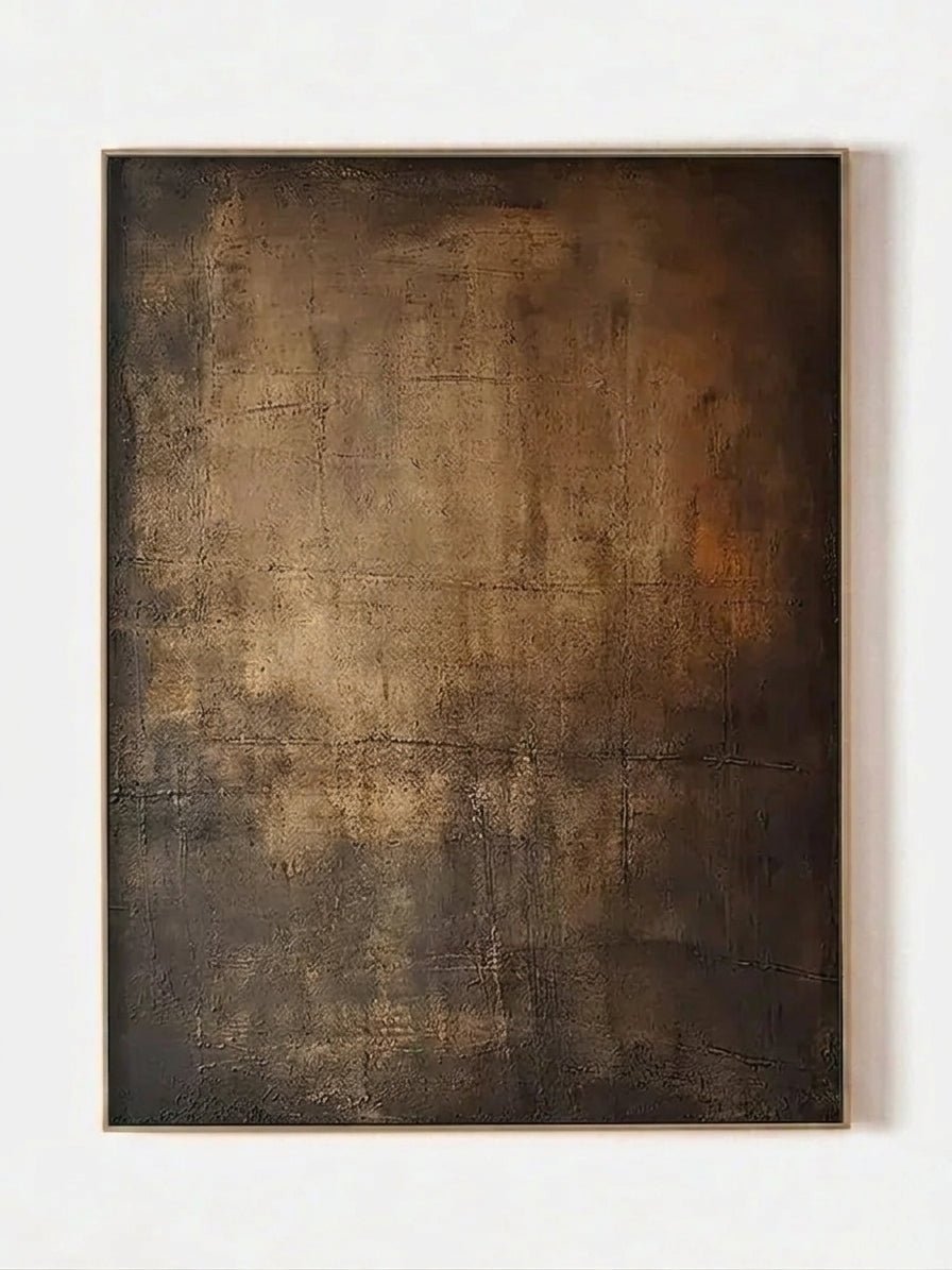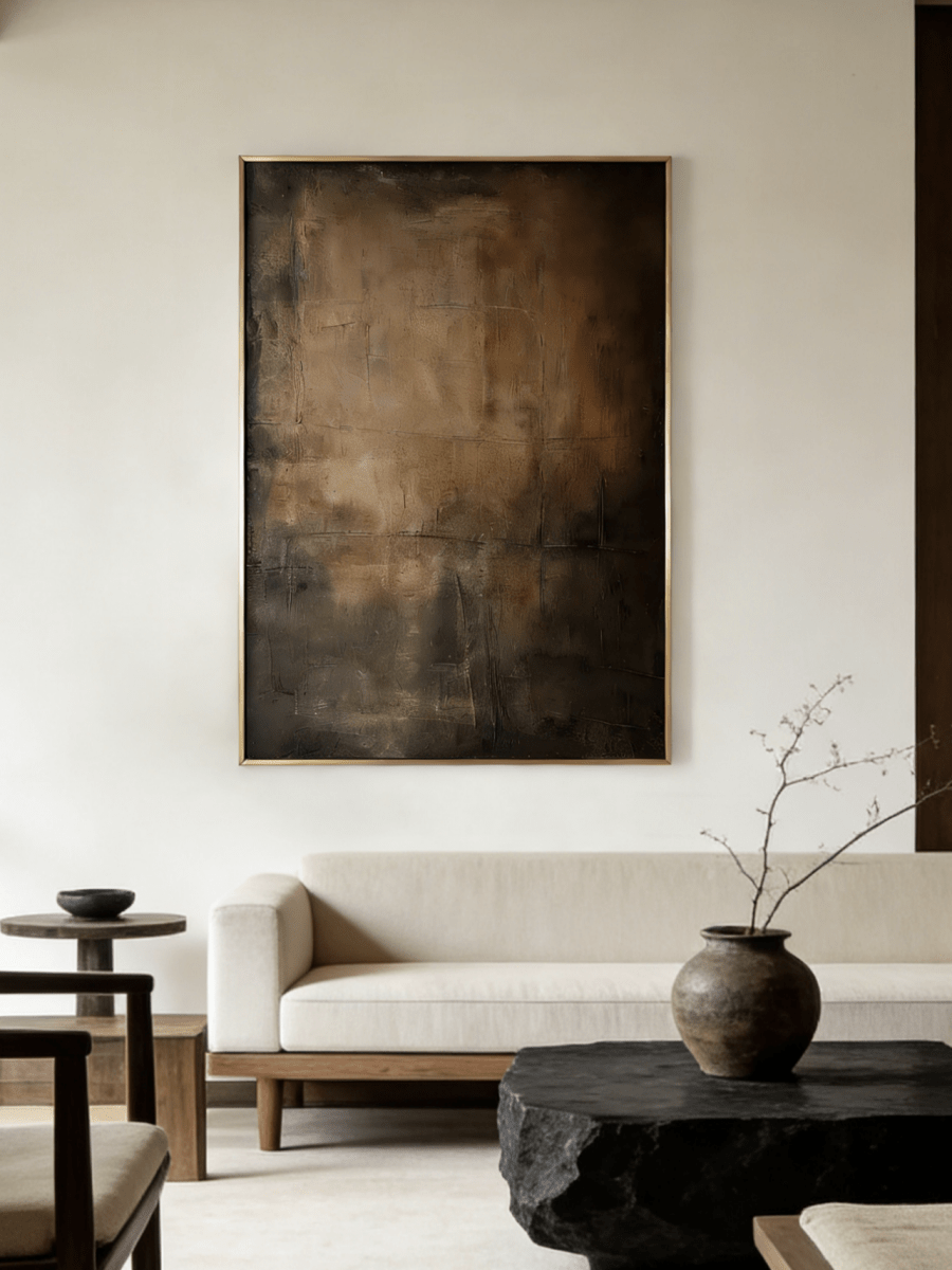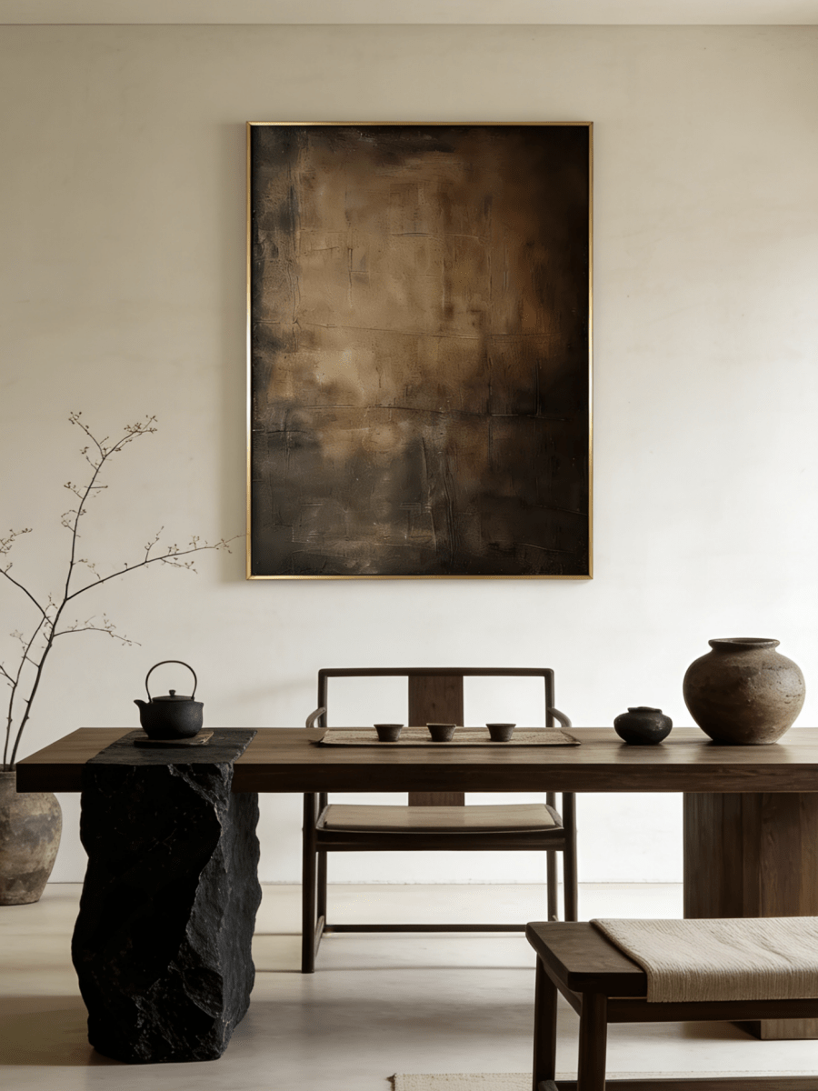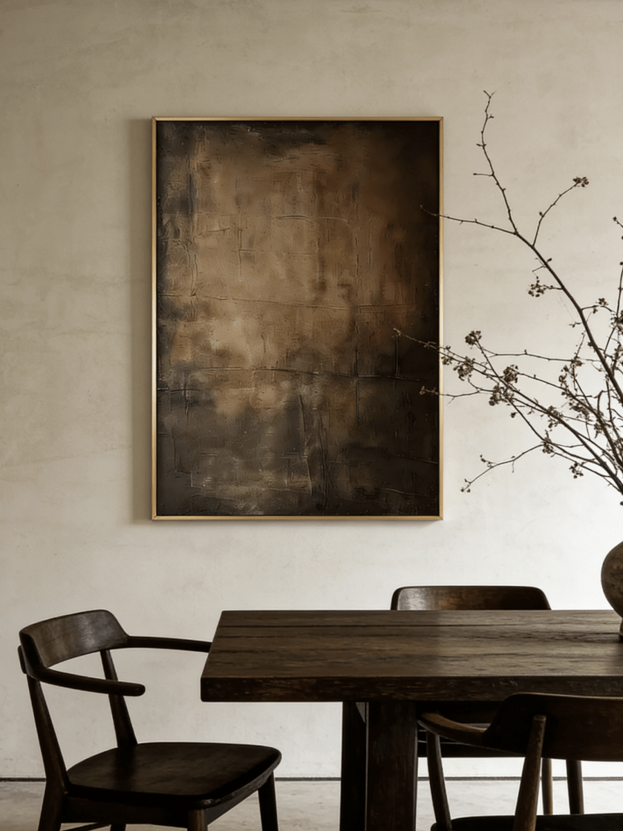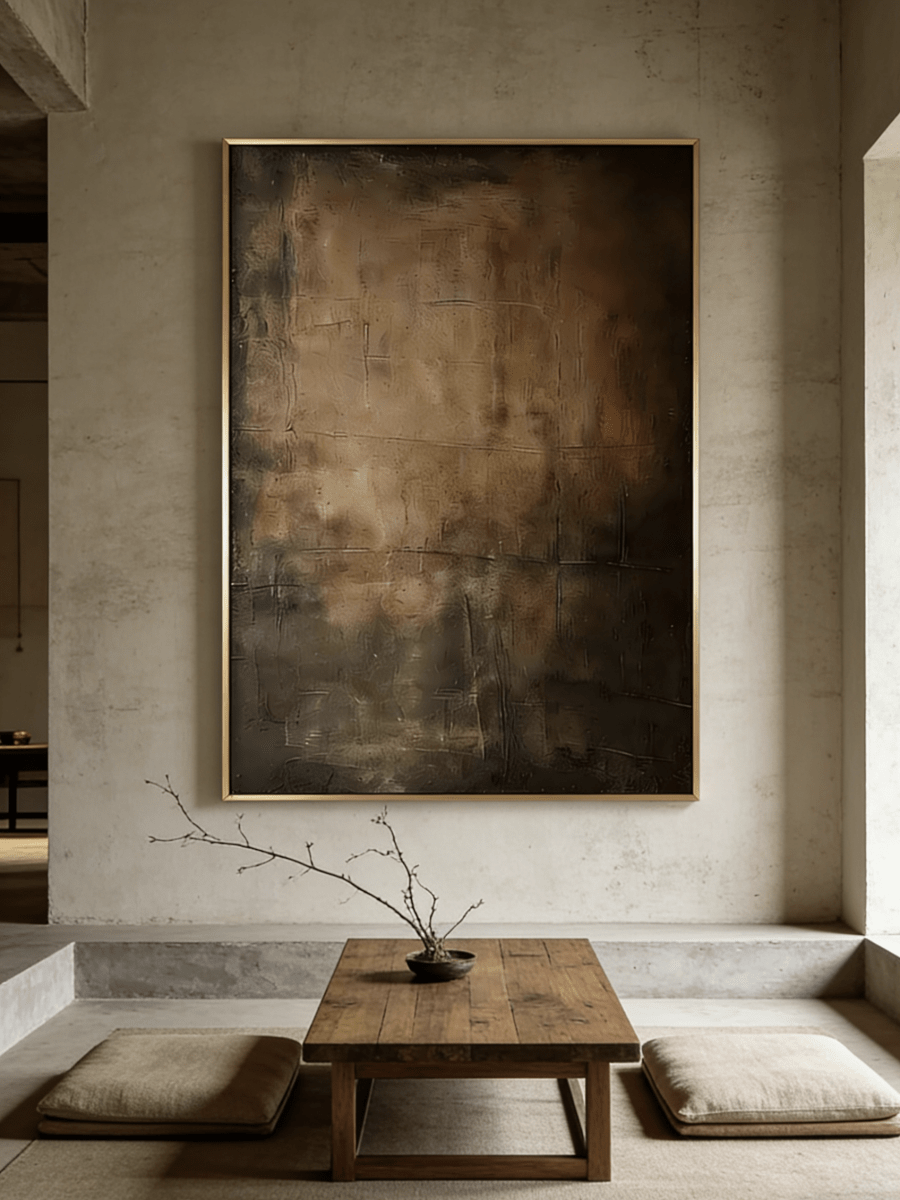

For years, the easiest formula for a modern room was simple: pale walls, restrained furniture, and wall art that stayed safely within the same neutral palette. That look is not disappearing, but it is changing. Across 2026—and in the first design forecasts for 2027—homes are becoming warmer, more tactile, more personal, and less interested in looking perfectly machine-made.
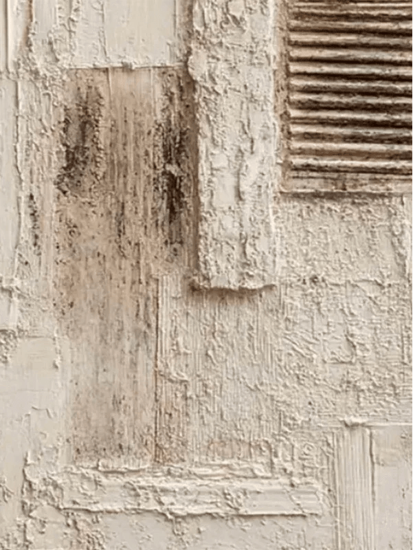
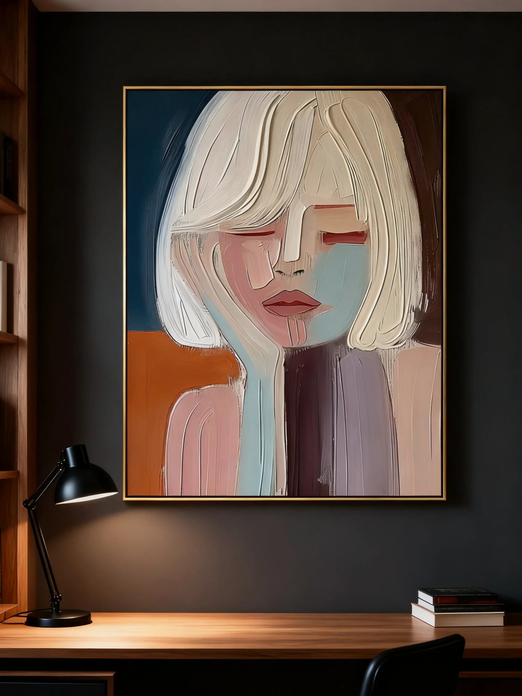
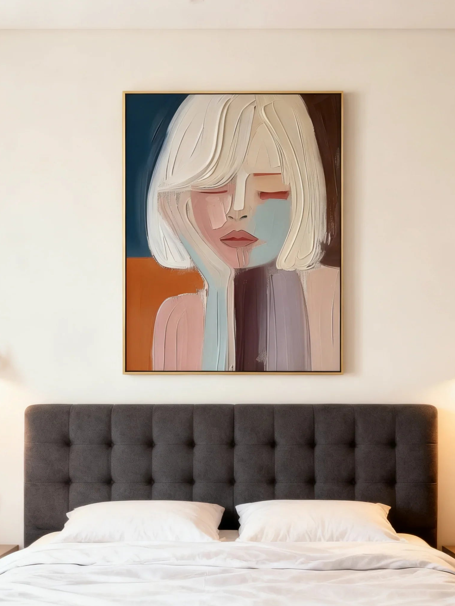
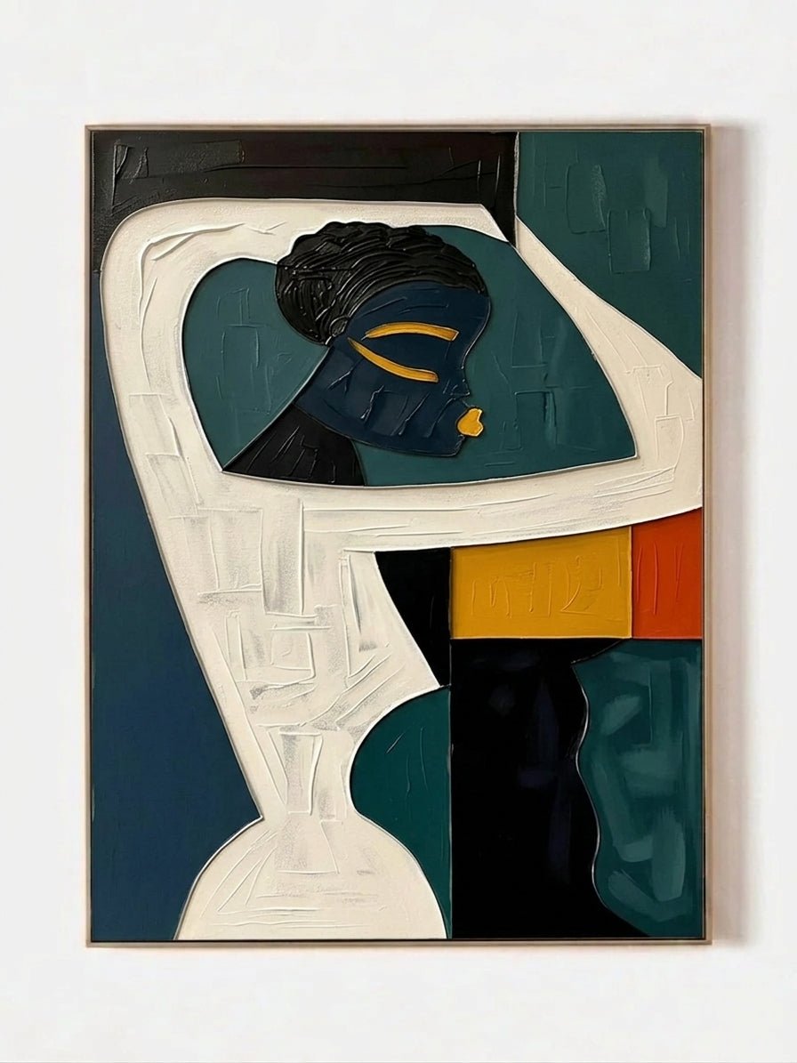
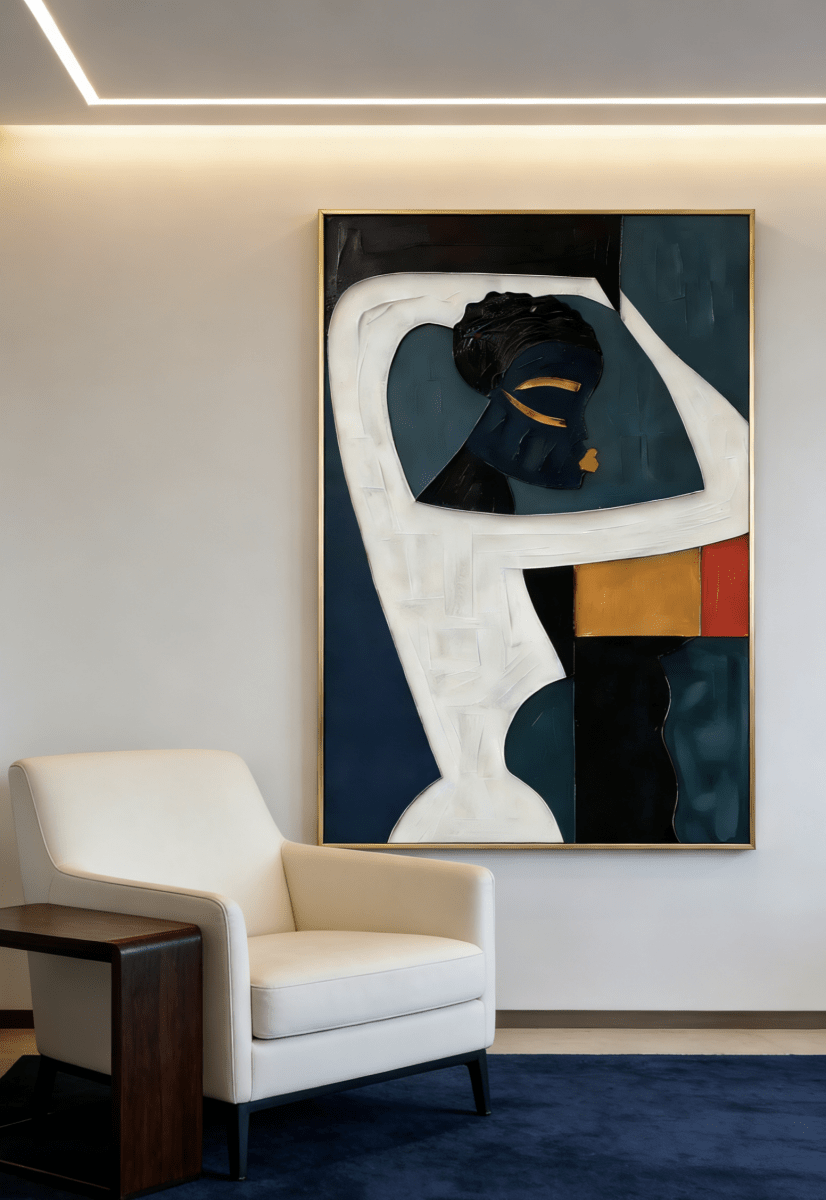
That shift matters for wall art. A painting is no longer expected to behave like a flat color block that simply fills an empty wall. Buyers are increasingly noticing the surface itself: the ridge left by a palette knife, the drag of a brush, a softened edge, a scraped-back layer, or the irregular transition where one color meets another. These details make a piece feel made rather than manufactured.
The broader design conversation points in the same direction: tactile interiors, natural materials, warm color, and spaces with character rather than showroom perfection. Color forecasts are moving beyond quiet beige toward grounded greens, nuanced browns, coppery earth tones, muted mauves, and softened blues.
For anyone choosing art now, the takeaway is not that every room needs to chase a trend. It is that the definition of “timeless” is broadening. Texture can be timeless. Visible handwork can be timeless. Color can be timeless when it works with the materials, light, and mood already present in the room.
The short version: 2026–2027 wall art is moving from perfect surfaces to expressive surfaces, from generic neutrals to nuanced color, and from matching a room to giving the room a stronger identity.

1. The Mark of the Maker Becomes Part of the Look
One of the clearest changes is that evidence of the artist’s hand is becoming a selling point rather than something to hide. In mass-produced decor, consistency is the goal. In a hand-painted work, small variations can do the opposite: they tell the viewer that a real surface was built layer by layer.
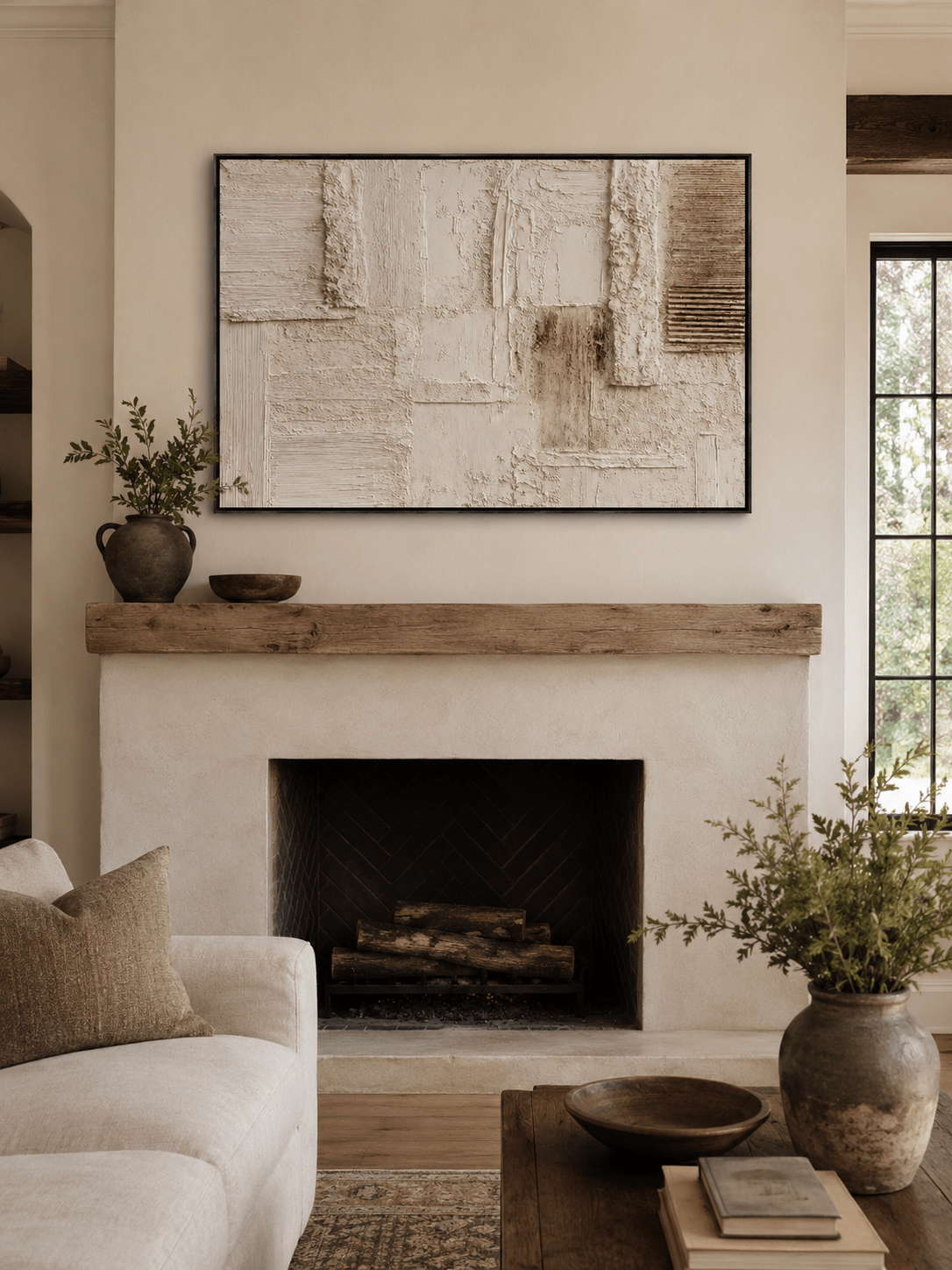
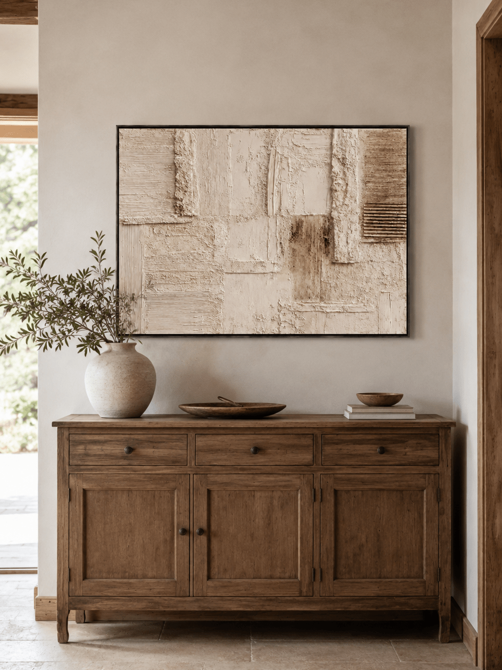
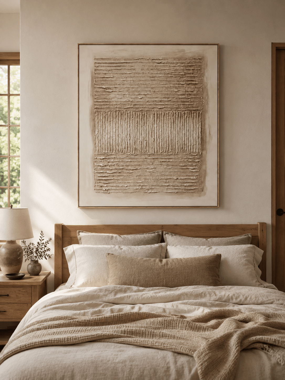
This is especially relevant to impasto, plaster-style relief, layered abstract painting, and atmospheric landscapes. When a brushstroke remains visible, it can create movement. When a palette knife leaves a raised edge, side light creates a shadow. When a thin glaze sits beside a rougher passage, the contrast adds depth even if the palette is restrained.
At WABI Wall Art, that quality is visible across the current Textured Wall Art collection, where many designs use layered paint, raised forms, and hand-shaped surfaces rather than printed simulations of texture. You can also explore Wabi-Sabi Wall Art for quieter surfaces that reward close viewing.
2. Texture Is Shifting From Effect to Material Presence
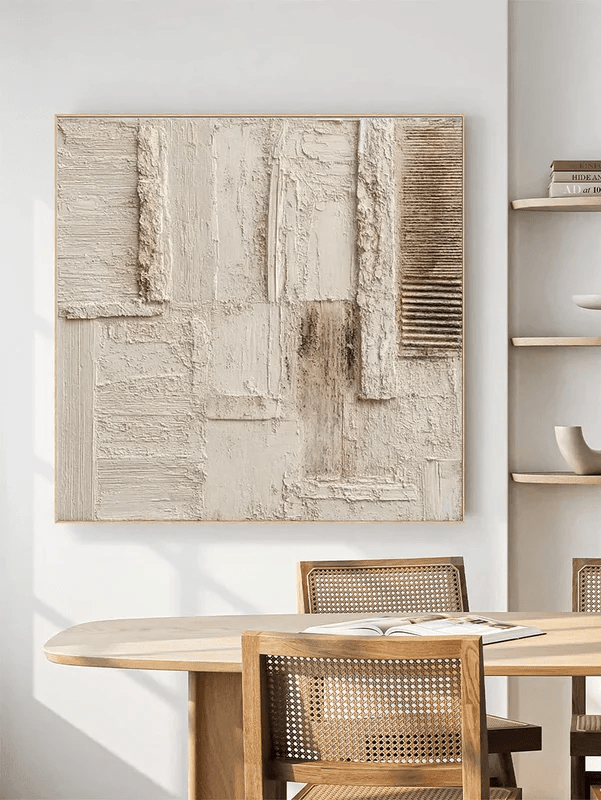
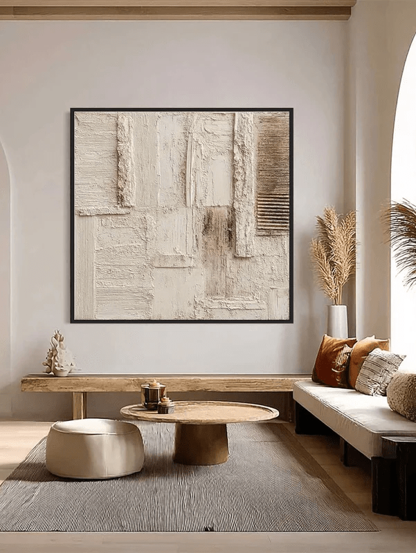
Texture is not new, but the way it is being used is changing. The 2026 interiors conversation is increasingly about tactile environments: plaster, stone, linen, seagrass, terracotta, carved wood, woven fibers, and surfaces that catch light unevenly. Wall art fits naturally into that material mix when the texture feels integral to the composition instead of added as decoration.
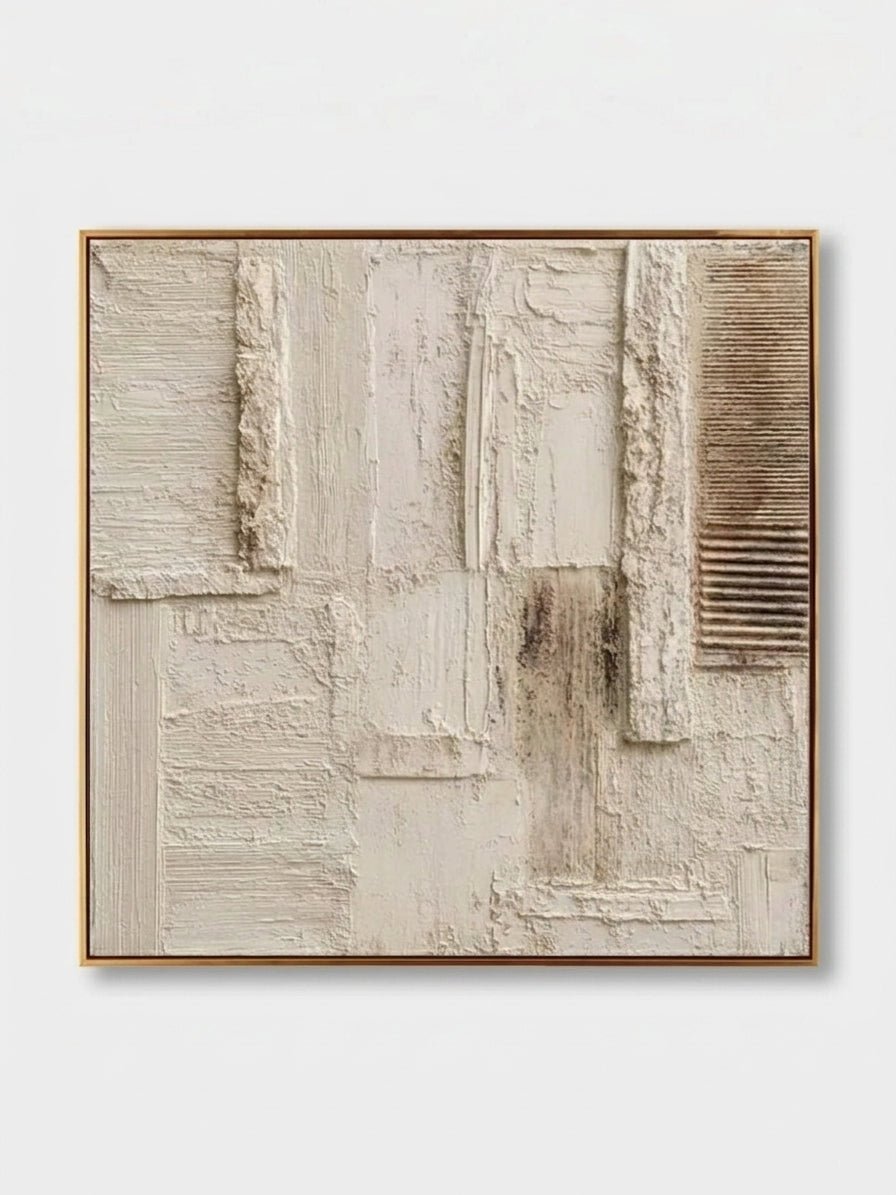
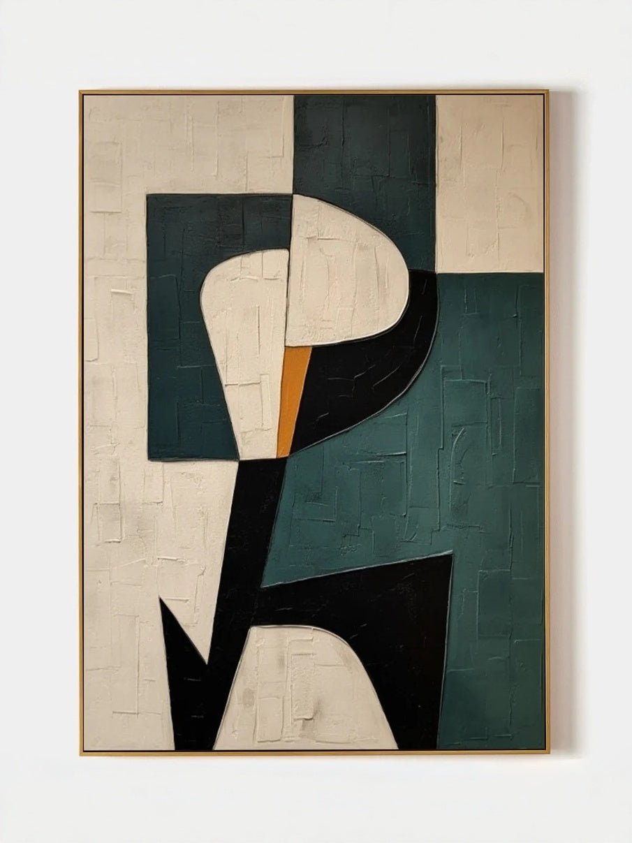
The most convincing textured paintings do more than create height. They direct the eye. Curved ridges can suggest water or wind. Repeated marks can create rhythm. Broken plaster-like fields can make a geometric composition feel aged and architectural. A restrained white or taupe painting can become visually rich because the shadows change throughout the day.
This is why textured wall art works particularly well in organic modern, Wabi-Sabi, Japandi, warm minimalist, and contemporary interiors. Those rooms often rely on a limited palette, so material contrast does the work that bright color or pattern might do elsewhere.
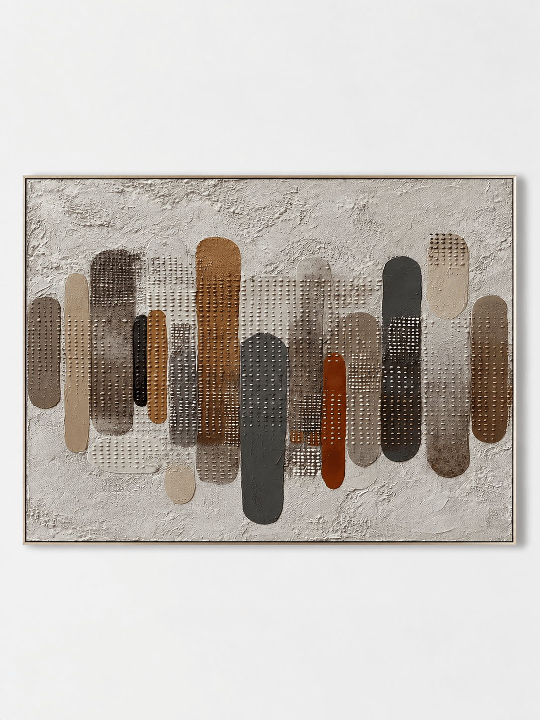
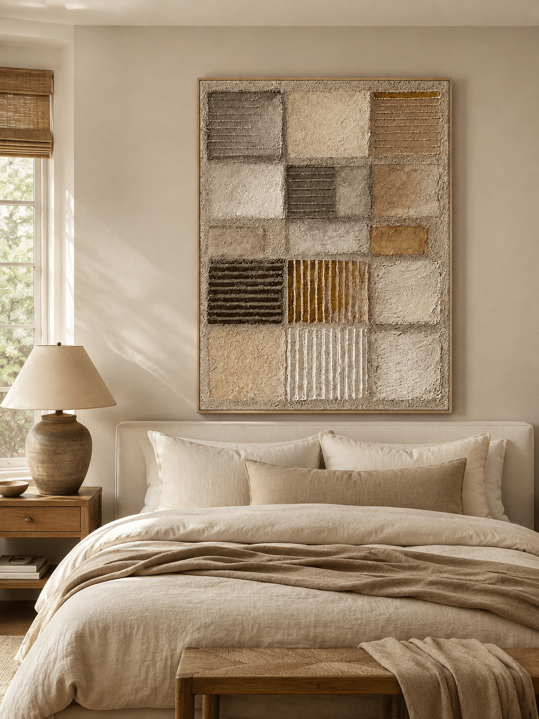
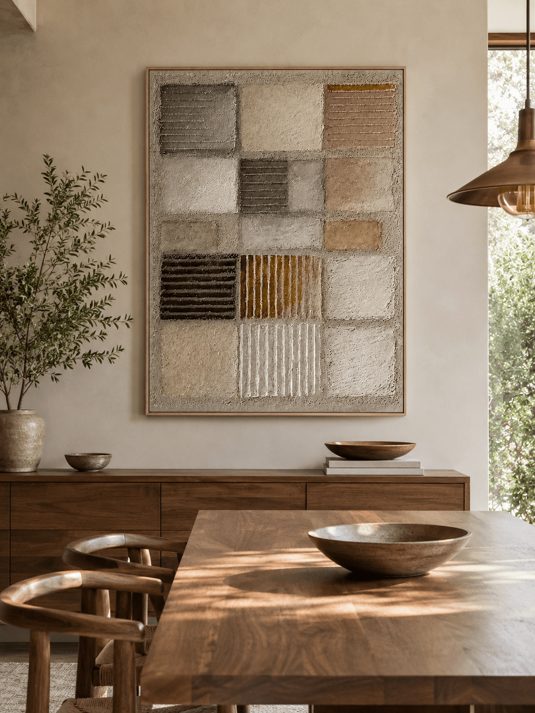
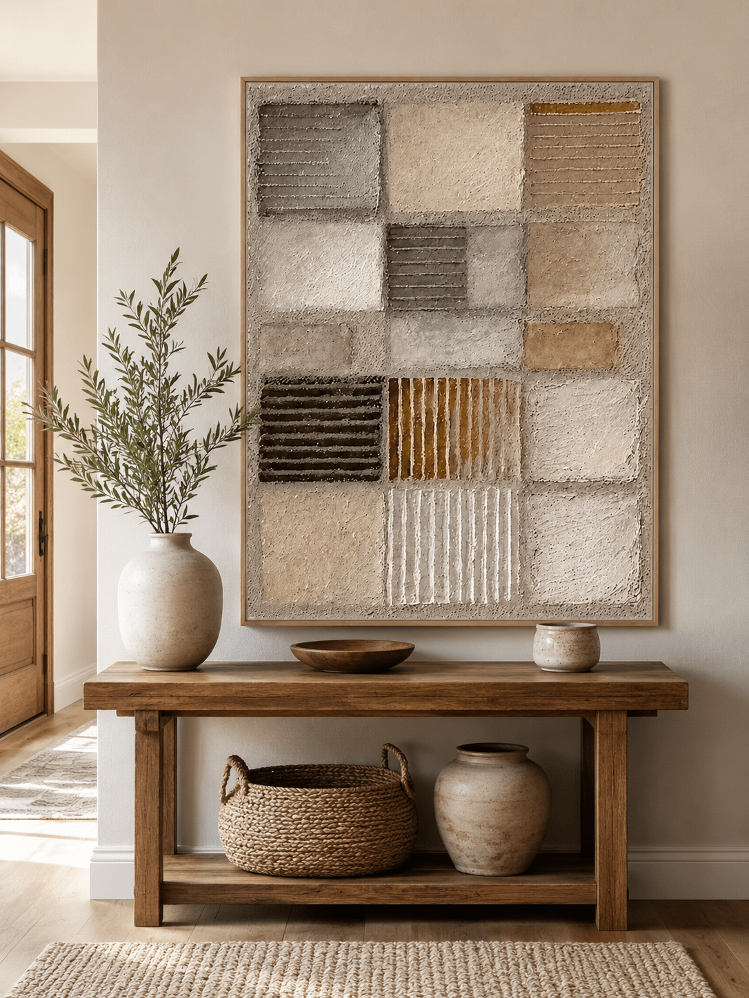
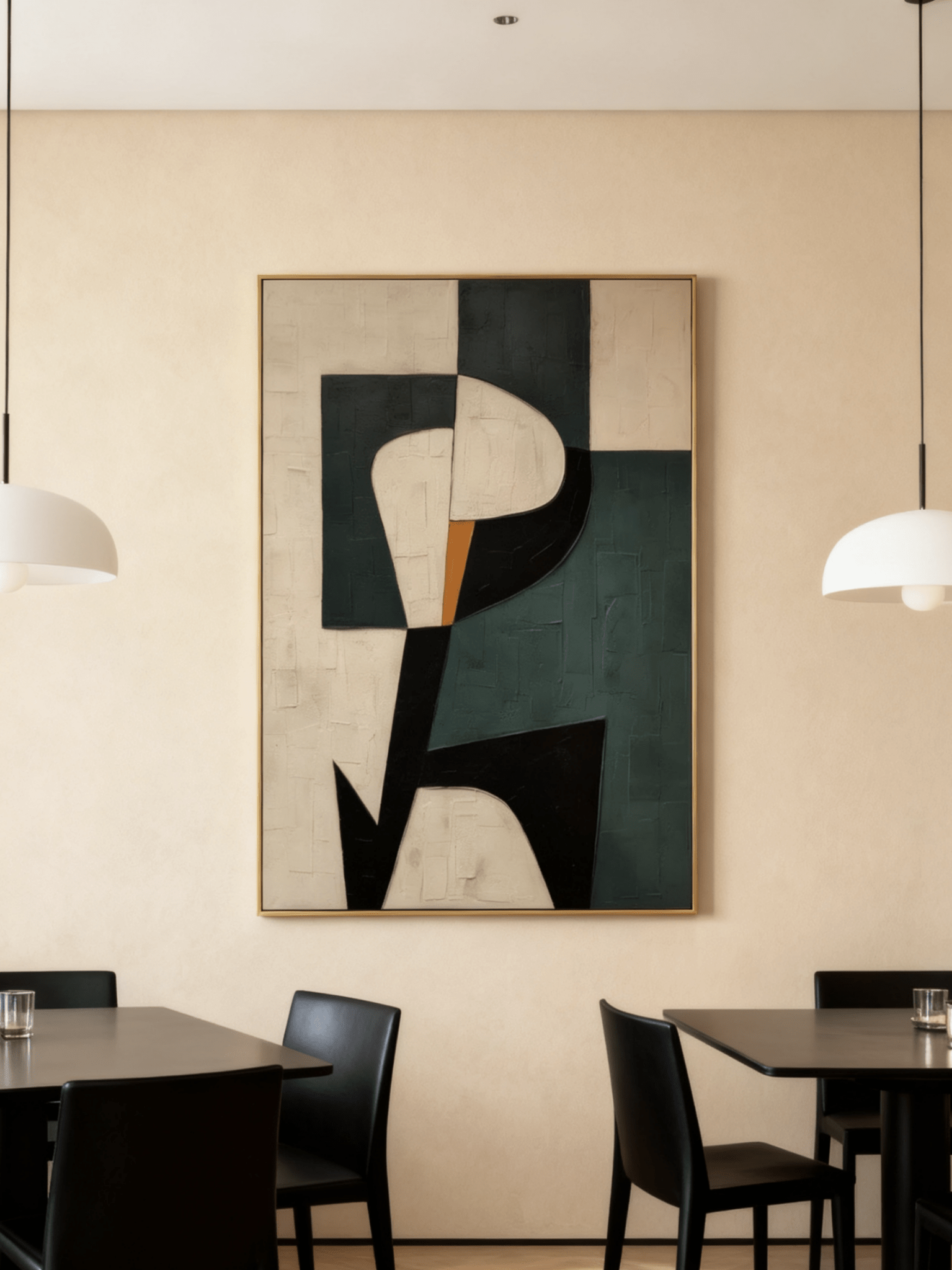
Weathered Strata – EV#0432 uses warm ivory, sand, concrete gray, and muted rust in an expansive composition. Its appeal comes from the way irregular architectural fields and physical surface variation interact with light.

3. Warm Neutrals Are Evolving, Not Disappearing
Beige is not over, but flat beige is losing ground. The more interesting neutral rooms now layer cream, oat, stone, taupe, camel, clay, caramel, mushroom, cocoa, espresso, and weathered brown. These colors still create calm, but they give the eye more tonal information.
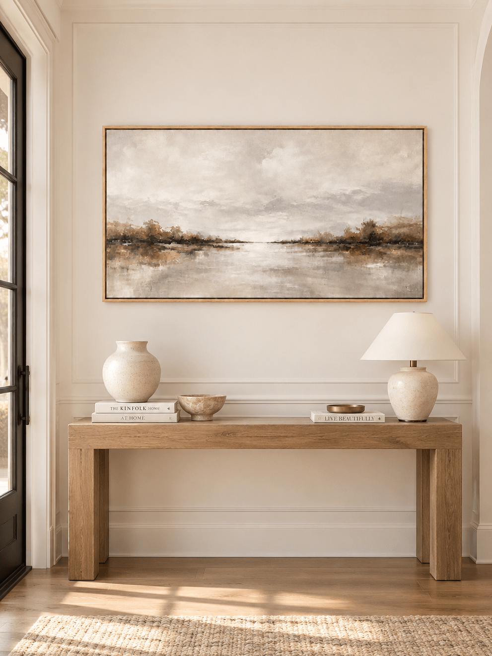
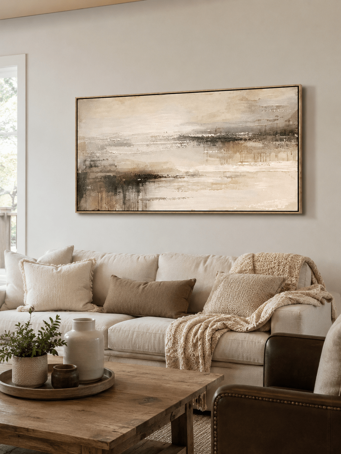
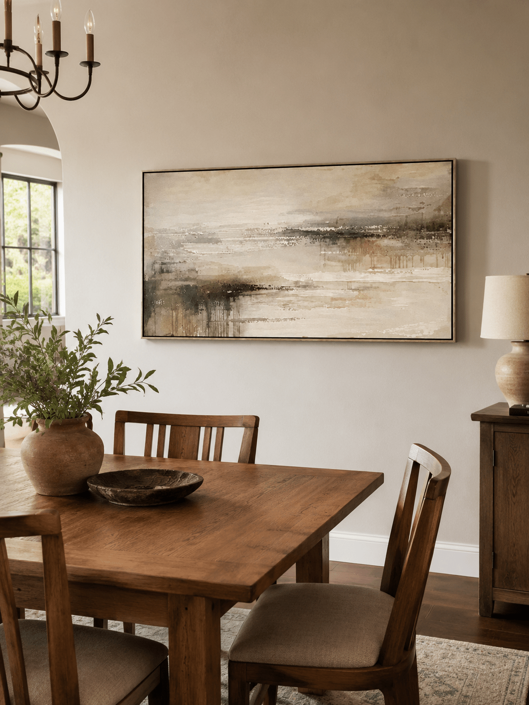
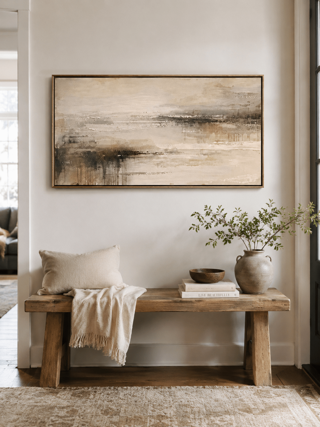
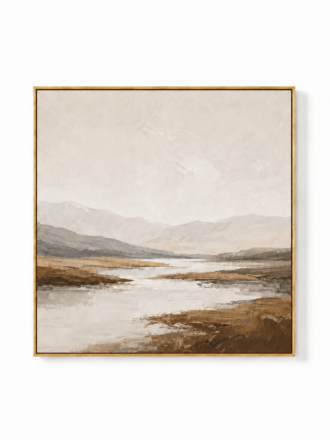
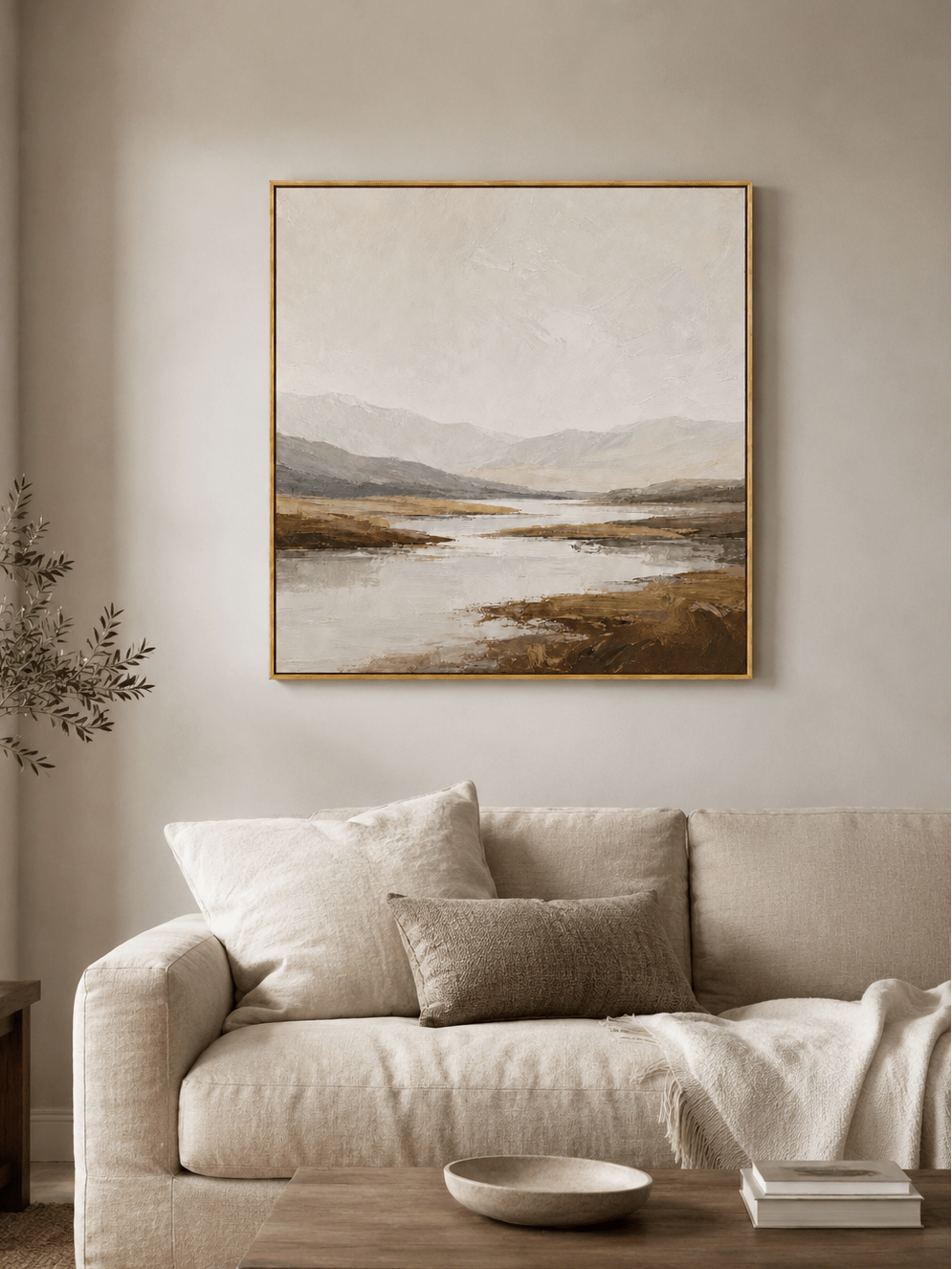
For wall art, this means a neutral piece should have a reason to exist beyond simply matching the sofa. Surface, value contrast, edge quality, and composition become more important. A caramel geometric relief can bring rhythm to a cream room. A brown-and-ivory shoreline can echo walnut furniture without disappearing into it. A soft gray-beige landscape can make a quiet room feel deeper rather than emptier.
Early 2027 forecasts reinforce this direction. Brown is being treated less as a throwback and more as a flexible grounding color, while copper, ochre, tan, and earthy red are returning as sophisticated accents. In practice, that gives neutral art a warmer and more collected feel. Compare Caramel Mosaic – EV#0424 with Wabi-Sabi Brown Texture Wall Art – EV#0016.
4. Green Is Becoming a Long-Term Interior Neutral
Sage green has already proved that green can function almost like a neutral, but the next phase is broader. Olive, moss, mineral green, smoky jade, and deeper historic greens are entering rooms that might previously have relied on gray or navy.
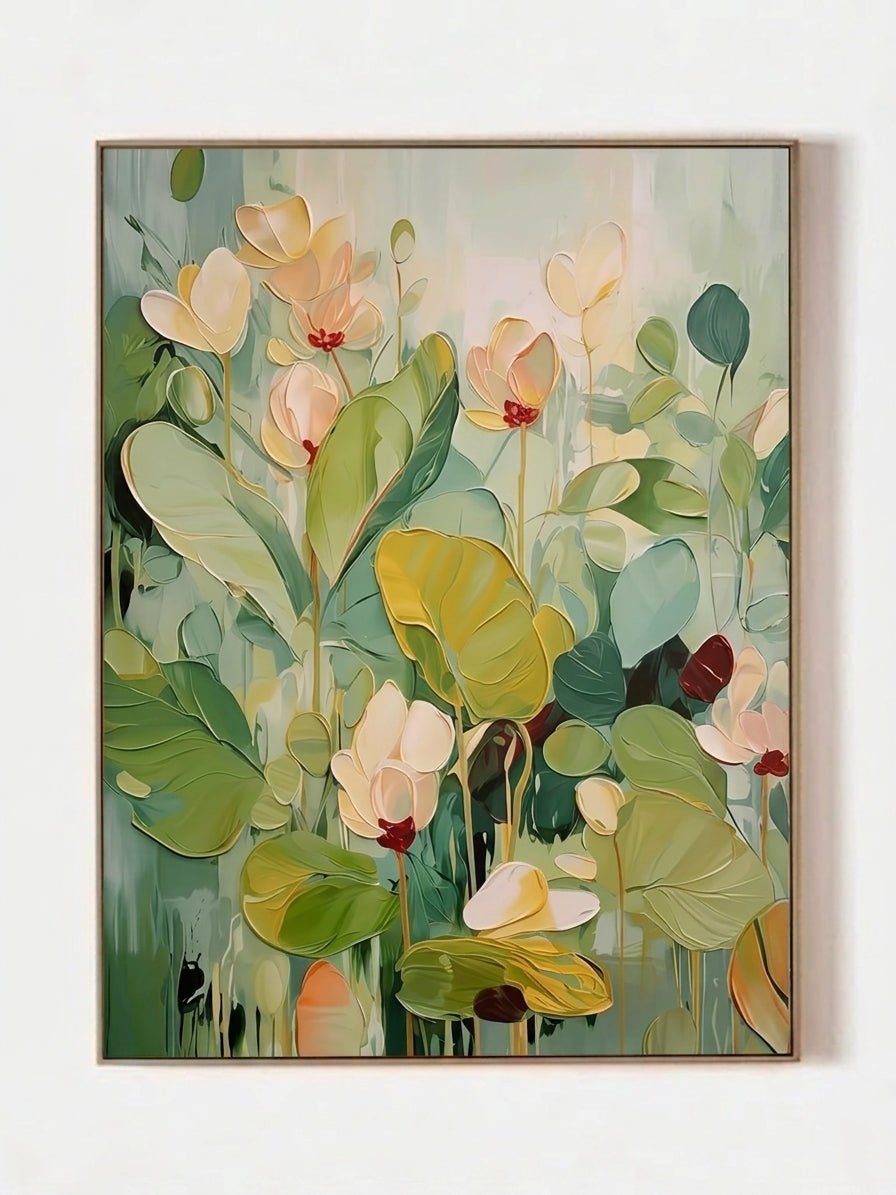
Green connects easily with wood, stone, linen, leather, black metal, warm white, and brass. It can feel botanical without requiring literal leaves or flowers. For a buyer who wants color but worries about long-term flexibility, a muted green abstract painting is one of the safest ways to move beyond beige.
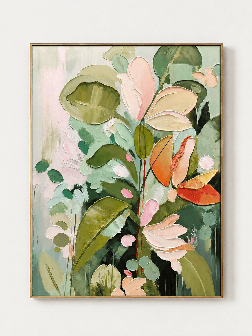
Sage Green Abstract Heavy Texture Painting – LL#0124 brings natural movement and ribbed surface into a room. Browse the Sage & Olive Green Wall Art collection for more grounded green options.

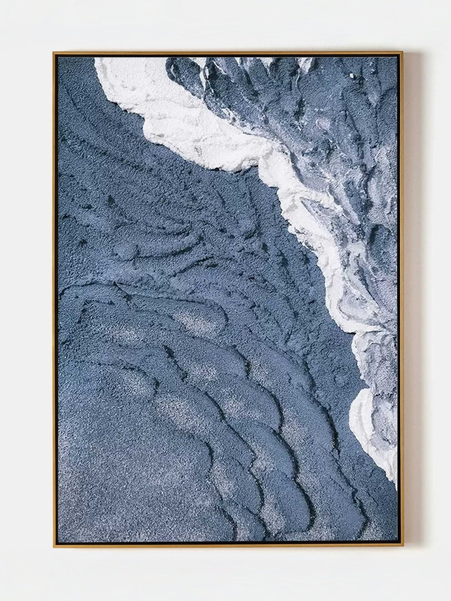
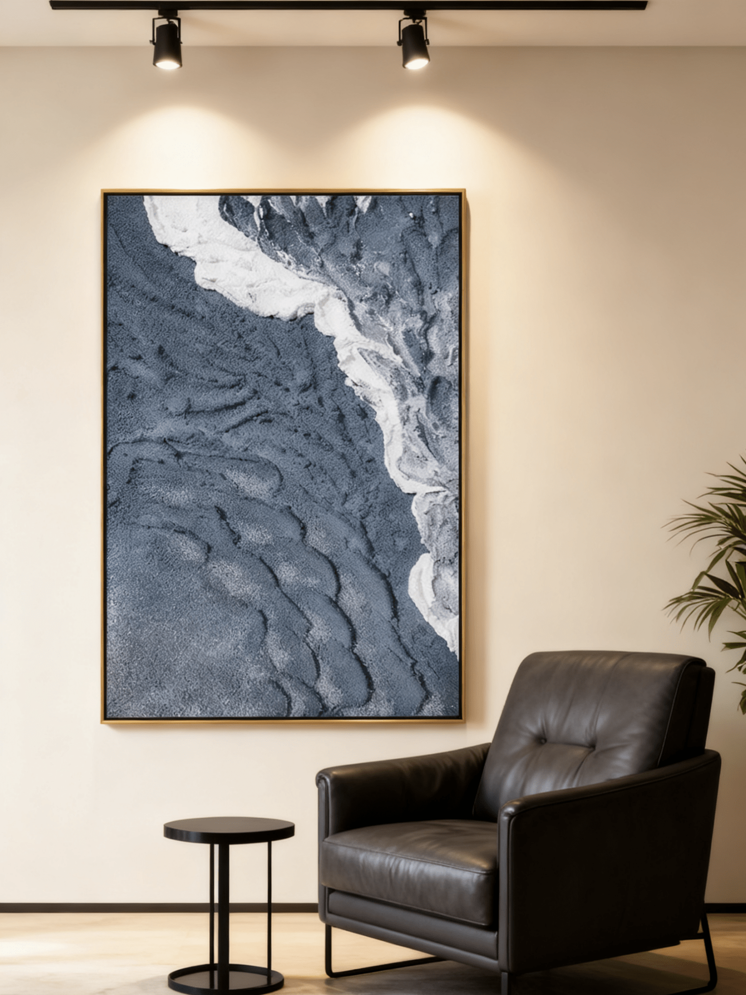
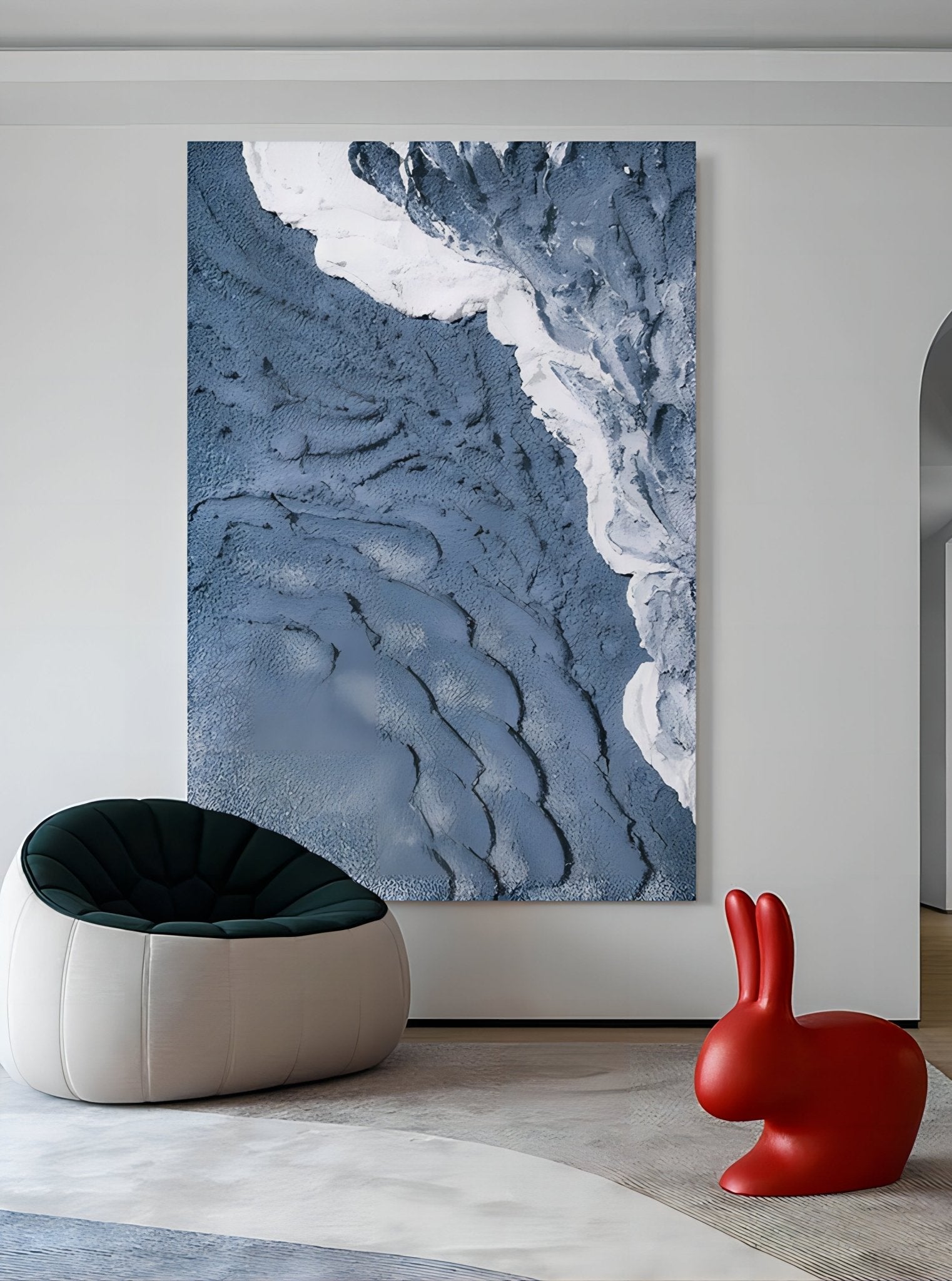
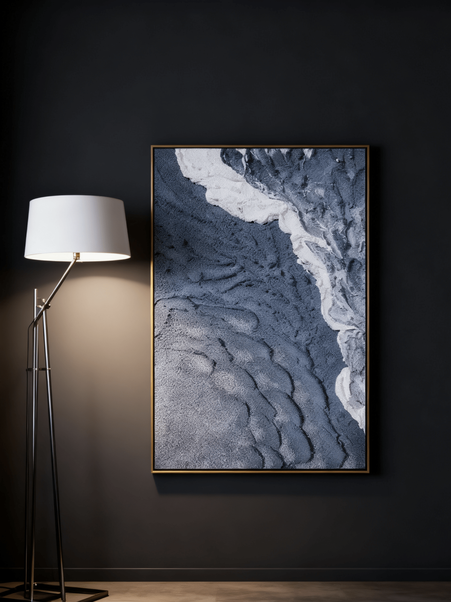
5. Cool Blue Returns With More Atmosphere and Less Coastal Theme
Blue never truly leaves interiors, but the current direction is less about obvious nautical styling and more about atmospheric blue: icy blue, fog blue, mineral blue, blue-gray, stormy teal, and softened ocean tones.
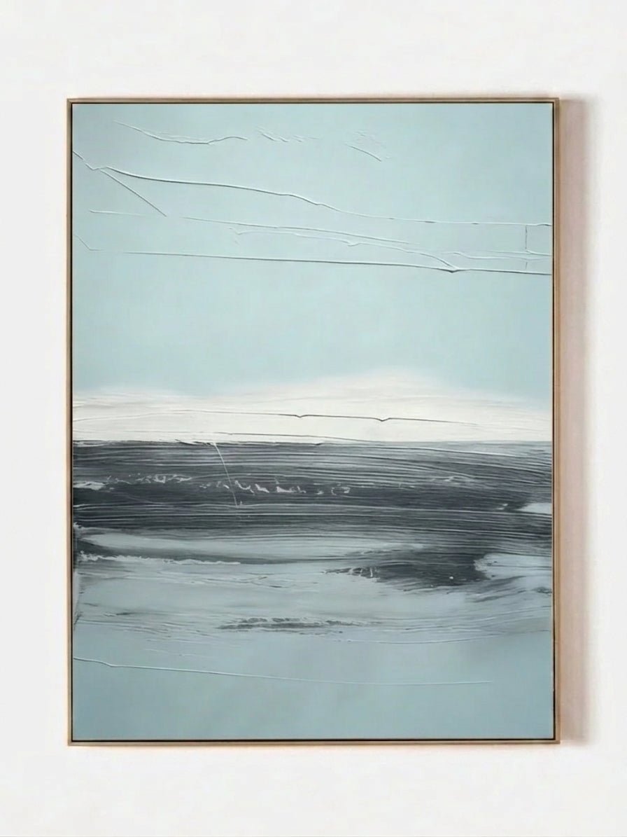
These shades are especially effective when they are broken by white texture, misty gray, charcoal, sand, or warm brown. The contrast keeps blue from feeling overly themed and allows it to sit comfortably in modern living rooms, bedrooms, home offices, and open-plan spaces. A blue painting can also provide the cooling counterpoint that today’s warmer interiors need.
Explore Cool Blue & Frosty-Tone Wall Art for atmospheric pieces that balance walnut, chocolate brown, terracotta, bronze, and warm beige.

6. Deeper Color Is Moving From Accent to Atmosphere
The other side of the 2026–2027 palette is much moodier. Plum, burgundy, aubergine, espresso, tobacco brown, rust, deep green, and near-black bronze are being used to give rooms a stronger sense of atmosphere.
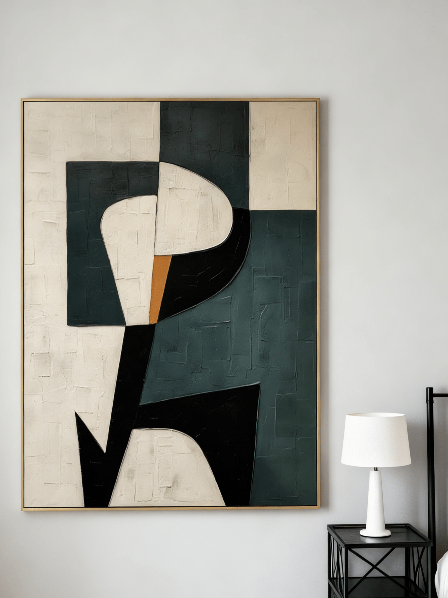
Dark color does not have to mean a dark painting. A mostly neutral artwork with one deep plum, rust, green, or charcoal passage can connect to darker furniture and painted walls without making the room heavy. Conversely, a more saturated statement piece can become the visual center of a room when the surrounding materials are quiet.
For buyers who have spent years decorating in cream and gray, this is a useful middle path: keep the architecture and upholstery restrained, then let the art introduce the depth. Explore Moody & Heritage-Tone Wall Art.

7. Landscape Art Is Becoming More Abstract, Textural, and Atmospheric
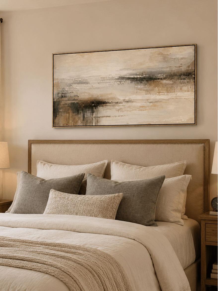
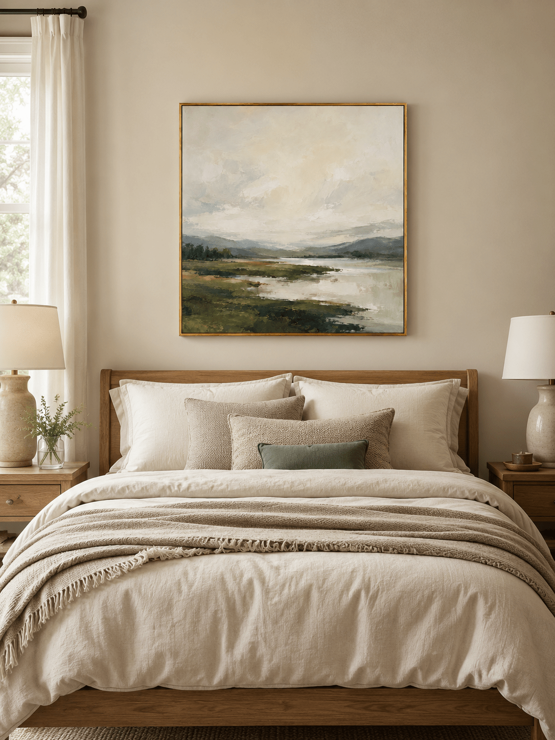
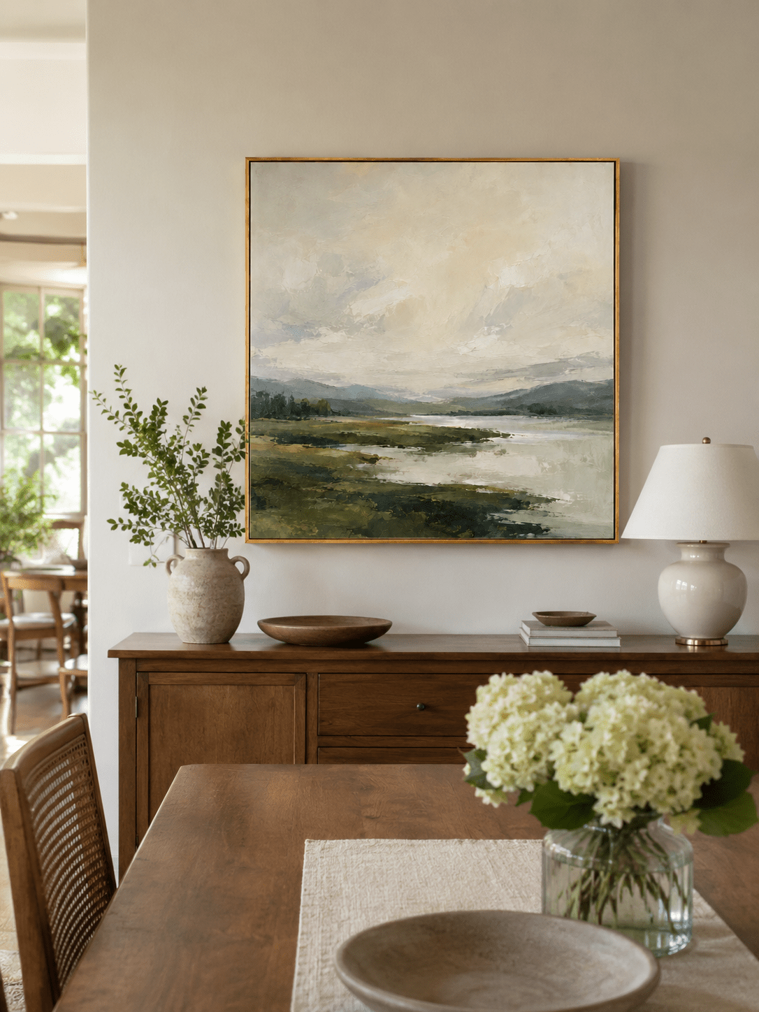
A landscape does not need to look photographic to create a sense of place. In many current interiors, the most versatile landscapes sit between representation and abstraction: a horizon is recognizable, but edges dissolve; mountains appear through fog; water is suggested by horizontal movement; a shoreline becomes a field of texture.
This approach gives the viewer enough information to feel nature without forcing the room into a traditional landscape theme. Texture adds another layer. Raised ridges can behave like mountain contours, wave foam, eroded stone, or the surface of a field seen from above.
WABI examples include Misty Mountain Forest – EL#0387, Misty Mountain Lake – EL#0396, and Textured Mountain Landscape – EL#0440. Browse Landscape & Nature Wall Art for more atmospheric options.

8. Large Art Is Being Used as an Architectural Element
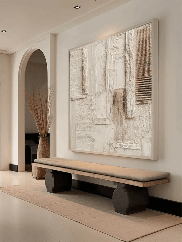
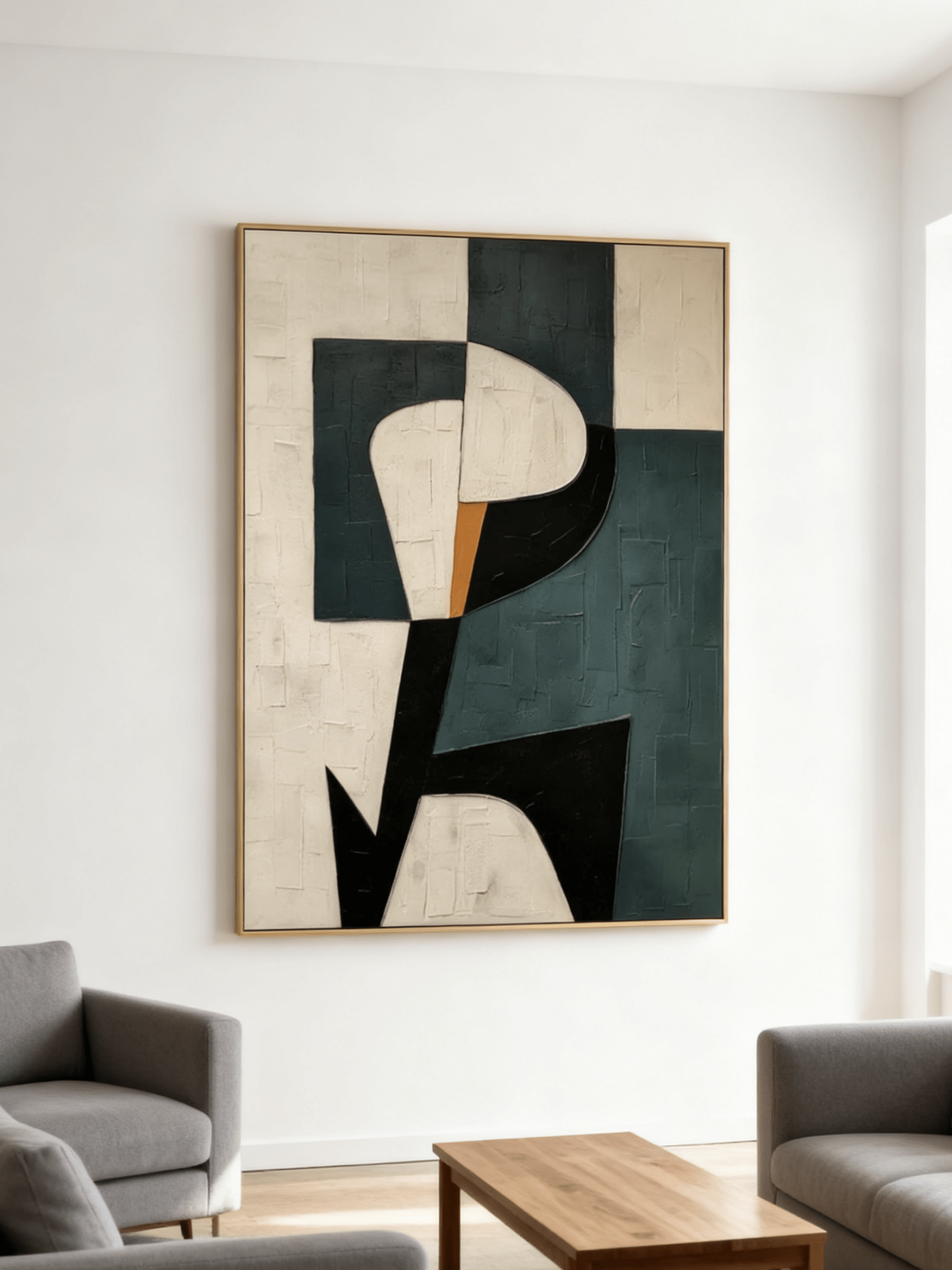
Instead of filling a large wall with several small pieces by default, many modern rooms are using one oversized painting to create a clear focal point. This is particularly effective above a wide sofa, fireplace, sideboard, bed, or dining console.
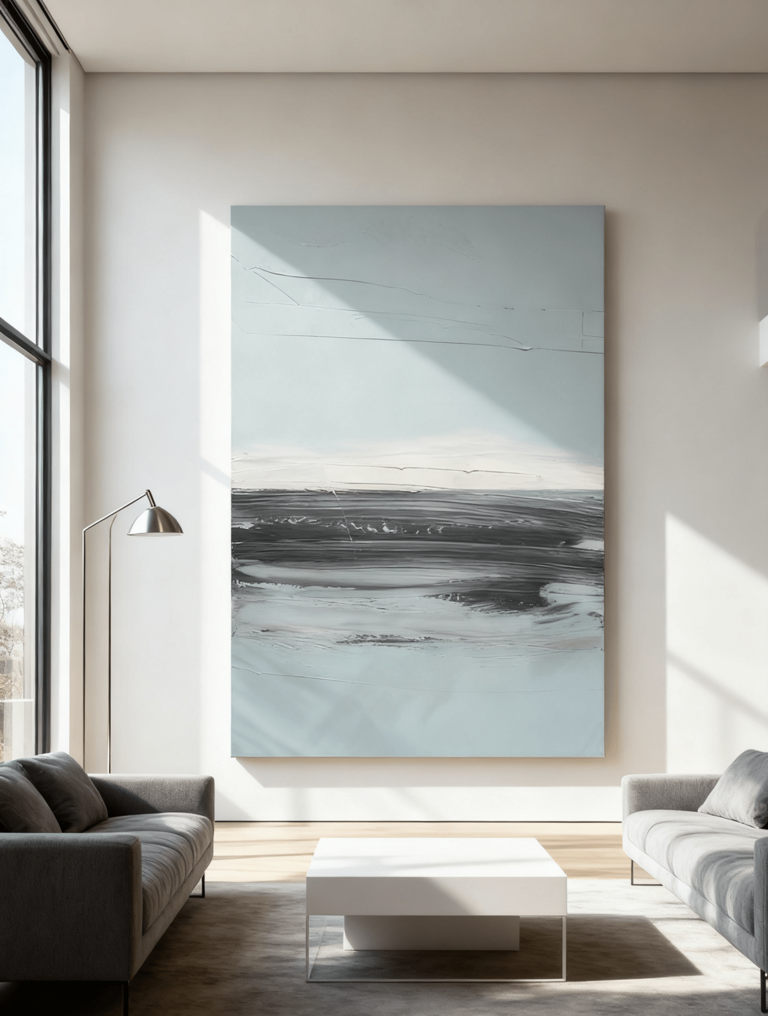
A large hand-painted canvas has an advantage over a flat graphic print because scale magnifies surface variation. Brushwork that looks subtle in a product close-up can become a field of movement when viewed across a 60- or 80-inch canvas. The goal is not simply to buy the biggest size available; the painting should feel connected to the furniture below it and still leave breathing room around the edges.

9. Collected Beats Perfectly Coordinated
One of the most useful 2027 ideas is not a color at all. It is the move toward rooms that feel accumulated rather than installed all at once. Designers are talking more about history, personality, found objects, handcrafted materials, and pieces that do not match perfectly but still belong together.
Wall art is central to that shift because it is one of the easiest places to introduce a different material language. Instead of searching for a painting that repeats every color in the room, look for one or two points of connection—perhaps a warm brown that relates to wood, an ivory that relates to upholstery, or a green that relates to a rug—and let the rest of the painting add contrast.
How to Choose Hand-Painted Wall Art for 2027 Without Chasing Trends
Start with the room’s materials, not the trend report
If your room already contains walnut, limestone, cream linen, black metal, or terracotta, use those materials as the foundation. Choose art that connects to at least one existing element, then adds either texture or color the room is missing.
Decide whether the painting should calm or energize the room
A sage, misty blue, ivory, or soft landscape can lower visual contrast in a busy space. A dark plum, emerald, rust, or multicolor abstract can give a quiet room the focal point it lacks.
Look at the surface from more than one distance
From across the room, judge composition and scale. From a few feet away, look for brush direction, layered edges, raised texture, and tonal variation. Good hand-painted art should offer something at both distances.
Let natural light influence the texture you choose
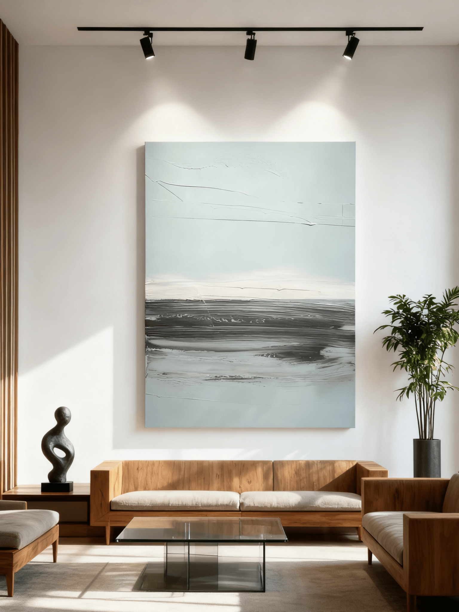
Deep relief becomes more dramatic with directional side light. Subtle brushwork works well in brighter rooms where the surface can reveal itself gradually. If a wall receives strong direct sunlight, consider glare, UV exposure, and how the color will read during the brightest hours.
Buy for the wall you have, not the thumbnail you love
A narrow vertical wall, long sideboard, wide sofa, square fireplace, and double-height entry all ask for different proportions. Orientation and final framed dimensions matter as much as subject matter.
Use trends to widen your options—not shorten the life of the artwork
The best trend-aware purchase is one you would still want if the trend name disappeared tomorrow. Choose a color family, texture, and composition that work with your home first; let the trend simply confirm that the direction feels current.
What These Trends Mean for WABI Wall Art
The strongest 2026–2027 directions already overlap with the materials and subjects found across WABI Wall Art: hand-painted texture, Wabi-Sabi surfaces, atmospheric landscapes, abstract compositions, large-scale formats, earth tones, sage and olive greens, cool blues, and deeper heritage colors.
That makes trend-led shopping less about replacing one aesthetic with another and more about choosing the version that fits your room. A neutral home may need stronger texture. A warm brown room may need cool blue. A pale space may benefit from emerald or plum. A highly decorated room may need a quieter landscape with a soft horizon.
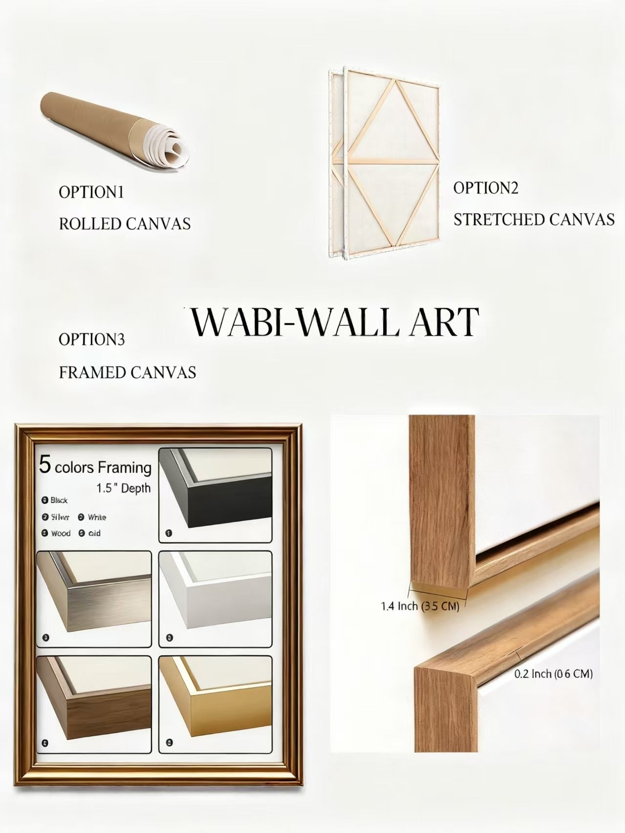
WABI Wall Art’s current collections are made for this kind of comparison. Browse by style, subject, color, orientation, and size, then review each artwork’s surface, palette, and framing options before deciding. Start with All Hand-Painted Wall Art, New Wall Art, Wall Art Trends, or Abstract Wall Art.
Frequently Asked Questions About 2026–2027 Wall Art Trends
Is hand-painted wall art still in style for 2027?
Yes. The broader design direction is moving toward more tactile, personal, handcrafted interiors. Hand-painted art fits that direction because brushwork, texture, and small variations give a room visible human character.
What wall art colors are trending for 2026–2027?
The strongest directions include warm earth neutrals, sage and olive greens, jade, cool and mineral blues, deep brown, plum and aubergine, muted mauve, copper, rust, ochre, and selective brighter accents such as persimmon. The best choice depends on the undertones and materials already in your room.
Is beige wall art going out of style?
No. Beige and cream remain useful, but the current look is more layered. Instead of one flat beige, designers are combining ivory, stone, taupe, camel, caramel, clay, brown, and textured surfaces to create depth.
What type of wall art works best with organic modern interiors?
Hand-painted abstract art, Wabi-Sabi wall art, textured landscapes, and restrained nature-inspired compositions work especially well. Look for tactile surfaces and palettes built around cream, taupe, sage, olive, brown, stone gray, or muted blue.
Are visible brushstrokes a flaw?
In hand-painted art, visible brushstrokes can be part of the intended finish. They show movement and application, and they can create subtle shadows or tonal changes. The key is whether the marks support the composition and overall surface quality.
What is the safest trend color if I want art that will last?
Muted greens, warm earth tones, and atmospheric blues are especially flexible because they pair with wood, stone, linen, leather, cream upholstery, and black or brass accents. A nuanced version of a color generally has more staying power than a highly specific novelty shade.
Final Takeaway: The Future of Wall Art Looks More Human
The most important hand-painted wall art trend for 2026–2027 is not one color or one style. It is the return of visible authorship. People are making room for surfaces that show how they were built, colors that create atmosphere, and compositions that feel chosen rather than mass-matched.
Texture makes a quiet palette more dimensional. Visible brushwork makes an abstract composition feel active. Sage and blue can bring calm without becoming anonymous. Brown, plum, copper, and rust can add warmth and history. Atmospheric landscapes can connect a modern room to nature without turning it into a themed space.
For WABI Wall Art, those trends point back to the same principle: choose a painting that rewards both the first glance and the closer look. Browse the current WABI Wall Art collection to compare hand-painted abstract, textured, Wabi-Sabi, landscape, and color-led artwork for your space.