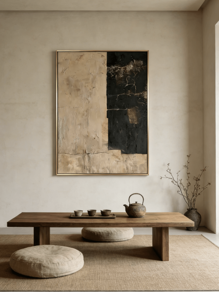
A painting that looks clear against a white wall can almost disappear against walnut paneling. Put the same painting on narrow oak slats and the opposite problem may appear: every ridge in the art competes with a line behind it. Wood brings color, grain, and a built-in pattern to the wall before anything is hung.
Choosing art for wood-paneled walls starts with those three qualities. Look for enough light-and-dark contrast to identify the painting from across the room, a composition that makes sense beside the grain, and a frame that gives the image a clear boundary. You can keep the warmth of the wood without choosing an artwork that repeats all of it.
The examples below cover pale oak, dark walnut, and strongly patterned paneling. They are alternative ways to dress one wall, rather than a set intended to be displayed together.
Read the paneling before choosing a painting
Stand in the doorway and decide what you notice first. Is it the dark color, the stripes between boards, or the swirling grain? This gives you the problem the artwork needs to solve. A smooth walnut wall needs a different response from knotty pine, even if both are described as brown.
Wide panels: work with the larger divisions
Broad panels usually leave generous uninterrupted areas. A painting can sit within one of these areas, with the surrounding seams acting as a loose architectural border. It does not need to match a panel's dimensions exactly, but avoid a frame that almost touches a seam on one side while leaving a large gap on the other.
If the composition belongs over a bench or console, begin with that furniture grouping. Then adjust it in relation to the panel divisions. Centering on the entire wall can look misplaced when the furniture occupies only one end.
Narrow slats: introduce a visual pause
Slats create many small vertical contrasts. An artwork with a broad pale field or a simple horizontal landscape can interrupt that repetition. Highly detailed linework may be harder to distinguish because both wall and image demand close attention.
Think of the painting as a quiet area within an active surface. There is no requirement to cover many slats; the useful question is whether the image reads as one coherent shape from your usual seat.
Knotty or weathered wood: simplify the surrounding objects
Knots behave like dark spots scattered across the wall. With this much existing variation, a restrained image and plain frame are a helpful starting point. Keep nearby shelves and console accessories simple while you judge the artwork.
Wood can support both rustic and contemporary rooms. Houzz's examples of wooden wall paneling show how varied the setting can be. Let the actual finish guide the choice instead of assuming that every paneled room needs traditional art.
Choose contrast that survives across the room
Color names alone are not enough. A beige painting may stand out strongly against espresso wood and barely register against pale oak. Compare the largest area of the artwork with the wood directly behind it, rather than focusing on one small accent in the image.
Pale oak and honey-toned wood
On light wood, cream artwork needs some definition: a darker frame, a visible brown mark, or a section of deeper tone within the painting. An entirely pale image in a pale timber frame may feel deliberately subtle, but make that a conscious choice.
If the wood has a yellow cast, start with ivory, taupe, muted gray, or restrained brown. Very yellow beige can exaggerate the wall's warmth. This is a comparison to make with samples in the room, since a product photograph and your wood finish may look different on a screen.
Walnut and deep brown paneling
A generous area of ivory creates a clear opening within a dark wall. The artwork can still include brown, especially along its lower edge, while the pale upper field keeps the whole image distinct.
Avoid judging the work only by its darkest feature. A painting that is mostly cream with a small chocolate passage will read much lighter than the product's brown color tag might suggest. Look at the balance of the entire image.

Red-toned and orange-toned wood
You do not have to repeat red or orange in the artwork. Quiet stone colors can make a warm wood wall feel less insistent. If you prefer a tonal pairing, use several lightness levels so the frame and the wall remain separate.
Before buying, place an ivory sheet and a gray sheet against the paneling. Observe each in daylight and under your evening lamps. This small comparison helps reveal which neutral feels comfortable with the wood, though it cannot predict an artwork's exact finished color.
Give the frame and composition different jobs
The frame defines where the wall stops and the artwork starts. The composition determines where your eye travels inside that boundary. A clear frame cannot fully rescue a busy image on a busy wall, but it can stop a softly colored painting from dissolving into its surroundings.
A thin dark frame can be useful on pale oak. Against dark walnut, a lighter or warm metallic edge may remain more visible. A wood frame can also work; compare its undertone with the paneling without insisting on an exact timber match. Check the frame options actually offered for the selected artwork.
On a slatted wall, consider broad curved or diagonal forms. These offer another direction for the eye to follow. On broad horizontal boards, a vertical painting can provide a useful upright accent beside a chair or a low cabinet. These are compositional options, not requirements to oppose every line in the room.
Texture deserves the same selective approach. Wood grain, slat shadows, raised paint, a woven rug, and a heavily grained console can all compete when gathered closely. Let two surfaces lead. For example, combine visible paneling with textured art, then use plain upholstery and a mostly clear console below.

Four artworks for different wood walls
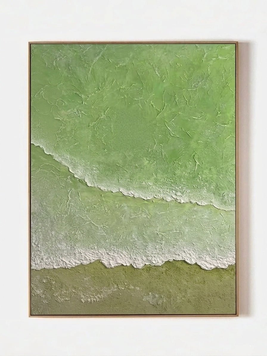
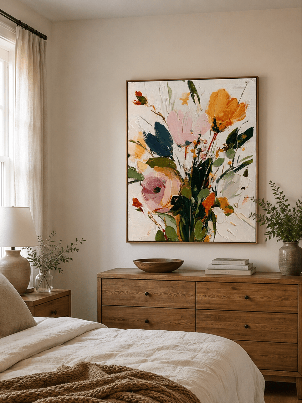
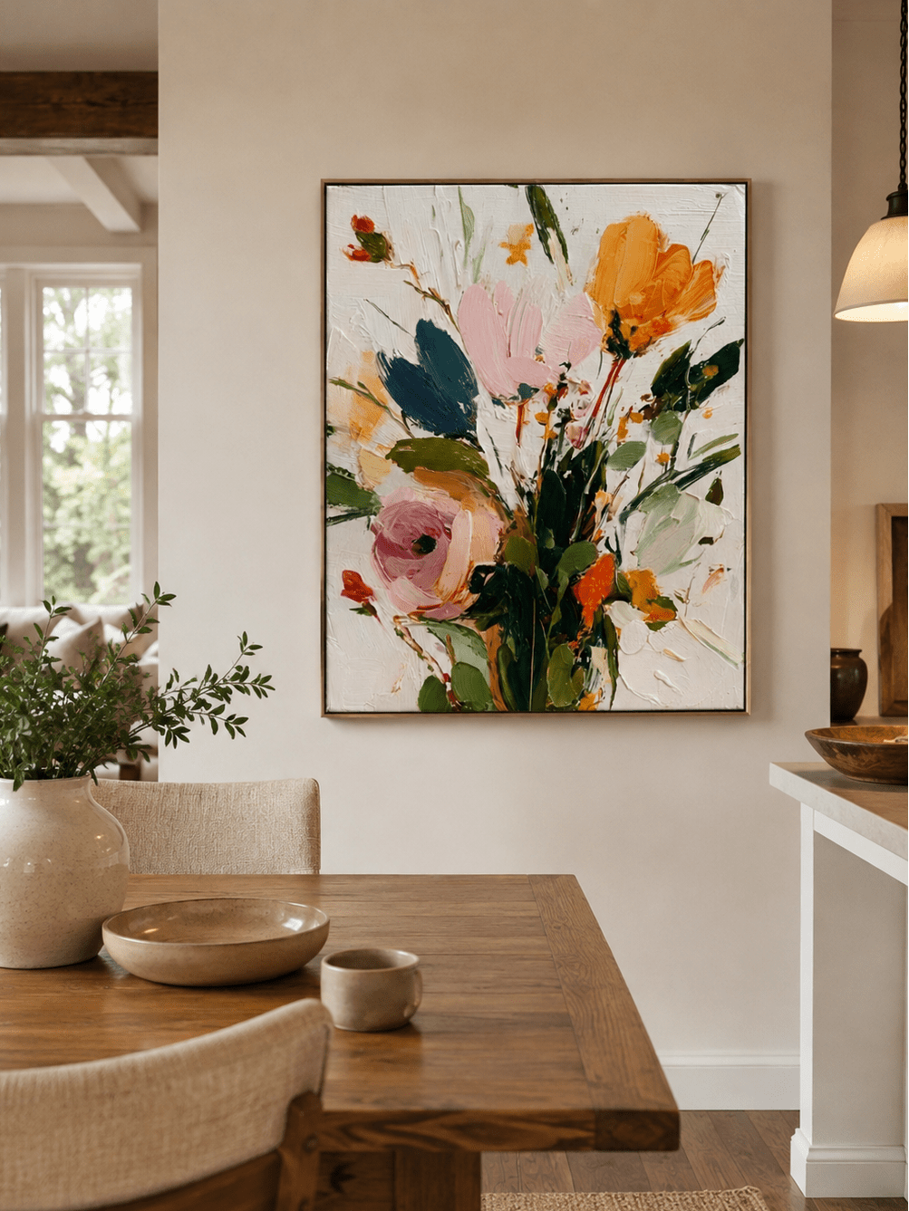
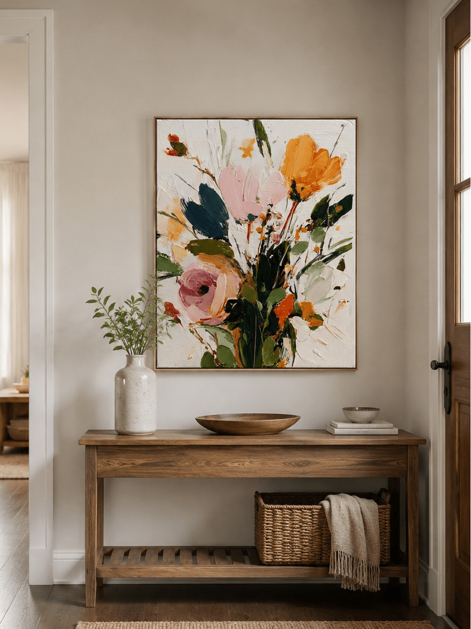
These WABI Wall Art works offer four different relationships between background, subject, and wood. Choose the relationship your room needs before selecting a size.
A broad pale field for a dark wall
Minimalist Textured Abstract Landscape, EL#0444 has a large ivory area above diagonal, earthy forms. On dark paneling, that light field makes the artwork easy to locate. The angled movement also gives the eye a change of direction from vertical seams.
It is a useful option beside a low chair or bench where the vertical format has room to breathe. Keep nearby cushions plain so the subtle marks within the painting remain worth looking at.
Rounded forms against orderly grain
Earthen Circles, EV#0417 uses warm neutral tones and a cluster of circular forms. The rounded pattern has a different rhythm from straight panel joints. On oak, the pairing feels close in color, so assess the frame boundary and the contrast of the raised forms carefully.
This approach suits someone who wants the art and wall to feel related. It is less suitable if the aim is a strong color break or if the paneling already has large, conspicuous knots.
Brown within the image, ivory around it
Quiet Mountain River, EL#0398 places chestnut riverbanks below pale mountains and a broad light sky. The brown passages relate to walnut while the ivory areas separate the painting from it. This creates a connection without relying on an all-brown image.
The square format can anchor a compact furniture grouping. Keep enough exposed wood around all four sides to make the pale image read as a deliberate interruption within the paneling.
A recognizable floral shape on a linear wall
White Hydrangea, ML#0377 offers white flowers, dark foliage, and a dark vase. The botanical silhouette introduces rounded shapes to a wall dominated by straight grain. Its light background helps the subject stay legible against deeper wood.
Choose this direction if you want an identifiable subject rather than an abstract relief. A cream seat below it can repeat the painting's light area; another busy floral textile nearby is unnecessary.

Test the placement before committing
Make a paper rectangle using the complete outside dimensions, including the frame. Position it where the painting will sit and view it from the doorway, the main chair, and the adjacent room if that sightline matters. Check the exposed wood around it as carefully as the rectangle itself.
Photograph the wall straight on. A seam that seems unobtrusive close up may look awkward when it almost aligns with a frame edge. Move the template a little, then compare the photographs. Small adjustments are easier before hardware is installed.
For an order, record these details:
- The usable wall area between trim, switches, and built-in features.
- The artwork's full framed dimensions and orientation.
- Whether the frame edge contrasts with the paneling.
- The product's weight and the wall construction behind the decorative finish.
Thin veneer or decorative slats should not be assumed to support a painting. Match the fixing method to the wall structure and artwork weight; ask a qualified installer if the construction is unclear. Check the manufacturer's guidance before using adhesive products on a finished wood surface.
Compare close-up surfaces within WABI's textured artwork collection, then narrow by the contrast your wall requires. The New Arrival selection provides more current options, but a different composition should earn its place through the same test.
Questions about art on wood-paneled walls
Can you put modern art on wood paneling?
Yes. A modern abstract or simplified landscape can work well with paneling. Relate the artwork to the wall's lightness and grain, and use a frame that keeps the image distinct. The age of the paneling does not dictate the subject of the painting.
What color artwork looks good on dark wood walls?
Ivory, cream, pale gray, and other light areas provide visible contrast. A painting can include deeper brown or green as well, provided enough of its surface remains distinct from the wall. Compare the whole image instead of matching a single accent color.
Should art fit inside one wood panel?
It can, especially with wide architectural panels, but it does not always need to. An artwork may cross several narrow boards or slats comfortably. Avoid nearly touching a prominent seam, and consider the furniture grouping as well as the panel layout.
Does textured art work on a slat wall?
It can if the painting's broad forms remain readable against the repeated slats. A restrained palette and uncluttered furniture help. If both the artwork and wall contain many fine ridges, test their combined effect from across the room before deciding.
Takeaway
Treat wood paneling as a patterned background with its own color and direction. Choose an artwork that remains clear against that surface, give its frame a visible edge, and let the surrounding furniture stay quiet enough for both materials to be appreciated.