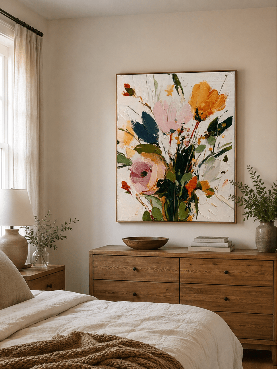
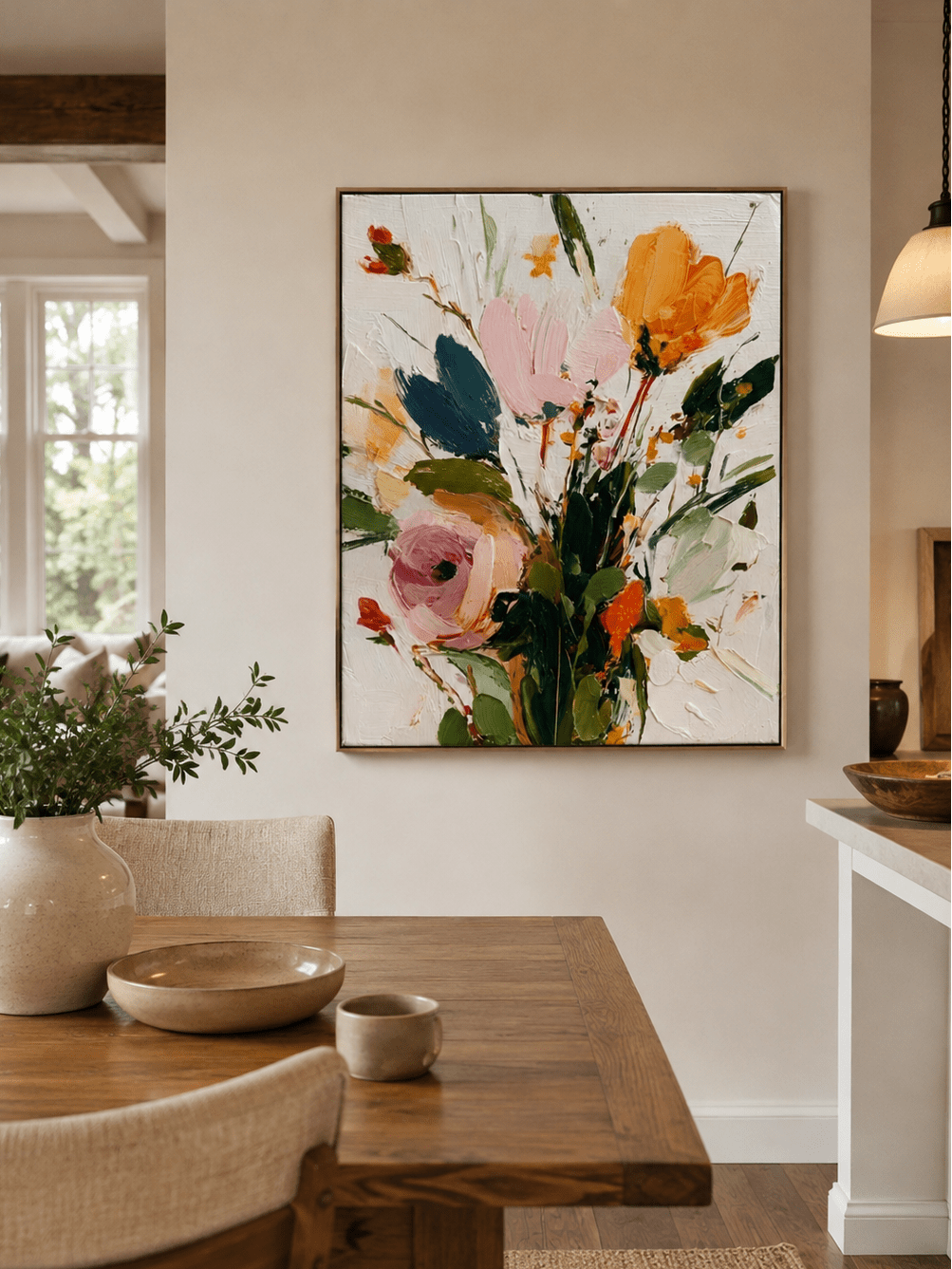
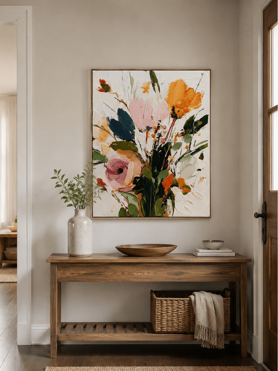
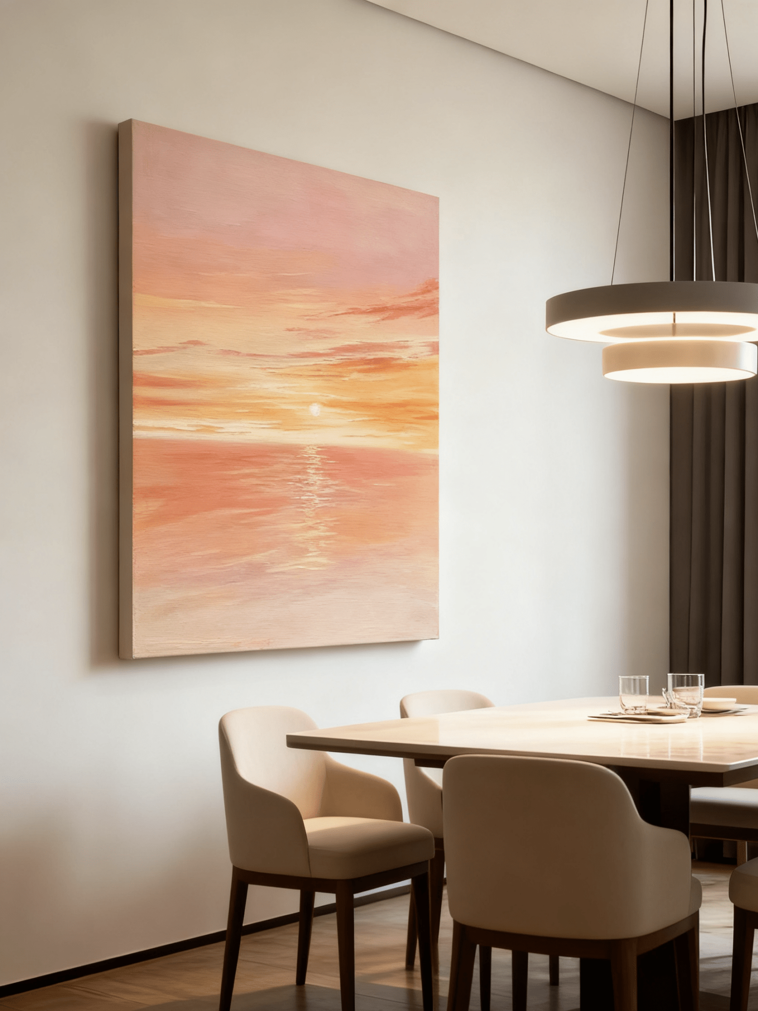
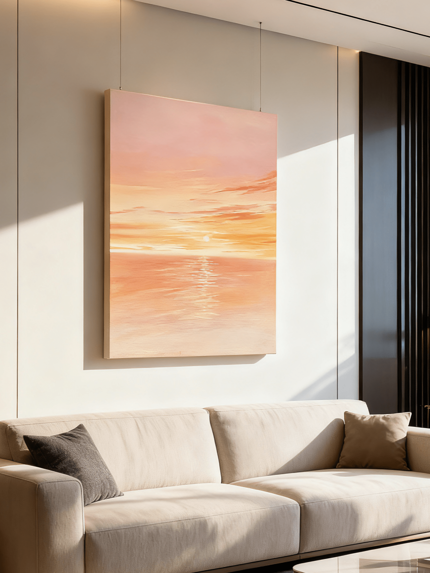
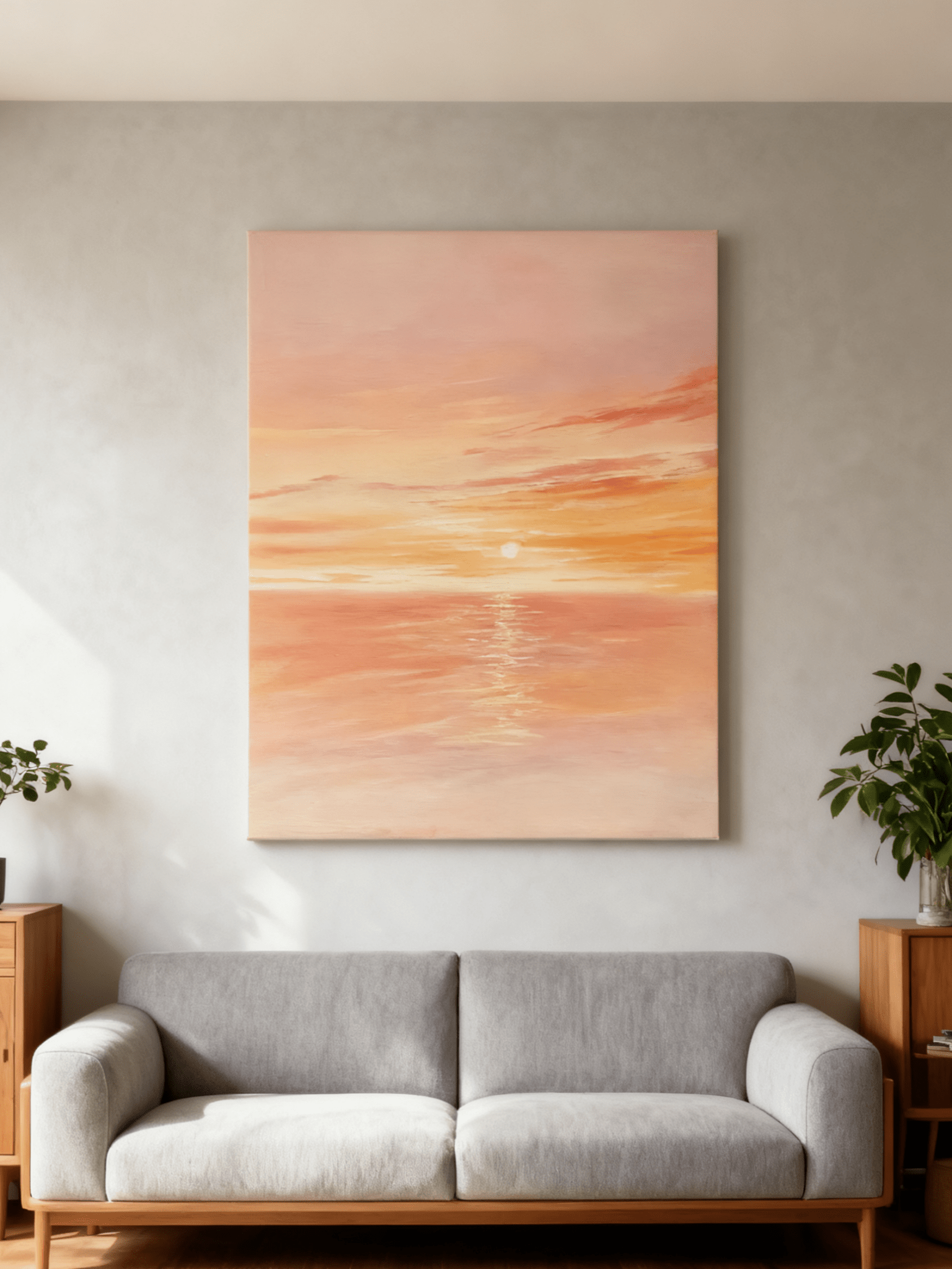
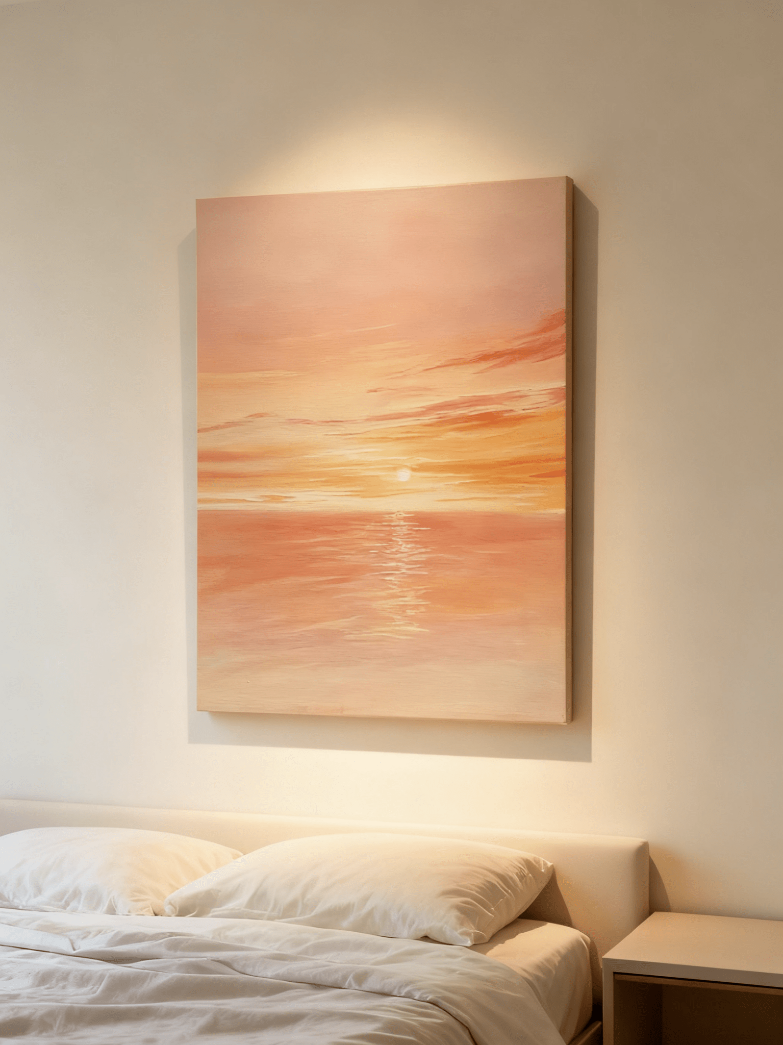
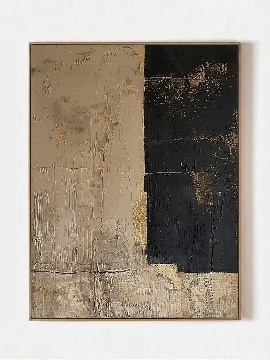
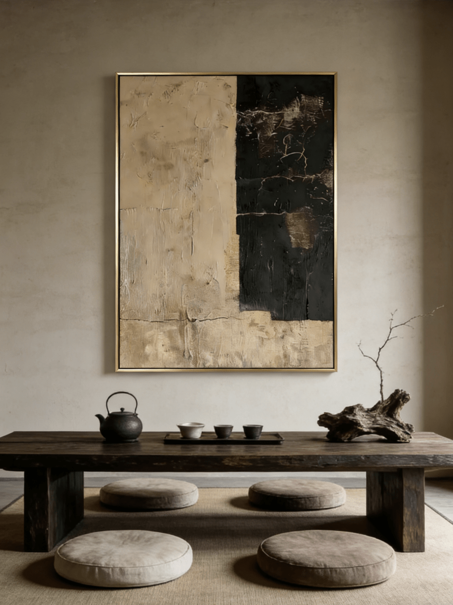
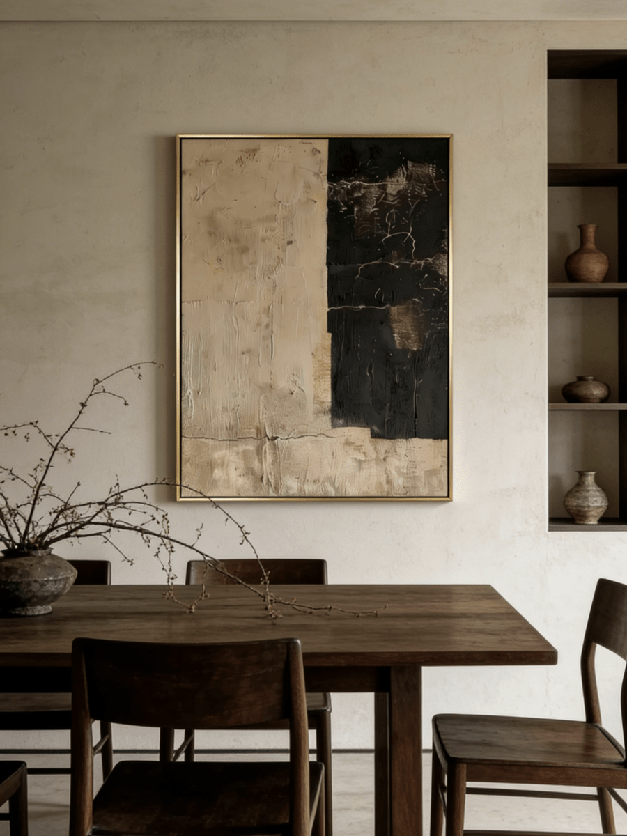
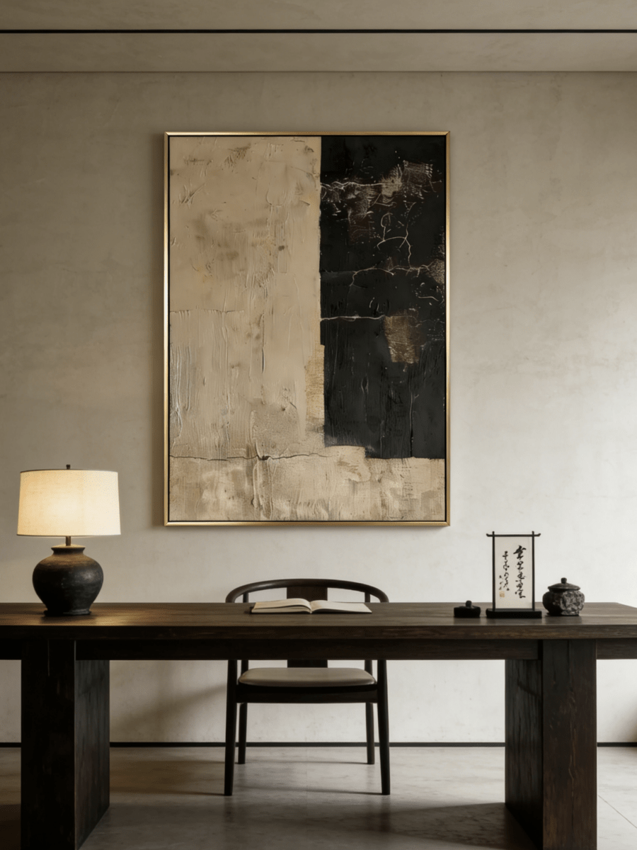
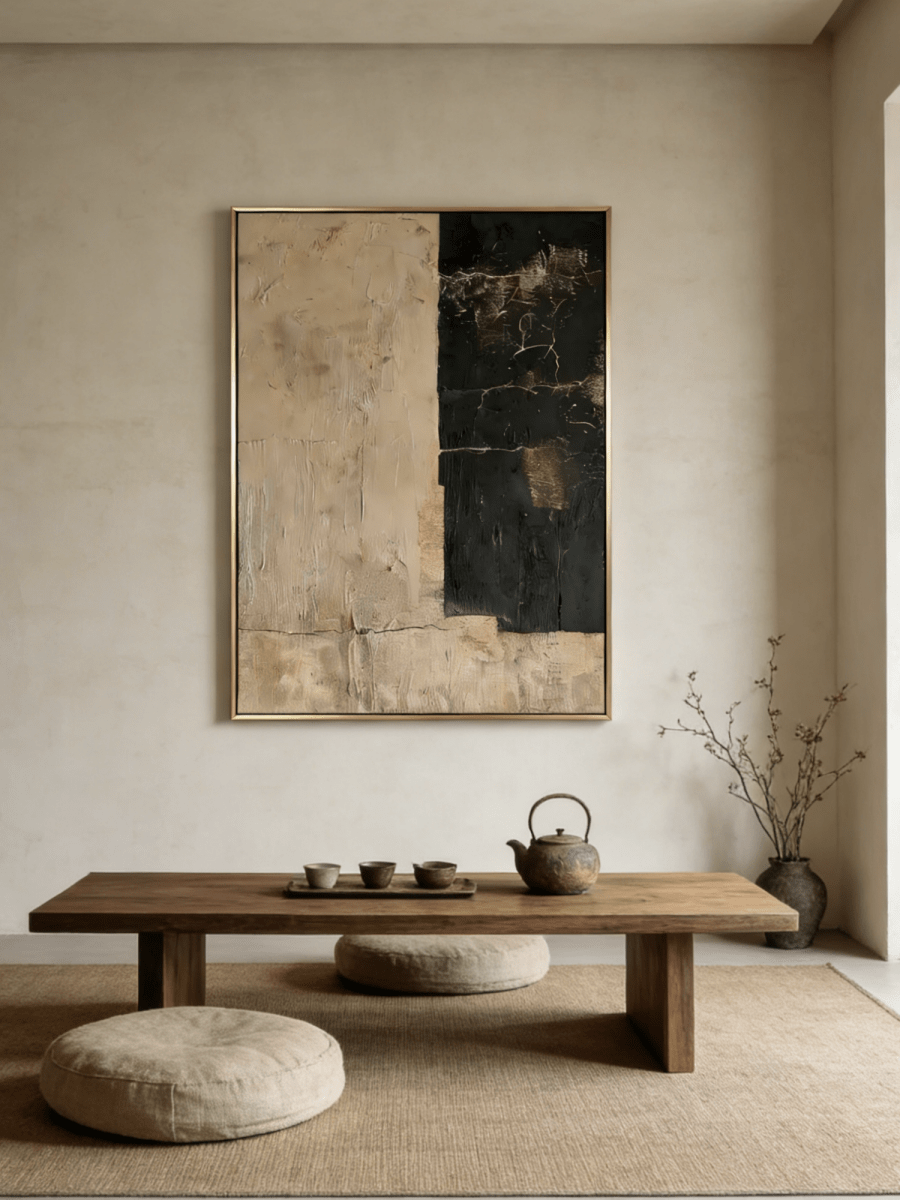
For art above a dining room sideboard, use the furniture as the visual anchor. A single painting or the full outer width of a group will usually look balanced at about 60% to 75% of the sideboard's width. Leave roughly 6 to 10 inches between the furniture top and the bottom of the artwork when the surface is mostly clear. If lamps, branches or serving pieces remain on the sideboard, treat them as part of the composition and raise or narrow the art enough to avoid a crowded overlap.
Those figures are starting points, not rules that override the room. The right size also depends on the painting's visual weight, the height of the sideboard, the ceiling and what people see while seated at the table. Tape the proposed outline on the wall before ordering and evaluate it from the dining entry and from the most-used seats.
Start with sideboard width, not wall width
A long wall can tempt you to buy art that floats independently from the furniture. The sideboard, buffet or credenza is the more relevant reference because the two objects will be read as one arrangement. Measure the cabinet from outside edge to outside edge. Multiply that number by 0.60 and 0.75 to create a practical target range for the artwork's total width.
- A 60-inch sideboard suggests about 36 to 45 inches of art.
- A 72-inch sideboard suggests about 43 to 54 inches.
- An 84-inch sideboard suggests about 50 to 63 inches.
- A 96-inch sideboard suggests about 58 to 72 inches.
Include the frame in the measurement. For a pair or a triptych, include both outer edges and every gap between panels. If you plan to keep two tall lamps on the cabinet, measure the open visual space between the lamps as well. In that case, a canvas can be narrower than 60% of the furniture and still look deliberate because the lamps complete the larger outline.
Set the bottom edge before the center point
“Eye level” is often too vague in a dining room. People view the work standing, walking past and sitting at the table. Begin with the relationship to the cabinet: leave about 6 to 10 inches of clear wall above a mostly empty surface. A taller gap can work when objects need vertical room, but too much separation makes the painting look unrelated to the sideboard.
Do not automatically center the artwork at 57 or 60 inches from the floor without checking the furniture height. A high sideboard plus a tall canvas may push the composition too close to the ceiling. Conversely, a low credenza under a high ceiling may need a larger or vertically oriented work to occupy the wall. Use the bottom-edge clearance first, then check the top margin and seated sightline.
Place a strip of tape at the proposed lower edge. Sit at the dining table and make sure the painting is not visually cut off by chair backs, pendant fixtures or a large centerpiece. Then stand at the room entrance. The art should feel attached to the sideboard without appearing to rest on it.

Choose square, horizontal or vertical art by the open shape
Square art for a centered arrangement
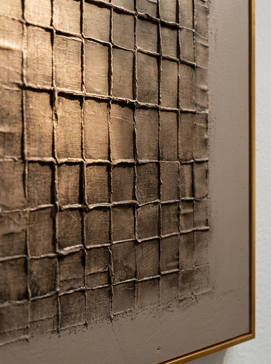
A square painting creates a calm center over a sideboard, especially when two matching lamps or balanced objects sit at the outer edges. Because a square leaves more wall visible at each side than a horizontal piece, its color and value need enough presence to hold the arrangement. The brown ground and ivory relief in Umber Relief Grid can work with light oak, cream lacquer or warm white cabinetry where a pale painting might recede.
Horizontal art for a long, low cabinet
A landscape format follows the furniture's width and is useful when the ceiling is standard height or the wall includes a wide console. A horizontal work does not need to be as wide as the cabinet; the 60% to 75% range already allows the sideboard to frame it. If the image itself has a low horizon, the arrangement may feel especially settled.
Vertical art for high ceilings or narrow wall sections
A vertical canvas can work over a sideboard when the surrounding architecture needs height, but watch the top margin. It is most convincing when the cabinet is relatively narrow, the ceiling is tall, or a nearby doorway creates a vertical bay. If orientation is the main uncertainty, the existing guide to horizontal, vertical and square wall art provides a wider room-by-room comparison.
Adjust for lamps, mirrors and objects on the surface
A sideboard is rarely empty. Treat permanent objects as real dimensions, not styling that will somehow fit later. A pair of lamps creates a visual frame; branches and sculptural vessels create irregular height; a mirror adds another large reflective field. The art should not collide with these shapes.
If two lamps remain in place, aim for at least a few inches of air between each shade and the artwork. If a tall vessel sits to one side, an asymmetrical arrangement may be more natural: move the painting slightly toward the open side rather than forcing it to the exact center. Keep the combined center of visual weight aligned with the sideboard, even if individual pieces are off-center.
Avoid layering a large painting over a large mirror unless the installation is intentionally designed and securely supported. In most dining rooms, choose one dominant wall element. A mirror emphasizes light and depth; a painting provides color, surface and a steadier focal point.

Let visual weight refine the measurement
Dimensions describe the physical object; visual weight describes how much attention it carries. Dark fields, sharp value contrast and compact shapes make art feel heavier. Pale color, open sky and soft transitions make it feel lighter. Two paintings of the same size can therefore occupy the wall differently.
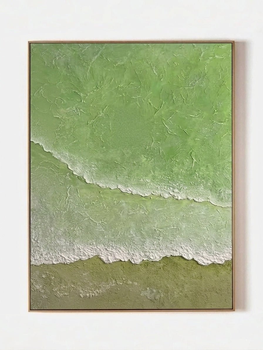
If the sideboard is dark walnut and the wall is medium taupe, a dark artwork may merge with the furniture and create a single heavy block. Introduce pale passages or a lighter frame. If both cabinet and wall are light, a deeper composition can supply the anchor. Quiet Blue River Valley – EL#0400 can provide a cool interval in a warm dining room, while Quiet Green River Valley – EL#0401 connects more directly with olive textiles, plants and warm wood.
Do not choose a larger size merely to fill a blank wall. Dining rooms need negative space so chairs, lighting and serving furniture remain legible. A well-proportioned gap at the sides of the artwork makes the cabinet look wider and the painting more intentional.
Coordinate color with the cabinet and dining table
- Light oak or ash: sage, blue-gray, umber and soft ivory all work; repeat one wood-adjacent warmth in the painting or frame.
- Walnut: use ivory, muted green or blue to separate the art from the dark wood. Brown art can work if it contains enough pale relief.
- Black or charcoal cabinetry: choose a painting with a readable light area so the composition does not become one dark rectangle.
- Painted cream cabinetry: add definition through landscape depth, brown geometry or a frame that is darker than the cabinet.
Also check the dining table, which may be closer to the viewer than the sideboard. A strong red-brown table can intensify warm art; a gray stone top can cool it. You do not need an exact color match. One repeated undertone and one deliberate contrast are enough.
Measure the actual product configuration
Product pages may offer several sizes and presentation options. Measure the exact configuration you are considering, not the proportions shown in a room image. Mark both width and height with tape. If you are deciding among several formats, the Square Wall Art collection and Landscape & Nature Wall Art collection make it easier to compare shape before narrowing to an individual work.
Check how doors open and whether people pass close to the cabinet. In a tight dining space, a deep frame or protruding hardware may need extra clearance. Review installation requirements and the wall construction before hanging a large work over furniture that stores glassware or serving pieces.

A final sideboard test
- Measure the sideboard and calculate 60% to 75% of its width.
- Subtract the visual space occupied by permanent lamps or tall objects.
- Mark the artwork's complete outer dimensions, including the frame.
- Test a 6-to-10-inch lower gap, then adjust for object clearance.
- Review the arrangement seated, standing and from the room entrance.
Frequently asked questions
How wide should art be over a sideboard?
About 60% to 75% of the sideboard width is a reliable starting range. Include frames and gaps between panels, then adjust for lamps or other permanent objects.
How high should a painting hang above a buffet?
Start with 6 to 10 inches between the furniture top and the artwork's lower edge. Increase the gap only when objects need clearance, and make sure the two pieces still read as one group.
Can the artwork be narrower than two-thirds of the sideboard?
Yes. A square painting framed by two lamps can be narrower because the lamps complete the visual width. The full arrangement matters more than the canvas alone.
Should art be centered on the wall or the sideboard?
Center it on the sideboard in most cases. If the surface styling is asymmetrical, shift the art slightly while keeping the combined visual weight balanced over the furniture.
Is one large painting better than a group?
One painting is simpler when the wall finish or tabletop styling is active. A group works when its total width and gaps are planned as a single outline and the individual images share a clear relationship.
Choose from measurements, then refine by mood
Proportion should narrow the field before color does. Once you know the workable outer width and height, compare square and landscape-format pieces by visual weight, palette and the objects that will remain below them. Browse the latest New Wall Art with your taped dimensions in view, and use each product page to confirm the available size and presentation before making the final choice.