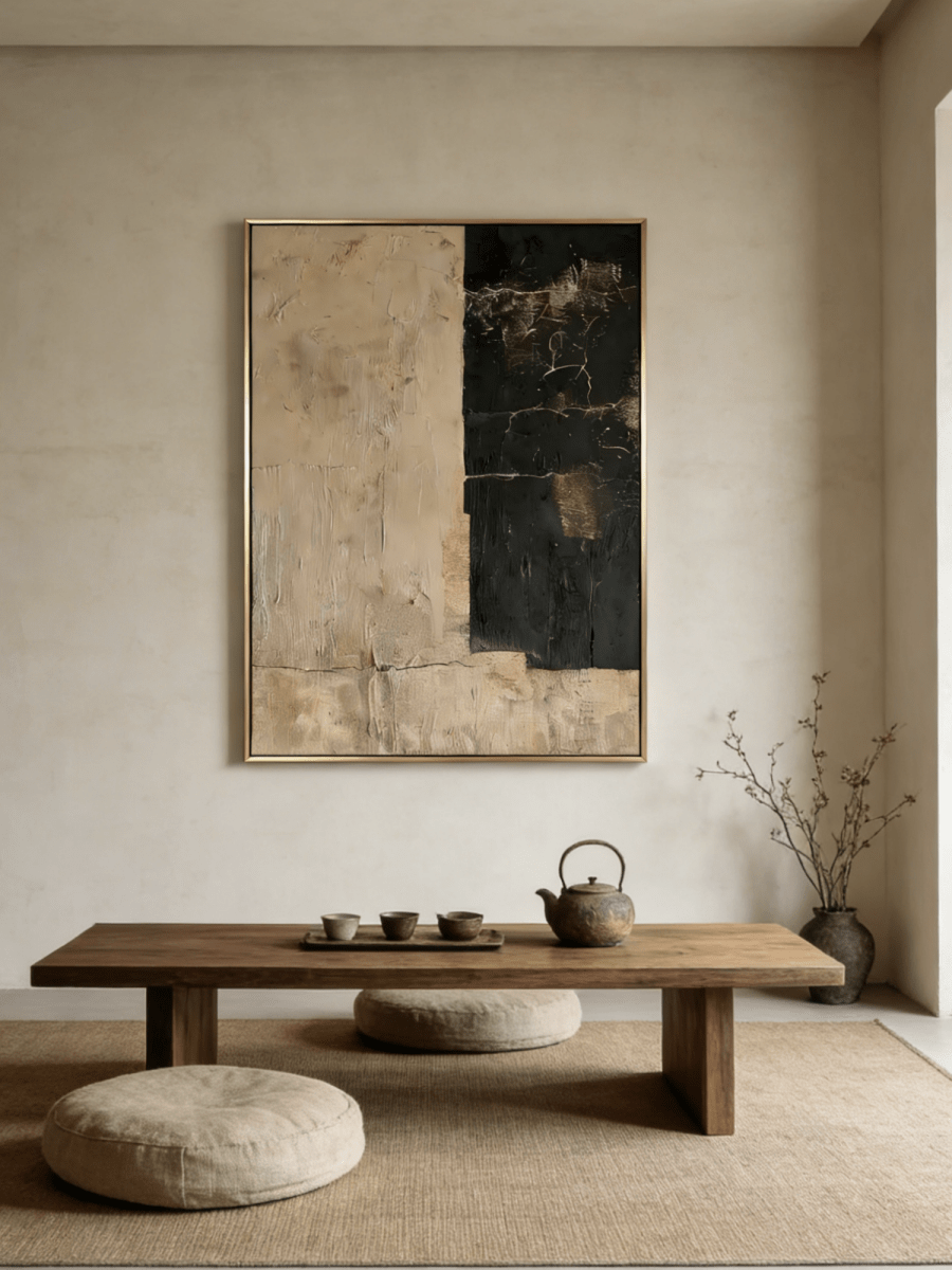
Mountain wall art for a bedroom works best when the palette supports the room's actual light and materials. Blue-gray paintings tend to cool warm daylight and pale wood; sage and olive connect easily with oak, linen and natural fibers; ivory, beige and gold-toned landscapes warm a north-facing or gray room. Choose the effect you need rather than the color that appears most calming on a screen.
Keep the composition quieter than the busiest textile in the room, and avoid making every surface the same color. A mountain painting can relate to bedding through one repeated tone while still providing contrast in value or texture. Before ordering, photograph the bedroom in morning and evening light, tape the proposed canvas dimensions above the bed or dresser, and confirm the exact size and orientation on the product page.
Blue, green and earth tones create different kinds of calm
“Calm” is not a single palette. Blue can feel spacious and cool; green can feel grounded and connected to natural materials; earth tones can feel enveloping and warm. The choice depends on what the bedroom already has too much or too little of.
- Choose blue-gray when the room is warm, sunny, cream or honey-oak and needs a cooler counterpoint.
- Choose sage or olive when you want a natural bridge among wood, stone, linen and muted textiles.
- Choose beige, ivory or gold-toned earth colors when the room is cool, gray or dim and needs warmth without bright saturation.
Look at value as well as hue. A pale blue mist behaves differently from navy; sage can be silvery or deep; beige can be chalky, golden or brown. The most useful product image is the one that shows the whole composition and its light-to-dark range, not only a close texture detail.
When blue mountain art is the better choice
Blue-gray landscapes are effective in bedrooms with warm white walls, flax bedding, camel leather or honey-colored wood. They introduce temperature contrast without the sharpness of a bright complementary color. A work such as Quiet Blue River Valley – EL#0400 combines blue-gray with ivory and earthier passages, so the painting can connect to a neutral room rather than read as a separate blue object.
Blue is less helpful when the room already has cool gray walls, blue bedding and low northern light. In that setting, a blue-gray canvas may flatten the palette. You can still use it if the work contains a clear warm bridge, or if the frame and nearby wood add contrast. Test the relationship after sunset, because warm bedside lamps may make muted blue appear grayer.
For a crisp bedroom, repeat blue only once elsewhere, perhaps in a cushion or throw. Avoid matching the bedding exactly. A slight shift in value makes the arrangement look layered rather than coordinated as a set.

When green mountain art is the better choice
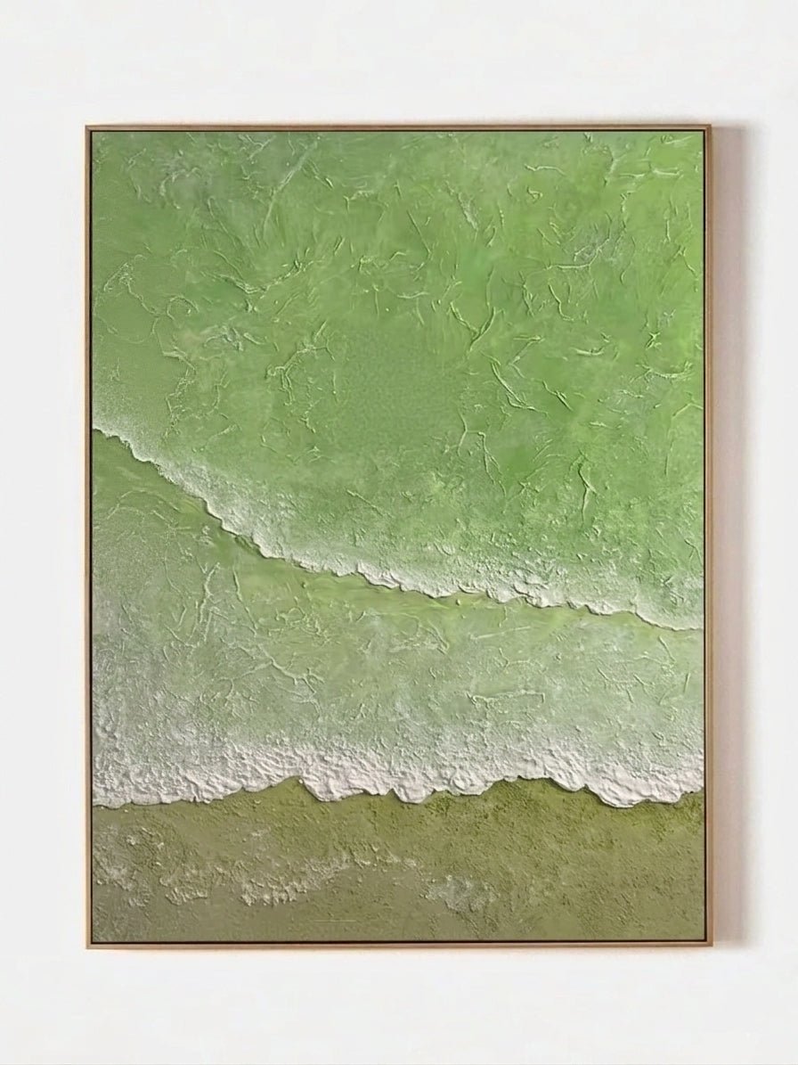
Sage and muted green sit comfortably beside natural materials. They can connect an oak bed, woven rug, linen curtains and a small amount of foliage without requiring a botanical theme. Sage Mountain Lake – EL#0402 includes sage, blue-gray and ivory, which gives it both a warm-cool bridge and a readable light area.
Green is particularly useful when the bedroom has several neutrals that do not quite agree: a cream headboard, gray-beige carpet and pale wood, for example. A muted green can sit between them. The paint does not need to match a plant or fabric swatch precisely; matching undertone matters more. Yellow-green works more easily with warm oak, while gray-green settles beside stone and greige.
Be careful with a room that already contains strong emerald, forest green or many leafy patterns. A quieter sage landscape may still work, but give it a pale wall and simple bedding so the mountain forms remain legible.

When earth-tone mountain art is the better choice
Earth-tone mountain paintings can warm a bedroom without the energy of strong red or orange. Ivory, beige, weathered gold and soft brown are useful in rooms with gray walls, black metal details or cool daylight. Golden Mountain Lake – EL#0399 uses soft gray, ivory and gold-toned passages, while Misty Mountain Lake – EL#0396 leans into warm beige, ivory and gold.
These palettes also work with walnut, but use contrast deliberately. A brown-heavy painting above dark wood can become visually dense; pale sky or water gives the eye a resting place. With light oak, a darker brown line or frame can define the canvas against cream walls.
Gold-toned color should connect with the room's warmth, not compel you to add shiny metallic accessories. Repeating it through wood, a woven throw or a small brass detail is enough. Check product imagery in both full view and detail view to understand how much of the composition is actually warm.
Match the palette to bedroom light
Bright south- or west-facing rooms
Warm light intensifies beige and gold. Blue-gray or sage can provide balance, while an earth-tone painting may become richer late in the day. If you choose warm art, keep the wall slightly lighter and let cool gray or ivory passages prevent the room from feeling uniformly yellow.
Cool north-facing rooms
Cool, indirect light can drain warmth from pale blue and gray. An ivory-and-earth composition often adds needed temperature. Sage can also work if it is muted rather than icy. Review the room in the morning, when the cool cast may be strongest.
Low-light bedrooms
Choose a composition with readable midtones and a light area. Dark mountain silhouettes are not automatically unsuitable, but a painting that is already compressed into dark values may lose depth under weak ambient light. Add a soft directional source that illuminates the artwork without producing glare or a harsh hotspot.
Coordinate with bedding without matching it
Pull one quiet color from the painting into the bedding, then allow the remaining tones to differ. A blue-gray landscape may connect to a single cushion while the duvet stays cream. A sage painting may relate to an olive throw while the headboard remains oatmeal. This keeps the art from looking like part of a packaged bedroom set.
Pattern density matters. If the bedding has a floral or geometric print, choose mountain art with larger, calmer shapes and a limited color range. If the bedding is solid and the furniture is simple, more texture in the painting can supply interest. The artwork and textile should not compete at the same scale.
For wood, compare undertones. White oak often supports sage and cool blue; honey oak likes muted blue or green that tempers its warmth; walnut pairs well with ivory and misty tones; painted black furniture benefits from light areas that prevent the wall group from feeling heavy.
Place mountain art above a bed or dresser
Palette selection does not replace measurement. Above a bed, use the headboard and mattress width as the primary reference, keep the work visually connected to the bed and confirm safe hanging. The existing above-bed wall art size guide covers headboard width and hanging height in detail, so this article does not duplicate that calculation.
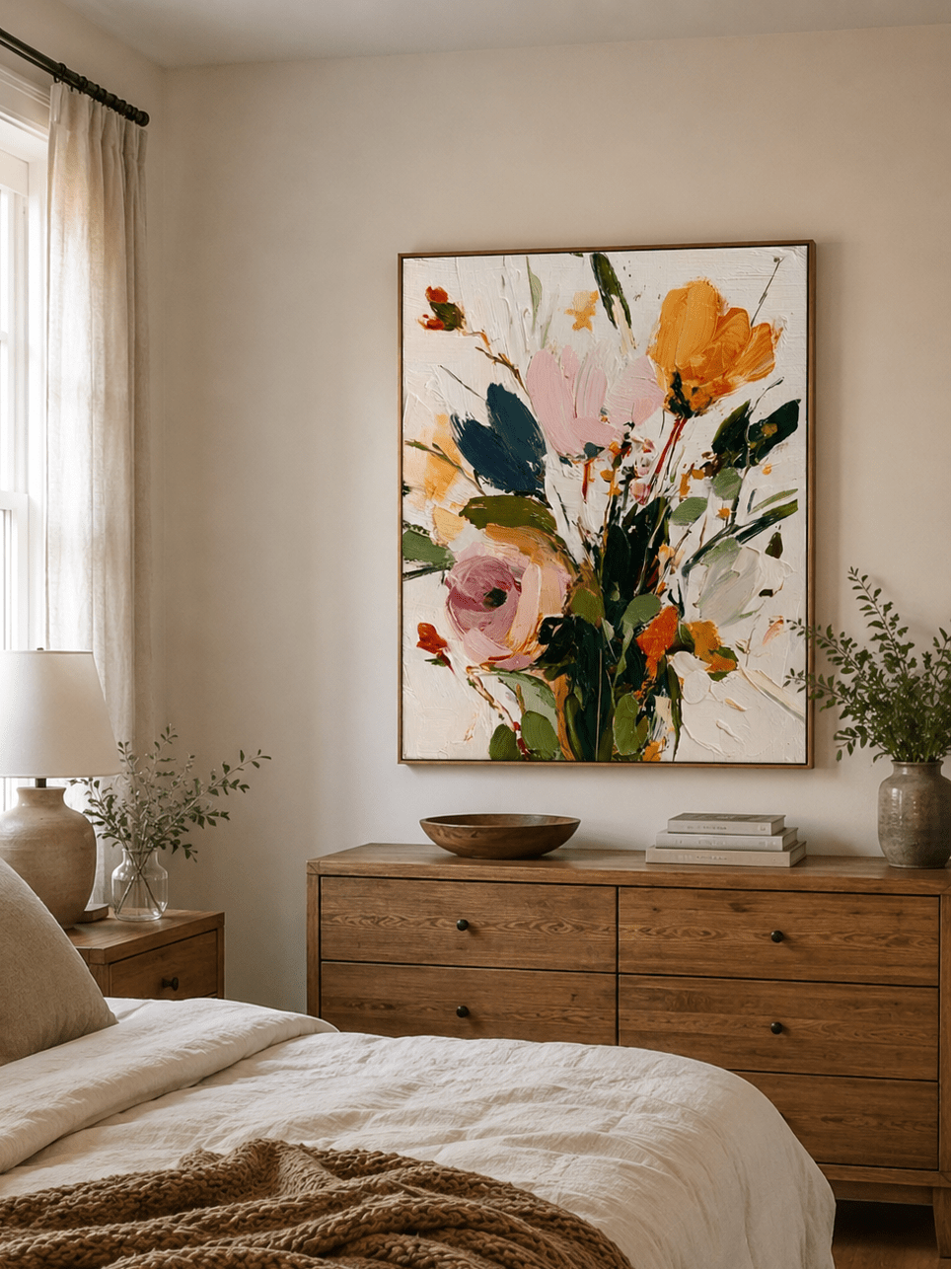
Above a dresser, group the painting with the furniture and account for lamps, mirrors and tall objects. A square mountain composition creates a centered, stable arrangement; a horizontal work follows a long dresser and can emphasize a low horizon. Tape the complete outer dimensions, including the frame, and check from the doorway.
Mountain imagery can also alter perceived openness. A distant, misty view may feel more expansive than a close, high-contrast ridge. If depth is your main decision, consult the separate guide to choosing landscape art by depth and openness.

A palette decision in five questions
- Does the room need cooling, grounding or warming?
- What color dominates in morning light and in evening lamplight?
- Which single tone from the painting can repeat in bedding or a small accessory?
- Does the work remain distinct from the wall and headboard in grayscale?
- Does the selected size fit the taped outline and the product page options?
Frequently asked questions
Is blue mountain art too cool for a bedroom?
Not if the room has warm walls, wood or textiles. Choose a blue-gray work with ivory or earth-toned passages and review it under your evening lamps.
What color mountain painting works with oak furniture?
Sage, muted blue and ivory-based earth tones all work. Yellow oak often benefits from a cooler blue or green counterpoint, while pale oak supports soft gray-green particularly well.
Can mountain art go above the bed?
Yes, provided the scale is tied to the bed and the installation is secure. Tape the dimensions first and follow appropriate hardware guidance for the wall construction and artwork configuration.
Should the painting match the bedding?
Repeat one restrained tone rather than matching the full palette. Contrast in value, texture or temperature keeps the room layered.
What mountain colors work in a dark bedroom?
Look for a composition with light sky, water or mist and readable midtones. Ivory, warm beige or muted sage can prevent low light from compressing the scene.
Choose the effect before the hue
Blue, green and earth tones can all support a restful bedroom, but they solve different problems. Name the adjustment your room needs, then compare the value range, undertone and taped scale. Explore the current Mountain Wall Art collection or browse New Wall Art, using each product page to confirm the available configuration.