
Stand in the doorway and look at a horse painting. What do you see first: the curve of the animal, the rider’s clothes, or the light around them? That first impression is a better guide to choosing Western wall art than a swatch of saddle brown. Two canvases can contain nearly the same colors and do entirely different things to a room.
Consider three hand-painted works from WABI Wall Art. In one, a black horse against ochre makes the silhouette the first thing you read. In another, burgundy and forest green give a cowgirl scene a more intimate mood. In the third, sand and caramel let a longhorn subject emerge gradually. Here is how to tell which one belongs on your wall.
Ochre and black when you want to see the horse from across the room
In the Minimalist Western Horse and Rider painting, EH#0539, the ochre ground gives the dark horse a clear edge. Imagine the work at the end of a dining room: from your seat, the horse should still read as a horse, even when individual painted marks are too small to see. This is the appeal of a silhouette. You can lose detail with distance and keep the gesture.
If you have a honey oak floor, resist the urge to match the ochre exactly. The floor already gives the painting a warm companion. Try a charcoal chair or the slim black stem of a reading lamp instead. It picks up the horse in a much smaller dose. On a wall crowded with black shelves or a television, that same dark silhouette has more competition; try it on the adjoining wall and compare the view from your chair.
View the ochre and black horse and rider · EH#0539
Burgundy and forest green when the rider is the story
The Modern Western Cowgirl and Horse painting, EH#0545, brings deep red, forest green and earthy brown into the same scene. Red and green can sound loud on a sample card. Here the useful distinction is depth: burgundy and forest green are both dark enough to sit beside walnut without turning the wall into a display of bright primary colors.

Picture it above a cream linen sofa. The upholstery leaves enough light around the canvas for both dark colors to register. Now picture it against deep green paint. The green passages may recede into the wall, making the warmer notes appear more prominent. Neither setting is inherently better. Choose the first if you want to see the whole color arrangement at a glance; choose the second if you like the sensation of discovering a figure inside a darker room.
For an easy trial, hold a burgundy fabric sample next to the green already in your room and look at both under your evening lamp. If they collapse into one dark patch, keep the wall or the furniture directly beneath the picture lighter. There is no need to buy matching red and green cushions.
View the burgundy and forest-green cowgirl painting · EH#0545
Sand and caramel when the architecture should stay in view
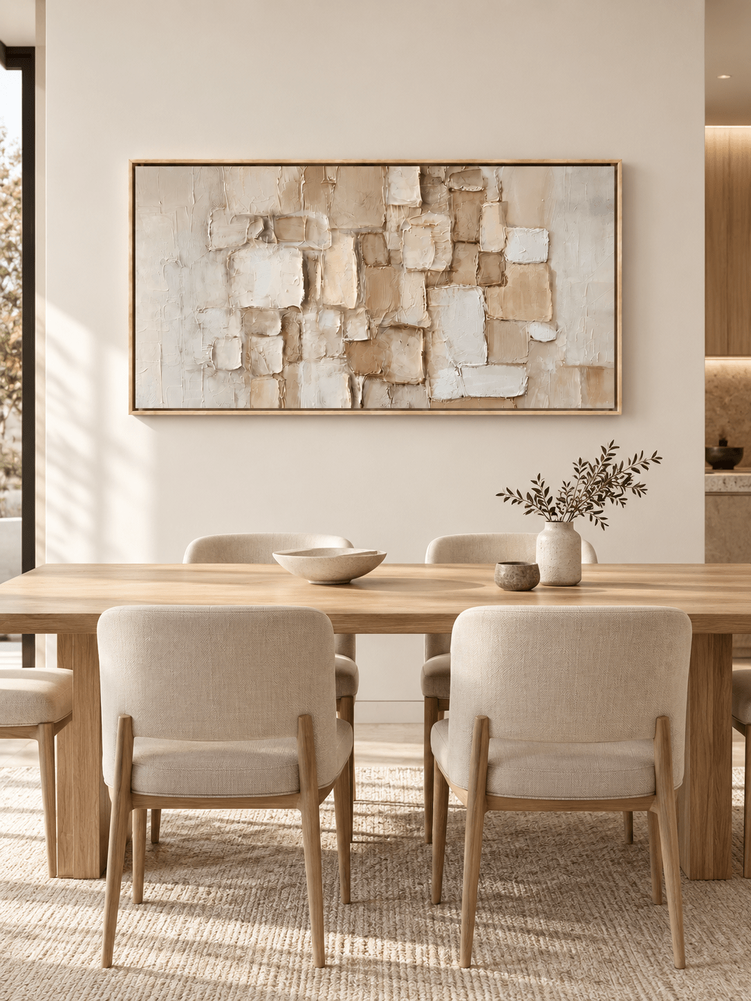
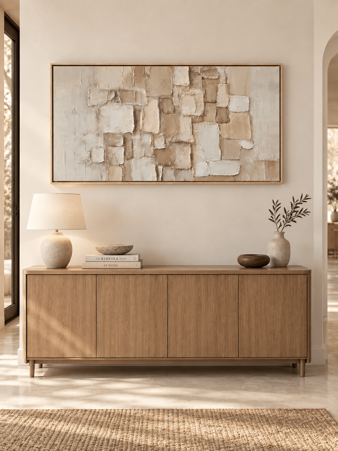
In the Abstract Western Longhorn Cowboy painting, EH#0538, warm beige, sand and caramel bring the subject closer to the color of plaster, timber and leather. Compared with a black horse against ochre, this is a gentler change from wall to canvas. It suits a place where you often stop close to the work: beside a dining bench, for instance, where there is time to notice how the painted marks build the subject.

A room with a tan leather banquette already has plenty of caramel. Introduce a little separation with a chalk-colored wall or pale linen nearby. If the painting seems to disappear above a honey-toned cabinet, move a lighter object beneath it before changing the frame. Sometimes a single cream bowl is enough to make the darker marks legible again.
View the sand and caramel longhorn painting · EH#0538
Try the doorway test before choosing a canvas
Photograph the intended wall from the spot where you first see it. On your phone, place each candidate over the same area at roughly the same scale. Shrink the photo until it is about the size of a postcard. Which feature survives: the black outline, the red-green relationship, or the sweep of warm neutral paint? That is the part of the work you are likely to notice when you walk through the room.
Then go back to the product detail photograph. A small screen can tell you which silhouette holds together; it cannot show how a hand-painted surface will feel at arm’s length. Check both distances before deciding. If the sofa faces the wall from across the room, give the doorway result more weight. If the canvas will hang beside your favorite reading chair, let the close-up have the deciding vote.
Western Art FAQ
Can Western art work in a room without ranch decor?
Yes. Let the painting supply the Western subject and let the furnishings stay as they are. A black bentwood chair can relate to the outline of a horse without looking rustic. A dark green book jacket can bring out a note in a cowgirl painting without turning the shelf into a themed display. One specific connection often looks more convincing than a collection of Western accessories.
What if I am choosing between two similar palettes?
Describe each picture without using a color word. If one answer is “the shape of the horse” and another is “the rider beside the horse,” you are choosing between a graphic image and a scene with a human presence. Pick the one you would still want to look at if you changed the rug. Color helps the painting settle into the room; the subject gives you a reason to keep it there.
Browse the collection with one question in mind: what do you want to notice from the doorway? Start with that work, then open its detail images to see what is waiting when you step closer.