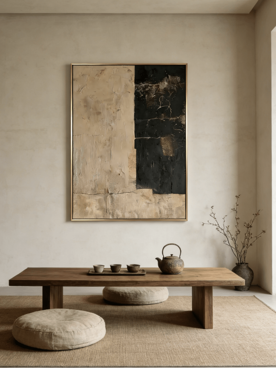
Open your camera preview before looking for a painting. The wall visible from your desk may be only a small part of the room, and your head and chair will hide another portion of it. A composition that works from the doorway can look oddly cropped during a call.
Home office art for video calls needs to work in two views: the room you occupy and the small rectangle other people see. Choose a painting with a clear overall shape, place it where its main features remain visible beside you, and test the surface under the light you actually use. There is no universal painting size or color that works for every camera position.
Start with your existing setup. A few measurements and a short test recording can answer more useful questions than a staged office photograph.
Map the part of the wall your camera sees
Set the laptop or webcam in its usual working position. Sit naturally rather than leaning forward to admire the preview. Include the chair you use and check the view with the camera framing settings you normally leave enabled.
Make a simple sketch of the visible wall. Mark the edges of the frame, your head, the chair back, and any fixed objects such as a door or bookshelf. This shows where a painting can remain recognizable rather than spending most of the call behind you.
Keep the main subject out of the head position
A flower, dark circle, or horizon line directly behind your head may create an awkward visual coincidence. Shift the proposed artwork to one side and see whether its important features stay clear when you move normally in the chair.
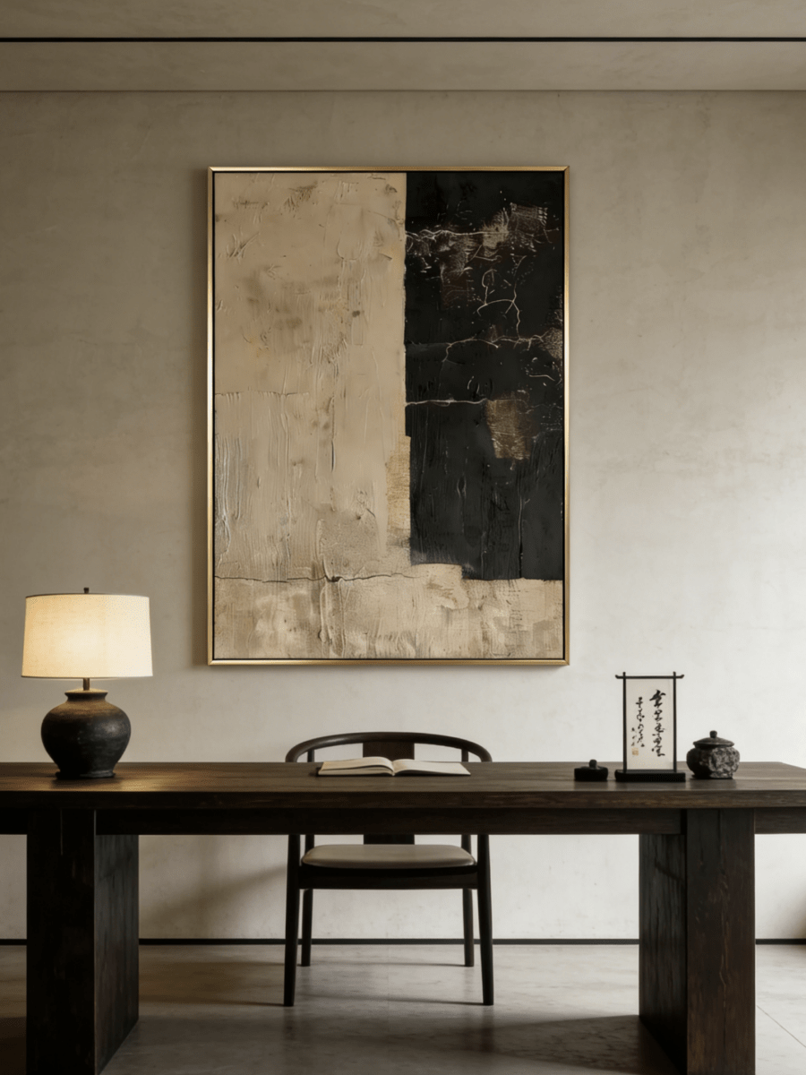
You do not need a perfectly symmetrical background. A painting on one side and a quiet section of wall on the other can feel composed. A small cabinet underneath can give the art a natural place in the room even if the camera shows only its upper edge.
Check more than one meeting view
Your large self-preview is not the only way colleagues see you. Look at a small tile-sized version as well. Fine marks that appear clear in a full-screen view may disappear, while a dark frame can remain surprisingly strong.
If you alternate between a laptop and an external webcam, check both before choosing the final position. Their fields of view may differ. The relevant measurement is the wall area visible through your actual camera, not simply the wall's total width.
Choose artwork that reads at a small scale
Broad areas of color and a clear composition are usually easier to judge in a small image. This does not mean the painting must be plain. It means its basic balance should still make sense when texture and fine details are less visible.
Try a practical comparison while browsing: reduce each product image to a small thumbnail. Can you still distinguish the light and dark areas? Does one corner seem much heavier than the rest? Then inspect the full image again, because you will also live with the work away from calls.
Separate the painting from the wall
An ivory painting on an ivory wall may need a visible frame edge or a darker internal mark. A very dark painting can become a strong rectangular block in the background. Neither is automatically wrong; both need to be assessed with your face and chair in the shot.
Muted sage, stone, taupe, and blue-gray are useful options when they relate to existing furniture. Avoid picking a color because it is supposed to make every office look professional. A green painting beside warm wood can be convincing, while the same painting in an unrelated room may feel added only for the camera.
Keep text and tiny patterns secondary
Words inside a painting or poster may be partly hidden or unreadable at meeting size. Closely spaced lines and small high-contrast details can also become visually restless in a reduced image. Test them on the actual call setup rather than assuming they will behave like the product photograph.
A quiet composition gives you more flexibility when your background also includes books, storage, or a door. If several items compete for attention, clear the cabinet surface before deciding that the painting itself is wrong.

Evaluate glare from the camera position
Reflections should be checked through the camera as well as from the chair. A surface may look comfortable to you while reflecting a lamp directly toward the lens. Zoom's lighting guidance specifically notes that reflective surfaces can distract viewers or affect a camera's automatic picture adjustment.
Start by lighting your face comfortably, then look at the background. Move a lamp, adjust a shade, or change the camera angle if a bright patch appears on the artwork. Avoid solving a background reflection by making yourself difficult to see.
Look at texture without demanding that it show on screen
Raised paint can add interest when you walk into the office, even if only its broad shadows register on a call. That is a reasonable outcome. The painting is part of your home as well as part of a video background.
Do not assume that textured canvas is glare-free. Finish, viewing angle, and lighting all matter. Ask about the selected work's surface and look closely at available product detail photographs before choosing it for a position opposite a bright window.
Test at the times you work
A background that looks balanced in the morning may look quite different during a late-afternoon call. Make a short recording at your usual meeting times and watch it at a normal viewing size. Look for distracting reflections, a disappearing pale image, or a dark artwork that dominates the shot.
Change one thing at a time. Adjusting the art position, lamp, camera, and software settings together makes it hard to know what helped. Keep a screenshot of the version you like so it is easy to restore after moving the desk.

Four paintings for different camera backgrounds
These works offer distinct starting points. Choose one according to the visible wall, existing furnishings, and amount of detail already in the camera frame.
Quiet structure beside a busy working area
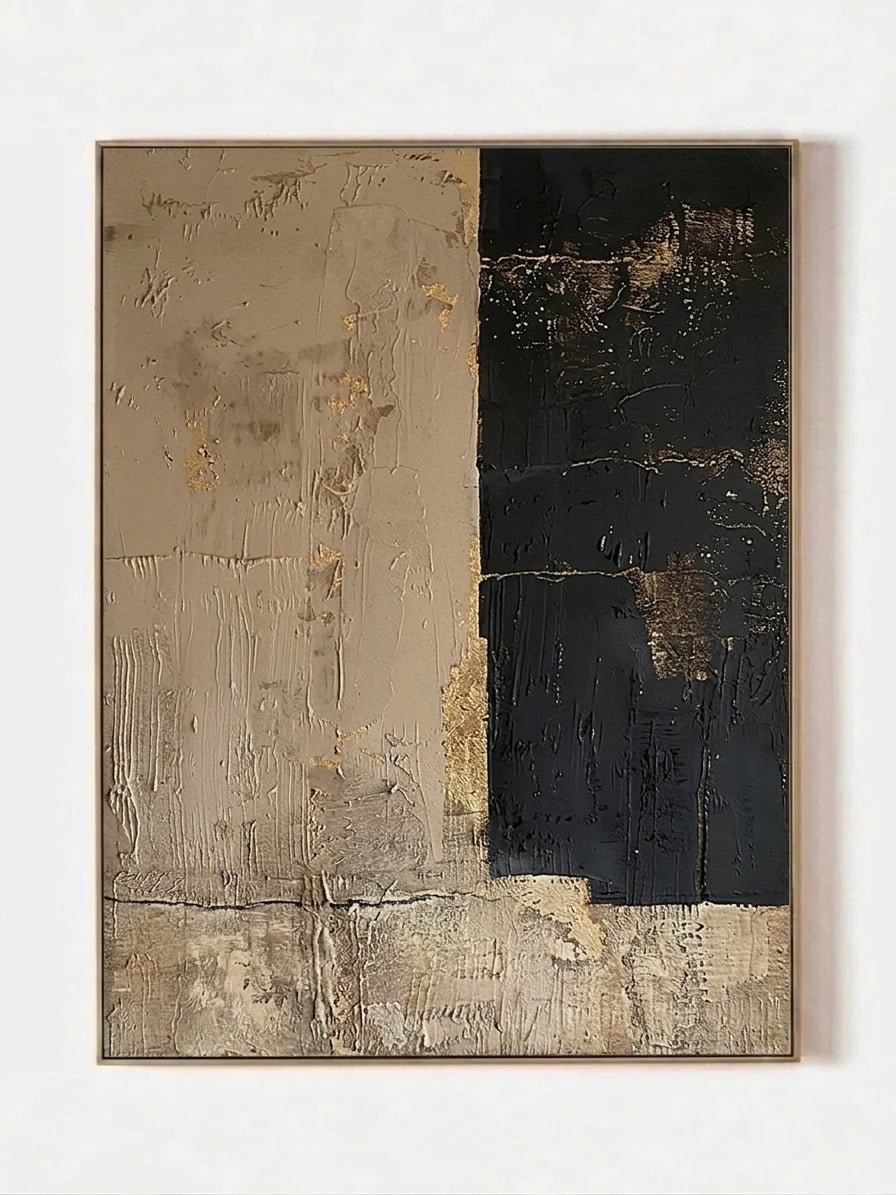
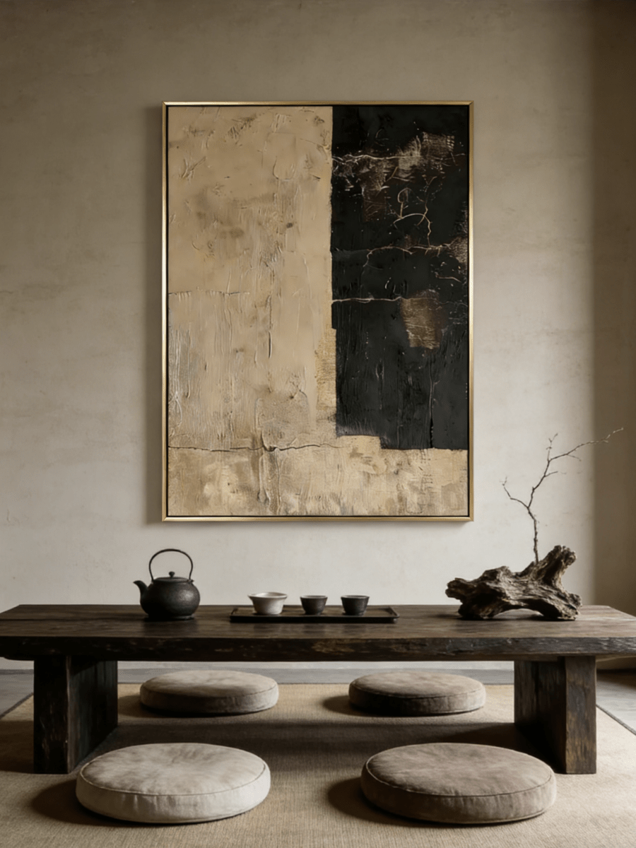
Quiet Stone Panels, EV#0414 uses pale neutral sections with different surface treatments. Its vertical format can sit beside the chair's head position, while the broad forms remain understandable when details soften on screen.
It suits a warm white wall with an oak or walnut desk when you want the office to stay restrained. Check that the frame and panel divisions remain visible in the preview; a pale painting that vanishes into a pale wall may need a different location.
A low horizon with a generous light field
Textured Coastal Landscape, EL#0352 combines a light sky, subdued water, and a narrow land area. Its square format can occupy a clear patch of wall without introducing a crowded subject. The blue-gray passages offer a small cool note beside warm timber.
Position the work so the horizon remains visible alongside you. If the chair hides most of the lower half, the camera may show little beyond a pale square, even though the full painting is attractive in person.
A muted green color field
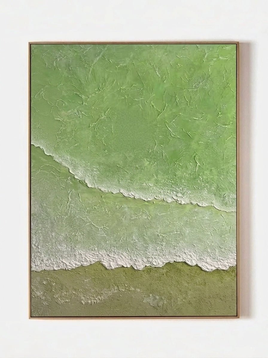
Textured Sage Green Abstract, AK#0371 contains broad green passages with deeper edges and small warm marks. It can add color when the office is otherwise cream, wood, and neutral upholstery. The darker area gives the image definition against a light wall.
Test the balance with the painting on each side of the chair. Because the composition has unequal light and dark areas, its position can change how heavy the background feels. Keep neighboring objects simple while making that comparison.
Repeated forms within one neutral square
Quiet Rhythm, EV#0427 organizes raised dots and lines on a warm neutral ground. The overall square is orderly, while the surface offers detail for in-person viewing. It can work above a low cabinet where a large color statement would feel out of place.
This is the option to test most carefully at small video size. The repeated marks may read clearly or merge into a quieter surface depending on distance and camera settings. Choose it because you like both the room view and the tested camera view.

Use a simple buying and placement test
Measure a proposed painting with its frame included. Make a paper template and place it on the wall using a method suitable for the wall finish. Sit at the desk and capture the ordinary working view, including your chair and normal posture.
Then step away from the desk. The painting should still belong to the room when the laptop is closed. If it sits awkwardly high merely to clear your head, try a smaller work, a position beside you, or a modest camera adjustment before committing to that height.
A useful shortlist records five things:
- The visible wall area beside your head and chair.
- The complete framed dimensions of each artwork option.
- Whether the main subject survives the camera crop.
- The appearance under daytime and evening lighting.
- How the painting relates to the desk, cabinet, and room outside the shot.
When comparing contemporary minimalist artwork, focus on the broad composition first and the surface details second. WABI's New Arrival collection offers additional subjects, but the same camera test is more useful than selecting by a room label alone.
Do a final private recording before a work call. Speak and move normally for a short period. A still screenshot can miss the moments when a frame edge appears to intersect your head or a reflection becomes more prominent as the camera adjusts.
Home office art questions
Should artwork be directly behind me on video calls?
It can be, but a position beside your head often keeps more of the composition visible. Test the view while seated normally and while moving slightly. Avoid placing the main subject where your head or chair hides it throughout the call.
What size painting works for a Zoom background?
There is no single correct size. Camera distance, field of view, chair height, and the available wall all affect what appears on screen. Use a full-size paper template and the actual camera preview before selecting dimensions.
Is abstract art better than a landscape for an office background?
Either can work. A broad abstract may read clearly at a small size, while a simplified landscape can provide an identifiable horizon. Compare the overall shapes and contrast rather than treating one genre as automatically more professional.
Will textured wall art show up on a video call?
Some larger ridges and shadows may remain visible, but fine texture can be lost in a small video tile. Choose texture for the room you use every day and verify its on-camera appearance with your own equipment and lighting.
The final check
Good placement lets the painting remain part of the room while keeping you visually clear on screen. Choose the work for its composition, test its full dimensions in the camera view, and make sure the background still looks comfortable when you close the laptop.