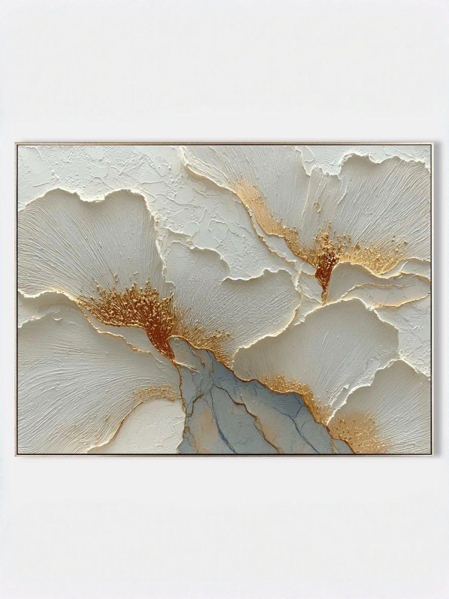
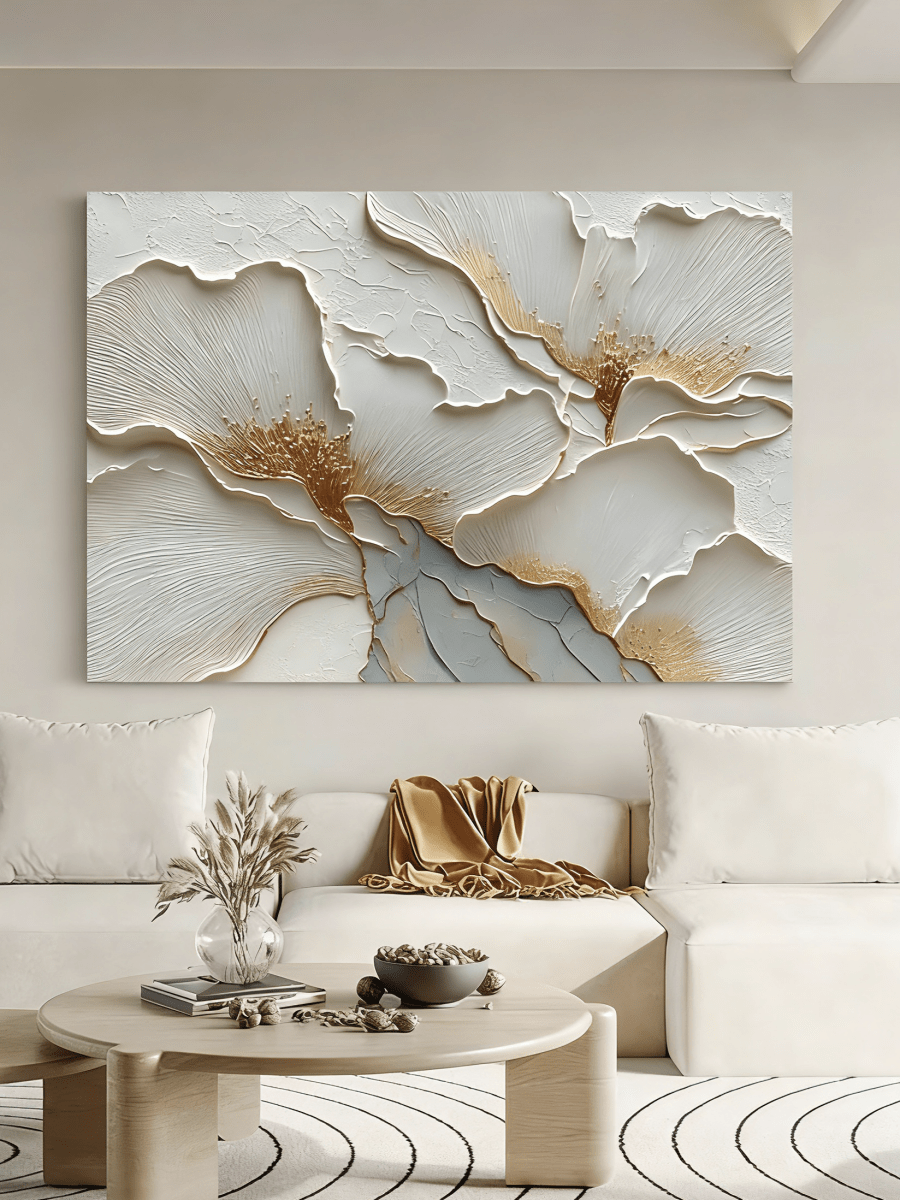
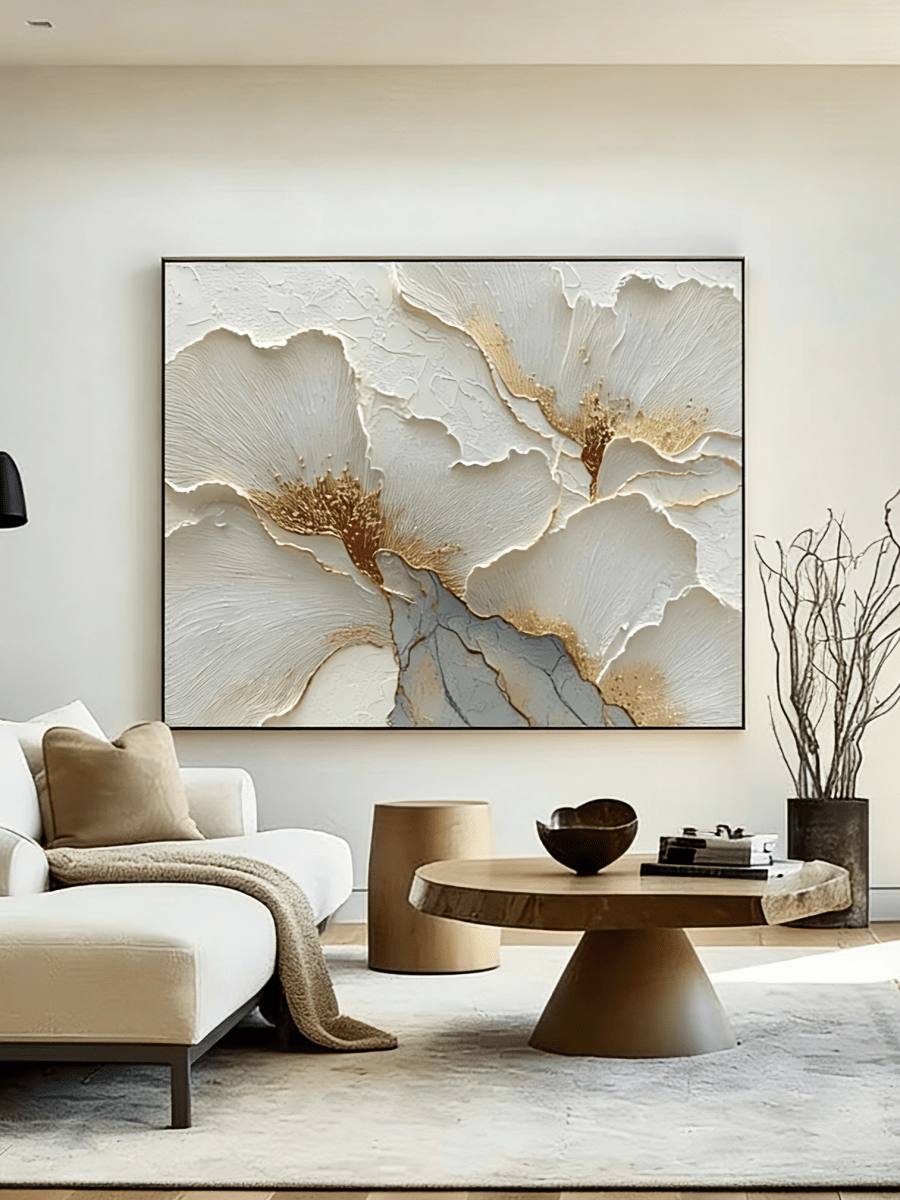
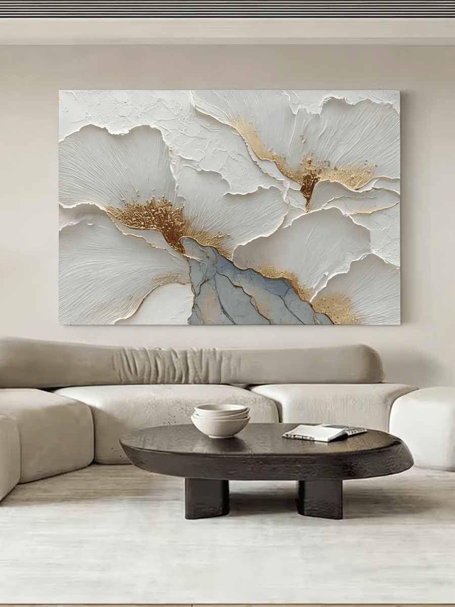
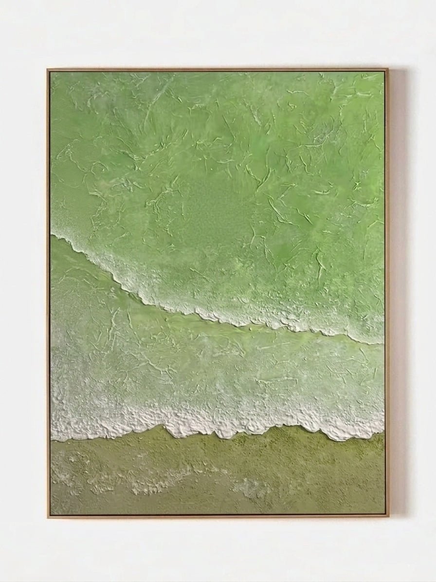
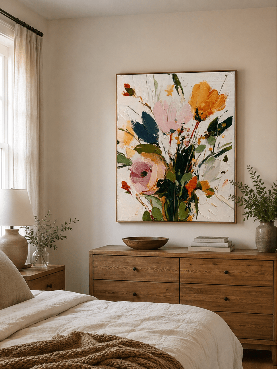
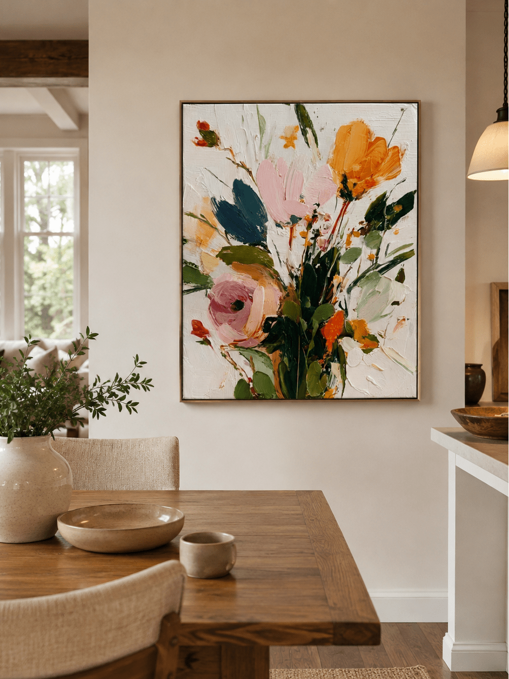
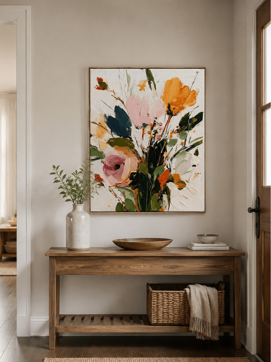
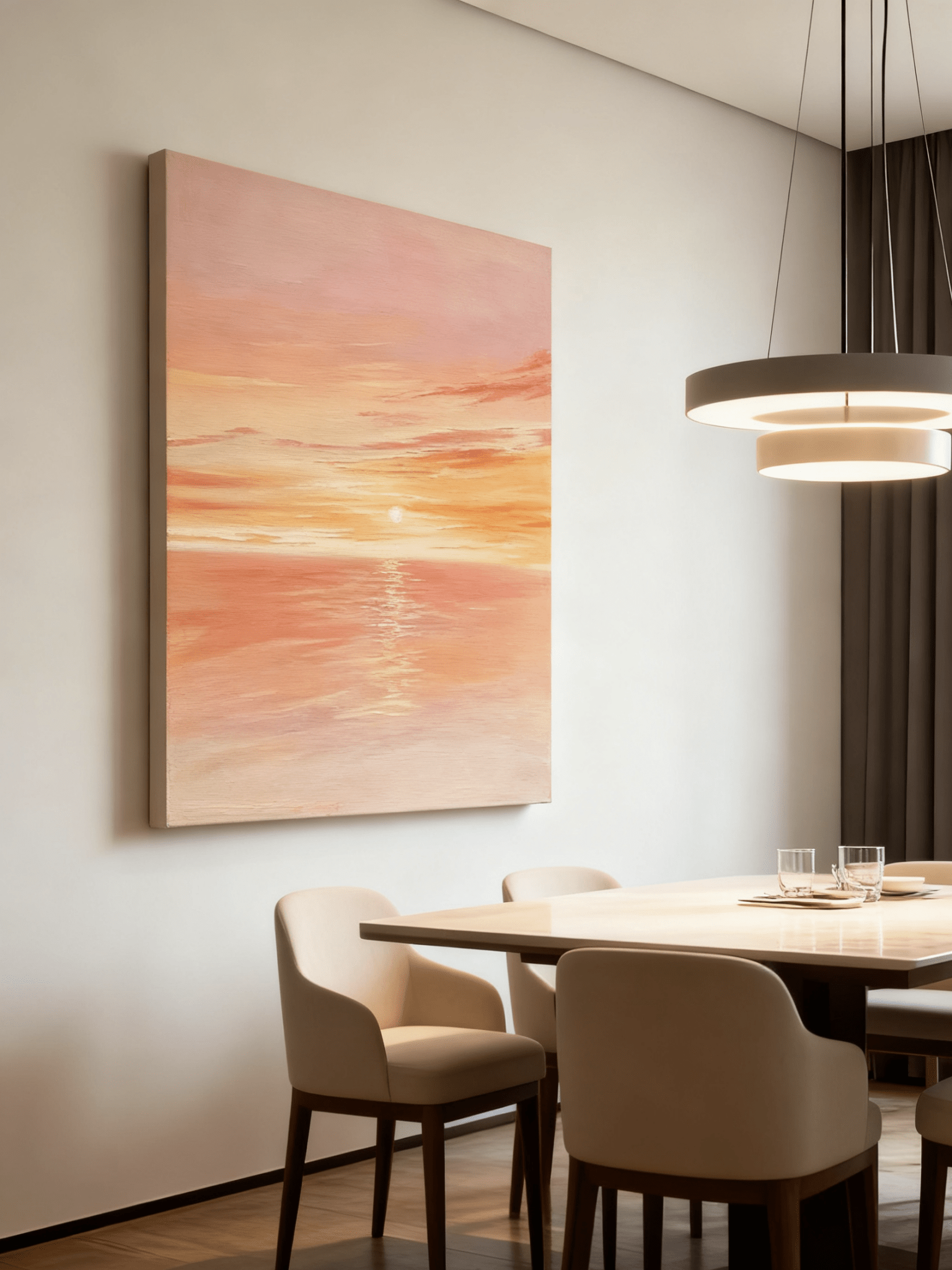
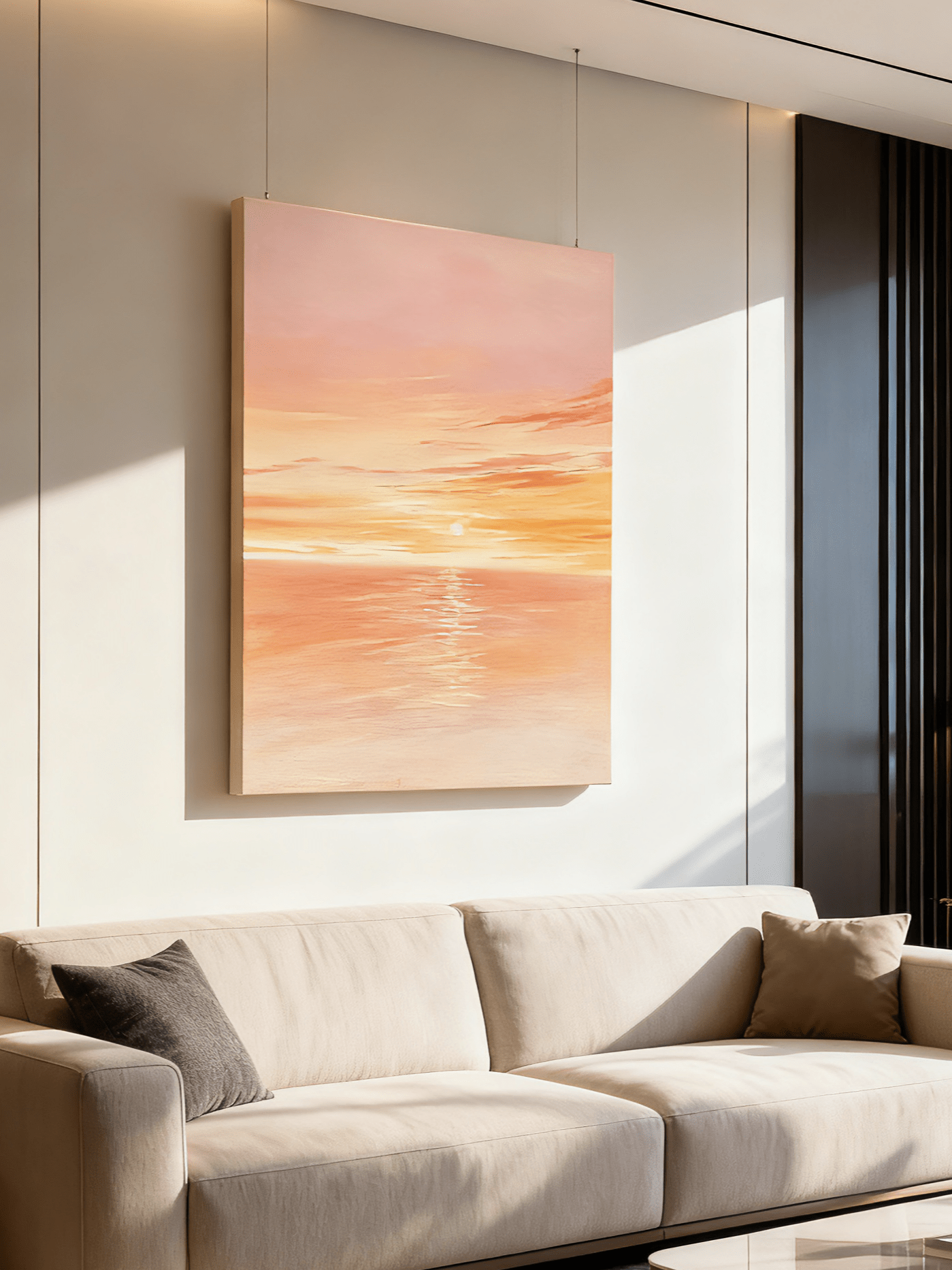
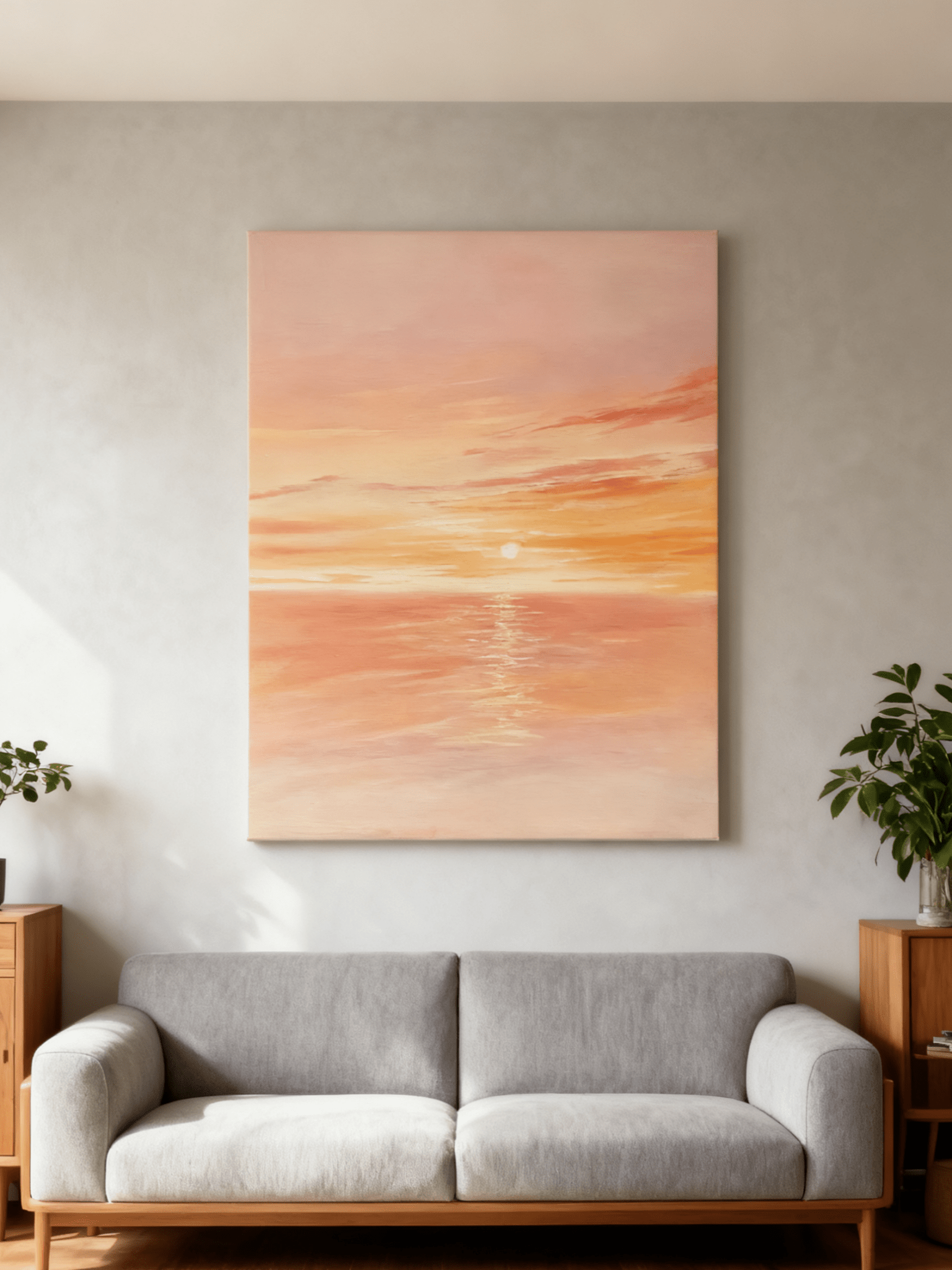
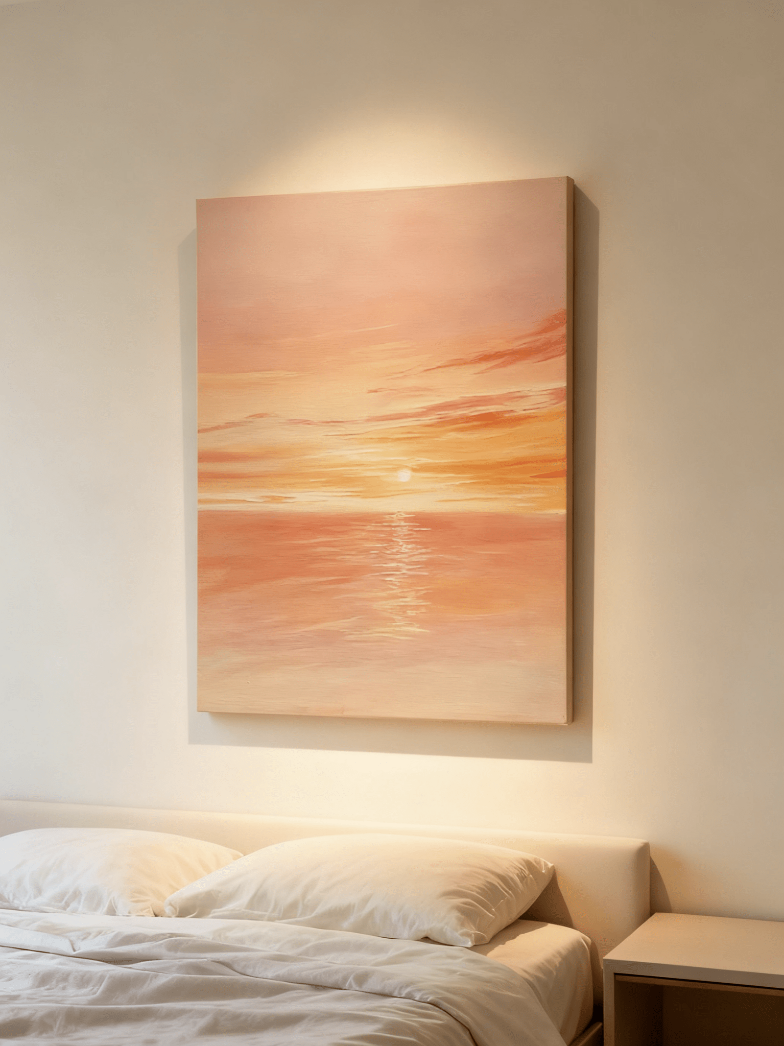
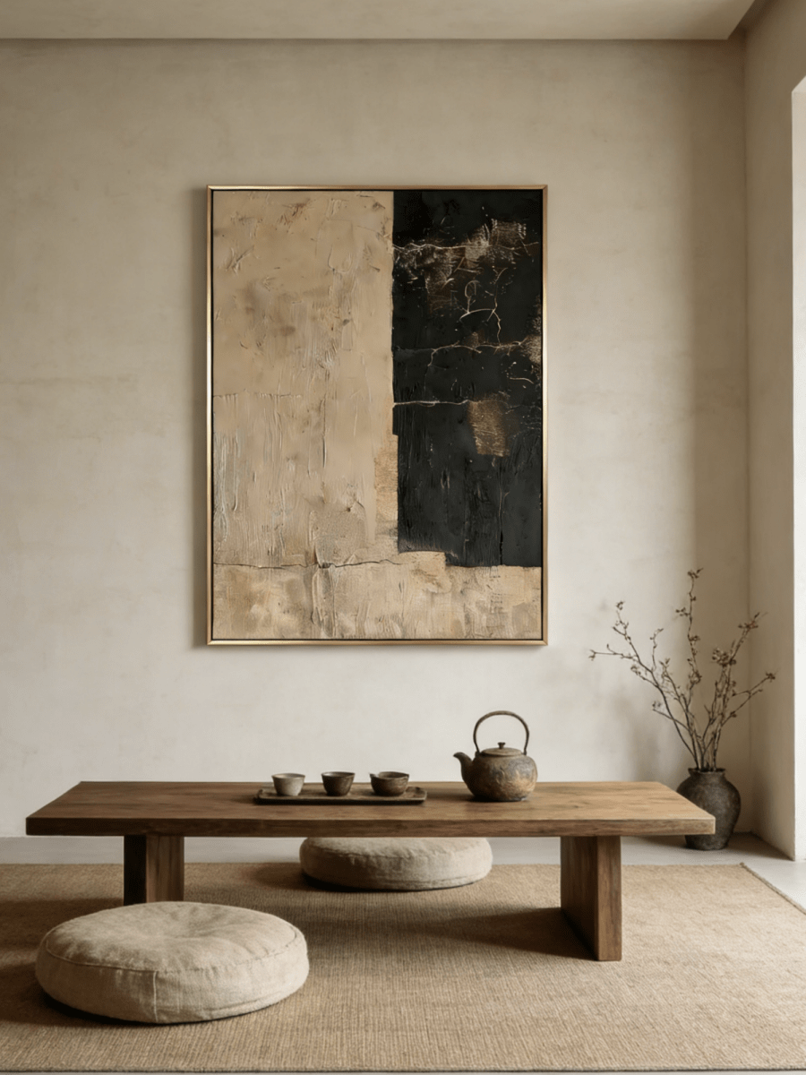
Choose wall art orientation by reading the usable wall first—not by matching the room name. Horizontal art usually supports wide furniture, vertical art uses tall narrow space, square art creates a stable focal point, and panoramic art stretches across an unusually broad wall. The best choice also depends on the furniture below, the canvas aspect ratio, the movement inside the artwork, and how the room is viewed.
This wall art orientation guide turns those variables into a practical decision. It covers horizontal vs vertical wall art, square placement, and the difference between a normal horizontal painting and a panoramic canvas.
Fast answer: Follow the dominant shape of the available wall or the furniture grouping when you want calm continuity. Choose a contrasting orientation only when you want to create height, a centered pause, or deliberate visual tension—and confirm it with a full-size tape test.
In This Guide
- Quick orientation comparison
- The five-factor decision model
- When horizontal art works
- When vertical art works
- How to place square wall art
- Panoramic vs ordinary horizontal art
- Orientation by furniture and architecture
- Canvas shape vs internal movement
- The five-minute tape test
- 14 common mistakes
- Real WABI Wall Art examples
- Frequently asked questions
Horizontal, Vertical, Square, or Panoramic: Quick Comparison
| Orientation | Best starting point | Typical effect | Watch for |
|---|---|---|---|
| Horizontal | Sofas, beds, consoles, sideboards, long walls | Expands the eye sideways; calm and grounded | A canvas too wide for the furniture or too shallow for the wall |
| Vertical | Narrow walls, between openings, stair landings, slim furniture | Draws the gaze upward; adds height and rhythm | Making a short room feel top-heavy or crowding doors and trim |
| Square | Centered wall zones, consoles, fireplaces, reading corners | Stable, focused, architectural | Leaving excessive empty width above very long furniture |
| Panoramic | Sectionals, long sideboards, wide dining zones, open walls | Immersive sweep; emphasizes breadth and horizon | Insufficient viewing distance or very limited wall height |
These are starting points, not fixed laws. A square painting can work above a long sofa when it is large enough and visually anchored. A vertical painting can sit above a console when nearby architecture creates a narrow usable zone. The next five factors explain why.
The Five-Factor Model for Choosing Wall Art Orientation
1. Usable wall shape
Measure the uninterrupted wall area, not the total room wall. Doors, windows, curtains, switches, sconces, vents, sloped ceilings, built-ins, and the swing of a nearby door reduce the space the art can actually occupy. That remaining rectangle is your usable wall shape. If it is wide and low, begin with horizontal. If it is tall and narrow, begin with vertical. If the usable zone feels centered and nearly equal in width and height, square becomes a strong candidate.
2. Furniture below
Furniture creates a visual baseline. A sofa, bed, console, or sideboard often makes the wall zone read wider than it would when empty. Art should feel connected to that grouping rather than floating independently. Horizontal and panoramic formats naturally echo long furniture; a square canvas can create a calm centered anchor; vertical art works best when the furniture is slim or when architecture narrows the display zone.
3. Canvas aspect ratio
“Horizontal” includes many shapes. A 4:3 canvas feels fuller and more compact than a 3:2 canvas. A 2:1 or 3:1 canvas reads as panoramic. Check the exact width and height of the size you plan to order; do not assume every size option preserves the same ratio. Frame width also adds to the finished outside dimensions.
4. Internal composition
The outside edge tells you the canvas orientation; the lines, forms, brushwork, and subject inside tell you where the eye travels. A square misty landscape can carry a strong horizontal horizon. A vertical abstract can contain a grid that slows the upward pull. Treat canvas shape and internal movement as related but separate decisions.
5. Viewing distance and desired effect
From across an open-plan room, a panoramic work can create a long, cinematic sweep. In a narrow hallway, the same ratio may be hard to take in at once. Decide whether you want the wall to feel wider, taller, centered, restful, or energetic. Then view a full-size outline from the doorway, the main seat, and a side angle before committing.
When to Choose Horizontal Wall Art
A horizontal painting is wider than it is tall, but it does not need to be extremely wide. It is usually the most intuitive choice above a sofa, bed, console, sideboard, or dining bench because it repeats the furniture’s lateral direction. The eye moves across the grouping as one composed unit.

For a horizontal painting for a living room, first compare the canvas width with the visible sofa width, not the wall-to-wall room dimension. A common starting range is roughly two-thirds to three-quarters of the furniture width, but the outline should also leave clear breathing room at both ends. A visually dense dark painting may feel larger than a pale atmospheric work of the same dimensions.
Horizontal art is also useful when you want to make a compact room feel more expansive. Repeated horizontal lines—such as a horizon, long brush marks, or low layered forms—strengthen that effect. Avoid forcing a horizontal canvas into a narrow bay where its corners nearly touch trim, curtains, or sconces.
When to Choose Vertical Wall Art
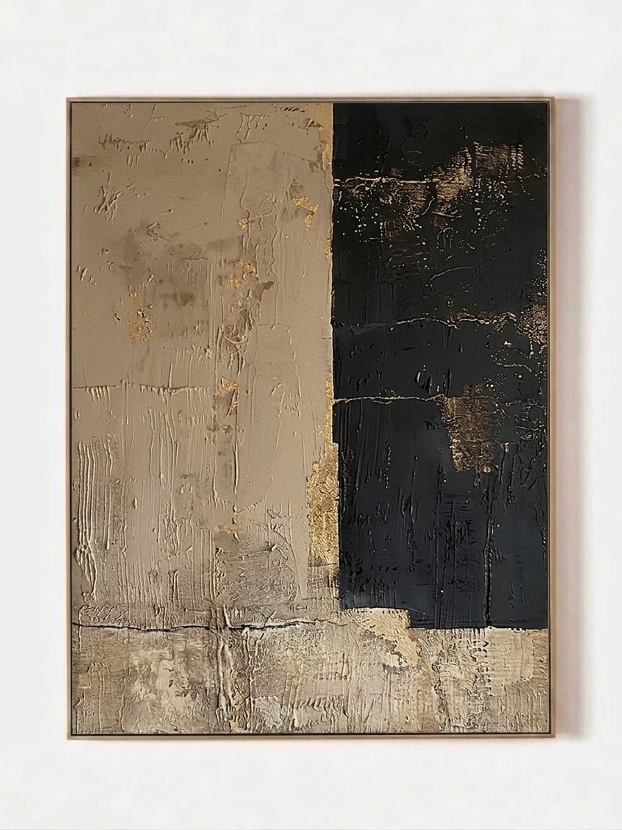
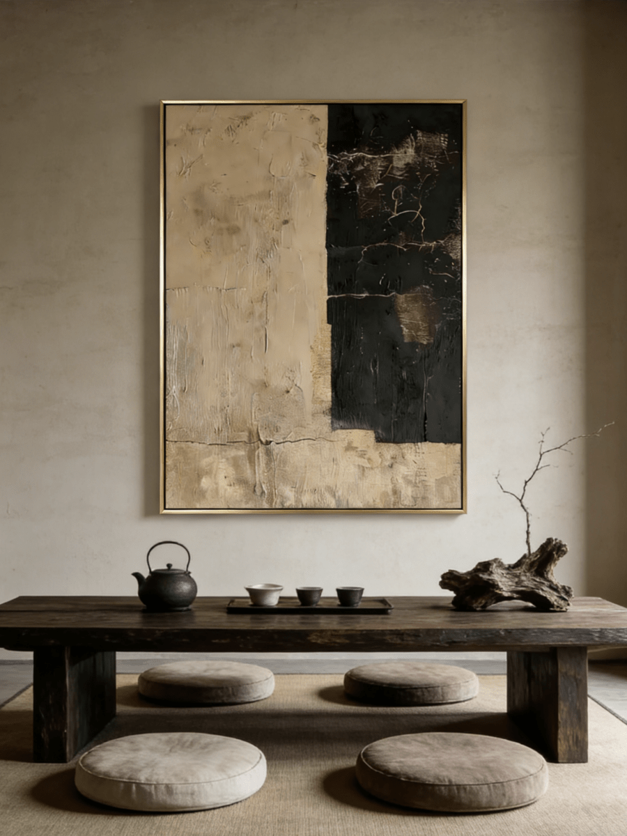
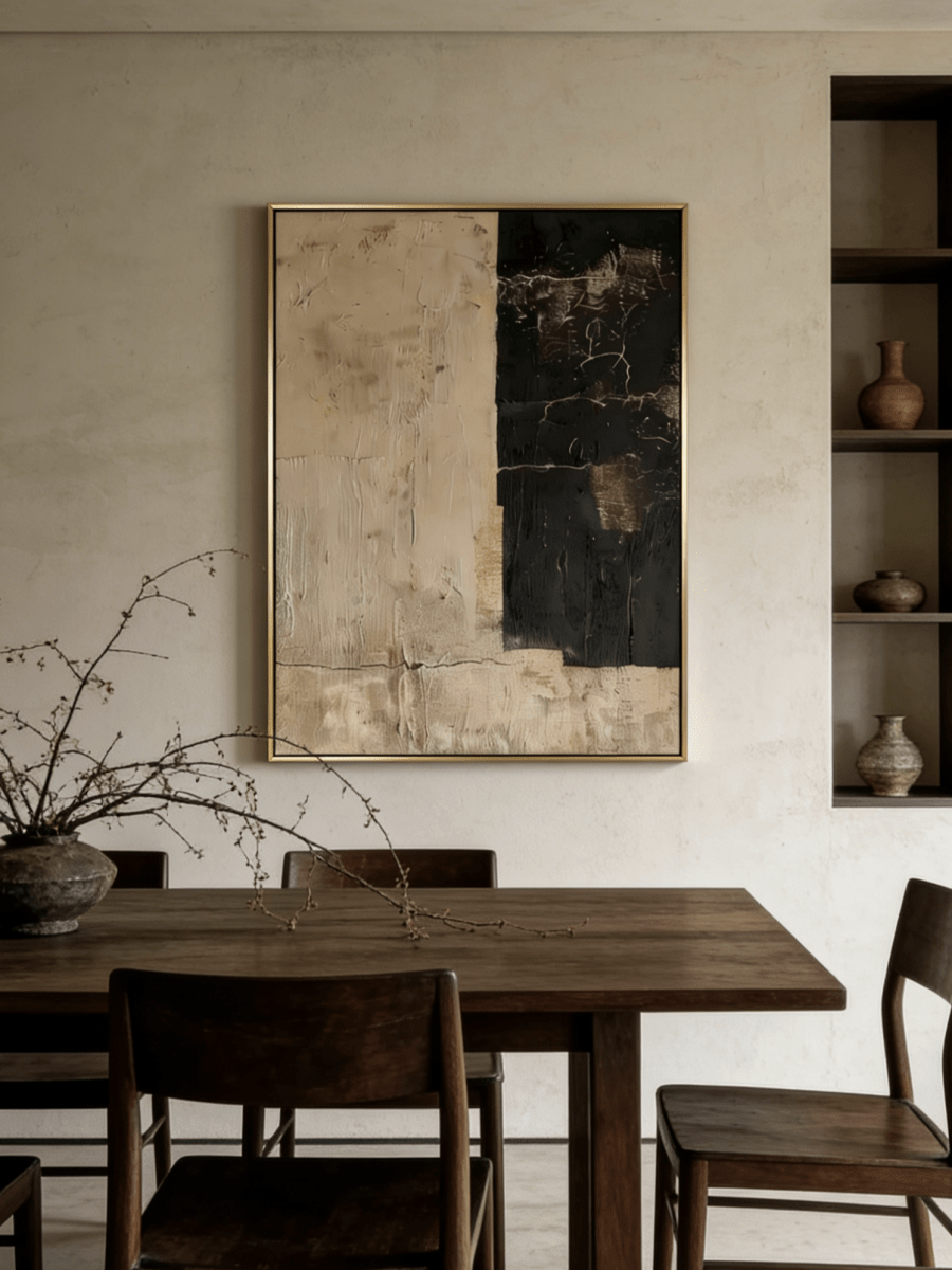
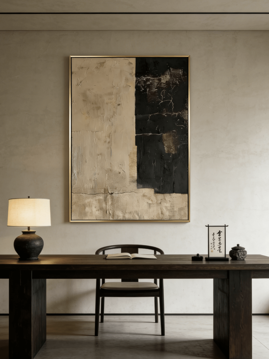
Vertical wall art is taller than it is wide. It makes efficient use of narrow walls and naturally lifts the gaze. Consider it between windows, beside a doorway, at the end of a hallway, on a stair landing, above a narrow pedestal, or next to a tall bookcase.

For vertical wall art on narrow walls, preserve space around all four sides. The canvas should not look wedged between casings. Check the top edge against door and window headers: alignment can create order, but a small intentional offset may look more natural in an asymmetrical room.
One vertical canvas creates a clear focal point. A pair of smaller vertical works creates cadence and can occupy more total width without losing the upward rhythm. In a low-ceilinged room, test the top edge carefully; hanging too high can make both the art and ceiling feel disconnected.
How to Choose and Place Square Wall Art
Square wall art has equal width and height, creating a balanced perimeter that neither pushes strongly sideways nor upward. That stability makes it especially effective when the wall needs a centered pause: above a console, over a fireplace, in a reading corner, at the end of a hallway, or between two architectural features.

Square wall art placement does not require a square wall. What matters is whether the square establishes a convincing center and enough visual weight. Above a medium console, a single square can echo a centered lamp, vase, or doorway axis. Above a wide sofa, choose a generously scaled square and keep it low enough to join the furniture group, or use two or three related square works if one canvas leaves the wall feeling underfilled.
A square format is also useful for art with complex movement. Because the boundary is neutral, diagonal, circular, or horizontal internal forms become more noticeable. Measure the finished framed size; a substantial frame can make a square piece feel more architectural and slightly larger than the listed canvas dimensions.
Panoramic vs Horizontal Wall Art
All panoramic art is horizontal, but not all horizontal art is panoramic. An ordinary horizontal canvas is wider than tall while retaining enough height to feel like a full visual field—often around 4:3 or 3:2. Panoramic art is noticeably wider and shallower, commonly around 2:1 to 3:1 in the available sizes. There is no single universal ratio that every retailer uses, so compare actual dimensions.

Choose an ordinary horizontal painting when the wall needs both width and presence in height. Choose panoramic when the usable wall is exceptionally broad, the furniture is long, and you want the eye to travel across a continuous horizon. Panoramic formats are particularly effective above sectionals and long sideboards, but they need viewing distance. From too close, the viewer may scan rather than perceive the work as a whole.
Do not choose panoramic merely to fill every inch. Leave wall around it, and check that the work will not compete with tall lamps, curtains, open shelving, or a television. A lower, extra-wide canvas may also require more careful lighting so its edges do not fall into shadow.
Wall Art Orientation by Furniture and Architecture
| Location | Best first test | Alternative | Key check |
|---|---|---|---|
| Sofa or bed | Horizontal | Large square or panoramic | Connect art to furniture width and keep a comfortable gap |
| Sectional | Panoramic | Wide horizontal or coordinated group | Use the main visible run, not every chaise edge |
| Console or sideboard | Horizontal or square | Vertical if architecture narrows the zone | Account for lamps and tall objects |
| Fireplace | Square or compact horizontal | Vertical for a tall chimney breast | Confirm heat, clearance, and mantel height |
| Between windows | Vertical | Small square | Leave space from curtains and trim |
| Long hallway | Horizontal sequence | Vertical at the end wall | Consider close viewing and walking sightlines |
Architecture can override the furniture cue. A long console placed between two close windows may still create a tall, narrow display zone. A sofa under a sloped ceiling may need a compact square rather than a wide canvas. Photograph the wall straight-on and draw the usable boundary on the image; this often reveals the true shape faster than looking at the empty wall in person.
Canvas Shape Is Not the Same as Visual Movement
Orientation describes the outside proportion of the canvas. Visual movement describes how lines, edges, contrast, repeated forms, and implied motion guide the viewer’s eye inside it. A square painting can contain a low horizon that moves laterally. A horizontal painting can use rising vertical marks. A vertical painting can feel grounded when a strong grid interrupts the upward path.
This distinction prevents a common mismatch. If you want a room to feel wider, a square canvas with a strong horizon may support that aim even though its outer boundary is not horizontal. If you want height, a vertical canvas with stacked forms can intensify the effect. For a deeper method, read How to Choose Abstract Wall Art by Visual Movement. Use that guide to read the composition; use this one to select the canvas shape and wall placement.
The Five-Minute Wall Art Orientation Test

- Measure the usable wall after subtracting doors, windows, curtains, vents, switches, and furniture.
- Mark the furniture centerline with a small removable tape tab.
- Choose one real product size, including the finished frame dimensions.
- Tape its exact outside width and height on the wall.
- Repeat with a second orientation or ratio; do not compare vague imaginary sizes.
- Photograph both outlines from the room entrance.
- Sit in the main viewing position and check eye movement and scale.
- View from a side angle and confirm doors, curtains, and lamps do not interfere.
- Check in daylight and again with evening lighting.
- Leave the preferred outline up for a few hours; the more natural proportion usually becomes obvious.
14 Wall Art Orientation Mistakes—and the Fix
- Measuring the whole wall. Measure only the uninterrupted usable zone.
- Choosing by room label. A “living room” does not automatically require horizontal art; read its wall and furniture.
- Treating every horizontal ratio as equal. Compare actual width-to-height proportions.
- Confusing panoramic with ordinary horizontal. Panoramic is substantially wider and shallower.
- Ignoring the frame. Add the frame to the finished outside measurement.
- Matching furniture width exactly. Leave breathing room instead of creating a rigid edge-to-edge block.
- Using a tiny square above long furniture. Scale it up, lower it into the grouping, or use a coordinated square set.
- Wedge-fitting vertical art. Preserve clear margins from trim, windows, and doors.
- Hanging too high. Relate the canvas to nearby furniture and seated sightlines.
- Ignoring internal movement. Read the composition as well as the outer boundary.
- Ignoring visual weight. Dark, high-contrast, heavily textured work can feel larger than pale quiet art.
- Testing from only one viewpoint. Check the entrance, main seat, and side approach.
- Skipping night lighting. A wide work may need balanced illumination across its edges.
- Ordering before a full-size mock-up. Use tape or paper at the exact selected dimensions.
Five Real WABI Wall Art Orientation Examples
1. Square canvas with horizontal internal movement
Minimalist Abstract Misty Lake Landscape Painting – EL#0152 is offered in square sizes, while its misty shoreline creates a clear horizontal drift. It demonstrates why canvas shape and internal movement should be evaluated separately. The square perimeter creates a steady focal point; the horizon visually opens the room sideways.
2. Horizontal art for a living room
Wabi Sabi Textured Wall Art – Soft Grey Horizon – EL#0277 is an active horizontal work with sizes from compact to large and with rolled, stretched, and framed options. Its broad gray band and long raised texture make it a natural example above a sofa, bed, or sideboard.
3. Vertical art for a narrow architectural wall
Wabi Sabi Textured Wall Art – Warm Architectural Grid – EV#0281 is offered in clearly labeled height-by-width vertical sizes. The warm architectural grid mixes upward emphasis with stabilizing horizontal relief, making it useful for a narrow entry wall or space between openings.
4. Stable square placement above a console
Handmade Beige & Bronze Wabi Sabi Textured Wall Art – EV#0071 is available in multiple square sizes. Its centered raised grid reinforces the square canvas’s stable character and gives a console, fireplace wall, or reading corner a deliberate focal point. The product description identifies professional oil and/or acrylic paint, so the tactile effect matters as much as the neutral palette.
5. Panoramic art for an extra-wide zone
Neutral Abstract Landscape Wall Art – Misty Tidelands – EL#0313 includes formats from 2:1 to 3:1. Its extended wetland horizon and horizontal palette-knife marks demonstrate the immersive sweep that distinguishes panoramic wall art from a standard horizontal canvas.
Product options and availability can change. Always confirm the currently selected size and finishing option on the product page before ordering.
Frequently Asked Questions
Should wall art be horizontal or vertical above a sofa?
Horizontal is the safest first test because it follows the sofa’s width. A large square can create a centered focal point, and panoramic can suit an extra-long sofa or sectional. Compare exact outlines rather than choosing by label alone.
Can vertical wall art go above a sofa?
Yes, especially as a pair or series, or when architecture creates a narrow zone above part of the sofa. One small vertical piece centered over a very long sofa often feels disconnected, so test scale and grouping carefully.
Where should square wall art be placed?
Square art works well above consoles and fireplaces, in reading corners, at hallway ends, and between architectural features. It can also work above a sofa when large enough to carry the wall or when used as a coordinated set.
Does square wall art need a square wall?
No. It needs a convincing center, appropriate scale, and enough visual weight. Furniture and architecture can define a centered square-like display zone within a much wider wall.
What is the difference between panoramic and horizontal wall art?
Horizontal simply means wider than tall. Panoramic is distinctly extra-wide and shallow, often around 2:1 to 3:1, although there is no universal cutoff. Panoramic art produces a longer visual sweep and usually needs more width and viewing distance.
Is vertical wall art good for narrow walls?
Yes. It uses height without crowding the wall’s width. Leave visible margins around the canvas and check its top edge against doors, windows, and ceiling lines.
Can internal composition change how an orientation feels?
Yes. Horizons, stacked shapes, diagonals, curves, contrast, and repeated marks guide the eye independently of the canvas boundary. A square painting may feel expansive; a horizontal painting may still lift the gaze.
How much space should remain around wall art?
There is no universal number. Preserve enough negative space that the canvas does not touch trim, curtains, lamps, or furniture edges visually. A full-size tape outline is more reliable than a generic spacing rule.
Should art orientation match the furniture?
Matching usually creates calm continuity, but contrast can work when intentional. A square above a long console creates focus; a vertical work beside a low bench can add height. Scale and placement must make the contrast look deliberate.
How can I test wall art orientation before buying?
Use painter’s tape or paper to outline the exact finished dimensions of two shortlisted sizes. View each from the entrance, primary seat, and side angle in both daylight and evening light.
Choose the Shape That Supports the Room
The strongest orientation is the one that fits the usable wall, connects to the furniture, respects the exact canvas ratio, works with the composition inside the art, and creates the effect you want from normal viewing positions. Start with the wall’s dominant shape, then verify the decision at full scale.
Browse by orientation:
Horizontal Wall Art · Vertical Wall Art · Square Wall Art · Panoramic Wall Art