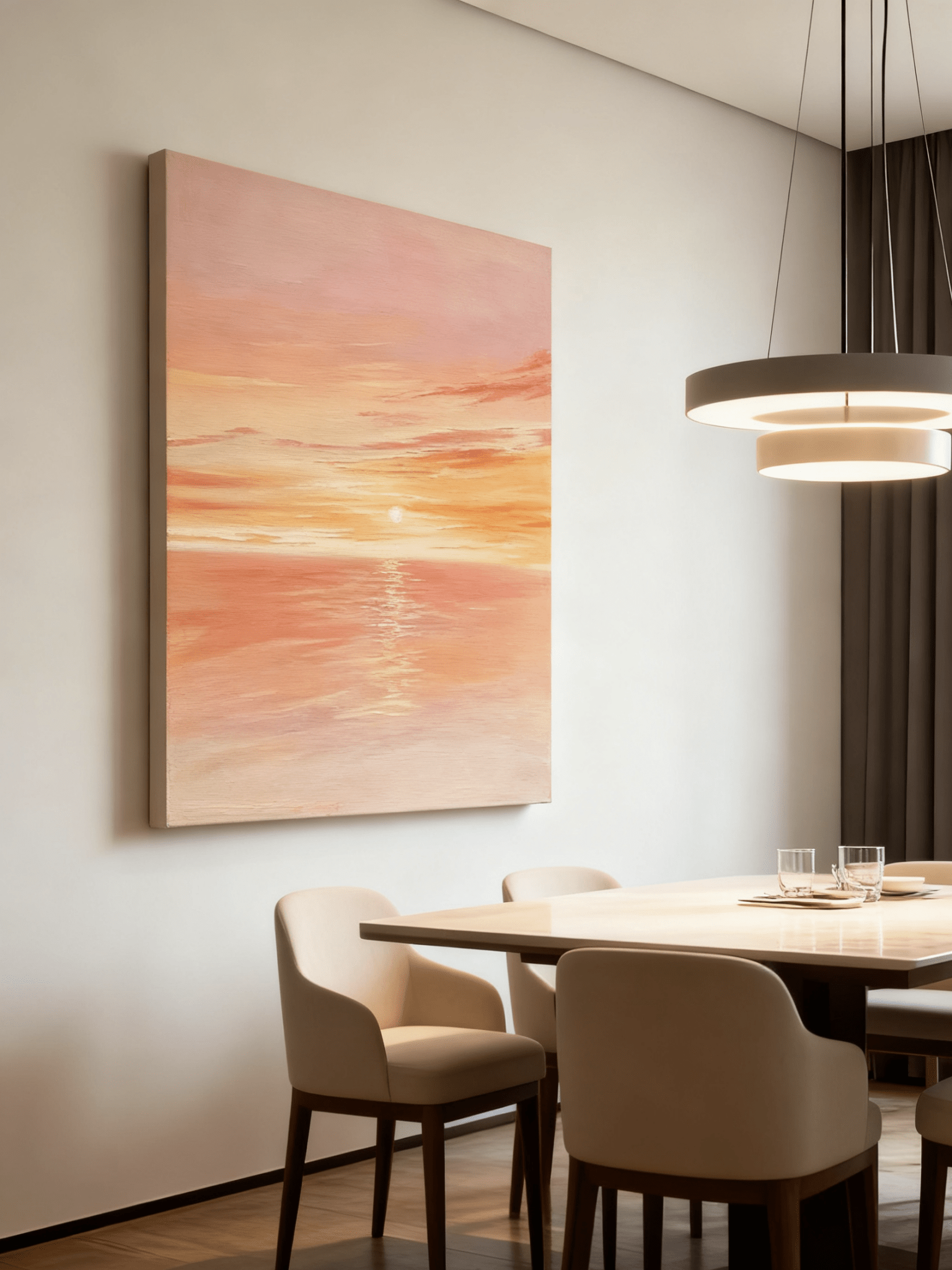
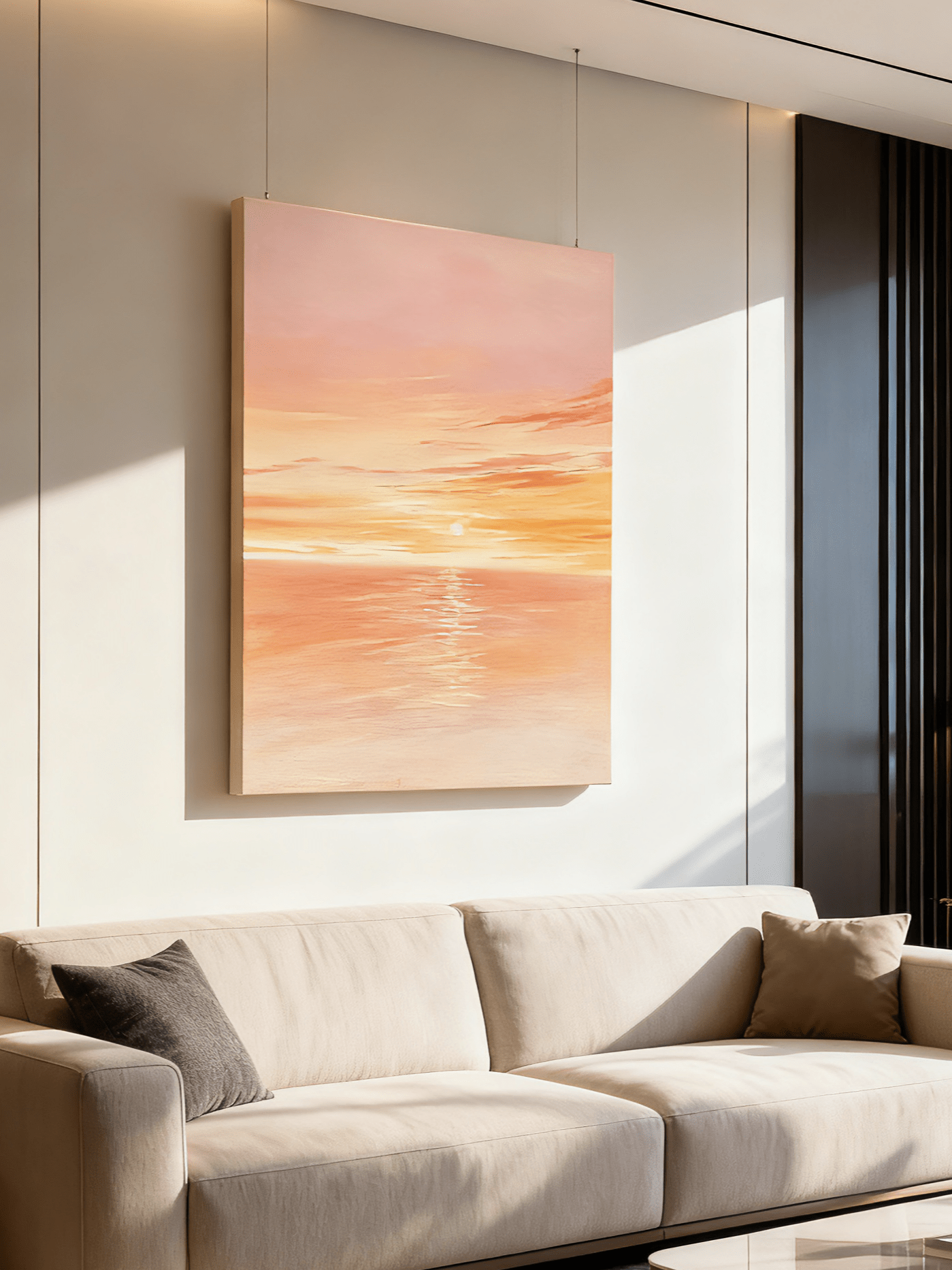
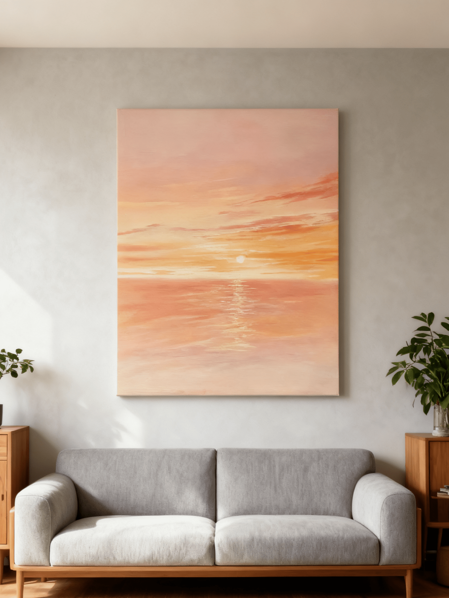
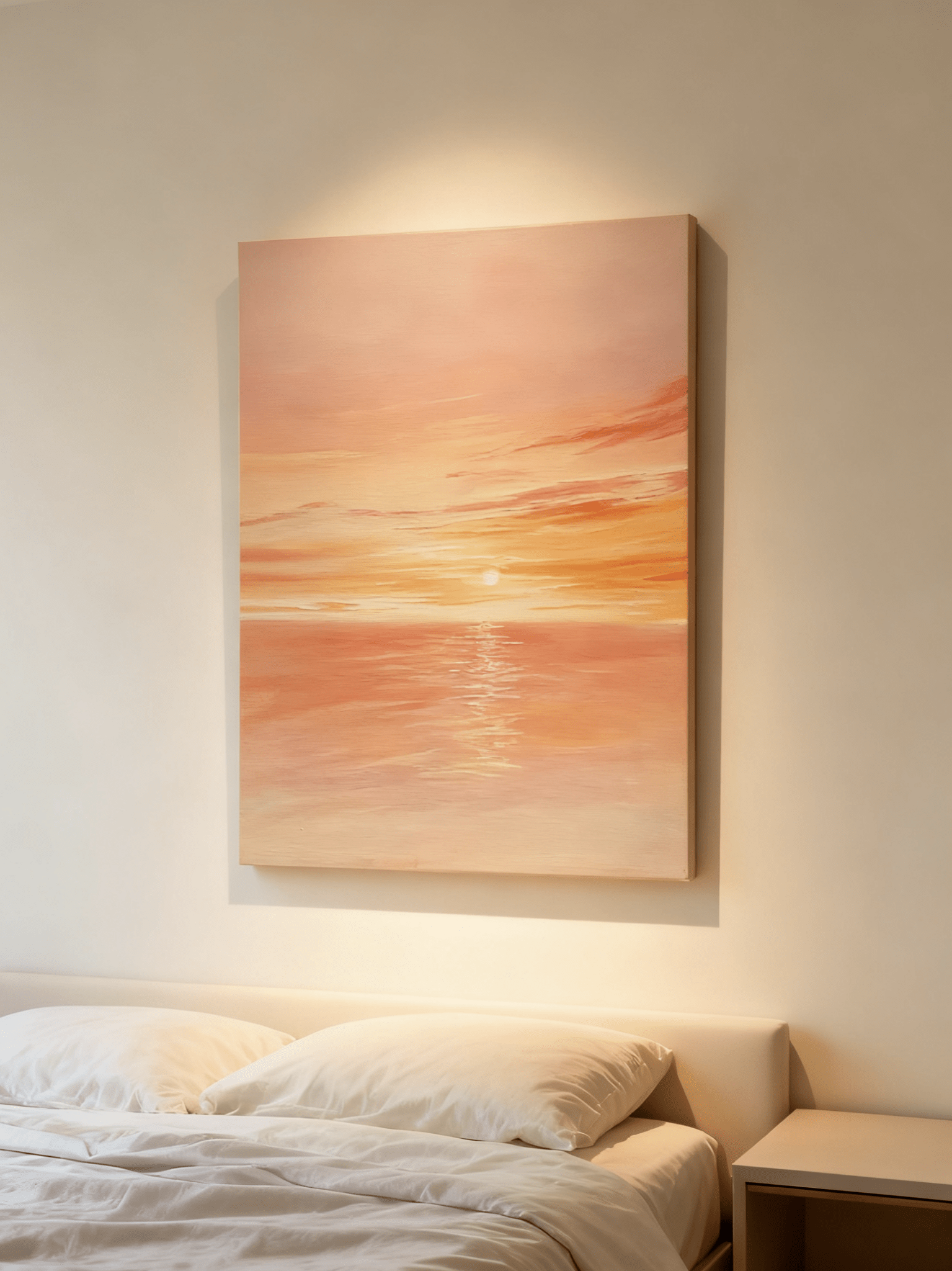
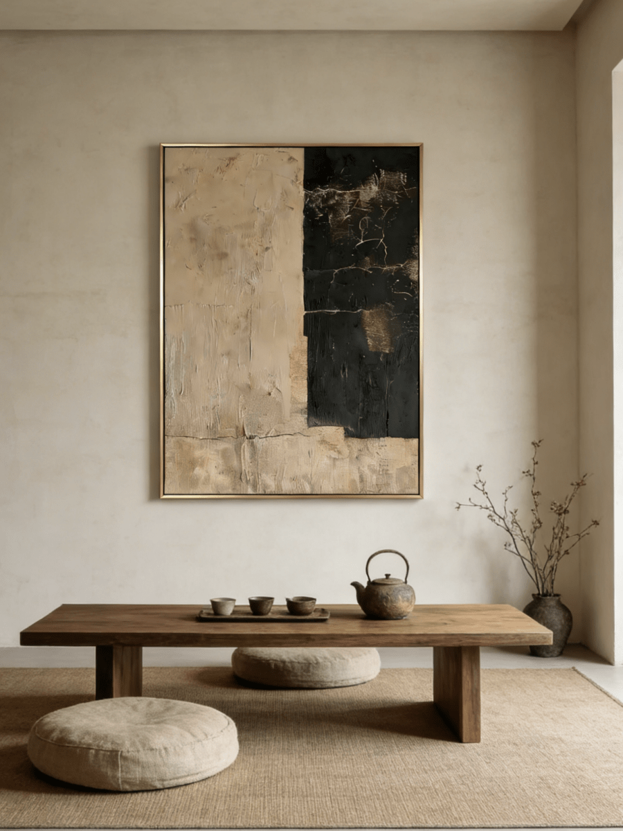
A room with walnut furniture, brown upholstery and a warm rug can feel beautifully settled. It can also start to look like one continuous band of color. A blue painting introduces a cooler interval without asking you to replace furniture that already works.
The most useful blue wall art for a brown living room usually contains a bridge between the two temperatures: ivory around a blue sky, an ochre riverbank beside gray-blue water, or a sandy foreground below a cool horizon. Start with the room's existing brown, then decide how much blue you actually want to notice.
This guide focuses on that specific relationship. You do not need to turn the room into a coastal interior or repeat blue across every accessory. The painting can carry most of the cooler color on its own.
1. Identify the brown that occupies the most space
Look at the largest brown surface from the doorway. Is it orange-toned leather, chocolate fabric, reddish wood or a muted taupe rug? Those are different starting points, even though retailers may call all of them brown.
Put a piece of plain white paper beside the surface in indirect daylight. The paper will not give you a professional color reading, but it makes a reddish, yellowish or grayish cast easier to see. Repeat the comparison beside the wall, because cream paint can make a cool artwork appear cooler by contrast.
Warm caramel and cognac
With orange-brown materials, begin with a blue that has some gray in it. Dusty blue introduces separation while allowing the furniture to remain visually warm. A painting with a small sandy or ochre passage can connect the wall to the furniture without duplicating its color.
Bright cyan and saturated orange create a much sharper relationship. That can be enjoyable, but it requires a deliberate decision about intensity. If the room is intended for quiet evenings, compare a softer blue-gray option before committing to the brighter one.
Chocolate and espresso
Dark brown furniture often benefits from a painting with generous light areas. A pale blue sky and ivory field can provide that interval. A mostly navy painting may make an equally dark sofa feel heavier, especially against a midtone wall.
The point is not that dark blue is unsuitable. It is that the painting needs an identifiable boundary and some internal variation. Check whether you can still distinguish its major forms from the far end of the room after sunset.
Taupe and gray-brown
Taupe can accommodate blue-gray easily, but too many similar midtones may make the room feel indistinct. Look for a painting with either lighter ivory passages or a few deeper marks. A little contrast often does more than adding a second decorative color.
2. Decide whether blue should be an accent or the main event
The size of a canvas and the amount of blue painted on it are separate decisions. A large landscape with an ivory sky may introduce less visible blue than a smaller canvas covered almost entirely in deep blue paint.
Compare product images as small thumbnails. Notice which color survives when the detail disappears. This is a useful way to judge the overall effect before becoming absorbed in brushwork, tiny highlights or a particular painted cloud.
For a small change, choose a painting where blue appears in water, distant hills or a narrow atmospheric band. Keep surrounding textiles mostly cream, oatmeal and brown. The art will feel related to the room without requiring a new decorating scheme.
For a clearer change, choose a broader blue field and repeat a related tone once, perhaps in a cushion or ceramic bowl. Use an approximate relationship rather than an exact color match. Matching every blue can make a room feel assembled from a coordinated set.

Blue and brown have current design relevance, but they also work beyond a single season. Benjamin Moore's 2026 color announcement centers on an espresso-and-charcoal shade, while Pinterest's 2026 palette includes Cool Blue. Those are separate trend signals, not evidence that a particular painting will suit every brown room.
The practical decision remains the same: choose the amount of cool color that improves your existing room. A trend can suggest a direction; your wall color, furniture and daily light determine the final choice.
3. Use the wall, frame and materials to connect the palette
A warm off-white wall gives blue artwork a clear background while remaining compatible with brown furniture. Very yellow cream may exaggerate the coolness of a pale blue painting. Test the actual wall alongside the product image instead of relying on the words warm white or ivory.
The frame is a small but influential transition. A restrained warm wood frame can connect cool paint to walnut furniture. A slim dark frame creates a clearer outline, which can help a pale image stand apart from a pale wall.
Avoid choosing a frame solely because its finish matches the coffee table. The painting's edge matters too. If a dark band reaches the edge of the canvas, another dark border may make that band appear broader; a lighter frame can interrupt it.
Material contrast helps the palette feel comfortable. Linen, wool and matte ceramics give a blue-and-brown room softer surfaces. If the furniture is polished or the upholstery is shiny, consider how the painting's raised texture will look alongside that sheen.

For example, a walnut cabinet, an oatmeal chair and a blue-gray painting already create a complete material conversation. A cream ceramic lamp can add lightness. Adding a blue rug, blue curtains and multiple metallic objects is optional, not necessary to make the painting belong.
Before selecting dimensions, mark the proposed outer frame size on the wall. View the outline from the sofa, doorway and adjoining room. The canvas should relate to the furniture group it serves, while leaving the surrounding wall visible enough to separate it from nearby lamps or shelving.
4. Check the painting under the light you actually use
Make the final comparison at the time of day when you spend the most time in the room. A blue painting that looks open beside a bright window can look much grayer under evening lamps. Warm light may also strengthen the ochre and brown passages within the painting.
Use the product's overall image to assess color balance and close-ups to assess surface. Neither replaces seeing a sample or the finished work, but together they give you more information than a styled room photograph alone. Room scenes illustrate a possible setting; they do not establish the exact size or lighting in your home.
If the artwork is made to order, discuss any important color requirement before ordering. Ask whether approval photos can show the whole canvas and a closer view under neutral light. Screens and photographs introduce variation, so describe the relationship you want, such as soft blue with warm ivory, rather than requiring a screen-exact match.

Four paintings that illustrate different blue-and-brown balances
These are alternative directions, not a recommendation to hang all four together. Each is part of WABI Wall Art's current New Arrival selection.
Quiet Blue River Valley — EL#0400
Quiet Blue River Valley combines light blue-gray water and sky with darker riverbanks and earthy accents. It is a useful direction for a brown room that needs lightness while retaining some connection to natural wood and warm textiles.
Wabi-Sabi Textured Coastal Wall Art — EL#0442
EL#0442 places a slender terracotta horizon above blue-gray and sandy shoreline passages. Its vertical shape and small warm accent make it a candidate for a narrower wall beside brown furniture, where a broad blue rectangle would feel too assertive.
Quiet Blue Shore — EL#0310
Quiet Blue Shore offers a softer horizontal meeting of pale blue, ivory and sand. Consider it when the room already has strong furniture silhouettes and you want the artwork to provide a quieter area rather than another heavy focal point.
Golden Blue Horizon — EL#0309
Golden Blue Horizon has deeper blue-gray and teal passages around a warmer luminous center. It can support a richer chocolate-brown scheme, provided the room has enough light and pale surrounding surfaces to keep the painting's darker areas distinct.
For further comparisons, browse the cool blue and frosty-tone paintings by the amount of light and dark color in the composition, not just the color named in the title. Confirm the listed size, framing configuration and current customization options for the specific work.
Frequently asked questions
Does blue wall art go with brown furniture?
Yes. Blue creates a cooler counterpoint to brown, and ivory, sand or ochre within the painting can connect the colors. The most important distinction is whether your brown is caramel, chocolate, reddish or grayish, and whether you want a subtle or pronounced contrast.
Is light blue or navy better in a brown living room?
Light blue usually introduces more visual lightness, while navy gives a deeper contrast. Neither is automatically better. With dark furniture and limited evening light, a canvas containing pale areas is often easier to read than an uninterrupted dark field.
Does the painting need to contain brown?
No. A frame, linen fabric or warm wall can supply the connection. Brown within the image is helpful when you want the artwork to feel closely integrated, but it does not need to repeat the furniture's exact shade.
Will blue artwork make the room look coastal?
The subject and surrounding objects matter more than blue alone. Abstract forms, restrained landscapes, walnut and wool can produce a contemporary room. Shells, rope and repeated nautical motifs are what make a coastal theme much more explicit.
The takeaway
Keep the brown elements you like. Choose blue artwork by its temperature, light areas and overall visual weight, then give it one or two connections to the room. The best result lets the painting introduce something new while still feeling at home.