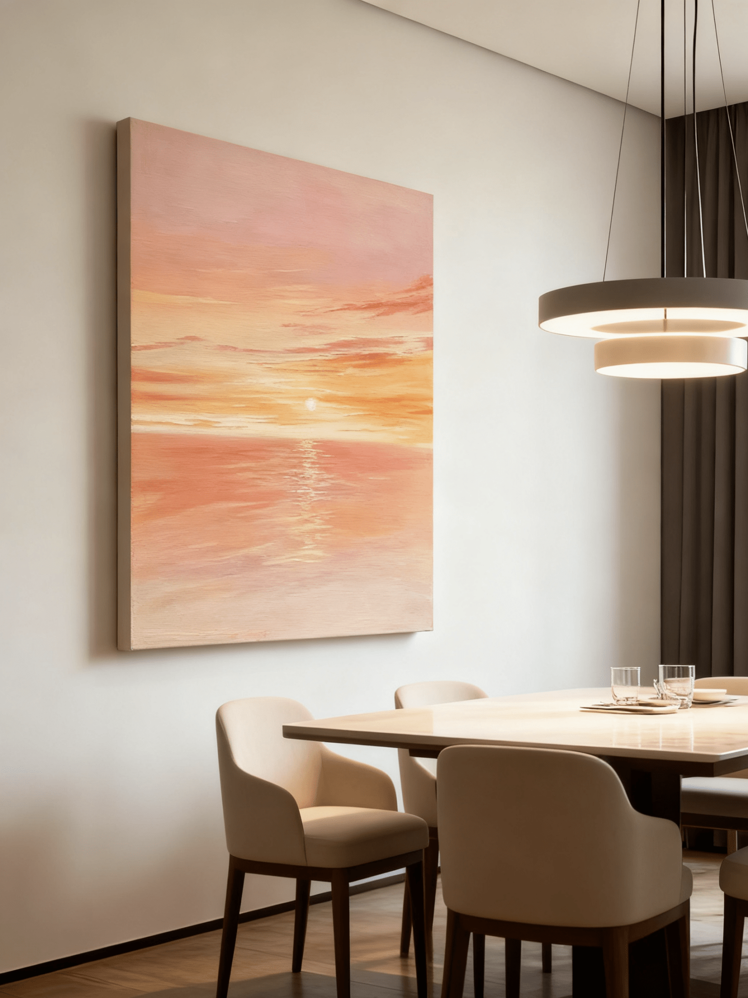
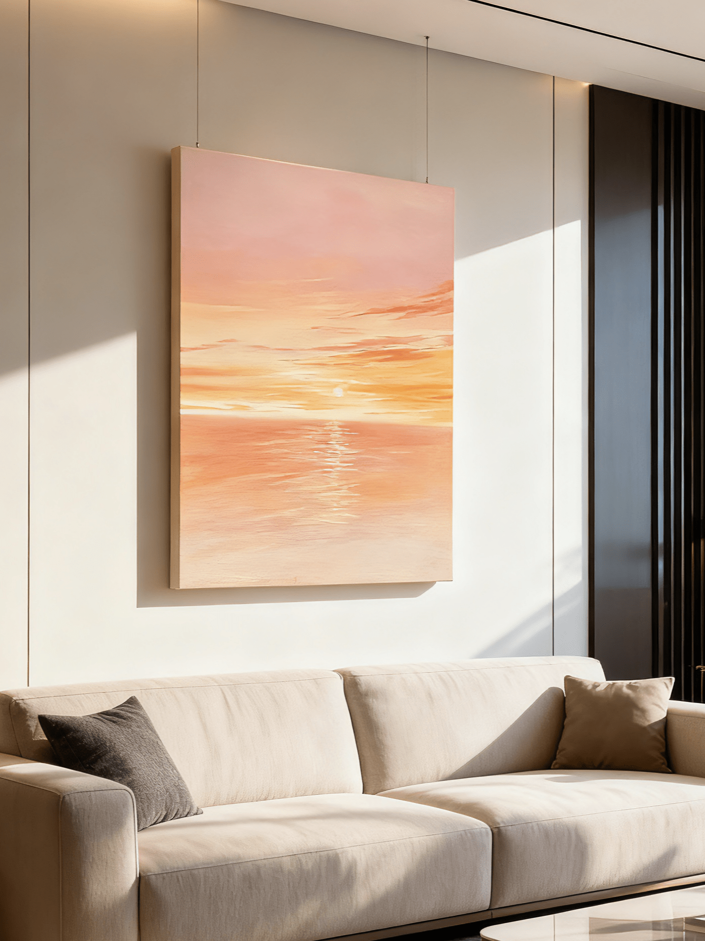
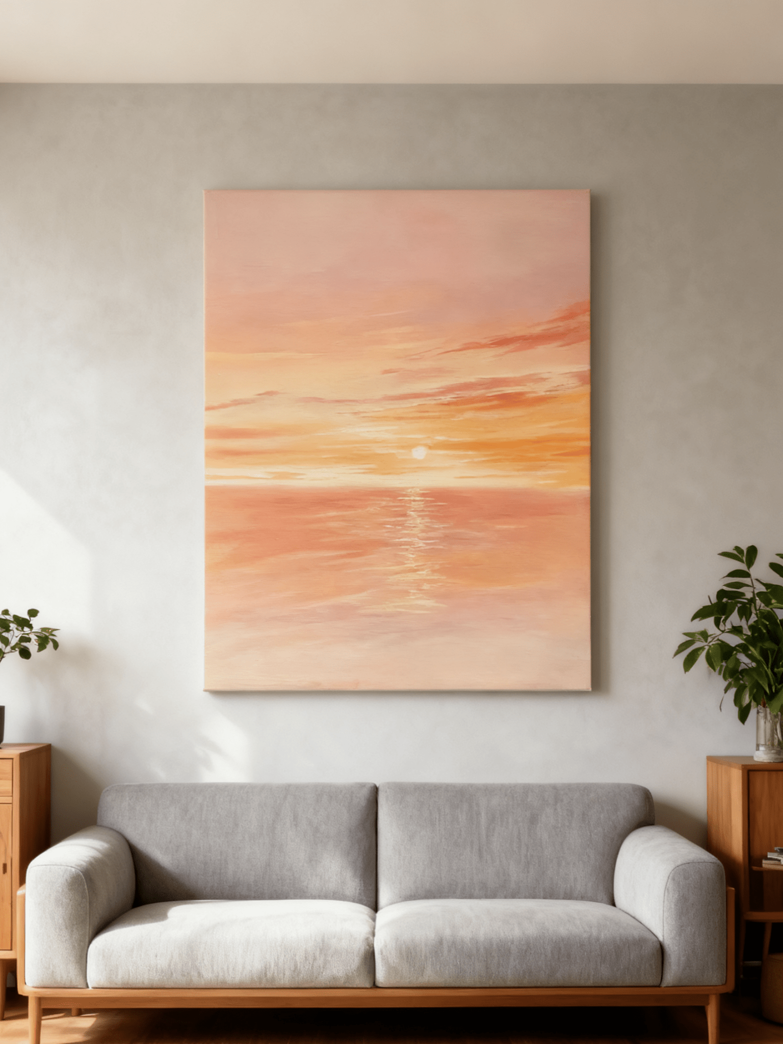
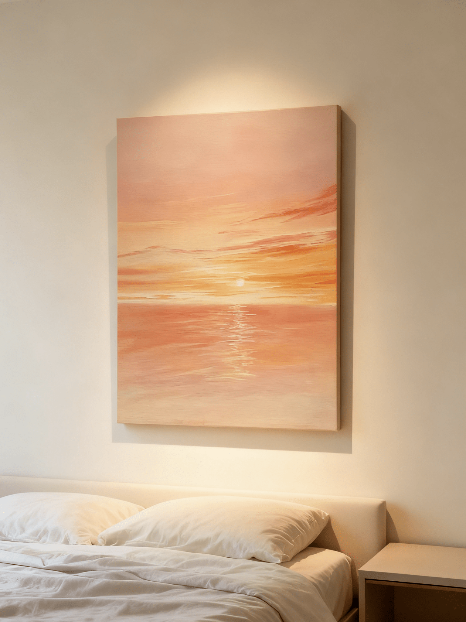
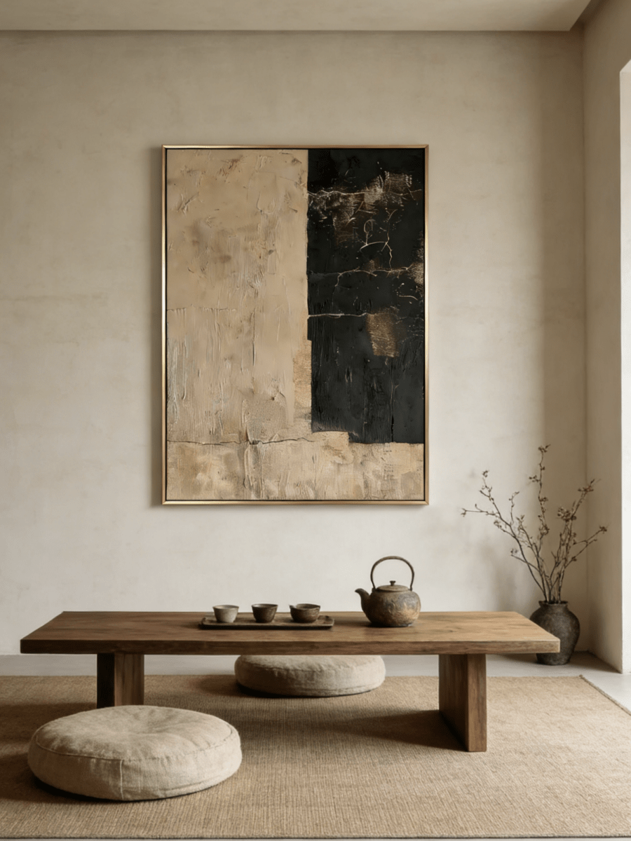
Color, contrast, saturation, and texture can change the atmosphere a room appears to have. Responses to color are personal, so this guide treats palette choice as an interior-design decision rather than a health or healing treatment.
Start with the room’s existing light
Observe the room in morning, afternoon, and evening light before selecting a painting. Cool daylight can make blue and green appear clearer, while warm artificial light can emphasize cream, terracotta, coral, and gold tones. A sample viewed on a screen will not reproduce every change in surface color or texture.
Bedrooms: reduce visual contrast
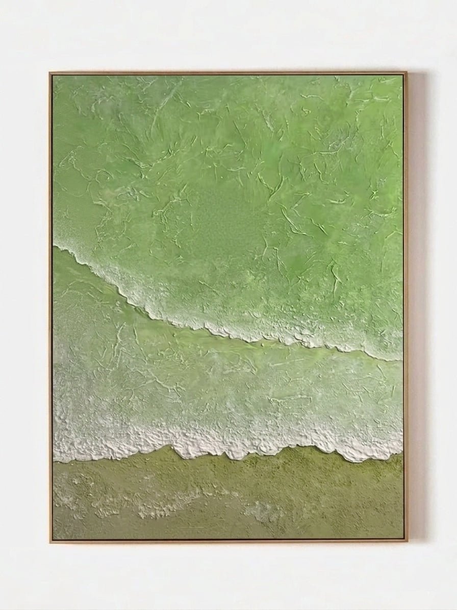
For a quieter visual effect, consider soft blue, sage, cream, blush, or other low-contrast palettes. Large areas of one color and gradual transitions generally read more softly than sharp black-and-white edges. This is a styling observation, not a claim that artwork changes sleep, stress, or health.
Browse cool blue wall art, sage and olive green wall art, or pastel and blush wall art.
Living rooms: balance warmth and contrast
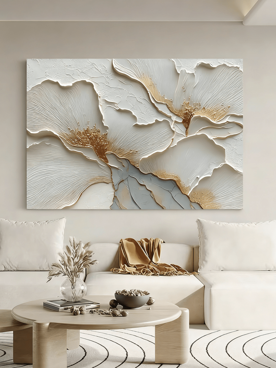
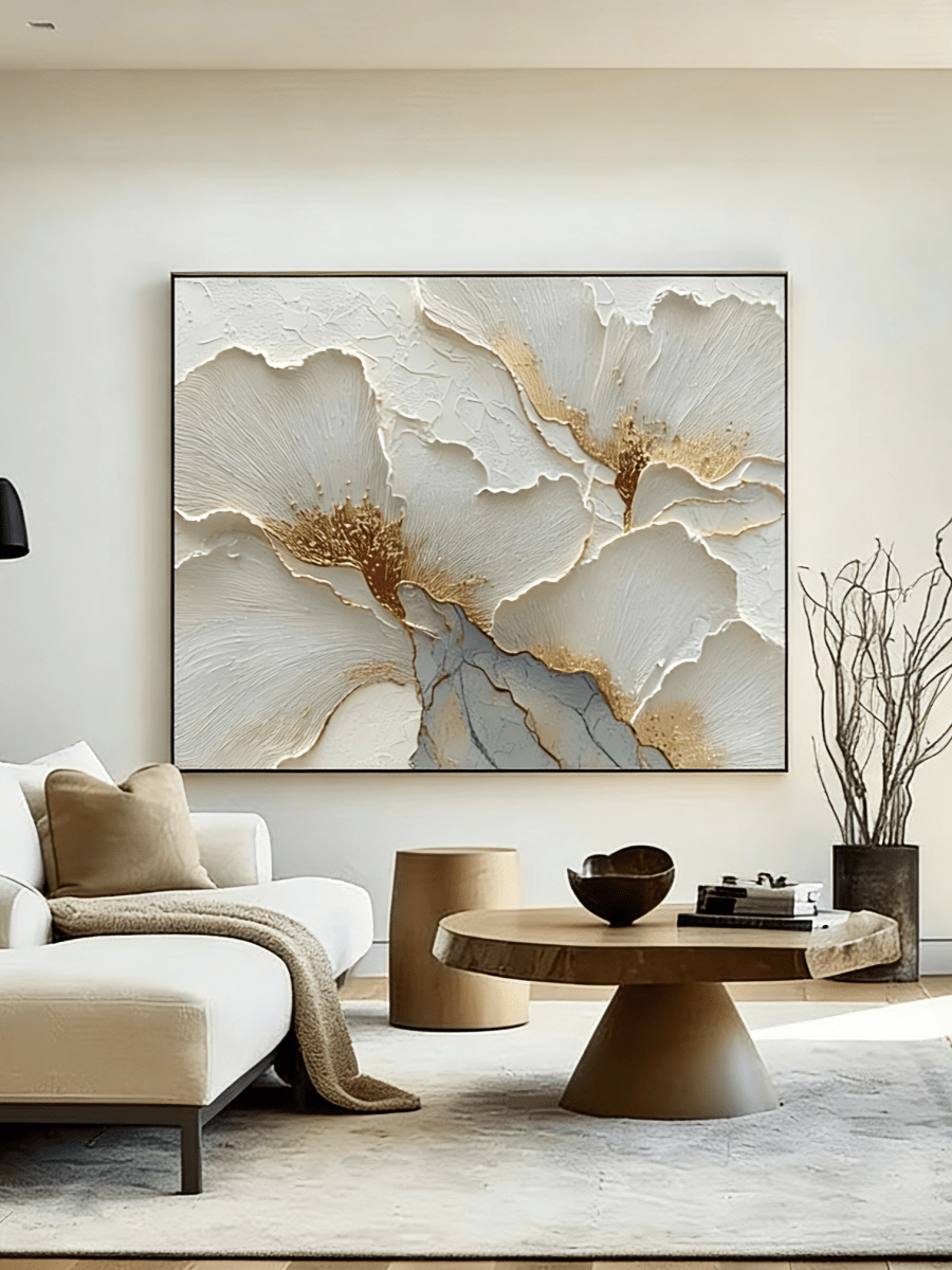
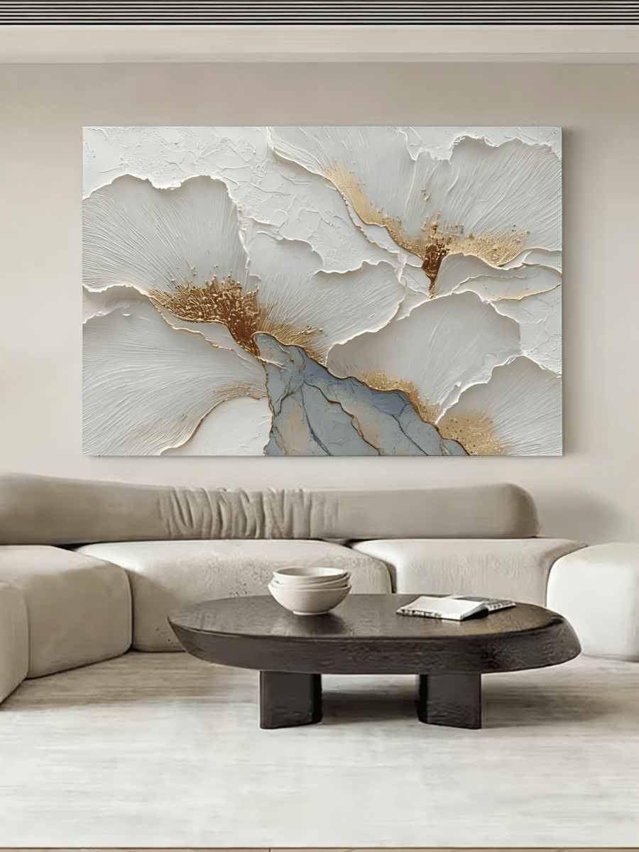
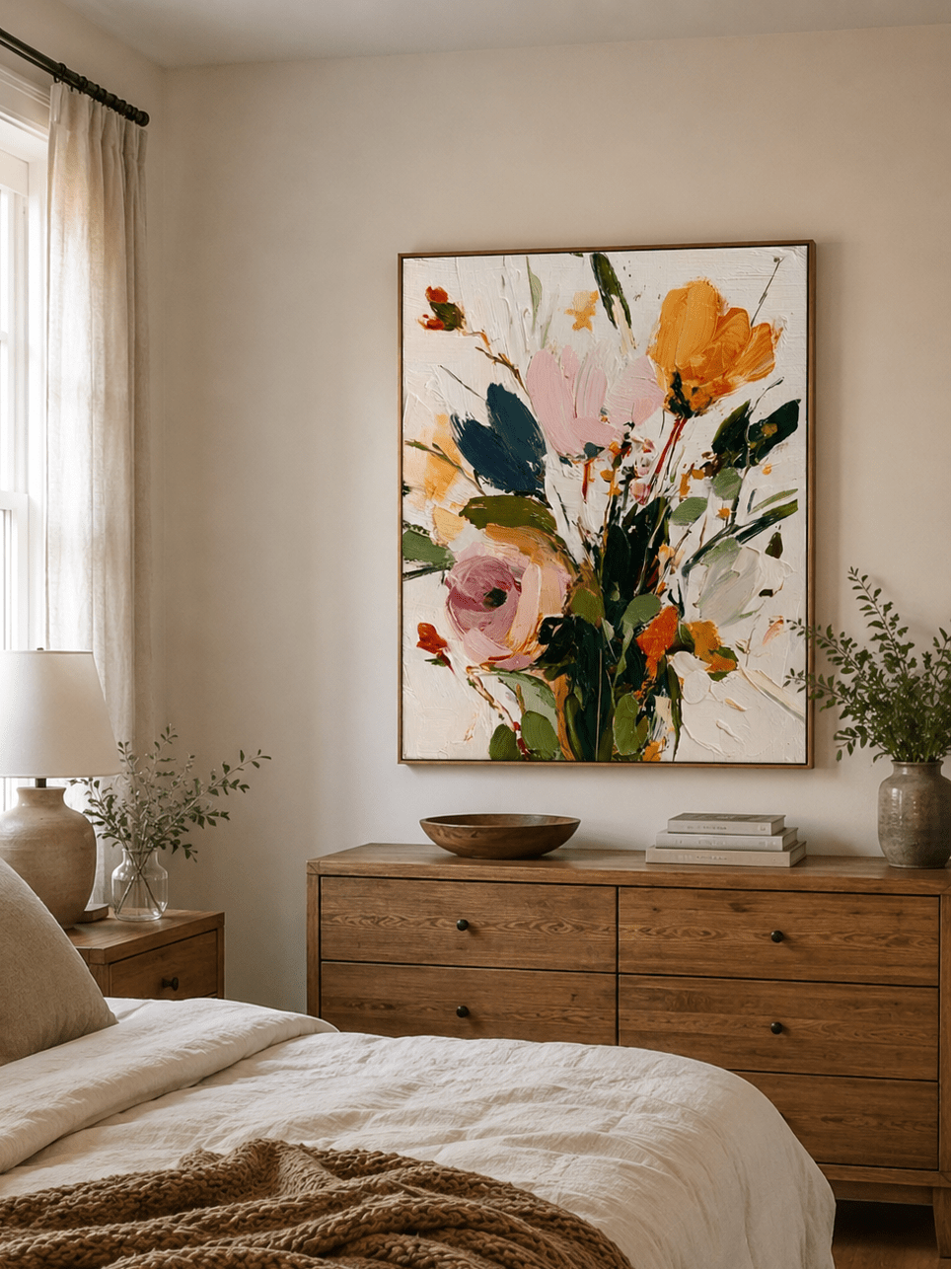
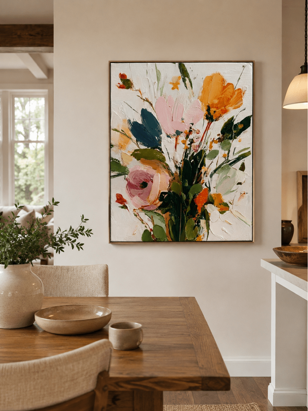
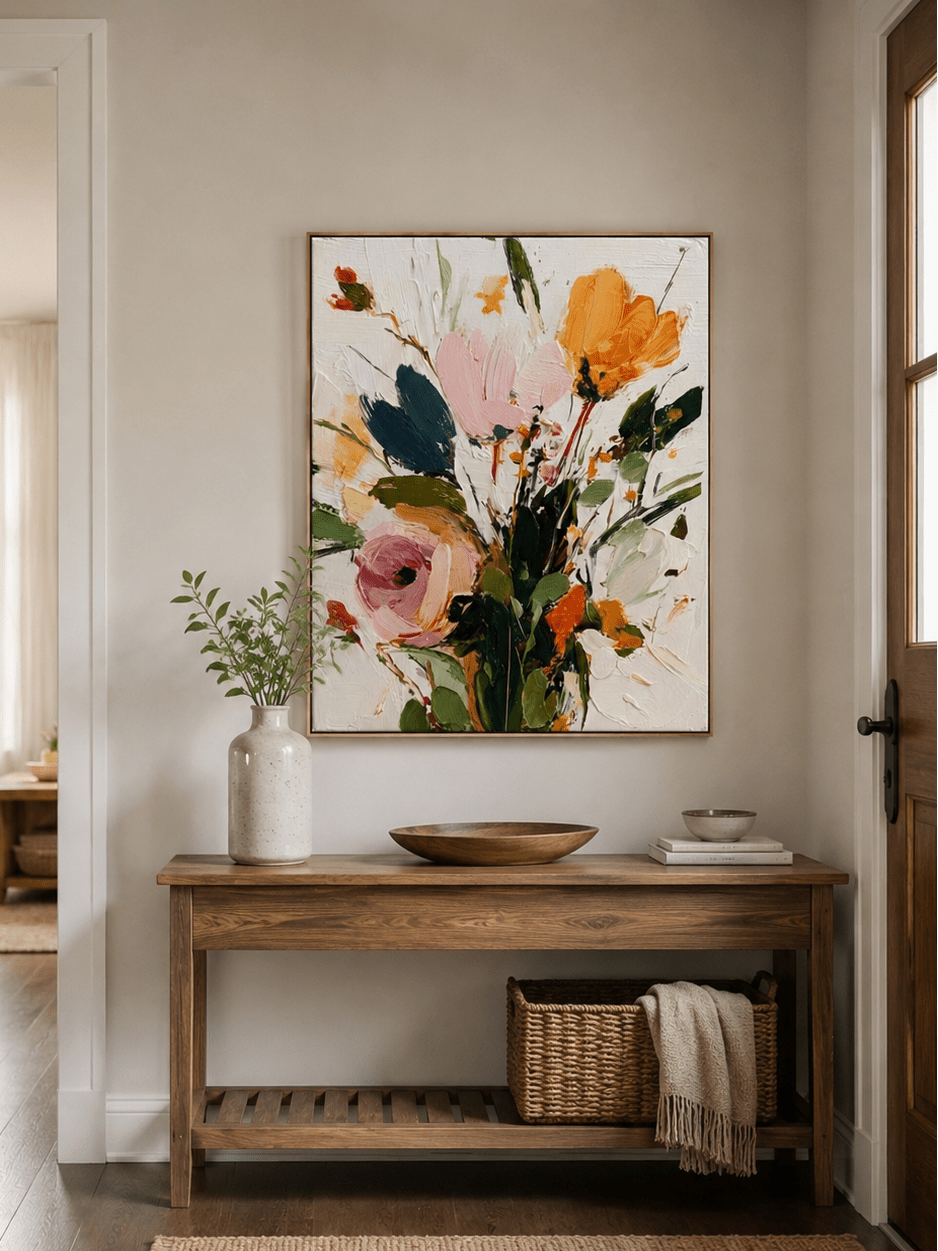
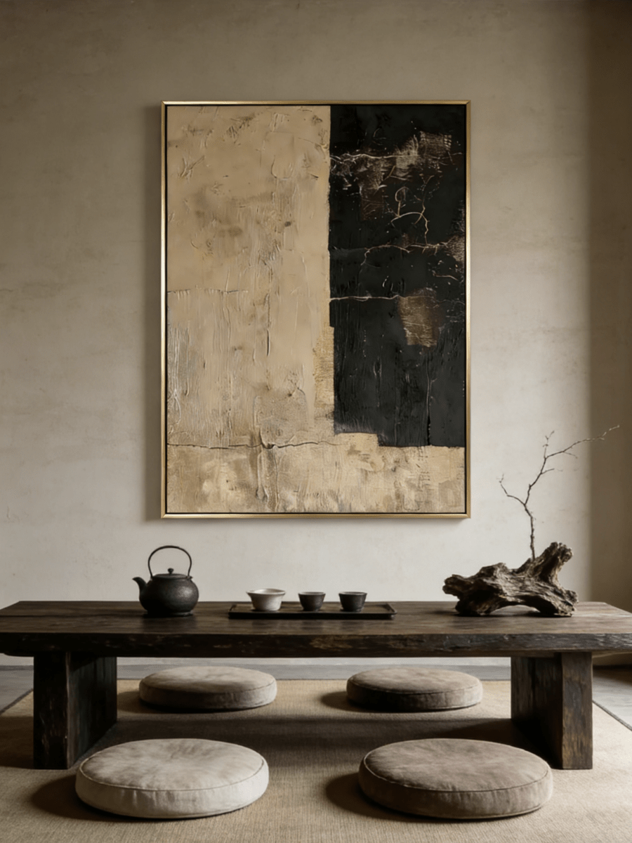
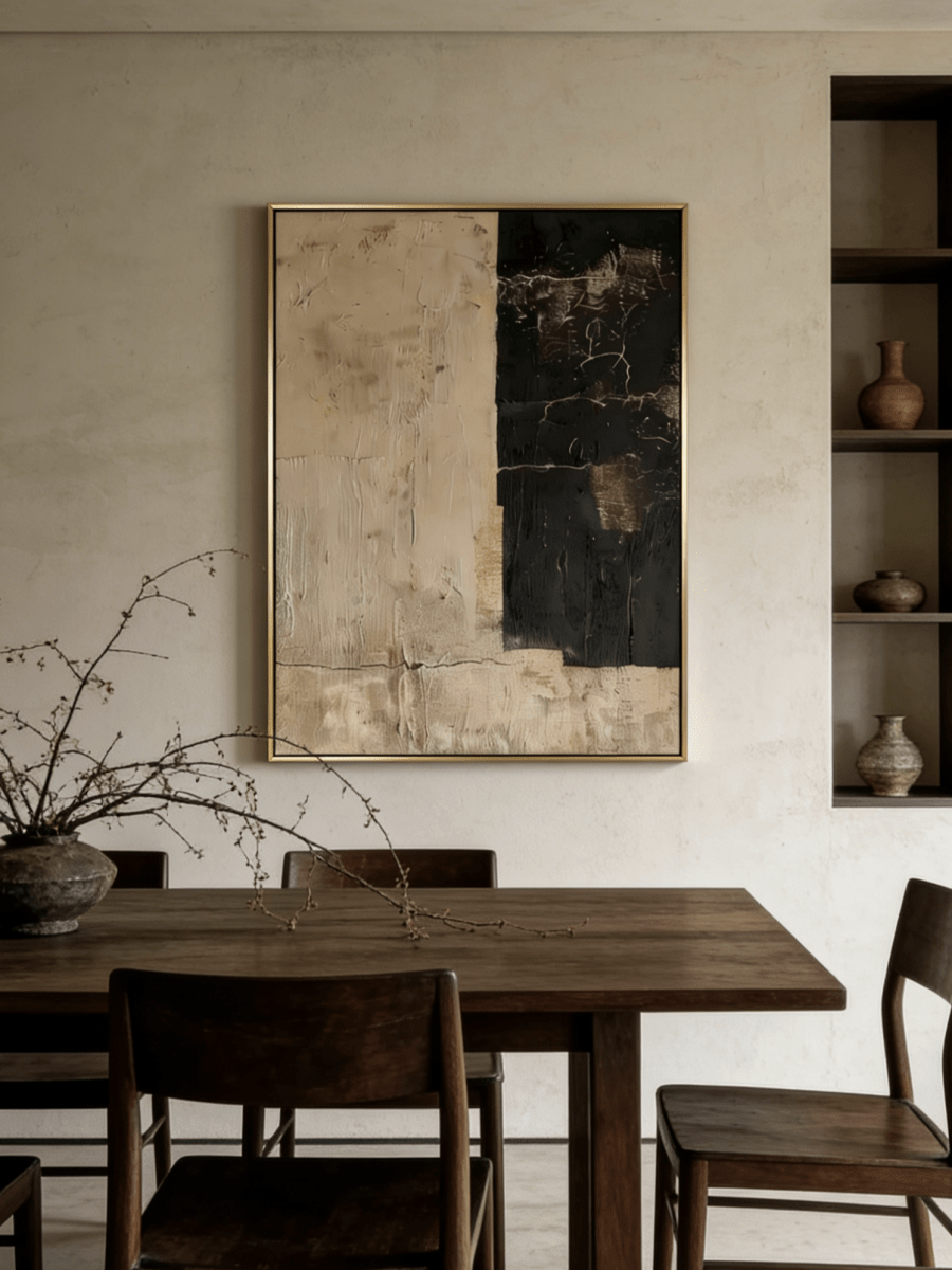
Living rooms often need enough contrast to remain visible across a larger seating area. Earth tones, coral, ochre, deep green, and layered neutrals can create a warmer visual center. Repeat one or two colors from the painting in a cushion, rug, ceramic object, or book spine instead of matching every color.
Browse earth-tone wall art and multi-color statement wall art.
Home offices: protect legibility
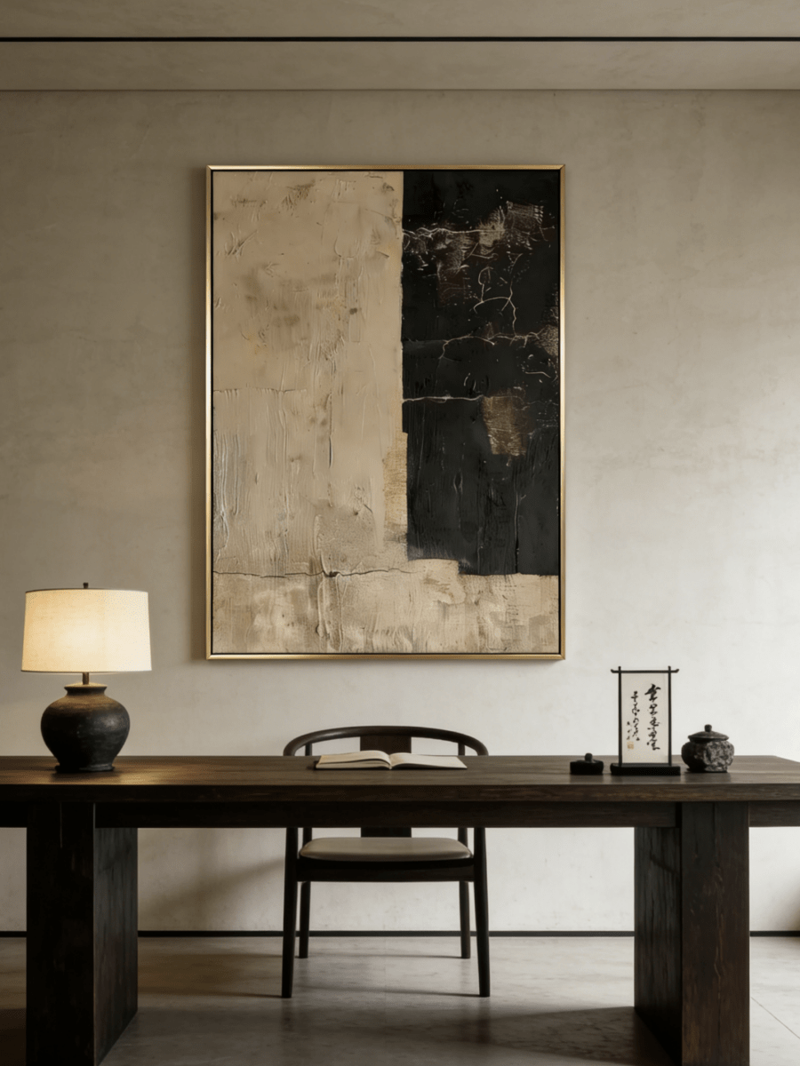
Choose a palette that stays distinct from the wall without competing with screens, shelving, or task lighting. A colorful work can act as a focal point; a black-and-white or minimalist work can keep the background visually restrained. The right choice depends on the room and viewer rather than a universal productivity effect.
Use texture and scale deliberately
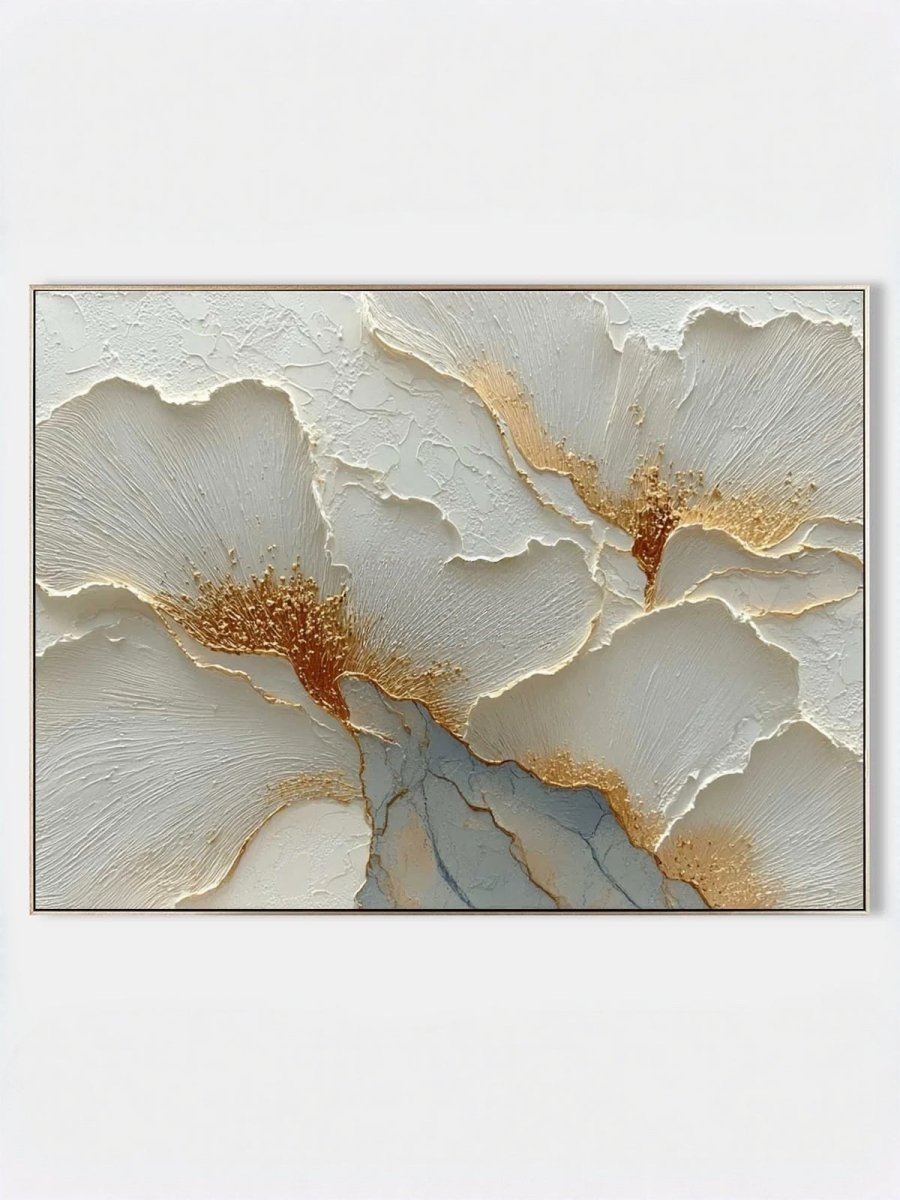
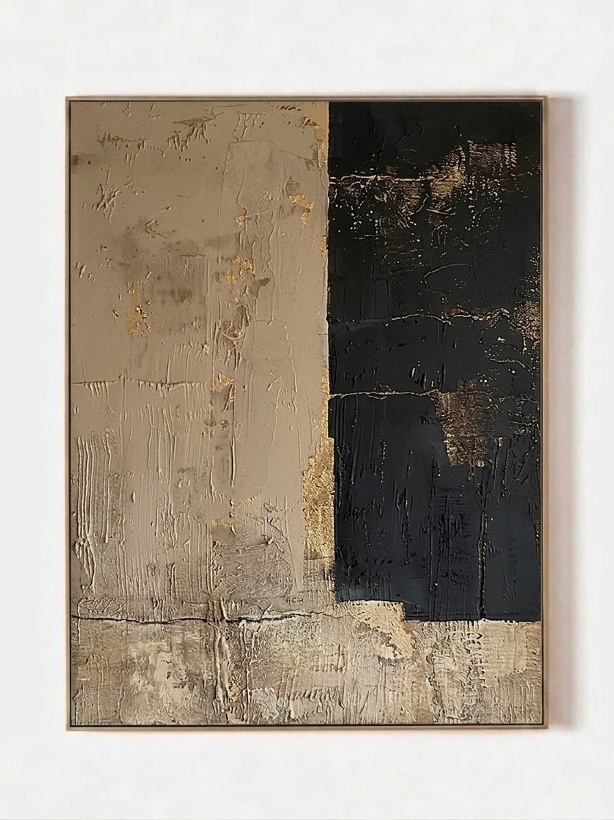
Raised brushwork becomes more visible under side lighting because small shadows define the surface. Flat frontal lighting can make the same painting appear quieter. Test the intended artwork size with painter’s tape and view it from the main doorway and seating position.
A practical color checklist
- Photograph the room in daylight and at night.
- List the three most visible fixed colors in the room.
- Decide whether the artwork should blend with those colors or provide contrast.
- Check the painting’s orientation and dimensions against the wall.
- Review close-up product images for visible texture and color variation.
FAQ
Can wall art change a person’s mood?
People can have subjective emotional responses to color and imagery, but WABI Wall Art does not make medical or healing claims for artwork.
Should every color in the painting match the room?
No. Repeating one or two colors is usually enough to create a visual relationship without making the room look overly coordinated.
How can I compare palettes?
Use collection filters, product close-ups, and room photos. Screen color varies, so allow for differences between digital previews, lighting conditions, and the painted surface.